
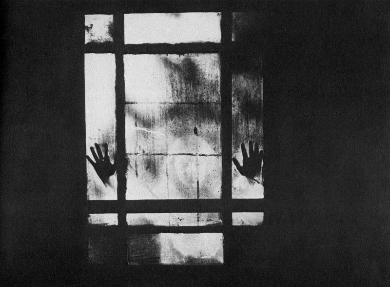
Curse of the Dead (1966).
Continuing an occasional series. This photograph, reproduced in Denis Gifford’s A Pictorial History of Horror Movies (1973), intrigued me for years. Gifford’s book is a very good collection of stills from horror films of all kinds, ranging from the earliest days of cinema to the 1970s. The pictures are mostly black-and-white, and are often far more stimulating than the films they would have been promoting. The text generally refers to the films depicted but in the case of this picture there’s only a single credit, Curse of the Dead (1966), a film I’d never heard of. These kinds of mysteries have been banished for good now we have resources like IMDB where you can learn immediately that Curse of the Dead is a Mario Bava film whose original Italian title was Operazione Paura. (It’s also known, with the usual hyperbole, as Kill, Baby…Kill!) “An 18th century European village is haunted by the ghost of a murderous little girl” says the summary. Bava’s films were always visually impressive so it’s really no surprise to find it was one of his.
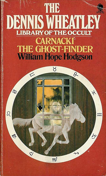
The first repeat usage I know of is this cover from the Dennis Wheatley Library of the Occult series published by Sphere books from 1974–77. Sphere used Wheatley’s name to sell a lot of reprints but the series was substantial and featured a number of titles that would have been appearing in paperback for the first time. Unfortunately the best thing about the covers was the uniform design of the horoscope circle against a coloured background. The quality of the illustrations was very uneven so it’s probably for the best that the artists and photographers went uncredited.
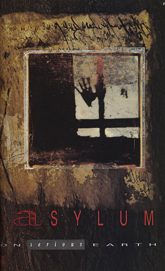
Then there’s one of Dave McKean’s title pages for Arkham Asylum (1989), the heavily symbolic Batman book he created with Grant Morrison. There’s only a portion of the picture but I’d say it’s a good guess he used the Gifford book since at least one of the panels in his earlier Violent Cases was based on another of the Gifford photos.
This isn’t all, I’m sure I’ve seen the Gifford picture used on a record sleeve but there’s little way of discovering which one unless somebody recognises the photo. If anyone knows, please leave a comment. And despite all of this I still haven’t seen Bava’s film even though I’m told it had a strong influence on Twin Peaks. This account at The Horror Digest is slightly disappointing when a colour equivalent of the Gifford still lacks the particulated creepiness of the black-and-white version. More surprising is finding yet another film featuring the arms-out-of-the-walls motif. This obviously requires further investigation.
Update: Thanks to Irv in the comments for finding the following singles so quickly. The Decorators sleeve was the one I remembered. (See it larger here.) Kicks were an Australian band. Odd that these were both released in the same year.
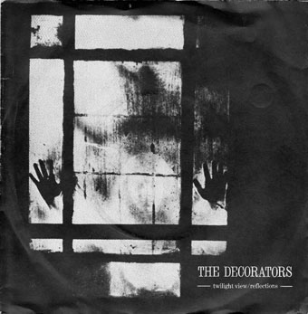
Twilight View (1980) by The Decorators. Design by Malcolm Garrett.
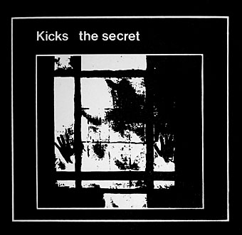
The Secret (1980) by Kicks.
Previously on { feuilleton }
• Design as virus 13: Tsunehisa Kimura
• Design as virus 12: Barney’s faces
• Design as virus 11: Burne Hogarth
• Design as virus 10: Victor Moscoso
• Design as virus 9: Mondrian fashions
• Design as virus 8: Keep Calm and Carry On
• Design as virus 7: eyes and triangles
• Design as virus 6: Cassandre
• Design as virus 5: Gideon Glaser
• Design as virus 4: Metamorphoses
• Design as virus 3: the sincerest form of flattery
• Design as virus 2: album covers
• Design as virus 1: Victorian borders
I don’t know if The Legendary Pink Dots were inspired by that picture, by the way the sleeve of their album ‘The whispering wall’ (2004) shows not two but four ghostly hands indeed!
Great image, the grid-like framing of the window really makes it. The inversion of childhood sweetness and innocence to create a creeping dread has seemed to be a permanent fixture of horror. ‘Play with me’…
Several albums used it! Found these, and several others, with a Google Image Search:
The Decorators, “Twilight View,” designed by Designed by Malcolm Garrett in the early 1980s: http://anniesanimal.blogspot.com/2007/06/decorators.html
Kicks, “The Secret,” from 1980 7″http://katorgaworks.bigcartel.com/product/kicks-the-secret-7
Thanks, Irv, great finds. The Decorators sleeve was the one I was trying to remember.
Pleased to see I’m not the only one with a well-loved copy of Gifford’s Pictorial History – it really is a stunning collection of B/W stills, often magical images extracted from poor films. That’s certainly not the case with Operazione Paura, which is one of Bava’s best, and well worth tracking down. Fascinating to trace the reuse of this image – I’ve had the Wheatley Carnacki for years, and never made the connection.
This indeed is one of my favorite cliches in the arena of images frozen in time, the beast or apparition or madman watching you intently from just beyond a supposedly protective facade of clear glass. Its been used to varying effect in good movies, especially in the successive Italian horror/giallo directors, ‘Inferno’ by Dario Argento, back when he still had it but was still kind of nuts, springs quickly to mind. There are the confusing examples like a few scenes hosting similar images in the uneven but watchable ‘Die Monster Die’. Unfortunately the technique is actually too effective, as mere orangutans with cameras try to partake of it as well , I can recall an early scene in the first ‘Critters’ movie…
Yeah, Argento’s earlier films are a mix of riffs from Hitchcock and Bava so he may have had this scene in mind at some point.
It was also usd by Vex a SE London Anarcho/ Goth band on a flyer to promote their ‘Sanctuary’ 12″ (although it’s not on the cover).
Said 12″ features perhaps the only anarcho-goth song inspired by the Hitchiker’s Guide to the Galaxy. http://www.youtube.com/watch?v=SvIMWnGTdbE.
I’ve got it somewhere. I’ll scan it if I can find it.