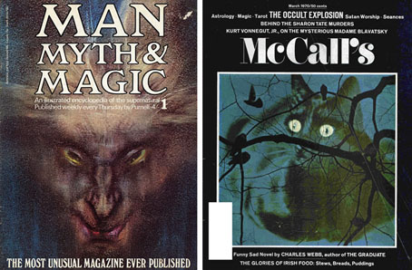
Man, Myth & Magic #1, January 1970; McCall’s, March 1970.
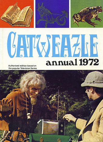
The announcement last week of the death of British character actor Geoffrey Bayldon prompted some discussion here about the typeface used for the titles of Bayldon’s TV series from the early 1970s, Catweazle. This was a humorous drama in which the actor portrayed a warlock transplanted by a time portal from the Norman era to the present day, a comic counterpart to another occult-themed series, Ace of Wands (1970–72). Being aimed at children, both Catweazle and Ace of Wands are at the lighter end of the great flourishing of occult-related media that runs in parallel with the rise and fall of psychedelic culture, a period roughly spanning the years 1965 to 1975. The two trends reflected and fed off each other; the hippie movement stimulated interest in the occult (Aleister Crowley is on the cover of Sgt Pepper) while giving to the commercial propagators of the supernatural a range of aesthetics lifted from the 19th century.
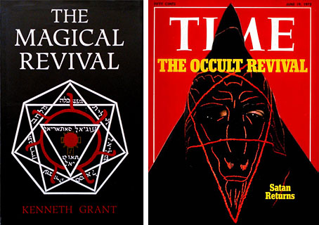
Muller, 1972; TIME, June 1972.
Among the graphic signifiers is a small collection of typefaces from the Victorian or Edwardian eras, designs which vanished from sight after 1920 only to surface 50 years later in very different settings to their previous deployment. I’m always fascinated by the way context changes the perception of a typeface; the repurposing of Art Nouveau fonts—which hadn’t previously been associated with diabolism—to signify witchcraft or sorcery is a good example of this. In the case of the occult revival this was partly opportunism: the commercial application of post-psychedelic style made the previously untouchable trendy again, decoration and elaborate stylisation was no longer taboo. But it was also a solution to the problem of signifying the sorcerous with typography when there were no off-the-peg solutions as there were for, say, Westerns or stories about the Space Race. As well as carrying with them a flavour of old books, some of the more curious letterforms were reminiscent of the glyphs of magical alphabets which no doubt explains their popularity.
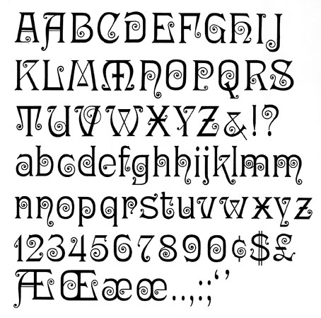
What follows is a chronological selection of the more striking examples (or my favourites…) which conveniently begins with Ringlet, the Catweazle font. With the trend being towards Art Nouveau you find popular Nouveau styles such as Arnold Bocklin also being used in the 1970s but I’ve avoided these in favour of the less common choices.
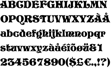
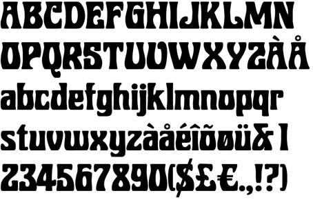
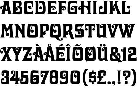
Ringlet (1882) by Hermann Ihlenburg
Pall Mall, 1971.
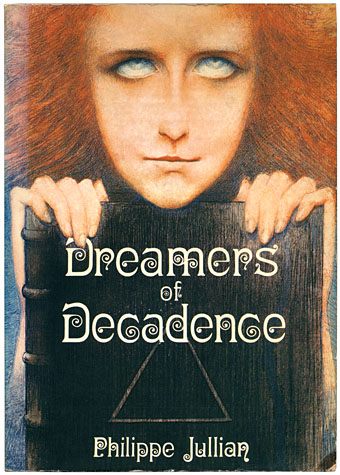
Jullian’s landmark study of the Symbolist movement isn’t an occult text but it is a great favourite of mine whose original title—Esthètes et Magiciens—puts it in the right sphere. Inside, the author touches on the spiritual concerns of many of the artists which included Theosophy and fashionable Satanism.
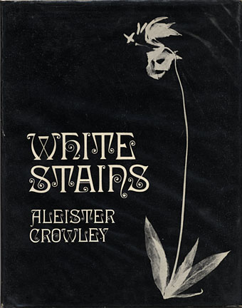
Duckworth, 1973.
Aleister Crowley is represented here with the first reprinting of his erotic poetry, produced in a limited run by the venerable London house of Duckworth.
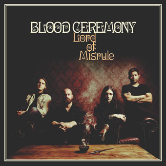
Rise Above Records, 2016.
Blood Ceremony are Canadians devoted to the occult rock of previous decades. Their presentation matches songs with titles like The Great God Pan and Morning Of The Magicians.
Rubens (1884) by John K. Rogers
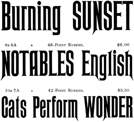
Rubens has long been a favourite of mine even though it gets used a great deal on horror novels and the like. Many Americans also regard it as “the Haunted Mansion font” owing to its use in Disney theme parks.
Peter Haining’s collection combined supernatural fiction with short non-fiction accounts of magical operations. The cover art is the full version of the drawing by Austin Osman Spare—The Elemental aka The Vampires are Coming—seen in detail on the cover of the first issue of Man, Myth & Magic.
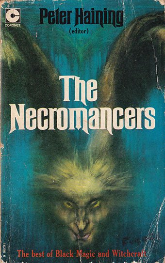
Coronet Books, 1972.
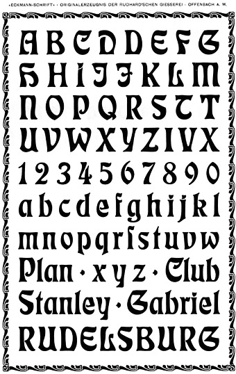
Eckmann (1900) by Otto Eckmann
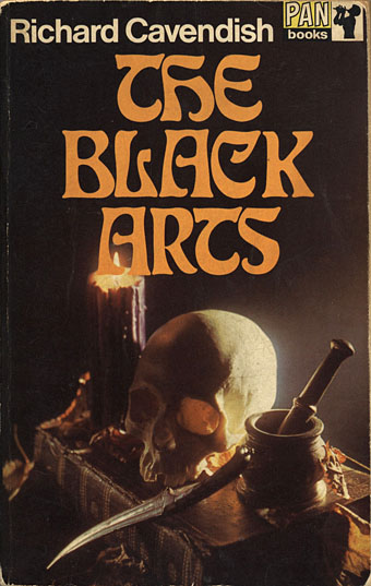
Pan Books, 1969.
Many of the examples in this post tend towards the exploitational (see below…) but Cavendish’s overview of occult theory and history is a serious study, even if the cover does beckon to the Dennis Wheatley readership. My mother was among the latter which no doubt explains why she had a copy of this paperback; in due course it found its way into my hands. Richard Cavendish was enough of an authority to be hired by Purnell as editor-in-chief of Man, Myth & Magic.
Siegfried (c. 1900) by Wilhelm Woellmer
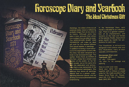
And speaking of which…Purnell offered their readership a sidereal start to 1971.
Man, Myth and Magic, 1970.
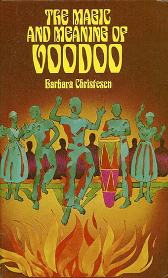
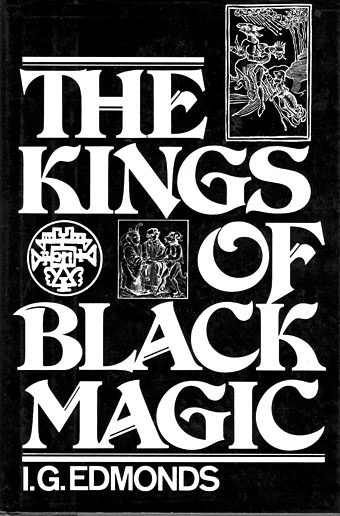
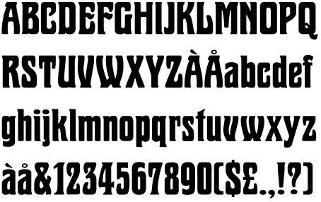
Heinemann, 1977.
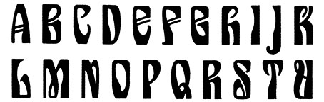
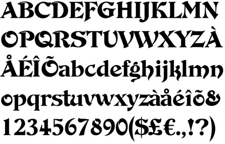
Pretorian (c. 1900) by PM Shanks & Sons
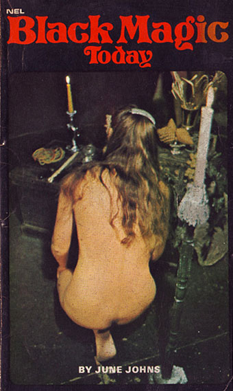
NEL, 1971.
This is where things shift from anthropology, history and children’s television to Satanic exploitation and hardcore porn. “Black magic” ceremonies in previous centuries were often a kind of orgiastic cosplay so it’s no surprise to find the same thing happening in the 20th century. New English Library dominated the British book world of the 1970s with a wide range of genre novels, as well as salaciously-packaged reprints of serious occult studies by Francis King and this volume by June Johns.
Undated.
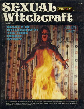
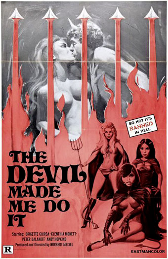
Sexual Witchcraft and The Devil Made Me Do It are two works whose pornographic nature means their origin remains obscure; nobody seems to have any information about the latter title.
Undated.
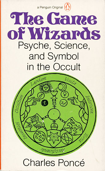
Penguin, 1975.
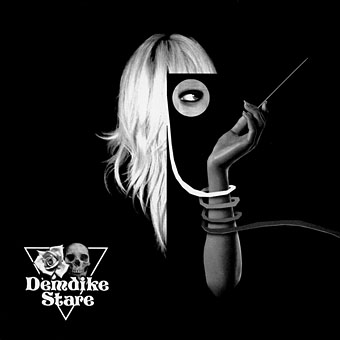
Symbiosis by Demdike Stare. Modern Love, 2009.
Mancunian duo Demdike Stare hark back to the heyday of Ouija boards and witchcraft with sinister electronics and the monochrome art and design of Andy Votel. Pretorian is used on all their early releases.
De Vinne Ornamental (1900) by Nicholas J. Werner
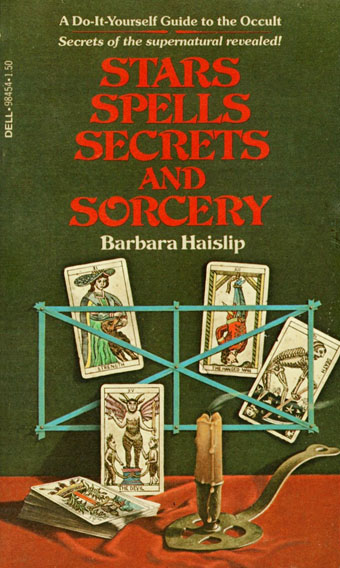
Dell, 1978.
Holt, Rinehart and Winston, 1984.
Marschall (1905) by Wilhelm Woellmer
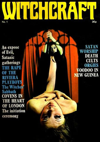
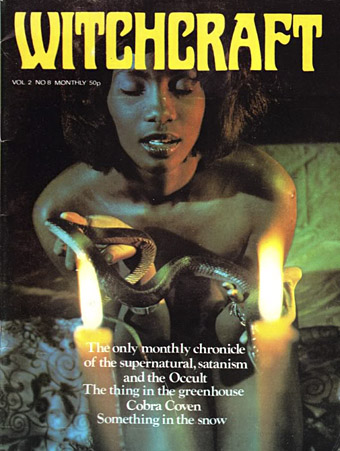
Witchcraft magazine was a UK publication (dates unknown) whose revelatory stories ran alongside many photographs of naked ladies. There was a brief fad for this kind of thing, a diabolic counterpart to all those beefcake mags pretending to be devoted to body-building. Witchcraft did at least manage more than a single issue.
Roberta (1962) by Robert Trogman
Trogman’s type was based on a Belgian restaurant sign so this may be another Art Nouveau derivation. Not so the use to which it was put, however. Flaubert’s novel doesn’t feature any overt occultism (although there is a whole chapter of human sacrifice) but the cover is one of the first to establish Roberta as a signifier of the exotic/erotic .
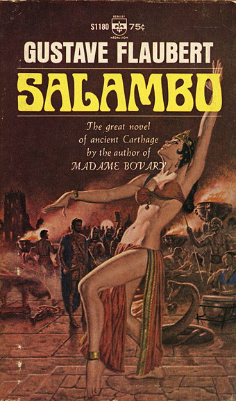
Berkley Medallion, 1966.
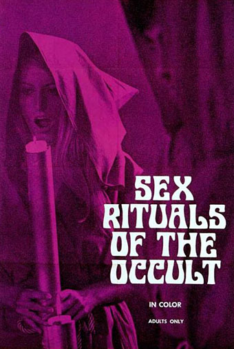
The film equivalent of Witchcraft magazine from 1970. According to this review, Sex Rituals of the Occult also features some gay sex from the male performers, a rare thing in these boob-fests.
Amicus Productions, 1971.
Davida (1965) by Louis Minott
Davida is one of those typefaces from the 60s that was very popular in the following decade so it’s no surprise to find one or two occult titles using it. I’ve included it here for the way its style refers back to Ringlet, and for Abragail and Valaria’s book of recipes.
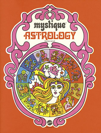
Mattel, 1969.
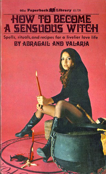
Coronet Communications, 1971.
Previously on { feuilleton }
• MMM in IT
• The Book of the Lost
• The Occult Explosion
• Forbidden volumes
• The Sapphire Museum of Magic and Occultism
• Occultism for kids