Main aesthetics

main01.jpg

Hydra-Calm (1992).

It’s always good to find a group of musicians who not only make the kind of sounds you like but also package their work effectively. Having read the Quietus interview with Robert Hampson last week I was going back through the catalogue of Hampson’s 90s group Main and thinking again how well the design of their digipak singles and albums complemented their music. Main evolved out of an earlier rock outfit, Loop, and the earliest Main productions still bear some trace of the trancey Loop approach to rock structures. The first Main album, Hydra-Calm, was released on Situation Two, and comes packaged like the first album from Faust, with an X-ray of a skull on a transparent sheet replacing the X-ray fist of the German group.

main02.jpg

Dry Stone Feed (1993).

With a move to the Beggars Banquet label a year later, a different design approach was adopted which set the template for nearly all the Main releases during the 1990s. An outfit (or person) named Avida is credited with Main’s design, with the name being adjusted on various releases to Avida Design, Avida Formations, Avida Hydroforms and Avida Iceforms. The decision to dwell on varieties of texture matches the evolution of the group’s music from arrangements of guitar, bass and drums to abstract and increasingly minimal fields of sound; in this respect, Deliquescence was a perfect title. Hampson and co. created their sound fields by subjecting guitar noise to unspecified sampling and effects processes. When Simon Reynolds invented the term “Post-rock” to describe some of the musical developments happening in the 1990s, Main always seemed to be exemplars of the term, they really did go from being a bona fide rock band to a group pushing sound far beyond anything to do with rock music at all.

main03.jpg

Firmament (1993).

The photos used by Avida Design start out as shots of TV screens or computer monitors then range through the natural world with close-ups of rock formations, lichen, wood grain and underwater ice. The typography is nearly always Copperplate Gothic (or a sans serif variation) printed in metallic silver ink. The most satisfying release for me was the Hz set of six CD-singles released from mid-1995 to 1996, the last of which came with a box to place the singles in and a booklet containing symbols which relate to each disc. Hz is the peak of their output, and although it was later released as a double-disc set I prefer the box.

Anyone looking for these releases today can find copies for sale at Discogs.com. Robert Hampson is still active, his site is here. A few more Main covers follow.

Continue reading “Main aesthetics”

Weekend links 78

carr.jpg

Struggle (2009) by Lindsey Carr.

• “Twilight Science is an imprint for sound, music and DVD editions initiated by artist Paul Schütze. We will progressively publish all back catalogue, new projects and collaborations. These will include works by Phantom City, NAPE, Schütze-Hopkins and others.” Related (because Paul Schütze remixed Main): Main Feed The Collapse, Neil Kulkarni talks to Robert Hampson.

• “You can’t really narrate or display this situation, you can only, endlessly, contemplate it. When the writer or director gets tired of the iterations, he tells us who the mole is.” Michael Wood on the novel, (superb) television series and recent film of Tinker, Tailor, Soldier, Spy.

• “Havin’ a dick is pretty fuckin’ awesome” says Horst, a new gay magazine limited to 1000 copies. Related (well, there’s a guy in and out of his underwear): Naked Lunch, a fashion shoot very tenuously based on David Cronenberg’s film.

“At first, I tried fighting bullies one-on-one, but they don’t fight fair; they fight two and three on one,” Bennett said. So the youths got together and “started carrying mace, knives, brass knuckles and stun guns, and if somebody messed with one of us then all of us would gang up on them.”

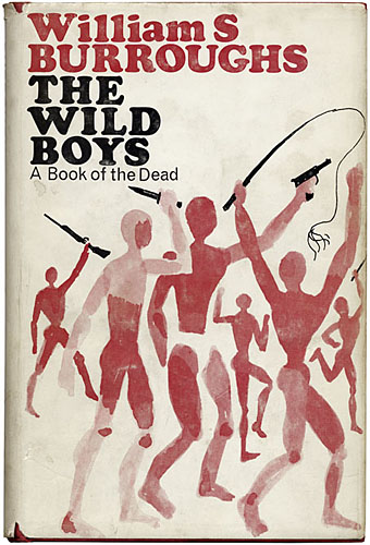
 “Gay black youths go from attacked to attackers” says the headline. A group of genuine Wild Boys; William Burroughs would have approved.

• Tor.com reminded me of Sally Cruikshank‘s amazing animated film Face Like a Frog (1987) which features a score and Cab Calloway-style song by Danny Elfman.

• It’s 1969, OK? Pádraig Ó Méalóid talks with Kevin O’Neill about the Swinging League of Extraordinary Gentlemen.

• In the Tumblr labyrinth this week: Fuck Yeah St Sebastian and Gender is Irrelevant.

• For when you need some motherfucking placeholder text: Samuel L Ipsum.

• “Study finds ‘magic mushrooms’ may improve personality long-term.”

Solar Megalomania: paintings by Leonora Carrington.

• It’s all fun and games until Charles Manson turns up.

Firmament II (1993) by Main | Firmament IV (1993) by Main | Reformation (1994) by Main.

William Burroughs interviews

bunker.jpg

With William Burroughs: A Report from the Bunker (1982) by Victor Bockris. Design by Neville Brody.

If it’s interviews you want, some of the most entertaining are in Victor Bockris’s collection of conversations between El Hombre Invisible and the various New York notables ferried round to sit at Burroughs’ table in his Bowery Bunker. The British edition published by Vermilion was always preferrable for its Neville Brody cover design beside which the US original looks very dull indeed. The encyclopedic Burroughs site Reality Studio has copious lists of earlier Burroughs interviews. They also note the occasions when he put on his journalist hat and went out to interview someone equally famous, usually at the behest of a music magazine. A couple of those pieces are online thanks to the diligence of various fans.

diamond_dogs.jpg

Diamond Dogs (1974), a blend of Lou Reed, George Orwell and William Burroughs.

One such is the 1974 interview with David Bowie for Rolling Stone in which Bowie discusses Burroughs as an influence while Burroughs informs the singer that the heroes of his latest novel, The Wild Boys, favour the Bowie knife as a weapon:

Bowie: Nova Express really reminded me of Ziggy Stardust, which I am going to be putting into a theatrical performance. Forty scenes are in it and it would be nice if the characters and actors learned the scenes and we all shuffled them around in a hat the afternoon of the performance and just performed it as the scenes come out. I got this all from you Bill… so it would change every night.

burroughspage.jpg

A year later Burroughs got together with Jimmy Page for Crawdaddy magazine where the discussion circles around some of the same subjects, notably the writer’s obsession with sound as a weapon. There’s also this comment from Burroughs which is the kind of thing that always gets my neurons firing:

Antony Balch and I collaborated on a film called Cut-Ups, in which the film was cut into segments and rearranged at random. Nicolas Roeg and Donald Cammell saw a screening of the film not long before they made Performance.

Roeg later directed Bowie, of course, and is one of the dinner guests in With William Burroughs, while Jimmy Page and Donald Cammell both appear in Kenneth Anger’s Lucifer Rising. The connections go round and round… Read the whole piece in a post I made a few years ago at the late, lamented Arthur magazine site.

Elsewhere on { feuilleton }
The William Burroughs archive

Weekend links 77

farmer.jpg

Art by Tessa Farmer.

• An exhibition of Tessa Farmer’s art is running at Viktor Wynd Fine Art, London, until October 30th. On Saturday, October 1st, Strange Attractor hosts Good Neighbours: Faeries, Folklore and the Art of Tessa Farmer also at Viktor Wynd.

Unearthing The Psychedelic Harp: “David Moats talks to harpist and songwriter Serafina Steer about her work with John Foxx and Patrick Wolf, being classically trained, the difficulties of doing live soundtracks and psychedelia.”

• And speaking of psychedelia, Arkhonia is still blogging up a storm here, here and here about the lost Beach Boys album, Smile, the farthest Brian and co. ventured into the tripped-out weirdness of 1967. The complete original recordings will finally be released in November.

• “‘We’ve arrived at a level of commodification that may have negated the concept of counterculture,’ Gibson says in the Paris Review.” William Gibson profiled by Thomas Jones.

One of the qualities I always stress when talking about this design work influenced by Surrealism is its enormous boldness and creative freedom, which is something of a paradox in many cases, since the Czech and Polish designs were created under communist regimes. So, while Uncanny documents a significant current in the history of 20th-century visual culture, the show also has a polemical intention aimed, quite deliberately, at our circumstances now. Students who encounter these images in lectures sometimes feel constrained by their conception of what they — or their teachers — regard as acceptable in today’s marketplace. At times, this has struck me as being a form of insidious self-censorship. (more)

Rick Poynor: Jan Švankmajer and the Graphic Uncanny.

• The exhibition curated by Mr Poynor last year, Uncanny: Surrealism and Graphic Design, is now showing at the Kunsthal in Rotterdam until early December. Related: MizEnScen’s somber, surrealist collages.

Howard Pyle’s Book of Pirates (1921) at Golden Age Comic Book Stories, the Urtext of buccaneer imagery.

bonnat.jpg

Another of those homoerotic religious pictures: Jacob Wrestling with the Angel (1876) by Léon Bonnat. Via Babylon Baroque.

• Celebrating the 250th anniversary of Laurence Sterne’s marbled page: Emblem of My Work.

John Martin’s Pompeii painting finally restored after 1928 Tate flood damage.

The Spectral Dimension: “where the paranormal and popular culture collide”.

The Writing of Stones (1970) by Roger Caillois at 50 Watts.

Mercury Arc Rectifiers.

• When silliness was an avant garde strategy: video from 1974 of Brian Eno performing China My China and (in better quality) The Seven Deadly Finns. (Go here for lyrics of the latter.)

Soft machines

smseven.jpg

Seven (1973) by Soft Machine. Design by Roslav Szaybo.

You’re the great, grey man whose daughter licks policemen’s buttons clean,
You’re the man who squats behind the man who works the soft machine.

Mick Jagger, Memo From Turner (1968)

By coincidence this month I’d been re-reading some William Burroughs when I picked up a nice box set of five Soft Machine albums, part of a series of reissues that Sony have been doing recently. They’re very cheap and sound excellent, and also have the additional benefit of being a card slipcase holding the discs in card sleeves so there’s no nasty plastic packaging. The set comprises the Third (1970), Fourth (1971), Fifth (1972), Six (1973), and Seven (1973) albums. I have the band’s first two studio albums already so this has been an opportunity to get fully acquainted with the rest of their output up to the point where the machine started to run out of steam.

smone.jpg

The Soft Machine (1968) with die-cut sleeve. Design by Byron Goto, Eli Allman, Henry Epstein.

Third and Fourth are freaked-out jazz fusion recorded when Robert Wyatt was still on drums; Fifth, which I had for years on vinyl, is post-Wyatt fusion of a more polite variety, great compositions but it sounds lightweight compared to Miles Davis’s On The Corner which was released the same year. Six, which I’d hardly heard at all, is a set of live recordings and four superb studio tracks. Seven is the weakest of the lot but it prompts this post on account of the cover which I always liked the look of when flicking past it in record shops. Seen today it still looks surprisingly advanced for 1973, and the intention behind the design is still mysterious. I used to regard it as vaguely “futuristic” despite knowing that the music was nothing of the sort. The accumulation of abstract symbols contained by a human head implies either a score for some aleatory composition (which again is belied by the short jazzy pieces within), or can perhaps be read as a “soft machine”, especially if one considers that the popular idea of electronics at this time involved patch-boards and banks of flashing lights. Ten years later with synthesizers in common use this kind of semi-cybernetic imagery was a lot more topical.

smtwo.jpg

The Soft Machine Volume Two (1969). Design by Byron Goto, Henry Epstein.

The first two Soft Machine albums both showed literal renderings of Burroughs’ “soft machine” idea albeit couched in the naked-woman-as-decoration style of the late 60s. Six has a horrible cover with an airbrushed attempt at a soft machine, one of those pictures common to the 1970s that you’re amazed was approved by band and record company.

v2.jpg

V2 by The Vibrators (1978). Design by Roslav Szaybo.

The design for Seven is credited to Roslav Szaybo, an in-house designer at CBS. Looking through Mr Szaybo’s other credits there’s little that resembles his Soft Machine cover until you arrive at the sleeve for V2, the second album by British punk band The Vibrators. This was another cover I always liked for similar graphical reasons to the Soft Machine sleeve; they also share a similar stencil typeface. Musically they’re worlds apart, of course, although William Burroughs’ influence on music carried on into the punk era (another Brit punk band named themselves Dead Fingers Talk) and beyond. It’s an influence reaching from the mid-60s with Soft Machine and his appearance on the cover of Sgt Pepper, into the 1990s with the many recordings he collaborated on or inspired from Bill Laswell, Hal Willner and others. His influence generally may have fallen off since his death in 1997 but it’s still a remarkable achievement for someone who never seemed to care much for music beyond the popular tunes he heard as a boy.

Elsewhere on { feuilleton }
The album covers archive
The William Burroughs archive