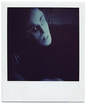
I was given a Polaroid Instant Camera some years ago, not the cult SX-70, a later model. I still have it somewhere but never used it very much. The film cartridges were still available in shops, but at around £1 a shot Polaroids always seemed like a costly indulgence unless you had some specific use for them which I never did. The photo of Murnau’s Nosferatu was taken from a TV screen, and seems to be the only print I kept.
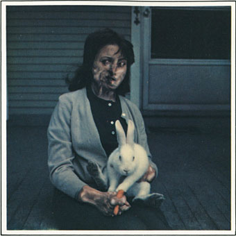
Radiation Victim Holding a Rabbit and Carrot (1974) by Les Krims.
This post was prompted by a search for the Polaroid manipulations made by Les Krims in the 1970s. Krims was one of the first people (the first?) to exploit the potential of the print’s slow processing to create surreal and grotesque images. Krims self-published a collection of these as Fictcryptokrimsographs in 1975. The Francis Bacon-like “radiation victim” is one of the more restrained examples, many of the others being male and female nudes in various stages of mutation.
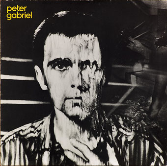
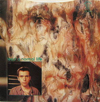
Peter Gabriel (1980).
The mutation technique was more famously employed by the Hipgnosis design team and Peter Gabriel for the cover art of Gabriel’s third album. (Americans insist on calling this album “Melt” even though it was never titled as such.) The technique was also used for photos on the inner sleeve and on two of the single releases.
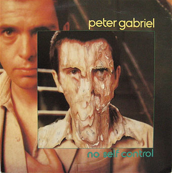
No Self Control (1980). Front and back sleeve of 7-inch single.
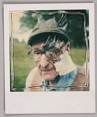
William Burroughs by Ralph Steadman.
Also in 1980, Ralph Steadman says discovered the same technique while on holiday in Turkey. I recall him discussing his own manipulations, which he calls “Paranoids”, on TV around this time. There’s no indication that Steadman was aware of Krims or the Gabriel album but he’s continued to use the technique ever since. The Burroughs portrait was one of a series created in 1995 when Steadman paid a visit to Lawrence, Kansas. There’s film of the meeting here although I’m more interested in the older TV film on the same page which shows Steadman creating a new composite portrait by drawing onto the emulsion.
Previously on { feuilleton }
• Portrait