Born to be Posthumous: The Eccentric Life and Mysterious Genius of Edward Gorey

dery.jpg

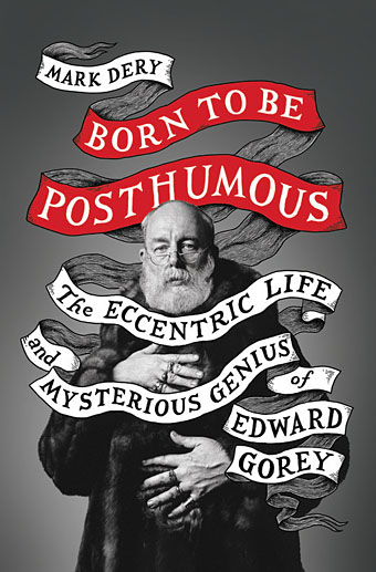
Cover design by Jim Tierney; photo by Richard Corman.

When so many current biographies are recounting the lives of those about whom we’ve already heard a great deal (see the new biography of Oscar Wilde by Matthew Sturgis), a book exploring the career of a previously undocumented yet worthwhile figure is especially welcome. Such is the case with Born to Be Posthumous, Mark Dery’s life of the elusive Edward Gorey: artist, writer, illustrator, book designer, book creator, bibliophile, theatre designer, cat lover and balletomane.

gorey5.jpg

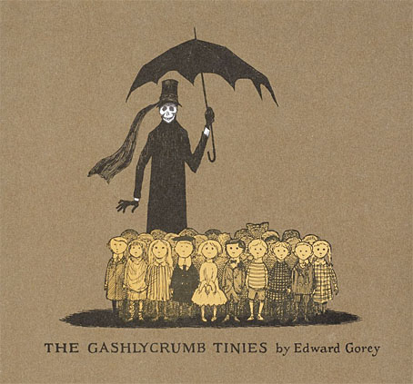
The Gashlycrumb Tinies (1963).

Gorey’s small books have long been one of the more curious fixtures of American culture: many of them look like children’s books but aren’t (unless the child is Wednesday Addams); others look like comic books but they aren’t comics either. The books are sometimes (but not always) Surrealist fables; or brief accounts of irreducible mystery; or sombre inexplicabilities; or camp ripostes to the pieties of Victorian morality; infrequently spiced with black humour and with lurches into outright horror. Gorey delivered his miniature tales in an idiosyncratic drawing style that combines a cartoon-like stylisation with the density of shading found in old wood engravings, a blend that would prove influential as his popularity grew. As Dery notes in his book’s introduction, without Edward Gorey’s work there would be no Lemony Snicket, while Tim Burton would be a skeletal shadow of his present self. (Given the latter’s current output, this might do him some good. But I digress.)

gorey4.jpg

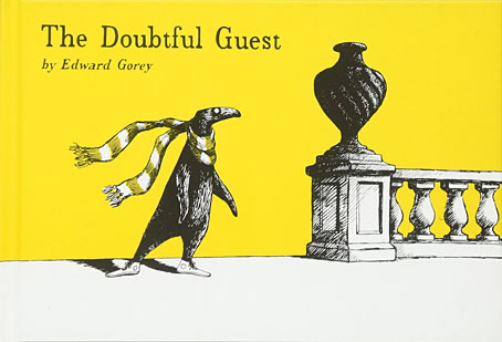
The Doubtful Guest (1957).

In Britain, however, Gorey remains a cult rather than cultural figure, still overshadowed by better-known contemporaries such as Maurice Sendak and Charles Addams. Until the publication of the Amphigorey story collections Gorey’s books were produced in small editions with such a limited availability you were more likely to encounter his art on the cover of another author’s book than within the pages of his own. I became aware of Gorey’s work by gradual osmosis. The first substantial piece I read about him was his entry in Philip Core’s Camp: The Lie that Tells the Truth (1984), in which Core’s mention of an art style “recollecting Victorian engravings” marked Gorey as an artist to be investigated. Two years later he received a longer entry in The Penguin Encyclopedia of Horror and the Supernatural edited by Jack Sullivan. (Camp and horror: how many other artists sit so easily in both worlds?) But Gorey is absent from many books about 20th-century illustrators, and despite the sequential nature of his work you won’t find him in histories of comic art.

gorey6.jpg

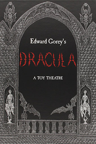
Edward Gorey’s Dracula: A Toy Theatre (1979).

In a way it’s fitting that the work of a man who was adamant in his determination to avoid being pinned down should be so difficult to find. But it’s also a shame that the work of an ardent Anglophile should be hard to find in the country that fuelled his imagination. Among Gorey’s literary favourites Dery lists Jane Austen and Agatha Christie together with Ronald Firbank, Saki, and EF Benson’s Mapp and Lucia novels. (The latter trio are all present in Core’s book on camp, which no doubt makes Gorey camp to the core. Whether he would have approved of being labelled as such is another matter.) I wasn’t surprised by the mention of Saki when so many of Saki’s story titles (The Secret Sin of Septimus Brope) sound like Gorey books, while many of the stories themselves are like Gorey scenarios in prose. Not all Gorey’s work is camp or comic, however; the 32 drawings that comprise the wordless masterpiece of The West Wing (1963) are closer to David Lynch or the “strange stories” of Robert Aickman, the latter an author that Gorey illustrated on several occasions. Dery emphasises how Gorey’s love of silent cinema contributed to The West Wing and other pieces, especially the serials of the Surrealists’ favourite filmmaker, Louis Feuillade.

Continue reading “Born to be Posthumous: The Eccentric Life and Mysterious Genius of Edward Gorey”

Peter Christopherson Photography & The Art of John Balance Collected

coil1.jpg

Look at it this way / In ten years’ time / Who’ll care? / Who’ll even remember?

Coil, The Dreamer Is Still Asleep

Coil’s John Balance died ten years ago today, bringing an end to two decades of a project that, in its earliest stages, was his own solo musical venture. Ten years on, Coil and Balance have hardly been forgotten: in addition to Coil’s continuing influence in the music world, Jeremy Reed & Karolina Urbaniak recently announced Altered Balance: A Tribute to Coil, a memorial volume whose publication is followed this week by two Coil-related art books from Timeless Editions:

Peter Christopherson: Photography

The legendary unpublished photographic work of Peter Christopherson. The b/w photos featured in the book run the gamut from personal fetishes to social commentary on 1970s UK, portraits of bands, friends and strangers. There are both snapshots and highly staged scenarios. Approximately 95% of this material is published here for the first time ever. Foreword by Claus Laufenburg and a short personal reminiscence by Thighpaulsandra. B/W hardbound, 27 x 33.5 cm, 284 pages.

Bright Lights And Cats With No Mouths: The Art of John Balance Collected

The first ever extensive overview of art (drawings, paintings and sketches) created by John Balance. The artworks featured in the book are both finished elaborate hallucinatory pieces as well as quick sketches with a good sprinkling of Balance’s often underestimated humour. Homages to idols and inspirations next to idiosyncratic magical dreamscapes executed in a wide variety of styles and mediums Compiled by Liam Thomas and Thighpaulsandra. With text by Val Denham and Jeremy Reed. Full colour throughout. 29 x 29 cm, 248 pages.

Both books are limited editions, and given the obsessive nature of Coil collectors they’ll probably sell out very quickly. Both volumes are significant, albeit for very different reasons. Peter Christopherson had a long career as a photographer, famously as one-third of the Hipgnosis design partnership, but outside his professional work, and publicity shots for Throbbing Gristle, Psychic TV and Coil, his personal work was always more alluded to than seen. One of the Hipgnosis books mentions his involvement with a group who staged realistic accident and trauma scenes for medical workers but little of this material has been seen until now. Elsewhere in the collection there are shots that resemble some of those that did surface occasionally, also some recurrent obsessions: thuggish youths, violent death, urban dereliction and male bodies. Still no sign of the photos of the Sex Pistols that (we’re told) Malcolm McLaren deemed too heavy.

The John Balance book fascinates simply for showing work that was even more hidden, and hardly alluded to at all. John and I did talk about his artistic endeavours once during our sporadic communications—the 3D scenes on the Musick To Play In The Dark albums were his creations using some PC program whose name I forget—but there was never a hint that he’d produced so much. The publisher sent me a link to their preview pages (here & here) so a few samples follow.

pc1.jpg

Continue reading “Peter Christopherson Photography & The Art of John Balance Collected”

Newspaper record covers

paper06.jpg

Gazette Vol. 2 (1961) by Pete Seeger.

More elaborate record sleeve design. Was Pete Seeger the first artist to have a fake newspaper as a cover design? Gazette Vol. 2 is the earliest example I can find. Some of these examples were suggested by this earlier overview. If anyone knows of any omissions then please leave a comment.

Newspaper covers offered understandable attractions to a musician: a vinyl sleeve is almost the same width as a newspaper, and, for the more verbose artist, they give an opportunity to wax satirical at the expense of print media and newspaper readers. Disadvantages would include increased production costs, more design and copywriting, and sleeves that don’t always last very long, especially if actual newsprint is used for the paper. Given the recent resurgence of vinyl I wouldn’t be surprised if we soon see further examples of this kind of design.

paper05.jpg

The Genuine Imitation Life Gazette (1968) by The 4 Seasons. Design: Desmond Strobel.

The 4 Seasons album is a surprise since it’s not so well-known yet features a very detailed newspaper sleeve. An 8-page insert continues the theme, and even includes a colour comic strip.

paper07.jpg

Volunteers (1969) by Jefferson Airplane. Design: Gut (Allen Turk).

Did Jefferson Airplane copy the 4 Seasons album? Seeing the progression of these designs you have to wonder who was imitating who. The Airplane album also had an insert with more newspaper pages.

paper03.jpg

Thick As A Brick (1972) by Jethro Tull.

Jethro Tull went further than everyone by making their album a 12-page newspaper which wraps around the vinyl. The content of the pages is filled with a satirical jab at concept albums and numerous in-jokes. Even if you don’t like the band’s music very much (I’ve never been keen) you have to admire the amount of work that went into this.

Continue reading “Newspaper record covers”

Weekend links 85

farmanfarmaian.jpg

Group I (Convertible Series, 2010) by Monir Farmanfarmaian.

The four albums recorded by Bruce Gilbert and Graham Lewis under the name Dome are being reissued by Editions Mego together with Gilbert & Lewis’s Yclept album. I always preferred Gilbert & Lewis in their Dome incarnation (and Colin Newman solo) to the punk and post-punk stylings of their former band, Wire. Dome were (among other things) eccentric, awkward, noisy, hypnotic and experimental. Their recordings seemed to go largely unnoticed in the early 1980s so it’s good to see them being reissued.

A Children’s Treasury of American Cops Brutally Attacking Citizens: “…it takes quite a lot of tax money to keep a bunch of vicious thugs overfed and dressed like junior Darth Vaders with their portable hard-ons, on the off-chance some college kids might one day peacefully sit outside to protest this nation’s revolting descent.”

• “Stevenson, as has been said, was disarmingly candid about the material he borrowed for Treasure Island. One name, however, is missing from the extensive catalogue of self-confessed ‘plagiarisms’.” John Sutherland at the TLS.

• “Messiaen’s advice was revelatory. ‘You have the good fortune of being an architect and having studied special mathematics’, he told Xenakis. ‘Take advantage of these things. Do them in your music.'”

• “They always said punk was an influence. Tracey Emin, Damien Hirst, what a load of old shit that was. It’s Thatcherite art care of Saatchi & Saatchi.” And don’t ask Jamie Reid about the Sex Pistols.

Dennis Cooper is interviewed at Lambda Literary. I was surprised last week to find my recent post about William Burroughs’ The Wild Boys linked on a feature about the novel at Cooper’s blog.

Cosmic Geometry: The art of Monir Farmanfarmaian at The Paris Review. Related: Monir Farmanfarmaian at the Haines Gallery, San Francisco.

• Paleolithic phallic art suggests that many early European men scarred, pierced and tattooed their penises.

FACT mix 301 is a selection of dub tracks, dubstep pieces and Middle Eastern songs compiled by Kahn.

Who left a tree, then a coffin in the library?

The Little Journal of Rejections (1896).

Clive finished another painting.

The Great Salt Desert of Iran.

Keep Drawing.

• Troisième (1980) by Colin Newman | And Then… (1980) by Dome | The Red Tent pts I & II (1980) by Dome) | Jasz (1981) by Dome.

Lonesome Cowboys

cowboys.jpg

Years before Brokeback Mountain, and a few years before The Place of Dead Roads, another pair of gay cowboys were causing a stir on a T-shirt in the SEX boutique, London, a shop run by Malcolm McLaren and Vivienne Westwood in the mid-1970s. Paul Gorman’s latest piece of pop archaeology examines the history and possible genesis of this shirt, one of a number designed by McLaren whose challenging nature made them ideal gear for the first wave of London’s punks. SEX specialised in transgression (and was famously the birthplace of the Sex Pistols), selling fetish and bondage clothing, and with a variety of erotic material on its hand-made shirts. But it was the Cowboys image which caused the most fuss in 1975 when the shop-owners were prosecuted for “exposing to public view an indecent exhibition”, a piece of police action that was all-too-common during that decade, especially where punks were concerned. McLaren’s cowboys might seem quaint today but in 1975 this was a shocking image for a country which had only decriminalised homosexual acts eight years before, and where the only gay people in the media (although they never admitted it) were camp comedians and flamboyant sitcom stereotypes.

So much for the history but we still don’t know the origin of the picture. Paul has his own theories; mine would be that McLaren borrowed this from one of the many gay mags which proliferated post-Stonewall. It’s not a Tom of Finland drawing, and it’s not George Quaintance either, an artist who drew many naked cowboys but never showed any genitalia. Vivienne Westwood still sells a version of the shirt: yours for ninety quid, dearie. Meanwhile, you can see a couple of the original Lonesome Cowboys here.

Update: That didn’t take long… It was Jim French after all. Paul has the details.

Elsewhere on { feuilleton }
The gay artists archive

Previously on { feuilleton }
More Queer Noise