On self-imitation

divinecomp.jpg

Or where Angry Robot leads, HarperCollins follows… The Law of Divine Compensation by Marianne Williamson is published today in the US by HarperOne, an imprint of HarperCollins, and if the cover looks similar to Mike Shevdon‘s recent edition of Sixty-One Nails it’s because I designed both of them. Harper’s contacted me earlier this year asking if I could adapt the Sixty-One Nails design for their new Marianne Williamson title. I was a bit unsure about accepting this at first but Ms Williamson isn’t a novelist so the books wouldn’t be appearing on the same shelves; I also said I’d prefer to create new decorative elements so there was enough difference between the new design and the earlier one. In the end the design was pared back considerably during the usual to and fro between art department and marketing people. Harper’s previous titles in this series have quasi-Victorian border designs on plain backgrounds so there needed to be some continuity. I haven’t seen a copy of the book itself yet but the last I heard the design was going to be given a foil treatment on textured paper.

shevdon1.jpg

It’s always an odd feeling being asked to imitate something you’ve done before. The new work often lacks the sense of accomplishment and exploration you felt earlier because you know exactly how it’s going to end up. When I started work on Mike Shevdon’s covers all I had in mind was that basic frame shape; everything else was improvised. I still prefer those earlier designs, I like the way all the details came together, and the way they look against a black background. Mike told me recently that someone picked up one of the books in a shop to look at the cover then bought the book; that’s exactly the kind of thing a cover designer (and author!) likes to hear.

Elsewhere on { feuilleton }
The book covers archive

Previously on { feuilleton }
Book talk
The Courts of the Feyre

The poster art of Vic Fair

fair1.jpg

The Man Who Fell to Earth (1976).

This weekend’s viewing was The Man Who Fell to Earth on Blu-ray, highly recommended for anyone who likes the film, Anthony Richmond’s photography looks better than ever. I’ve had this for a while on DVD and what’s notable about the old and new formats is that both UK editions use Vic Fair’s poster design as the cover art. It often seems a hit-or-miss affair whether the original poster gets used for home release. This tends to happen more with older films that have acquired an artistic reputation; the recent UK release of The Conformist by Arrow Films prints four different poster designs on the inlay, with the box enclosure having a clear window that allows one or other of the designs to be facing out. A great idea which makes owning the physical copy a little more worthwhile.

I’d known the poster for Nic Roeg’s film for years but until this weekend I’d never thought to find out who was responsible for the artwork. Vic Fair was a prolific artist for UK film releases during the 1970s and 1980s so this is a small selection of his work. Apparently he was so pleased with the Roeg poster that he signed it. As is often the case with film posters, there’s no record of the designers for these examples so we don’t know who was responsible for the type layouts.

fair5.jpg

Countess Dracula (1972).

The Countess Dracula art looks surprisingly similar to some of the promotional art that Roger Dean produced around this time for UK studios, Hammer included. A few examples appear in his Views book but it’s a side of his work that’s seldom seen or discussed. I recall being impressed by the Vampire Circus poster in the past (although the big cats look a little silly). One of the better Hammers of the 70s, with a cast including cult cutie John Moulder-Brown.

fair2.jpg

Vampire Circus (1972).

fair3.jpg

The Hireling (1973).

As with many posters of the 1970s, The Hireling is a great example of an approach that marketing departments would never allow today.

fair4.jpg

Castaway (1987).

Another Nic Roeg film, and another subtle design, possibly too subtle as I don’t recall seeing it used anywhere. First time I saw this was on the cover of a soundtrack album a few years back when I was putting together Jon Hassell’s website. There’s a piece of his music used in the film so we were trying to trace all the relevant cover art.

There’s more about Vic Fair and his contemporaries in British Film Posters: An Illustrated History by Sim Branaghan & Steve Chibnall, a book I think I ought to buy. If anything it may spare me the temptation to start collecting film posters again.

Previously on { feuilleton }
Petulia film posters
Lucifer Rising posters
Wild Salomés
Druillet’s vampires
Bob Peak revisited
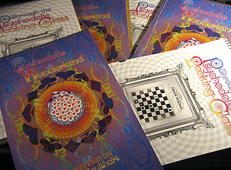
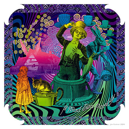
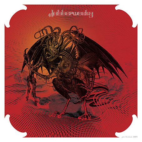
Alice in Acidland
Salomé posters
Polish posters: Freedom on the Fence
Kaleidoscope: the switched-on thriller
The Robing of The Birds
Franciszek Starowieyski, 1930–2009
Dallamano’s Dorian Gray
Czech film posters
The poster art of Richard Amsel
Bollywood posters
Lussuria, Invidia, Superbia
The poster art of Bob Peak
A premonition of Premonition
Metropolis posters
Film noir posters

Hill figures

whitehorse.jpg

Last year I was searching out various works of American land art via Google Maps. This is a similar post looking for some of Britain’s hillside figures, all of which are far older than any 20th-century artworks even if some of them aren’t as old as people hope. The antiquity of the Uffington White Horse in Oxfordshire has been established, however, the figure being estimated to be at least three thousand years old. The debate in this case is whether it represents a horse, a dragon or some other creature. What’s most fascinating about the figure is that it can’t be seen from any of the surrounding area, it’s only visible at the top of the hill; all other hill figures are intended to be viewed from a distance. There are other white horse figures carved into southern England’s chalky hillsides but the rest look like distinctly modern creatures. The Uffington carving resembles the kind of animals seen in cave paintings.

longman.jpg

The Long Man of Wilmington in East Sussex provokes endless speculation as to its age and purpose. In the case of this figure and the Cerne Abbas Giant (below) there are no written records of them earlier than the 16th century whereas the Uffington horse is mentioned in medieval texts. This doesn’t rule out their being far older but it implies that their origin may be more recent and more mundane than some would like to believe. The satellite view of the Long Man currently on Google Maps shows that local wags have given the figure a smiley face.

cerneabbas.jpg

The most famous erect penis in Britain can be found near the village of Cerne Abbas in Dorset. In the 1930s the Bishop of Salisbury petitioned the Home Office to have the giant phallus covered over, to no avail.

cropcircle.jpg

Not a hill figure, this is the remains of a crop circle I noticed when looking at Avebury from the air. There are no doubt more to be found, Wiltshire is apparently a popular area for circle makers.

uno.jpg

Uno (1974) by Uno.

Given the usual subjects of concern here I have to mention these two album covers which make use of hill figures. The Uno sleeve is a design by Hipgnosis which is a lot more well-known than the album it decorates. The original XTC vinyl sleeve designed by Ken Ansell was textured card with the horse and lettering embossed into the surface. I’ve not been able to find a cover featuring the Cerne Abbas Giant although that doesn’t mean to say there isn’t one.

xtc.jpg

English Settlement (1982) by XTC.

Elsewhere on { feuilleton }
The album covers archive

Previously on { feuilleton }
Land art
How to make crop circles

Milbury souvenirs

milbury.jpg

A little something I ran up this weekend inspired by a certain TV serial which has been the subject of discussion recently. This is now a new design at CafePress. The idea was to do a travel poster in the style of those produced by London Transport in the 1920s promoting their destinations outside the city. I’ve always liked the colours and bold design of those prints so this piece is based on posters by artist Noel Rooke (1881–1953).

rooke.jpg

Betchworth by Noel Rooke.

The picture of the stones was adapted from a photo by Jim Champion which is made available under the Creative Commons licence. I took the liberty of enlarging the stone on the left to give it more presence. I couldn’t find a font that was a good match for Noel Rooke’s pen lettering so I scanned an alphabet from a lettering book my mother used to use when she was at art school (thanks, Mum!). The snake design is based on a postcard seen in the TV serial; nothing else looked as effective, and the combination of the snake with the slogan adds the requisite sinister touch.

Previously on { feuilleton }
A Journey to Avebury by Derek Jarman
Children of the Stones
Avebury panoramas

Weekend links 135

kuhlman.jpg

Two Grove Press covers by Roy Kuhlman. From Arden Kuhlman Riordan’s Pinterest page collecting her father’s cover designs.

• “When people asked me what boylesque was, I’d say I’m doing burlesque and I have a penis,” said Mr. Ferguson.

Sequence5: 42 tracks of new, atmospheric/ambient music. A free download in a variety of formats.

The trailer for Jimmy’s End, the forthcoming film by Alan Moore and Mitch Jenkins.

As a porn performer, I can say from experience and with confidence that I’ve never been objectified by other performers. Nor have I been objectified by viewers. At least not in a way that seemed to confuse them into thinking I was an object. What happens instead is that I shift in and out of object-hood. Athletes do this too—they engage with their bodies for a specific task. At the end of the game or the shoot, the context changes.

Conner Habib on The Virtues of Being an Object

Secret Weapons (1972), David Cronenberg’s lost TV movie resurfaces.

Joseph Burnett reviews Nude, the new album by The Irrepressibles.

Over a third of e-readers are used just once before being set aside.

The guarded, the cautious, the small-scale, the modest, the well-crafted—such books may be rewarded (in our own time, at the national level), but they are rarely preserved. They are not preserved because guardedness, caution, smallness, modesty, and craft can be replaced in any given generation. What is irreplaceable is excess: Of verbal kinesis, religious intensity, intellectual voracity.

Amit Majmudar on Entertainment and Excess: The Great Literary Audiences

Miniature Book Interviews with Louis Wain Bound by Hand.

A Tour Inside Salvador Dalí’s Labyrinthine Spanish Home.

• Horror fiction should be deep, not cheap, says Nina Allan.

• RIP Peter Kuhlmann aka Pete Namlook

More is More by Alex Trochut

The Useless Web

Lost In The Sea (1992) by Sequential (Pete Namlook & DJ Criss) | Angel Tech (1994) by Bill Laswell & Pete Namlook | Yenlik (Part II) (1996) by Burhan Öçal & Pete Namlook