Quay Brothers: On Deciphering the Pharmacist’s Prescription for Lip-Reading Puppets

quays1.jpg

It’s not exactly the most appropriate moment to be recommending an exhibition in New York given the chaos in the city following the recent hurricane. However… Quay Brothers: On Deciphering the Pharmacist’s Prescription for Lip-Reading Puppets has been running at MoMA since August, and will continue into early 2013. A copy of the catalogue turned up this week, a slim volume of 64 pages that’s nevertheless an essential item for Quay obsessives such as myself.

quays2.jpg

Set design for A Flea in Her Ear (1989).

I’ve written before that while the Quays’ films are the most visible part of their oeuvre, much of their early output as artists and designers remains either obscure or unavailable. So it’s a pleasure to find a number of their early drawings, poster designs and book covers reproduced here. The catalogue also features examples of gallery installations and their designs for the stage. Ron Magliozzi, the curator, and Edwin Carels contribute essays while the Quays themselves are “interviewed” by Heinrich Holtzmüller “who was once real and now only exists under the glass of a museum vitrine in Nürnberg”. An appendix includes a thorough listing of their film works, giving me more things to chase at a later date.

quays3.jpg

In addition the Quays have also designed parts of the book, notably the title pages which feature their idiosyncratic typography. The catalogue may be purchased direct from the museum.

quays4.jpg

Grand Box, decor for Street of Crocodiles (1986).

Elsewhere on { feuilleton }
The Quay Brothers archive

Steampunk Revolution

srev01.jpg

The “S” word again. One of the jobs from earlier this year is now available for purchase from publishers Tachyon and other outlets. Steampunk Revolution is the third in a series of steampunk story collections edited by Ann VanderMeer (Jeff VanderMeer was co-editor on the first two volumes). I designed the previous title, Steampunk Reloaded, and was working on these pages whilst also putting together the cover for Lavie Tidhar’s The Bookman Histories. Tidhar’s trilogy is a steampunk affair (and this collection features one of his Bookman stories) so there’s some slight overlap between the two designs, notably the use of a typographic “charm” I took from a Victorian printer’s catalogue. I’ve since seen that shape used elsewhere so it’s evidently more common than I thought. Bah.

The title page design above can be added to my ongoing obsession with the Exposition Universelle of 1900. Malissa Kent’s story, The Heart is the Matter, ends with a scene at the Exposition so I had an excuse to use an elaborate banner which includes an Exposition medal. (The same medal, incidentally, that you still see on the labels of Campbell’s Soup). The illustration below is adapted from one of Walter Crane’s Socialist drawings, and I feel bad now that we didn’t credit him for it. Sorry, Walter.

srev05.jpg

srev03.jpg

srev04.jpg

Continue reading “Steampunk Revolution”

Petulia film posters

petulia1.jpg

Illustration by Bob Peak.

Further examples of those things you find when you’re searching for something else, these posters for Richard Lester’s Petulia (1968) are a good example of just how differently the same film can be presented by its advertising materials. Petulia (“the uncommon movie”) is a fascinating, unjustly neglected gem, a serious adult drama quite unlike the comedies (or comic dramas) Lester was making before and after. Nicolas Roeg photographed Petulia shortly before embarking on his own directing career, capturing San Francisco just after the Summer of Love in a more documentary fashion than the exploitation films of the period. There are nods to the psychedelic scene with party appearances by Big Brother and the Holding Company, and the Grateful Dead, but the narrative concerns the flipside of hippiedom with a group of middle-class professionals ensnared in adultery and marital failure.

A commonly remarked feature of Petulia is Antony Gibbs’ fragmented editing style which flashes backwards and forwards throughout, even showing events that never happen. The technique is usually taken to be derived from Alain Resnais although Gibbs had earlier edited The Knack…and How to Get It for Lester which is often as fragmented, albeit for a more comic effect. What’s notable about the technique is that Gibbs went on to edit Nicolas Roeg’s first two features, Performance (co-directed with Donald Cammell) and Walkabout, both of which take the fragmentation even further, creating the style which Roeg made his own.

petulia4.jpg

The poster that caught my attention was the marvellous one by Bob Peak who manages to depict the awkward relationship between the two leads—holding hands yet facing away from each other—whilst alluding to the psychedelic backdrop in the details. It’s difficult to tell at a small size but the sheet music design above shows that Peak’s drawing is a complex arrangement of blended faces, the reflected figure of a woman and a pattern of Bridget Riley swirls. If I was still collecting film posters I’d be sorely tempted to buy one of these.

petulia2.jpg

Illustration by Jean Fourastié.

Compared to which this pair of French designs veer off in opposite and unsatisfying directions. Jean Fourastié seems to have been under the impression that the story concerned a San Francisco flower child not a bored housewife, while Jean Mascii’s painting isn’t inaccurate but is more suited to a romance paperback. Big heads were apparently Mascii’s métier even if there were no people in the film.

petulia3.jpg

Illustration by Jean Mascii.

Petulia has been available on DVD for a while now, it’s well worth seeking out. Watch the trailer here.

Previously on { feuilleton }
Lucifer Rising posters
Wild Salomés
Druillet’s vampires
Bob Peak revisited
Alice in Acidland
Salomé posters
Polish posters: Freedom on the Fence
Kaleidoscope: the switched-on thriller
The Robing of The Birds
Franciszek Starowieyski, 1930–2009
Dallamano’s Dorian Gray
Czech film posters
The poster art of Richard Amsel
Bollywood posters
Lussuria, Invidia, Superbia
The poster art of Bob Peak
A premonition of Premonition
Metropolis posters
Film noir posters

In the Key of Blue by John Addington Symonds

symonds1.jpg

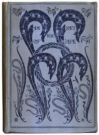
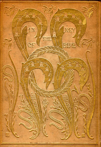
I probably overspent a little on this charity-shop purchase, the third edition (published 1918) of In the Key of Blue by John Addington Symonds (1840–1893), a personal selection of writings first published in 1893. First edition copies sell for over a thousand pounds so this was an opportunity to acquire something close to the original without breaking the bank. The book is significant for two reasons: on a decorative level the cover design is one of my favourites by book designer (he preferred the term “book builder”) Charles Ricketts. The first editions have the design blocked in gold on cream cloth (below); a few copies were made with blue cloth but Ricketts apparently changed the colour after worrying that reviewers would joke about “Reckitt’s Blue” a popular laundry product. The contraposed curves of the leaf shapes pre-empt the Art Nouveau style which only started to emerge a year or two later.

symonds2.jpg

The other notable feature of Symonds’ book is its being one of the more outspoken manifestations of the author’s advocacy for what he called “a man’s love for a man”. Symonds was a pioneer of what are now called gay studies: in addition to accurately translating the love sonnets of Michelangelo which previous translators had heterosexualised, his 1873 study A Problem in Greek Ethics sought to show 19th-century readers that the Ancient Greek culture they so admired had an indisputable history of same-sex relationships running through its core. This was only one side of Symonds’ work but it was an admirably continual thread. I often think of Symonds and Oscar Wilde as twinned in this respect: Wilde made frequent use of Greek attitudes as a justification for his views on love; both men had to perform a careful balancing act, trying to advocate the unacceptable without drawing too much attention to their own proclivities. If Wilde was the public advocate for Uranian desire then Symonds was a kind of think-tank man, labouring behind the scenes to bring to light the historical precedent. Finally, both men were connected by Charles Ricketts, a friend of Wilde’s who designed and illustrated a number of Wilde’s early editions.

In the Key of Blue was published in the last year of Symonds’ life by which time much of his previous equivocations had been abandoned. In homoerotic terms it’s far more out of the closet than pre-trial Wilde ever dared to be. The title piece is a poem which presents eight studies of an unnamed “you”, a figure seen by the poet in various Venetian settings, painted in a range of colours with blue as the dominant tone. I have the poem in another book; taken alone as it is there it seems mildly homoerotic—the ecstatically observed subject is obviously male—but remains ambiguous enough for any subtext to be a matter of interpretation. In the collected edition Symonds adds additional text that picks apart the poem, explaining the origin of each setting. Thus we learn that the mysterious “you” is a 19-year-old Venetian porter named Augusto whom the author had befriended. The explanatory paragraphs discuss the artistic intent of the poem, its depiction of contrasted tones and colours, while the circumstantial details quietly remove all the ambiguity from its paean to male youth.

Elsewhere in the book, there’s a discussion of male love among the Greeks, culled from Symonds’ earlier researches, then in Clifton and a Lad’s Love, written thirty years earlier, we have another piece of alternating poetic verse and prose description. Part seven of the poem could hardly be less equivocal:

I saw a vision of deep eyes
In morning sleep when dreams are true:
Wide humid eyes of hazy blue,
Like seas that kiss the horizon skies.

Then as I gazed, I felt the rain
Of soft warm curls around my cheek,
And heard a whisper low and meek:
“I love, and canst thou love again?”

A gentle youth beside me bent;
His cool moist lips to mine were pressed,
That throbbed and burned with love’s unrest:
When, lo, the powers of sleep were spent;

And noiseless on the airy wings
That follow after night’s dim way,
The beauteous boy was gone for aye,
A theme of vague imaginings.

Yet I can never rest again:
The flocks of morning dreams are true;
And till I find those eyes of blue
And golden curls, I walk in pain.

Anyone wishing to read In the Key of Blue can find most of Symonds’ work online. Project Gutenberg has all his major texts available while the Internet Archive has a scan of the 1918 edition, albeit in slightly better condition than my copy.

Elsewhere on { feuilleton }
The book covers archive

Previously on { feuilleton }
Greek games
Charles Ricketts’ Salomé
Achilles by Barry JC Purves
Der Eigene: Kultur und Homosexualität
Charles Ricketts’ Hero and Leander

Design as virus 15: David Pelham’s Clockwork Orange

clockworkbook.jpg

Design by David Pelham (1972).

Continuing an occasional series. Pity the poor designer who has to create a new cover for Anthony Burgess’s novel when David Pelham’s Penguin cover—created in haste forty years ago—is more visible than ever. Pelham’s design is a familiar sight on these pages but it’s also an increasingly familiar sight elsewhere, having become the primary visual signifier not only of the novel itself but also the novel’s entanglement with Stanley Kubrick’s film. Burgess came to resent the cult power of the film and the way it inflated the status of one of his early novels whilst overshadowing the rest of his work. The book still overshadows his other novels but what’s interesting now, fifty years after it was published, and forty years on from Pelham’s cover design, is seeing the novel clawing back some of the territory ceded to the film, in part because of that memorable cog-eyed face. What follows is a look at some of the subsequent reworkings of Pelham’s design.

clockworkposter1.jpg

Artwork by Philip Castle, design by Bill Gold (1971).

It’s necessary to mention the original poster art first since the fat title typography gets reused more than any other part of the film’s publicity. The poster was also indirectly responsible for Pelham’s cover design when Kubrick denied Penguin any use of his promotional material:

Barry Trengove had designed a delightful cover for the Penguin edition of A Clockwork Orange and then the movie came along. While the Penguin marketing department was desperate to tie in with the film graphics, the director of the movie Stanley Kubrick wasn’t at all interested in tying in with the book. Consequently I was given the task of commissioning an illustration that gave the impression of being a movie poster. Sadly I was subsequently let down very badly by an accomplished airbrush artist and designer (whose name I will keep to myself), who kept calling for yet more time and who eventually turned in a very poor job very late. I had to reject it which was a hateful thing to have to do because we were now right out of time.

[…]

Well there I am, late in the day and having to create a cover for A Clockwork Orange under pressure. Already seriously out of time I worked up an idea on tracing paper overnight, ordering front cover repro from the typesetter around 4.00 am. I remember that my type mark-up was collected by a motorcycle messenger around about 5.00 am. Later that morning, in the office, I drew the black line work you see here on a matt plastic acetate sheet, specifying colours to the separator on an overlay while the back cover repro was being pasted up by my loyal assistants who had the scalpel skills of brain surgeons. I had wonderful assistants, absolutely wonderful.

Then more motorcycle messengers roaring around London in large crash helmets; and some days later I would see a proof. In those days, that was quick! Since those times I have often been amused to notice that my hurried nocturnal effort of so long ago appears to have achieved something of iconic status, for I’ve seen this cog-eyed image on fly-posters in Colombia, on t-shirts in Turkey, and put to a variety of uses in Canada, Los Angeles and New York. Because I did it, I spot it. Its like walking into a room where a party’s going on and, although the room is buzzing with conversation, if somebody simply mentions your name in conversation you immediately pick it up because it’s so familiar.

Penguin by Designers: David Pelham

clockworkposter2.jpg

A scarce item, allegedly from 1972 (although it may be from a year later), which surprisingly uses the book design with the film poster titles. According to a film memorabilia site “This rare alternate style R-Rated poster was designed for wild posting exclusively in New York and Los Angeles”. In the US the film was given an X rating on its first release meaning that many theatres wouldn’t have shown it. Following a few edits it was reissued with an R rating. On the back of the 1972 Penguin paperback there’s notice of a copyright restriction against selling that edition in the US so Pelham’s design wouldn’t have been familiar there until much later.

Continue reading “Design as virus 15: David Pelham’s Clockwork Orange”