

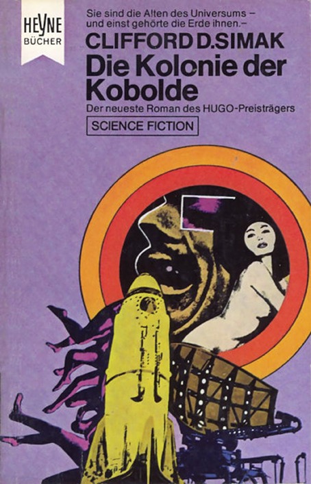
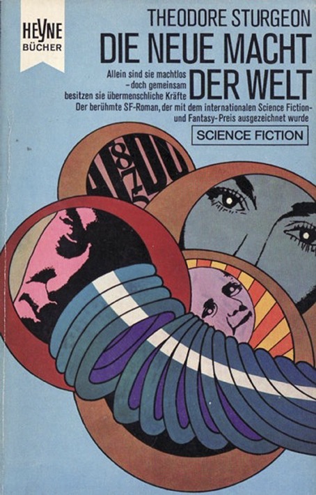
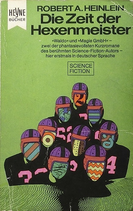
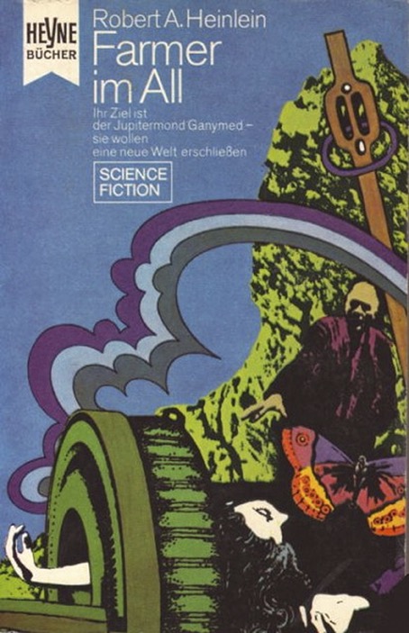
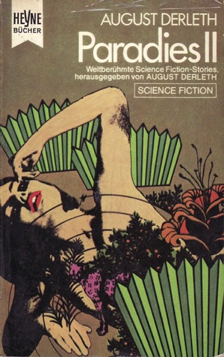
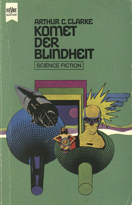
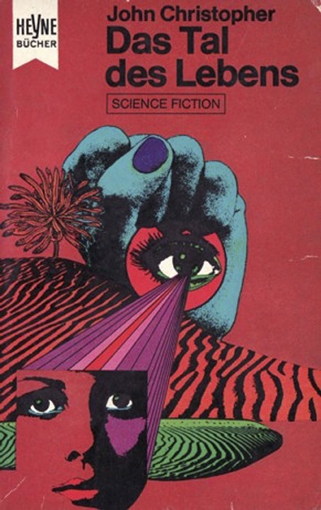
Who were Heinrichs and Bachmann? That’s a good question because neither I nor anyone else who’s written about their book covers can offer any more information beyond their names and the dates when they were active. What we do know is that from the mid-60s to an unspecified point in the 1970s Heinrichs and Bachmann’s studio was credited with many cover designs for books published by Heyne in Germany. By the 1980s the studio was still working for Heyne but with a credit now changed to Atelier Heinrichs & Schutz.

The designs featured here date from 1969 to 1971, and are part of a longer run of Heinrichs & Bachmann covers for science fiction titles published from the late 1960s to the early 1970s. I’d run across a few of these in the past but hadn’t gone looking for more until this weekend. I always enjoy seeing unusual approaches to SF illustration, and I especially enjoy anything which adopts this kind of post-psychedelic Pop-collage style. The influence of Heinz Edelmann’s art is evident in places, in particular the Edelmann look as it was filtered through the artists who worked on the Beatles’s Yellow Submarine. The Frank Herbert cover above could easily be added to the Sea of Heads. Also evident are faces that look as though they’ve been lifted from film stills. I’d guess that most of the figures in these collages were clipped from magazine pages then run through a photocopier once or twice to give that posterised effect.




















Elsewhere on { feuilleton }
• The book covers archive
• The illustrators archive
Previously on { feuilleton }
• The groovy look
I am reminded somewhat of some of Eduardo Paolozzi’s work, especially those that you see on the Russell Hoban covers for Penguin Modern Classics. Of course, the Pop Art approach is largely the reason.
Brilliant work. I bet the great Julian House loves this stuff.
PS – Their horror series was wonderful: https://c86.tumblr.com/post/102801625046/heynes-horror-anthologies-1974-artwork-by/amp
These are so illustrative of design in that era; and since they’re from Germany, I don’t think I’ve seen any of these before. The “15 Science Fiction Stories” cover, which is cheerily showing a Peter Max influence, seems the odd one out here; it could almost be an American cola advert. The rest have a suitably existential seriousness about them. But most of the title fonts are surprisingly sober; I would have expected more variation in that area. Great roundup of covers.
Liam: Yes, Paolozzi had his own variations on this style in the late 60s. Check out the series of prints he titled Moonstrips Empire News.
Caspar: Yes, I’d spotted some of the horror covers but thought it best to stick to the SF.
Jim: Yeah, Peter Max or Milton Glaser/Pushpin Graphics. There was such a ferment going on at that time it’s never easy picking out influences. Typography is a failing with French books as well. French covers often have great art that’s let down by the graphic design.
Are these collected in a book?
Bibliomancers has done a few books which are just a collection of book covers. For example, Spell Bound: Exploring Witchcraft and the Occult Through Paperbacks or Binding the Devil: Satanism and Witchcraft Reflected in 20th Century Tomes.
These covers haven’t been reprinted together, so far as I’m aware. Science fiction is a bigger field than horror so book collections tend to be very general or concentrated on the work of a single (usually popular) artist.