Weekend links 61

knaus.jpg

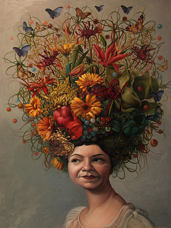
Marbles and Butterflies (2011) by Jennifer Knaus.

• “Cutter’s Way is a cinematic masterpiece” says John Patterson. Yes, it is, and it’s often been difficult to see (although it’s now on DVD) being one of those cult films that rarely surfaced on TV or video. Another cult film surfacing at last is Jerzy Skolimowski’s Deep End (yes, again…) which will be out on DVD & Blu-ray next month. I missed this Telegraph piece about the film. You want more? Lint: The Movie is showing at the Kino Club, Brighton, later this month.

• This week’s Eno haul: Developing Your Creative Practice: Tips from Brian Eno; Eric Tamm’s 1995 study Brian Eno: His Music and the Vertical Color of Sound is now available for free at the author’s website; Imagine New Times is an outtake from Eno’s forthcoming Drums Between the Bells which can be downloaded here.

• Mixtapes of the week: Demdike Stare with a suitably sinister and eclectic mix are out-curated by Current 93’s David Tibet who mashes together a unique blend of folk, prog, riffs, choral works and glam rock.

I began to realize the hypocrisy about sexual freedom in the feminist establishment was as bad as it is in the religious right. They do whatever they want. They look at whatever they want, they masturbate to whatever they want, they fuck whoever and however they like. I couldn’t even say everything I know in the book because it would just be too cruel and personally invasive. But I’ve had it with their lying. I spent so long trying to have these earnest conversations and now I’m like, “Fuck you — you’re as bad as the Vatican!”

Susie Bright interviewed by Tracy Clark-Flory at Salon sounding as happy and positive as she always does.
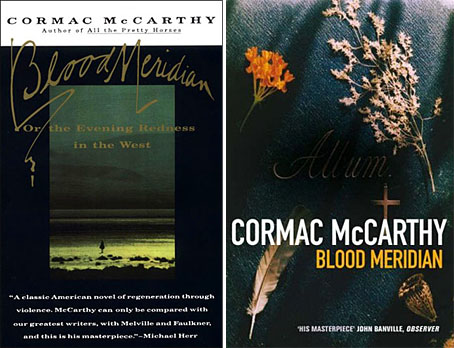
The Gnostic #4 is out this month featuring Alan Moore’s essay on magic and related matters, Fossil Angels, and a piece examining the Gnostic influences on Cormac McCarthy’s Blood Meridian.

• “Nobody should be sent to prison for taking drugs,” says Richard Branson. Many politicians agree with him but they’re all too cowardly to do anything about it.

eng.jpg

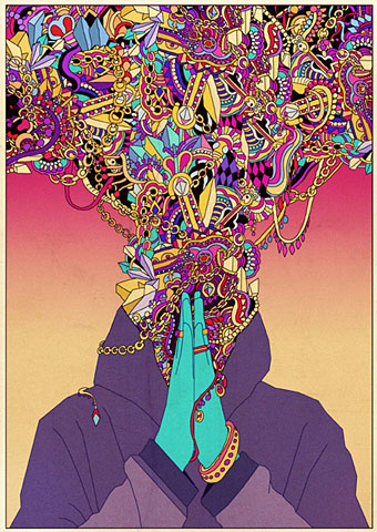
Untitled work by Kilian Eng.

The Adventures of Jerry Cornelius, The English Assassin (1969–70). A comic strip written by Michael Moorcock & M John Harrison with art by Mal Dean & Richard Glyn Jones.

The Lavender Scare: The Cold War Persecution of Gays and Lesbians in the Federal Government by David K Johnson is available as a free ebook here.

• “If I was to try to write a mainstream book I would be constantly bumping my elbows up against the restrictions.” Tim Powers is interviewed by Alison Flood.

HOMO Online, Adventures in Homosexuality: Fiction, Fact, Art and Porn.

Your Rainbow Panorama, a new work by Olafur Eliasson.

Self Suck, a poem by Angelo Nikolopoulos.

Map Of Dusk (1987) by Jon Hassell | Lam Lam (1998) by Baaba Maal (with Jon Hassell & Brian Eno) | All Is Full Of Love (1999) by Björk (Guy Sigsworth mix featuring Jon Hassell).

Poe at 200

poe.jpg

Poe by Harry Clarke.

Happy birthday Edgar Allan Poe, born two hundred years ago today. I nearly missed this anniversary after a busy weekend. Rather than add to the mountain of praise for the writer, I thought I’d list some favourites among the numerous Poe-derived works in different media.

Illustrated books
For me the Harry Clarke edition of 1919 (later reworked with colour plates) has always been definitive. Many first-class artists have tried their hand at depicting Poe’s stories and poems, among them Aubrey Beardsley, Gustave Doré, Arthur Rackham, W. Heath Robinson and Edmund Dulac; none complements the morbid atmosphere and florid prose as well as Clarke does. And if it’s horror you need, Clarke’s depiction of The Premature Burial could scarcely be improved upon.

Honourable mention should be made of two less well-known works, Wilfried Sätty’s The Illustrated Edgar Allan Poe (1976) and Visions of Poe (1988) by Simon Marsden. I wrote about Sätty’s collage engravings in Strange Attractor 2, and Sätty’s style was eminently suited to Poe’s work. Marsden’s photographs of old castles and decaying mansions are justly celebrated but in book form often seem in search of a subject beyond a general Gothic spookiness or a recounting of spectral anecdotes. His selection of Poe stories and poems is a great match for the photos, one of which, a view of Monument Valley for The Colloquy of Monos and Una, was also used on a Picador cover for Blood Meridian by Cormac McCarthy.

Recordings
These are legion but among the outstanding one-off tracks I’d note two poems set to music, Dream Within a Dream from Propaganda‘s 1985 album, A Secret Wish, and The Lake by Antony & The Johnsons. The latter appeared on the landmark Golden Apples of the Sun compilation and also on Antony’s own The Lake EP.

Among the full-length works, Hal Willner’s 1997 2-CD collection Closed on Account of Rabies features lengthy readings set to music from a typically eclectic Willner line-up: Marianne Faithfull, Christopher Walken, Iggy Pop, Diamanda Galás, Gavin Friday, Dr John, Deborah Harry, Jeff Buckley (one of the last recordings before his untimely death) and Gabriel Byrne. Byrne’s reading of The Masque of the Red Death is tremendous and the whole package is decked out in Ralph Steadman graphics.

Antony Hegarty appears again on another double-disc set, Lou Reed’s The Raven (2003), a very eccentric approach to Poe which I suspect I’m in the minority in enjoying as much as I do. An uneven mix of songs and reading/performances, Reed updates some Poe poems while others are presented straight and to often stunning effect by (among others) Willem Defoe, Steve Buscemi, Laurie Anderson, David Bowie, Amanda Plummer and Elizabeth Ashley.

Films
Once again, there’s too many films but The Masque of the Red Death (1964) has always been my favourite of the Roger Corman adaptations, not least for the presence of Jane Asher, Patrick Magee and (behind the camera) Nicolas Roeg. I wrote last May about the animated version of The Tell-Tale Heart from UPA. That adaptation, with narration by James Mason, is still on YouTube so if you haven’t seen it yet you can celebrate Poe’s anniversary by watching it right now.

Elsewhere on { feuilleton }
The illustrators archive

Previously on { feuilleton }
The Tell-Tale Heart from UPA
William Heath Robinson’s illustrated Poe
The art of Harry Clarke, 1889–1931

Buccaneers #2

pirate1.jpg

Continuing from yesterday’s post, these nameless characters were sketches for a proposed comic strip that writer Jamie Delano and I were planning in the mid-Nineties. We had a feeling that the long-neglected pirate genre was due for a revival and talked about a revisionist take on buccaneering which would dispense with the Robert Newton antics and steer closer to the brutal reality. Among the touchstones there was On Stranger Tides by Tim Powers, the anarchist pirate community in Cities of the Red Night by William Burroughs and the ferocious scalp-hunters in Cormac McCarthy’s masterpiece, Blood Meridian. There was also talk of throwing some voodoo into the mix, hence the veve tattoos. It wasn’t to be, of course. Little of my work has ever resembled mainstream comics fare and Jamie’s publishers, DC Comics, had already been underwhelmed by the detailed style I was using in the Lovecraft and Lord Horror comics. When I tried presenting them with some trial pages in a more open style I was told that they’d been expecting to see more of my detailed line work…

We had a couple of other characters planned, including a tattooed islander inspired by Queequeg from Moby Dick, but the samples here are the best of the sketches. The shark- or whale-jaw false leg was my own invention and something I’m fairly sure I’ve not seen before. I’ve no idea whether such a thing is workable but it was a nice touch.

Continue reading “Buccaneers #2”

Repackaging Cormac

blood_meridian.jpg

left: Vintage International (US), cover design by Susan Mitchell (1993).
right: Picador (UK) reprint (2008).

After the Oscars success of No Country for Old Men it’s understandable that Cormac McCarthy’s publishers would want to reprint all his works. His books still appear under the Picador imprint in the UK where they’ve been reissued recently in uniform editions with new cover designs. A couple of these are an improvement on their lacklustre predecessors, and they don’t look so bad when seen together on a shelf, but on the whole this McCarthy reader is disappointed by the overall blandness they present.

crossing.jpgMy earlier post about McCarthy’s UK covers was critical of the The Road which used a combination of a stock photo and Akzidenz-Grotesk Condensed for the typography. In the case of No Country for Old Men the photo from the American original by Chip Kidd was used but his carefully-judged type layout was dropped. Unfortunately it’s The Road approach which has been continued on the new covers, with variable degrees of success. The Chip Kidd designs that Picador repeated in the 1990s made similar use of suggestive photos but there was at least some attempt made to match form to content; a number of the new designs are vague in the extreme. I assume that the disparate group of objects on the cover of Blood Meridian relate to the character of the Judge when he reveals his intention to catalogue every new object that he comes across. But that’s an incidental detail in one scene of a baroque, ferocious and very violent historical novel. So the image isn’t exactly a misrepresentation but it puts the wrong emphasis on a book that could easily be described as a Western nightmare. And they’ve also dropped the book’s subtitle, an amendment I find especially egregious.

Even more bland is the picture of a shack on the cover of Child of God, McCarthy’s tale of a backwoods psychopath who moves into a cave and murders women so he can have sex with their corpses. Anyone buying the Picador book on the strength of the cover is in for a surprise. And since when did that novel have a definite article in its title? Best of the bunch is probably The Crossing (above) which shows the wolf that provides the impetus for the story. The type works better on this cover while the animal’s reflection in the water is a nice touch that can be read as relating to the various symmetries and reflections in The Border Trilogy, of which this book forms the second part.

Picador set a high standard for paperback design in the Seventies which makes the sight of uninspired and lazy work doubly-dismaying. Susan Mitchell’s covers for the Vintage paperbacks are still the best I’ve seen for McCarthy’s books—and they’re still available—but if these new editions pick up new readers on the strength of the author’s moment in the limelight then that’s no bad thing. It’s the words that count, after all.

Elsewhere on { feuilleton }
The book covers archive

Previously on { feuilleton }
Cormac McCarthy book covers