Weekend links 140

cards.jpg

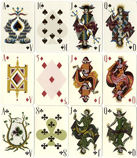
Thanks to Callum for pointing the way to a beautiful set of playing cards designed by Picart le Doux.

Of cigars and pedants by Houman Barekat, in which Vladimir Nabokov has a problem with Henry James. Tangentially related: Post-Punk’s Nabokov: Howard Devoto and Magazine, live from Berlin, 1980. (Given A Song From Under The Floorboards, and lines like “I could have been Raskolnikov / But mother nature ripped me off”, I’d say it’s more accurate to describe Devoto as Post-Punk’s Dostoyevsky.)

• “I was introduced to Kneale’s work like most kids: by a fifty-foot hologram of a psychic locust and a British colonel deliquesced by five million years of bad Martian energy.” In Keep Me in the Loop, You Dead Mechanism Dave Tompkins looks back at Nigel Kneale’s TV play The Stone Tape. I reported my own impressions at the end of October.

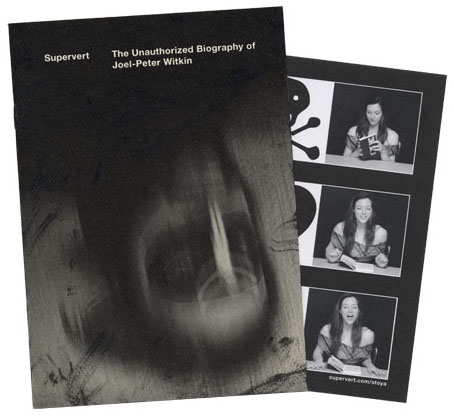
• At The Quietus this week, Carol Huston on Lord Horror: A History Of Savoy Publishing. Michael Butterworth is interviewed, and the piece includes some quotes from earlier interviews by yours truly.

As the Massachusetts minister Increase Mather explained in 1687, Christmas was observed on Dec. 25 not because “Christ was born in that Month, but because the Heathens Saturnalia was at that time kept in Rome, and they were willing to have those Pagan Holidays metamorphosed into Christian” ones. So naturally, official suppression of Christmas was foundational to the godly colonies in New England.

Rachel N. Schnepper on the Puritan War on Christmas.

• Maxine Peake and the Eccentronic Research Council have a seasonal song for you. Take the title, Black ChristMass, as a warning. The group recently played live on The Culture Show.

• Clive Hicks-Jenkins’ Artlog is currently hosting Alphabet Soup, an online exhibition by different artists each depicting the letters of the alphabet. Start here and click forward.

Ornate Typography from the 19th Century featuring samples from the King George Tumblr. Related: Sheaff ephemera.

saturn.jpg

Saturn at Saturnalia. A Cassini image of the planet’s nightside.

Kenneth Anger interviewed by P. Adams Sitney. A 53-minute tape recording from 1972.

• At The Outer Church: James Ginzburg of Emptyset posts a winter music mix.

When Candy Darling met Salvador Dalí.

The psychedelic secrets of Santa Claus.

• At Pinterest: Camp as…

Saturn (1956) by Sun Ra | Permafrost (live, 1980) by Magazine | Uptown Apocalypse (1981) by B.E.F.

Hipgnosis turkeys

turkeys.jpg

Here in Britain there’s no Thanksgiving so turkey as a seasonal meal is a Christmas dish. Turkey also has another meaning which the OED can supply:

6.6 U.S. slang. a.6.a An inferior or unsuccessful cinematographic or theatrical production, a flop; hence, anything disappointing or of little value.

This post concerns the latter—turkeys for the turkey season—being a series of bad or merely lacklustre album covers produced by the Hipgnosis design partnership throughout the 1970s. If the label seems unfair it should be emphasised that “turkey” is the designation applied by Storm Thorgerson himself in the appendix to the third Hipgnosis book, For the Love of Vinyl: The Album Art of Hipgnosis (2008). The following are all covers that he says Hipgnosis disliked, although not necessarily because they were bad designs:

There are some designs we would rather like to forget altogether and have been awarded turkeys to denote — no disrespect is intended for the blame lies mostly with us, save for the twin spectres of release schedules and rock egoism — “That’s a jolly interesting idea chaps but… hmm… actually we’d rather have a picture of our good selves.”

A consistent feature of the Hipgnosis books is a refusal to adopt the Olympian attitude that radiates from many design monographs. Thorgerson has always been happy to describe the history of Hipgnosis, and the practice of album cover design, in warts-and-all anecdotal detail, so it’s no surprise if he also admits to failings. You’d be hard-pressed to find other designers who would draw attention to poor work in this manner, especially in a book dedicated to the highlights of a lauded career. Most designers are self-conscious types who can be relied upon to bury their mistakes as thoroughly as possible.

I wrote a brief post years ago about bad cover design but I usually try to avoid such things, there’s already enough junk in the world without compiling lists of it. But this post is instructive for showing that not everyone gets things right however good they might be, and also that everyone has to start somewhere. Most of my early album covers are various degrees of terrible so I try to spare others the accusatory finger. That said, you have to wonder what on earth Thorgerson and partner Aubrey Powell were thinking of with some of these designs.

01gods.jpg

Genesis (1968) by The Gods.

Thorgerson’s introduction to For the Love of Vinyl explains the haphazard beginnings of Hipgnosis, pretty much two guys and a couple of cameras. They had no design training but a lot of luck (not least having Pink Floyd as friends), and were learning on the fly, something you can see happening with these early covers. It’s unfair to compare a design like the Gods sleeve to work they were producing a few years later when they had access to a range of professional illustrators, retouchers and models, and also budgets from record companies that paid for flights to exotic locations.

02gun.jpg

Gun Sight (1969) by Gun.

This was Gun’s second album. The cover for the first happened to feature the first album cover art by Roger Dean whose career in the music business would run parallel with that of Hipgnosis. Most of the early Hipgnosis covers are simple photos that are occasionally processed in some way. This one didn’t really work out, however, the Roger Dean cover is better.

03prettythings.jpg

Parachute (1970) by The Pretty Things.

But at least the Gun cover doesn’t look like this bizarre attempt at Surrealist collage. Hipgnosis often tried to illustrate the album title but I can’t see how you get “parachute” from this one. The collage approach worked a lot better on the Quatermass album produced the same year.

04pepejaramillo.jpg

Till There Was You (1970) by Pepe Jaramillo.

This was the only cover singled out in the first Hipgnosis book, Walk Away René (1978), as something they didn’t like:

…straight down the line and utterly tasteless as a result — it doesn’t even work as a genteel piece of middle class tweeness.

Continue reading “Hipgnosis turkeys”

Witkinesque

supervert.jpg

Arriving in the post this week, a Christmas gift from Supervert, a chapbook featuring a new piece of writing that purports to be the unauthorised biography of American artist/photographer Joel-Peter Witkin. The premise is that the facts of the real Witkin’s life are far too mundane to account for his extraordinary photo tableaux so Supervert supplies details such as “Mary Witkin [his mother] worked as a bookkeeper in a DDT plant, slowly saving to enrich the unfathomable reservoirs of the absurd.” A metaphysical portrait of the artist, then, with echoes of David Lynch or Bruno Schulz. Inside the chapbook was a promo postcard bearing pictures of the delightful Ms. Stoya whose reading of Necrophilia Variations has now gained over four million YouTube views.

The Witkin book isn’t for sale but copies are available to those who enter the Supervert contest which is running throughout December. All you need do is enter an email address here then keep your fingers crossed.

witkin.jpg

Sanitarium, New Mexico (1983) by Joel-Peter Witkin.

Witkin’s tableaux made an immediate impression circa 1993 when I bought a copy of PhotoVision, a Spanish photography journal which had devoted an entire issue to his work. This arrived at a point when I was halfway through drawing the Reverbstorm comic series, and Witkin’s parade of unorthodox humanity, crucified apes and sundry body parts seemed an ideal complement for the parade of similar grotesqueries (and sundry body parts) we were putting into the comic pages. I also liked the way Witkin worked his own variation on familiar scenes from art history, something we were doing throughout Reverbstorm (Witkin’s Vase: Study For the Base of the Crucifix just happens to combine a partly dissected human skull with Picasso’s Guernica, a recurrent motif throughout the series).

reverbstorm1.jpg

Above and below, some of the more Witkinesque details from part seven of Reverbstorm. The main figure above was a direct reference to Witkin’s Sanitarium, New Mexico. Many figures in other drawings are given Witkin-like blindfolds.

Continue reading “Witkinesque”

Weekend links 137

jacobsen.jpg

Self-portrait by Jon Jacobsen from his Home series.

Steven Arnold: Cabinet of Curiosities is “a retrospective exhibition of this groundbreaking yet under-recognized queer artist at the ONE Archives Gallery & Museum in West Hollywood. The exhibition celebrates Arnold’s radical imagination, presenting many of his tableaux vivant photographs alongside never before exhibited drawings, sketchbooks, paintings and original poster art. In conjunction with the exhibition, ONE will screen Arnold’s four films, including Luminous Procuress (1970), which featured The Cockettes and was lauded by Salvador Dalí.” The exhibition runs to  January 12, 2013.

• “The boundary-pushing techno/sound design duo Emptyset will transform London’s cavernous industrial space Ambika P3 into an immersive sound installation for one night only—and here’s how they’re going to do it”.

• “At one time he was a well-known figure in Montparnasse, where he had a reputation as a master of the occult sciences.” Aleister Crowley is interviewed about his expulsion from France in 1929.

Our normal waking consciousness, rational consciousness as we call it, is but one special type of consciousness, whilst all about it, parted from it by the filmiest of screens, there lie potential forms of consciousness entirely different. We may go through life without suspecting their existence; but apply the requisite stimulus, and at a touch they are there in all their completeness… No account of the universe in its totality can be final which leaves these other forms of consciousness quite disregarded… [T]hey forbid our premature closing of accounts with reality.

William James (1842–1910) quoted in What Should We Do With Our Visions of Heaven—and Hell? by John Horgan at Scientific American.

Screws is an album of piano music by Nils Frahm that’s currently available as a free download (inc. aiffs).

• At Pinterest: Art Visonnaire. Related: Ain’t We Got Fun: The magical surrealism of Jen Ray.

Rowan Somerville “challenges the purpose and legitimacy” of the Bad Sex Awards.

Jimmy’s End: the website for the film by Alan Moore & Mitch Jenkins.

Douglas Rushkoff in conversation with Genesis Breyer P-Orridge.

• Linda Rodriguez McRobbie explores The History of Boredom.

• Recreating the sounds of the BBC Radiophonic Workshop.

Alchemical Emblems, Occult Diagrams, and Memory Arts.

Rocaille: A Blog about Decadence, Kitsch and Godliness.

• A new video for Goddess Eyes II by Julia Holter.

• The complete audio recordings of Jean Cocteau.

The Rumpus interview with Russ Kick.

Forgotten Bookmarks

• RIP Spain Rodriguez

Astradyne (1980) by Ultravox (produced by Conny Plank) | Biomutanten (1981) by Les Vampyrettes (Conny Plank & Holger Czukay) | Never Gonna Cry Again (1981) by Eurythmics (feat. Holger Czukay, produced by Conny Plank).

Hill figures

whitehorse.jpg

Last year I was searching out various works of American land art via Google Maps. This is a similar post looking for some of Britain’s hillside figures, all of which are far older than any 20th-century artworks even if some of them aren’t as old as people hope. The antiquity of the Uffington White Horse in Oxfordshire has been established, however, the figure being estimated to be at least three thousand years old. The debate in this case is whether it represents a horse, a dragon or some other creature. What’s most fascinating about the figure is that it can’t be seen from any of the surrounding area, it’s only visible at the top of the hill; all other hill figures are intended to be viewed from a distance. There are other white horse figures carved into southern England’s chalky hillsides but the rest look like distinctly modern creatures. The Uffington carving resembles the kind of animals seen in cave paintings.

longman.jpg

The Long Man of Wilmington in East Sussex provokes endless speculation as to its age and purpose. In the case of this figure and the Cerne Abbas Giant (below) there are no written records of them earlier than the 16th century whereas the Uffington horse is mentioned in medieval texts. This doesn’t rule out their being far older but it implies that their origin may be more recent and more mundane than some would like to believe. The satellite view of the Long Man currently on Google Maps shows that local wags have given the figure a smiley face.

cerneabbas.jpg

The most famous erect penis in Britain can be found near the village of Cerne Abbas in Dorset. In the 1930s the Bishop of Salisbury petitioned the Home Office to have the giant phallus covered over, to no avail.

cropcircle.jpg

Not a hill figure, this is the remains of a crop circle I noticed when looking at Avebury from the air. There are no doubt more to be found, Wiltshire is apparently a popular area for circle makers.

uno.jpg

Uno (1974) by Uno.

Given the usual subjects of concern here I have to mention these two album covers which make use of hill figures. The Uno sleeve is a design by Hipgnosis which is a lot more well-known than the album it decorates. The original XTC vinyl sleeve designed by Ken Ansell was textured card with the horse and lettering embossed into the surface. I’ve not been able to find a cover featuring the Cerne Abbas Giant although that doesn’t mean to say there isn’t one.

xtc.jpg

English Settlement (1982) by XTC.

Elsewhere on { feuilleton }
The album covers archive

Previously on { feuilleton }
Land art
How to make crop circles