Deutsche Kunst und Dekoration #10: Turin and Vienna

dkd10-18.jpg

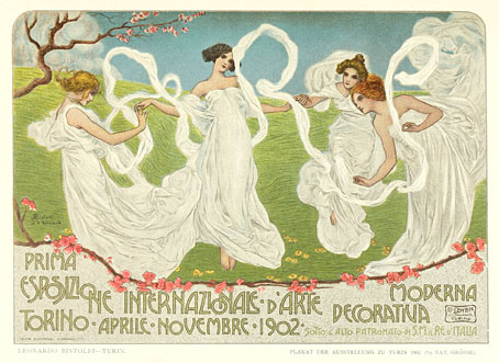
Turin exposition poster by Leonardo Bistolfi.

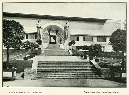
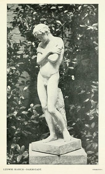
Part two of a two-part skate through the contents of volume 10 of Deutsche Kunst und Dekoration, the German periodical of art and decoration. In addition to the Heinrich Vogeler feature which was the subject of yesterday’s post, this edition includes articles on the Prima Esposizione Internazionale d’Arte Decorativa Moderna in Turin—another international showcase for the Art Nouveau style—and a feature on the Viennese Secession exhibition of the same year. This latter piece was especially fascinating when seeing such a notable event reported for the first time. There’s more about that below. This volume also includes a piece on the Glasgow Arts and Crafts movement but the photos for that piece are poor quality. As before, anyone wishing to see these samples in greater detail is advised to download the entire volume at the Internet Archive. There’ll be more DK&D next week.

dkd10-19.jpg

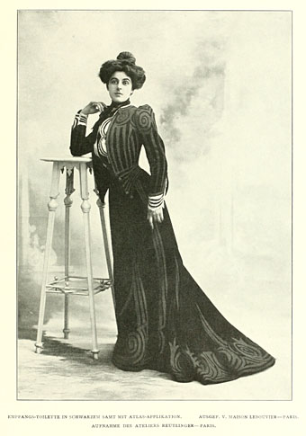
A feature on dress design shows some rare examples of Art Nouveau style being applied to clothing.

dkd10-20.jpg

Continue reading “Deutsche Kunst und Dekoration #10: Turin and Vienna”

Deutsche Kunst und Dekoration #9

dkd09-01.jpg

The Ludwig Habich building, Darmstadt.

Continuing the delve into back numbers of Deutsche Kunst und Dekoration, the German periodical of art and decoration. Volume 9 covers the period from October 1901–March 1902. This edition continues the examination of the Darmstadt Artists’ Colony begun in the previous number. Despite the colony being very much an Art Nouveau venture the pictorial content is largely photographic, with many views of the show-homes built by the colony artists. Much of the other content is a disappointment compared to what’s gone before, the featured painters being the conservative types who were crowding Jugend magazine at this period with generic depictions of stolid German farmers. Unlike Jugend, however, this isn’t the end of the line. As usual, anyone wishing to see these samples in greater detail, or the rest of the edition, is advised to download the entire volume at the Internet Archive. There’ll be more DK&D next week.

dkd09-02.jpg

Continue reading “Deutsche Kunst und Dekoration #9”

The art of Ron Rodgers

rodgers1.jpg

Century of Progress.

While the web has given many artists a visibility they wouldn’t have had in the past, too many artists’ sites are blighted by the dreaded “Artist’s statement” in which people who express themselves visually are forced to try and articulate for the paying customers what it is they’re doing with all this art stuff. Nowhere will you find anyone saying “I don’t know what I’m doing” or “I do this because I’m compelled to but don’t know why” or even “I do this to make a living”. All too often what you get is a rifle through the favourite jargon phrases of the social sciences where the polysyllabic words seem important but are as worn out and redundant as any of the examples George Orwell complained about sixty years ago in ‘Politics and the English Language‘.

All of which is a very long-winded and polemical way of saying I loved Ron Rodgers’ artist’s statement:

“That’s what his stare has been saying to me all this time:
‘At least I galloped – when did you?'”
– Peter Shaffer, from “Equus”

Here’s hoping more artists follow his example. There’s more of his art at the Glass Garage Gallery. Via Monsieur Thombeau who has a knack for finding good things.

rodgers2.jpg

Phoenix.

Previously on { feuilleton }
Geoffrey Haberman’s brass insects
The art of Arnaldo Pomodoro
The art of Sergei Aparin
Sculptural collage: Eduardo Paolozzi
The art of Igor Mitoraj

Deutsche Kunst und Dekoration #7

dkd07-01.jpg

Continuing the delve into back numbers of Deutsche Kunst und Dekoration, the German periodical of art and decoration. Volume 7 covers the period from October 1900 to March 1901 and features a set of ornamental capitals throughout this edition designed by Karl Lürtzing, part of a presentation of typefaces in the Art Nouveau style. The figures in Lürtzing’s alphabet all seem to be Biblical or mythological (as with David and Eve above) although some are easier to decipher than others. Volume 6 paid a visit to the Exposition Universelle in Paris and there’s a few more examples from that event here, along with further examinations of the best in German art and design. As usual, anyone wishing to see these samples in greater detail is advised to download the entire volume (which comprises over 300 pages) at the Internet Archive. There’ll be more DK&D next week.

dkd07-02.jpg

Remarkable interiors by Richard Riemerschmid.

dkd07-03.jpg

Continue reading “Deutsche Kunst und Dekoration #7”

The writhing on the wall

hands9.jpg

Dracula (1992).

This is the closest you’ll get to a guest post here even though it’s been done remotely and I’ve changed things around a little. Following my mention yesterday of the Cocteau-derived lantern-arms in Francis Coppola’s Dracula, Jescie sent me an abandoned blog post which collected similar examples of the arms-through-the-walls motif. I’ve done this kind of thing here in the past so it’s good {feuilleton} material. Almost all these examples are fantasy- and horror-related which isn’t too surprising, and I’m sure there’ll be other examples in films I haven’t seen. If anyone has any suggestions just remember that hands grasping through doors and windows don’t count with this, it’s through the wall or not at all.

hands1.jpg

La Belle et la Bête (1946).

Jean Cocteau sets things off in 1946, a perfect piece of fairytale Surrealism and one of the many memorable aspects of this film.

hands2.jpg

La Belle et la Bête (1946).

Continue reading “The writhing on the wall”