Johann Theodor de Bry’s Neiw Kunstliches Alphabet

debry.jpg

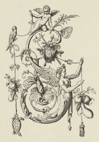
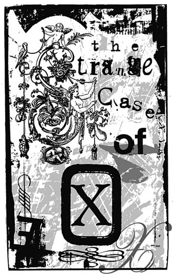
A page from Johann Theodor de Bry’s Neiw Kunstliches Alphabet (1595) which can be found in a free PDF version here, the scans being taken from a Victorian reprint. The late, lamented Giornale Nuovo featured some of these curious letter designs in 2005. Each capital is embellished with various symbolic figures—Moses appears perched on the letter M, for example—whilst also being draped with fruit, lobsters and even insects. I used a smaller redrawing of De Bry’s letter S for one of the page designs in Jeff VanderMeer’s City of Saints and Madmen in 2002. Probably not the use that De Bry intended but then I expect he’d be surprised that his work was still being used at all after four hundred years. Via BibliOdyssey.

strange.jpg

Previously on { feuilleton }
The Book of Ornamental Alphabets
Paul Franck’s calligraphy
Gramato-graphices
John Bickham’s Fables and other short poems
Letters and Lettering
Studies in Pen Art
Flourishes

Weekend links: Ghosts, Spooks and Spectres edition

spectres.jpg

Cover design by Philip Gough.

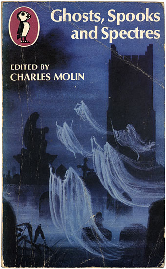
Ghosts, Spooks and Spectres (1972 reprint). Editor Charles Molin collected nineteen ghost stories by writers including Oscar Wilde (The Canterville Ghost), Charles Dickens (The Signal-Man), J. Sheridan Le Fanu (Madame Crowl’s Ghost) and HG Wells (The Inexperienced Ghost). This was one of my favourite books when I was ten-years old. There’s nuffin like a Puffin. Puffin Books’ parent company, Penguin, is 75 this year.

• The good people at the Outer Alliance have posted an interview with me here in which I talk about the subversive sexualities of sf in the 1970s and also admit to writing fiction.

• There’s just time to mention It Came From Pebble Mill, an event which includes another screening of David Rudkin’s Penda’s Fen.

• “In our society, there has tended to be a very strong compartmentalization of different experiences, different cultural forms, different genres. We can talk in a very broad sense and say art is separate from science, for example, or body is separate from mind, or we can talk in a specific sense and say one certain form of dance music is separate from one form of, say, heavy metal. I don’t really buy those compartmentalizations. I understand why they exist, how they’ve come into being and why they’re convenient, but it’s not the way I think, it’s not the way I experience the world, it’s not the way I believe things should be.” From an interview by Colin Marshall with David Toop at 3QD. Toop’s latest book is Sinister Resonance: The Mediumship of the Listener.

The Kingdom of the Pearl by Léonard Rosenthal, illustrated by Edmund Dulac.

Ghost Stations by Dollboy, a CD package. And then there’s the Ghostly Bento.

7 Inch Cinema are Birmingham-based cultural historians.

• Mark Pilkington’s Mirage Men now has its own site.

Borges on Pleasure Island: JLB and his love of RLS.

• RIP Arne Nordheim, Norwegian composer.

• Charlie Visnic’s Modular Ghost Synth.

On the trail of Tutankhamen’s penis.

Photos by Thom Ayres.

Ghosts by Japan | Spooky Rhodes by Laika | Purple Dusk by Spectre.
New work: Two forms of darkness

darkness.jpg

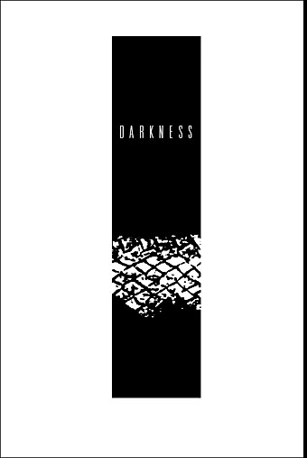
Darkness: half-title page.

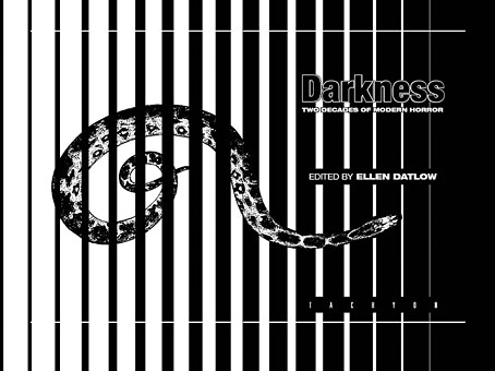
I’m still behind with site updates but here are two recent design jobs come to cast a shadow over the summer. Darkness is another fiction anthology from Tachyon, edited by Ellen Datlow and subtitled Two Decades of Modern Horror. Ann Monn’s cover design has a snake writhing through shadow so I carried the serpentine motif into the interior design. The book runs to 478 pages and, as the title implies, features lots of big names including Clive Barker, Joyce Carol Oates and Stephen King.

darkness2.jpg

Darkness: title spread.

dark-matter.jpg

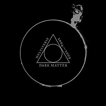
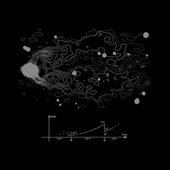
Dark Matter, on the other hand, is a double-CD compilation of singles from Bristol’s Multiverse label which is released this month. If you need a descriptor then many of the tracks here would be classed as dubstep, and a few are doomy enough to serve as soundtracks for urban horror. Skream is one of the featured artists, and his Trapped In A Dark Bubble on Tectonic’s Plates 2 collection (which I designed last year) has a great sinister ambience.

dark-matter2.jpg

The design is very minimal with silver ink on a matt black digipak. The label requested graphics that mixed esoteric symbols with references to modern physics or astronomy without any of the allusions being too specific as to their origin or meaning. For the fonts I used the Fell types which take the design back to grimoires and old manuscripts.

Dodgem Logic again

dodgem.jpg

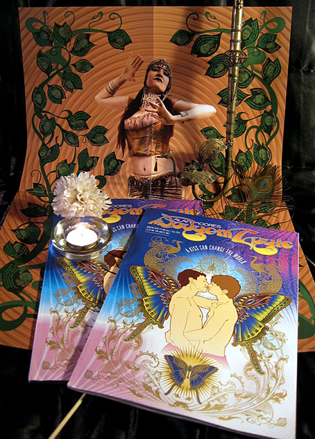
Look what the postman delivered. Well, not the peacock feather and candle, obviously… Dodgem Logic #4 is now in print and my cover design looks as splendid as I hoped, gold ink included. The bonus item for this delirious issue is the rather wonderful poster you see in the background, a Joe Brown & Alan Moore collaboration entitled Bohemia which features a burgeoning growth of Bohemians through the ages, from Sappho through to more contemporary cultural icons. Inside there’s Dick Foreman discussing psychedelia, comics from Steve Aylett, Barney Farmer, Lee Healey, Kevin O’Neill and Savage Pencil, Melinda Gebbie’s gorgeous paintings, Debbie Delano on how to be an openly gay school teacher, Steve Moore asking for no more war, and Mister Alan Moore giving us his personal history of science fiction. You can order it online here.

Previously on { feuilleton }
Dodgem Logic #4
Dodgem Logic

Dodgem Logic #4

dodgem1.jpg

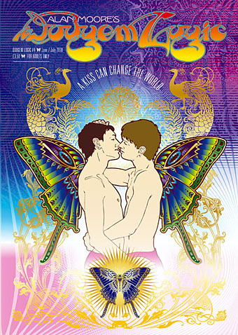
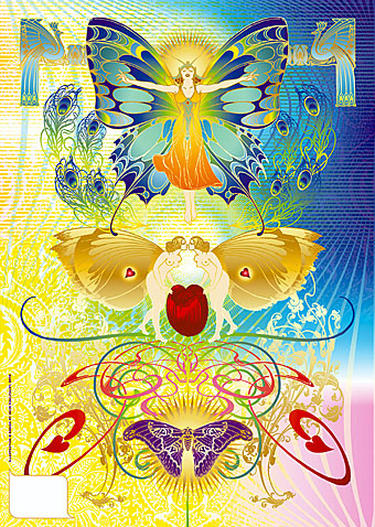
The magazine isn’t out for another couple of weeks but my cover art has been posted to various websites so I can finally show this here. Alan Moore was in touch at the beginning of February asking for a wraparound cover design, the only brief being that he liked my Alice in Wonderland calendar and asked for something equally florid or—for want of a better term—psychedelic. Alan’s magazine owes something to the underground mags of the 1960s and a common feature of those, especially Oz magazine, was a degree of provocation in the choice of cover art. A picture of two boys kissing is nothing more than a show of affection yet to many people the sight still inspires enormous outrage. This was demonstrated a week or so after I’d finished the cover when the Washington Post was deluged by angry letters and emails after they showed a photo of two newly-weds outside the Washington DC Superior Court. People used to have a similar reaction to the sight of a black man kissing a white woman; the only way attitudes change is when something becomes so commonplace it’s no longer worthy of note.

dodgem2.jpg

Aside from the politics, this was also an excuse to run riot with more Art Nouveau motifs, especially peacocks and butterflies. The butterfly-winged boys are a nod to the paintings of Yannis Tsarouchis, and this in turn gave me an excuse to borrow from another magazine cover, Frank X Leyendecker’s 1922 painting of The Flapper for Life. Frank X was the brother of the more renowned illustrator JC Leyendecker. Joseph C was known to have been discreetly homosexual; so too was brother Frank according to this article in which case his butterfly woman has an additional resonance.

dodgem3.jpg

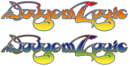
Having written a lengthy polemic about Roger Dean’s work in January I had the idea of doing the magazine title in his lettering style. I spent the best part of two days working on these as I wanted the result to be as accurate as possible. All the gold parts of the cover shown here are gradients but I made a slightly different version for print which will render those areas in gold ink. I’m looking forward to seeing this printed.

Previously on { feuilleton }
Roger Dean: artist and designer
The art of Yannis Tsarouchis, 1910–1989
Dodgem Logic
Psychedelic Wonderland: the 2010 calendar
Butterfly women