The Art Nouveau dance goes on forever

nouveau1.jpg

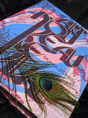
Catalogue for Art Nouveau Revival 1900 . 1933 . 1966 . 1974. Peacock feather not included.

Regular readers may recall my mention of the Musée d’Orsay exhibition Art Nouveau Revival which was launched late last year. I didn’t get to see the exhibition, unfortunately, but this week I finally ordered a copy of the catalogue, an expensive cloth-bound volume with essays (in French) by Philippe Thiébaut, Stephen Calloway, Irene de Guttry, Thierry Taittinger and Philippe Thieryre. Despite the ruinous postal charges incurred by the book’s weight this was worth every euro, it being the kind of polymorphous production which in solipsistic moments one can choose to believe was created solely for your own benefit.
nouveau3.jpg

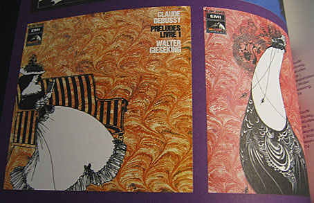
Aubrey again, album covers from 1974.

Much of the subject matter has been explored here in various small ways, with the curators following the influence of Art Nouveau through Surrealism (mainly Dalí) to the psychedelic art of the 1960s and on into the Pop Nouveau (for want of a better term) which flourished in the first half of the 1970s. Among the familiar Aubrey Beardsley graphics and psychedelic posters there are also some pleasantly surprising inclusions, including illustrations by Philippe Jullian (yes, I’m still intending on writing about him at some point), yet more Beardsley album covers, film posters, and even some of the sillier films of the late-60s such as Casino Royale. Being a French exhibition there’s a section devoted to comic strips which includes work by Moebius, Philippe Druillet and Guido Crepax.
nouveau2.jpg

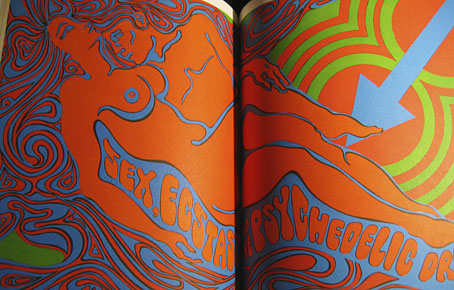
Sex and LSD, a spread from Playboy, 1967.

It’s common to see parallels drawn between the 1890s and the 1960s but the strange blooms of vulgarised fin de siècle style which burgeoned in the wake of psychedelia are seldom given much attention. One of the great things about this catalogue is the amount of ephemera the curators chose to include such as magazine ads and trend-chasing album sleeves. It was precisely this blend of 1890s + 1960s + 1970s I sought to capture in my recent cover for Dodgem Logic. As I said, it’s an expensive book but for anyone drawn to this aesthetic hothouse it’s also an essential purchase. Art Nouveau Revival can be ordered direct from the museum shop. Further samples follow.

Continue reading “The Art Nouveau dance goes on forever”

The Epigenesis by Melechesh

epigenesis.jpg

This new piece of work, a cover illustration for metal band Melechesh, was still in progress only a month ago but the album in question, The Epigenesis, has been announced so I can post it here. This follows a design I produced for an earlier Melechesh album, Emissaries, in 2006, both of which refer to the Sumerian mythology which powers the band’s music. There’s some vague Parajanov influence in this piece which isn’t the kind of thing that usually extends to the metal world but Sergei Parajanov’s films were one of the reference points the band offered. The suspended carpets at the top left are the most obvious allusion to the director but for the composition as a whole I also had in mind the tableaux scenes he creates in The Colour of Pomegranates and other films.

The Epigenesis will be released on the Nuclear Blast label on October 1st, 2010.

Elsewhere on { feuilleton }
The album covers archive

Previously on { feuilleton }
Short films by Sergei Parajanov
New things for October

Design as virus 12: Barney’s faces

lowe.jpg

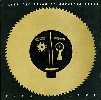
Sleeve for I Love The Sound Of Breaking Glass (1978), a 7″ single by Nick Lowe. Design by Barney Bubbles.

Continuing an occasional series. Designer Vic Fieger had a guest post at Reasons To Be Cheerful earlier this week examining Barney Bubbles’ use of the human face in his graphic designs. This is one side of the Bubbles work I really enjoy, he had a remarkable facility for demonstrating a versatility with abstract shapes—or found objects, as in the piece above—while playing games with our pattern recognition. A recurrent playfulness was one of the many notable things about his approach to design.

colour.jpg

Story title from The Best of Michael Moorcock (2009).

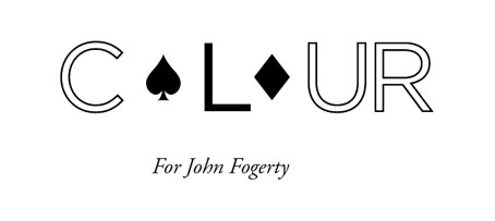
Fieger’s focussing on the faces in Barney’s work struck a chord for me since I’d deliberately tried something similar last year, taking a cue from Barney’s example. The Colour piece above is one of the story titles from The Best of Michael Moorcock published by Tachyon. For each story I designed a different title in a style which complemented the subject; Colour is a science fiction piece in which card games figure, hence the symbols. Mike Moorcock was friends with Barney during the 1970s so there was an additional reason for the reference.

booklife.jpg

I don’t know whether anyone has noticed the face on the cover of Booklife but it is there, with the two flowers at the top forming the eyes and the book’s title standing for the mouth. Once again, this wasn’t strictly necessary for the success of the design but it gave a rationale for the arrangment of the flowers. There’s also the hope when something is this subtle that the attraction of the pattern impells a browser to pick up the book in a shop without quite knowing why.

Booklife and The Best of Michael Moorcock are both available from Tachyon. Paul Gorman’s Barney Bubbles book, Reasons To Be Cheerful: The Life & Work Of Barney Bubbles, will be relaunched later this year in a new edition.

Previously on { feuilleton }
Into the Media Web by Michael Moorcock
Design as virus 11: Burne Hogarth
Design as virus 10: Victor Moscoso
Design as virus 9: Mondrian fashions
The Best of Michael Moorcock
Design as virus 8: Keep Calm and Carry On
Designing Booklife
Design as virus 7: eyes and triangles
Design as virus 6: Cassandre
Design as virus 5: Gideon Glaser
Design as virus 4: Metamorphoses
Design as virus 3: the sincerest form of flattery
Design as virus 2: album covers
Design as virus 1: Victorian borders
Barney Bubbles: artist and designer

Weekend links 24

early.jpg

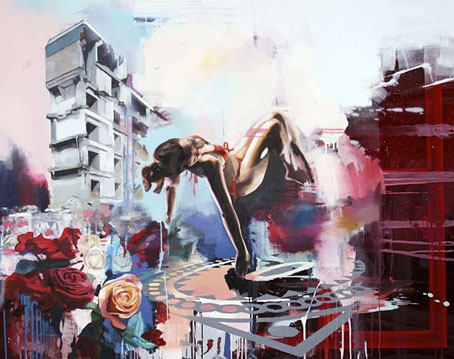
Delta-Wing (2009) by Chloe Early.

• “Feted British authors are limited, arrogant and self-satisfied, says leading academic”. Stating the bleeding obvious but it still needs to be said, apparently, especially when the announcement of the Booker list this year caused the usual confusion when Amis Jr. and McEwan weren’t included, as though the mere existence of their novels makes them prize-worthy. And as someone pointed out, the word “male” is missing from that headline.

Hero of Comic-Book World Gets Real: Alan Moore again, in the NYT this time. Related: a review of Unearthing live.

• Announcing The Hanky Code by Brian Borland & Stephen S Mills, a 40-poem book to be published next year by Lethe Press. For an explanation of the Hanky Code there’s this, and there’s also an iPhone app.

Folk—the ‘music of the people’—is now hip again, says (who else?) Rob Young who can also be heard on the archived podcast here. Related: the folk roots of Bagpuss. Related to the latter: The Mouse Mill.

zvorykin.jpg

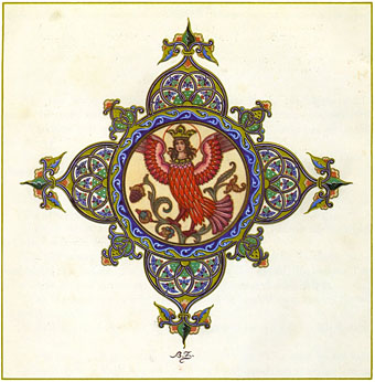
An endpiece from The Firebird and other Russian Fairy Tales by Boris Zvorykin.

‘Yes’ to Catastrophe: Roger Dean, Prog and SF. A lengthy and thoughtful analysis of Roger Dean’s early work.

Into the Media Web, the enormous Michael Moorcock book which I designed, is officially published this week.

Cassette playa: in praise of tapes. I’ve complained about tapes in the past but people continue to find them useful. Some technologies die harder than others.

Boy BANG Boy: “Quiet moments made suddenly very loud with the attitude and opinion of what it means to be a young male in an impossibly diverse world.” An exhibition opening at Eastgallery, London, on August 5th.

Empty your heart of its mortal dream: Alfred Kubin’s extraordinary novel, The Other Side.

Ghostly and Boym Partners devise a new way to deliver digital music.

Besti-mix #27: a great selection by producer Adrian Sherwood.

Agnostics are troublemakers. Amen to that.

• RIP Harry Beckett.

Acousmata.

Let Us Go In To The House Of The Lord by Pharoah Sanders (live, 1971): Part 1 | Part 2

Portuguese Diseases

disease1.jpg

This volume appears to be in print now, the Portuguese edition of The Thackery T Lambshead Pocket Guide to Eccentric and Discredited Diseases, a unique fantasy anthology compiled in 2003 by Jeff VanderMeer and Mark Roberts. The new edition is published by Saida de Emergência and translated by Luís Rodrigues, João Seixas and Vítor Morta. I didn’t design this cover with its eccentric kerning but I did design the original edition for Night Shade, to date still one of my most elaborate and detailed book designs, too elaborate for the larger publishing houses, in fact, who either dropped or amended the deliberately diseased title spread for their paperback editions. You can see some of the original pages below. I sent the Portuguese publishers all the artwork and layouts but since I haven’t seen a printed copy of the book I don’t know how the interior looks. I don’t even know whether my name appears on the cover as it does here since other examples online show a different design. However, it’s often the case these days that cover designs get sent out prematurely for marketing purposes before things have been finalised.

disease2.jpg

Title spread.

disease3.jpg

Contents spread.

Previously on { feuilleton }
Pasticheur’s Addiction