Televisual art

sotn1.jpg

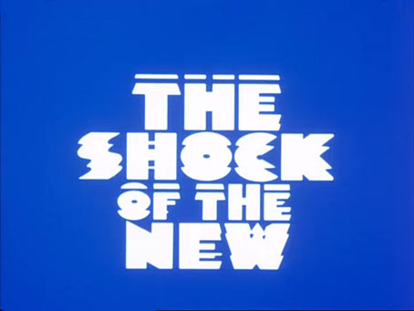
A few words of praise for The Shock of the New, Robert Hughes’ eight-part TV series about art in the 20th century. Not that it’s ever been lacking in praise—it was lauded from the outset back in 1980—but, having read the book of the series twice, then dipped back into it on regular occasions, it occurred to me recently that I’d not seen the series itself for a very long time.

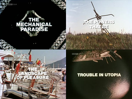
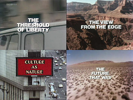
If you don’t know—and is anyone today really unaware of this?—Hughes was commissioned by the BBC and his employers at TIME magazine to travel the world presenting a history of modern art from the 1880s to the end of the 1970s. The series was part of a run of costly co-productions that flattered viewers with colour television sets (still a luxury item in the UK) while engaging the intellect; Kenneth Clarke’s Civilisation, Jacob Bronowski’s The Ascent of Man and David Attenborough’s Life on Earth established the template that Hughes was required to follow. If you have the time and the money, the globetrotting is the easy part of an enterprise such as this. Much more difficult is making sense of the increasingly fragmented development of art in a century of two world wars and rapid technological change. Hughes did this by selecting a single route of evolution for each episode, often missing out significant artists or entire movements, then winding back the clock in the following episode to trace a different route that included the neglected names. Some of them, anyway. In the introduction to the book he admits the difficulty of trying to summarise a century of complex aesthetic activity and philosophy in a mere eight hours. The book is inevitably much more thorough, making the TV series seem like a sketch beside it; but there are good sketches and bad ones, and this one is exceptional.

sotn2.jpg

Hughes had an enviable talent for lucid explanation, an ability to tell you what was important about an artist or an idiom or an artistic development in a few simple, memorable sentences, free of jargon or the obfuscation that bedevils art criticism. This is best seen in his collected reviews from TIME magazine, Nothing if Not Critical (1991), which offers bite-sized appraisals of individual artists or group shows, from the Renaissance to the present day. Difficult to do well when you’re limited to a few hundred words, near impossible when you have to explain something using a minimum of words while simultaneously talking to a camera and walking down a busy Paris street. Some of his statements, like the following one, have been lodged in my memory for years:

A Rodin in a parking lot is still a misplaced Rodin, but this in a parking lot is just bricks.

“This” being Carl Andre’s oblong of 120 firebricks, Equivalent VIII, a minimalist sculpture that caused a huff of outrage from the philistine British tabloids in the 1970s. Hughes’ comment occurs when he examines the way that galleries in the same decade became frames for creations such as Andre’s, works that wouldn’t be recognised as art without the building they were situated in.

sotn3.jpg

The explication is very familiar but I’d forgotten about all the foreign travel. This seems profligate at times although it’s only the same as David Attenborough flying to a remote jungle to film a lemur or a lizard. Paintings and sculptures seen in their natural habitats, as it were, together with the locations that inspired them: van Gogh’s Arles, Matisse’s Côte d’Azur, de Chirico’s Turin, and so on. One of the axioms of Hughes’ criticism, repeated here as elsewhere, was that art has to be studied in situ, not appraised via mediated representations, whether that means halftone dots in a book, 16mm film delivered by cathode ray tube, or a gallery website. It’s an attitude I sympathise with even though I don’t visit galleries very often. Sculptures have a physical presence that doesn’t reproduce at all, while paintings are more subtle or more dramatic or more detailed or more dimensioned when you’re standing in front of them. Piranesi’s prints are big; William Blake’s paintings are very small; Max Ernst’s engraving collages are not only smaller than you expect but they’re also toned by age; Picasso’s canvases reveal the direction his brush was travelling when he painted a line in a single stroke…

sotn4.jpg

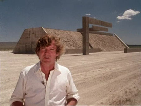
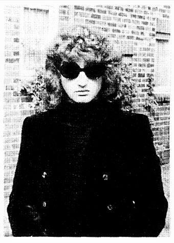
Hughes and Complex One, an artwork that few people are allowed to visit.

Something else I’d forgotten about was the artist interviews in the later programmes, especially those with land artists Michael Heizer and Walter De Maria. The final episode in the series examines the collapse of the idea of the avant-garde, with land art being presented as work that can’t be bought by wealthy collectors or appropriated by mass media. Hughes treks into the Nevada desert to see Heizer’s Complex One which at the time was all that existed of the massive site known today as City; Walter De Maria is seen walking through The Lightning Field in New Mexico accompanied by synthesizer chords from Jean-Michel Jarre’s Equinoxe. Electronic music abounds in this series, from Peter Howell’s clanging Radiophonic theme, to extracts from albums by Tangerine Dream and Brian Eno, Music For Films being a popular choice with TV producers at the time. It’s notable that the phrase “the shock of the new” only occurs once, near the very end, possibly as a capitulation to the BBC who Hughes says chose the title for him. In a later book, Things I Didn’t Know: A Memoir (2006), you’ll find another of those memorable statements:

Some new works of art have values of some kind or another. Others, the majority, have little or none. But newness as such, in art, is never a value.

I’m following this with a re-viewing of Hughes’ multi-part American Visions (1996), a history of American culture that I’ve not seen since its first broadcast. The Shock of the New is all over YouTube if you require it, also at the Internet Archive. The series took three years to create and was broadcast at 8:00pm on Sunday evenings to an audience of millions. They really don’t make them like this any more.

Previously on { feuilleton }
Robert Hughes, 1938–2012
Land art

Weekend links 600

window.jpg

My kind of window. From a collection of machine-learning images by Unlimited Dream Co. Via Bruce Sterling.

• “I will never call myself a queer. That word is one of the things that I detest that has happened, and it’s almost being forced now. For me, you cannot separate that word from the hatred and violence that once accompanied it. When I read it being used in The New York Times, I think, ‘It’s their word and they can fucking have it all they want.’ I will never use ‘queer.’ It’s an ugly word.” John Rechy, still active at the age of 90, talking to Jeff Weiss about hustling, social opprobrium, and his pioneering books.

• “At a time when we are being constantly told that humanity is destroying the planet, it is somehow comforting to see nature not merely outlasting, but triumphing over humanity’s constructions—as nature does in many of Piranesi’s Views of Rome.” Alasdair Palmer on Piranesi’s peerless renderings of Roman ruins.

• “The magical aspect of Get Back is its total refusal to adhere to the standard tropes of music documentaries. There are no talking heads commenting on the Beatles’ greatness, no continual barrage of quick edits and highlights.” Geeta Dayal on Peter Jackson’s resurrection of the Fab Four.

But men are not traditionally meant to be objects of art. “Men look at women,” John Berger wrote. “Women watch themselves being looked at.” When men look at men, however, they break rules. “I didn’t set out to be radical,” says Miller. “But I was at a fair and I had a huge nude on a stand by Michael Leonard. I’d only been open ten minutes and a woman started having a go and saying it’s filth. What I found fascinating is she’d walked past a whole span of female nudes. I think society is just immune to female nudity. People don’t see it. If you take this to the straight world of an art fair, it provokes reactions other dealers don’t get. There isn’t anyone else like me.”

Tony Wilkes talks to Henry Miller, owner of an art gallery devoted to the male form

• “I imagine men with starched collars, horrified by an animal with no hard edges to grab onto, no solidity to venerate. Something low, lateral, creeping.” Fiona Glen on “Devil Fish”, Cthulhu and cephalomania.

• I like glowing things so Brian Eno’s glowing record turntable has an immediate appeal. A shame it’s a very limited production which is almost certainly sold out by now.

• The next release on the Ghost Box label will be A Letter from TreeTops by Pneumatic Tubes.

• At Dangerous Minds: A Sight for Sore Eyes Vol. 1, a visual history of The Residents.

• At Wormwoodiana: Mark Valentine on the supernatural thrillers of Archie Roy.

• Mix of the week: A reflection on 2021 at A Strangely Isolated Place.

Swan River Press looks back over a year of book production.

• New music: Spherical Harmonics by Joseph Hyde.

Octopus’s Garden (1969) by The Beatles | The Kraken (2006) by Hans Zimmer | Kraken (2017) by Dave Clarkson

Piranesi record covers

piranesi12.jpg

Title page for the Carceri d’Invenzione (second state), 1761.

Continuing an occasional series about artists or designers whose work has appeared on record sleeves. Giovanni Battista Piranesi (1720–1778) is a cult figure here so this is an inevitable post even if there isn’t a great deal to look at. Many of the record covers that use Piranesi etchings are for classical releases, which isn’t so surprising. The prints that comprise the Vedute di Roma were Piranesi’s most popular works, and remain so today despite their exaggerations of the true size of Rome’s monuments and ruins. But I thought the Carceri d’Invenzione (aka The Prisons) might be more popular, especially in the metal world where dark and gloomy imagery is de rigueur. There may be more examples, of course, since I’m having to rely on Discogs which doesn’t always note the work of uncredited artists. I suspect that architecture alone isn’t attractive enough for the metal hordes, however vast and tenebrous that architecture might be. The covers I’ve done for metal bands have always had to incorporate figures—human or otherwise—or some kind of occult symbolism. The most prominent musical piece based on Piranesi’s Prisons is also a classical work, one of the Bach cello suites recorded by Yo-Yo Ma in 1998. Ma’s album, Inspired By Bach, was accompanied by six films from different directors; the film for Suite No. 2, The Sound of the Carceri by François Girard, shows Ma playing the piece inside a CGI rendering of Piranesi’s colossal spaces. Copies of Girard’s film come and go on YouTube so this one may not stay around.

piranesi01.jpg

Luigi Dallapiccola: Il Prigioniero (1975); National Symphony Orchestra Of Washington DC, Antal Dorati.

piranesi02.jpg

Palestrina: Missa Aeterna Christi Munera / Oratio Jeremiae Prophetae / Motetti (1976); Pro Cantione Antiqua, London.

piranesi03.jpg

Tartini: Concerti Per Violino E Orchestra / Sonate (1981); P. Toso, I Solisti Veneti, C. Scimone, E. Farina.

piranesi04.jpg

Captivation (1994) by Tefilla.

Continue reading “Piranesi record covers”

David Britton, 1945–2020

db.jpg

Mister Rock’n’roll, 1969.

David Britton, author, artist and publisher, died on 29th December. I wrote this for the Savoy Books news announcement:

My closest artistic collaborator from 1989 to 1999, and a close friend for longer than this: capricious, determined, fearless, funny, generous and inspirational. No David Britton, no Lord Horror; no Lord Horror, no Reverbstorm. He changed my life.

He’d been increasingly ill for several years so this came as less of a surprise to those of us close to him than to others. Dave and I used to talk at least once a week, and on the last occasion he’d sounded worse than usual. Those talks were episodes in a conversation about art that ran for over 30 years, beginning in the mid-1980s at the counter of the Savoy bookshop in Peter Street, Manchester, continuing in the Savoy offices with co-publisher and collaborator Michael Butterworth, and resuming on the phone; art in all its forms and in any medium, with no attention paid to categories of “high” and “low”.

reverbstorm-covers.jpg

Reverbstorm, the Lord Horror comic series that we created throughout the 1990s, was the product of those conversations, and was also produced mostly through conversation, working by instinct without a script. The series, which was compiled into definitive book form in 2012, is testament to a pooled breadth of interest, encompassing/quoting/appropriating/reworking Pointillist, Cubist and Expressionist painting, Modernist poetry, pop songs, Sondheim musicals, Finnegans Wake, Tom Phillips’ Humument, Burne Hogarth’s Tarzan comics, Joel-Peter Witkin’s photographs, voodoo chants, Piranesi, King Kong, Bauhaus graphic design, Hugh Ferriss architecture, and illustration of all kinds, from fairy tales to cosmic horror via Aubrey Beardsley and Harry Clarke; there’s even ballet in the mix if you look closely. Dave always liked the idea of Lord Horror leaping and pirouetting like a dancer. More than anything, Reverbstorm is rock’n’roll, and this is partly what the title refers to: a thundering rhythm.

wf2.jpg

Britton art from Weird Fantasy #2, 1971. This is the drawing that caught the attention of William Burroughs when Britton and Butterworth visited Burroughs in New York City in 1979.

The term “rock’n’roll” always requires qualification when considering the Britton oeuvre, he used it with regularity while remaining bitterly aware that the original charge of the words had been degraded by over-use, reduced to a caricature by too many mediocre music acts and lazy journalists. I chided him a couple of times that his use of the term was functionally meaningless, a synonym for “my favourite things”. But the application was always a serious one, a label for any work that he found sufficiently thrilling, wild, original, excessive, anarchic, flamboyant, boundary-breaking or confrontational. Little Richard, Larry Williams, Howlin’ Wolf and Bo Diddley were Dave’s kind of rock’n’roll, as were Captain Beefheart and His Magic Band, PJ Proby, Iggy Pop, the Sex Pistols, The Cramps, The White Stripes and the Wu-Tang Clan. No surprise there, but Burne Hogarth was also rock’n’roll, although Hogarth would no doubt have disputed this. Another favourite artist, James Cawthorn, was given the label because Dave had discovered Cawthorn’s work when his teenage rock’n’roll obsession was at its height; two forms of art were permanently bound together, with sword & sorcery recast as the literary equivalent of a delinquent musical idiom. Dave’s other artist collaborator, Kris Guidio, was rock’n’roll for having served time as a peerless portraitist of The Cramps. LaVern Baker was rock’n’roll, as was CL Moore. Aubrey Beardsley was rock’n’roll and Harry Clarke was rock’n’roll; William Burroughs and William Hope Hodgson were rock’n’roll, so were Michael Moorcock and Harlan Ellison. Francis Bacon and Paula Rego were rock’n’roll; Alan Clarke was rock’n’roll and so was David Lynch. The quest for more of this rare commodity was relentless and unceasing. Many of our conversations were little more than enthusiastic discussions of shared favourites, or recommendations to watch/read/listen to something new.

stormbringer.jpg

The first Savoy publication from 1976—Cawthorn adapting Moorcock’s apocalyptic Elric novel—was a declaration of intent: maximum rock’n’roll.

The photo at the head of this post is one that Dave had reused in recent years, one of the few portraits he seemed to like. It first appeared inside his debut publication, Weird Fantasy #1, a genre fanzine that was also enough of an underground publication to receive a passing mention in Oz magazine. The picture is emblematic of the Britton character, dressed in a manner at odds with the north Manchester surroundings he grew up in, and where he was still stuck at the time, a world of back-to-back housing and squalid ginnels. Rock’n’roll in all its forms was the great escape from a world of severely limited horizons and circumscribed lives, where all you could look forward to after a few years of poor education was a job in the local mill or factory. People who dismiss the gaudier forms of entertainment as “escapist” are usually middle class and blessed with comforts and opportunities that reinforce their condescensions; people who never had to consider a life so lacking in promise that a song heard on the radio, a vinyl record, a comic book, a paperback found on a market stall, might be the key to a wider world, an affirmation that there was more than the brick walls of your immediate environment, and there could be even more than this. “Escapist” suggests a hiding away but it also means breaking free. In later years Dave maintained a sporadic correspondence with Alan Moore; they never met but were mutually supportive, thanks in part to a shared background as bright boys from working-class backwaters with no encouragement to try and transform their lives through their escapist enthusiasms. Alan maintained an affection for his background, but Dave seldom spoke of his without a shudder, as though he’d evaded a fate worse than death. One thing he retained from north Manchester was an ebulliently vulgar sense of humour. He agreed with Picasso that good taste is the enemy of creativity.

lh.jpg

David Britton’s first novel wasn’t one he considered his best but it remains the most notorious thanks to the conscientious literary assessments of the Greater Manchester police.

I’ll miss Dave’s infectious humour, just as I’ll miss the conversations that so often provoked it, the quest for better art, some new kind of kick, more rock’n’roll. I’ll miss being able to show him something I know he’ll enjoy. He always liked quotations so I’ll end this with a lengthy one from Walter Pater, the aesthetic theorist whose ideas energised the Decadents and the founders of The Savoy, the magazine from which Savoy Books took its name. It summarises Dave’s attitude to life even if he’d never discuss things in such a grandiloquent manner:

…we are all condamnes, as Victor Hugo says: we are all under sentence of death but with a sort of indefinite reprieve—les hommes sont tous condamnes a mort avec des sursis indefinis: we have an interval, and then our place knows us no more. Some spend this interval in listlessness, some in high passions, the wisest, at least among “the children of this world,” in art and song. For our one chance lies in expanding that interval, in getting as many pulsations as possible into the given time. Great passions may give us this quickened sense of life, ecstasy and sorrow of love, the various forms of enthusiastic activity, disinterested or otherwise, which come naturally to many of us. Only be sure it is passion—that it does yield you this fruit of a quickened, multiplied consciousness. Of this wisdom, the poetic passion, the desire of beauty, the love of art for art’s sake, has most; for art comes to you professing frankly to give nothing but the highest quality to your moments as they pass, and simply for those moments’ sake.

Previously on { feuilleton }
James Cawthorn: The Man and His Art
A Reverbstorm jukebox
Reverbstorm: an introduction and preview

The Layering

layering.jpg

In Alan Moore’s recent novel, Jerusalem, the ghosts of Northampton travel to different ages of the town by pulling up the concentrated layers of time which they peel back like the pages of a book. The passage of time as an accumulation of layers was materially evident in 18th-century Rome even before geology became an established science. Piranesi’s most popular series of prints, the Vedute di Roma, show how centuries of wind-blown dust and soil had raised the level of the city several feet above its ancient ruins. Before antiquarians began to remove the soil the city was a place of curious juxtapositions, with truncated Corinthian columns growing from the earth, surrounded by—or even forming part of the structure of—the rougher buildings where contemporary Roman citizens were living or sheltering their livestock.

Layers of time and history are the subject of the new compilation from A Year In The Country:

The album explores the way that places are literally layered with history, and is an audio slicing through the layers of time. It journeys amongst the stories and characters of these layers, including, amongst other aspects, the structures built, events which took place and different era’s technologies and belief systems.

Such layering can go far back into pre-recorded history. Much of the earth is thought to have once been underwater, and it is likely that the majority of cities, towns and villages are built in former ocean areas. Current land masses have come to be formed, in part, through a layering of past marine, other life and plants, which in turn are then quarried or mined, subsequently being used to create the infrastructure of contemporary civilisation, and creating something of a cyclical, time-out-of-joint nature to the layers of time.

Track list:
1) A Year In The Country — Cross Sections Of Time
2) Circle/Temple — The Hollow Stream Buried
3) The Heartwood Institute — Beneath The City Streets
4) Sproatly Smith — Chapel Still Stands
5) Field Lines Cartographer — Layers Of Belief
6) Howlround — A Heart Shaped Forest
7) Folclore Impressionista — The Problem Of Symmetry
8) Handspan — At The End Of The Aerial Flight
9) Widow’s Weeds — Gilmerton Cove
10) Listening Center — Wattle And Daub Office Blocks
11) Vic Mars — Once There Were Houses
12) Pulselovers — Brodsworth
13) Grey Frequency — Tigguo Cobauc

As with some of the earlier releases in this series, the accompanying notes are essential to flesh out the substance of the instrumentals; so The Hollow Stream Buried follows Coil in charting the lost rivers of London, Tigguo Cobauc deals with the labyrinth of caves under the city of Nottingham, Chapel Still Stands concerns a place of worship marooned inside an industrial estate, and so on. Without a description, Howlround’s evocation of a Cumbrian landmark might be another example of stone-tape clairaudience. The tape distortions, however, turn out to be the tape feedback playing itself; if there are any ghosts here their origin is presumably rural, not mineral. Handspan combine a traditional tune from the North-East of England with outdoor percussion, a piece whose jauntiness is undermined (somewhat literally) by thoughts of the collieries of Northumberland and the “aerial flight” itself, the cable conveyor at Blackhall Rocks that makes such a memorable backdrop to the final scenes of Get Carter (1971). Relying on notes in this manner may seem like a flawed approach but it’s the nature of all programme music to be accompanied by some kind of description. Several of the more ambient pieces aren’t too far removed from Brian Eno’s On Land, an album that also concerns itself with place and memory, and which contains its own lengthy contextualising note. Delve beneath the layers here.

Previously on { feuilleton }
The Quietened Journey
Echoes And Reverberations
The Watchers
The Corn Mother
The Quietened Mechanisms
The Shildam Hall Tapes
Audio Albion
A Year In The Country: the book
All The Merry Year Round
The Quietened Cosmologists
Undercurrents
From The Furthest Signals
The Restless Field
The Marks Upon The Land
The Forest / The Wald
The Quietened Bunker
Fractures