Tomita album covers

tomita01.jpg

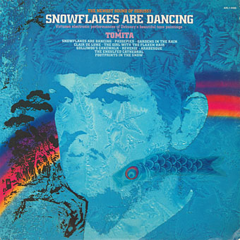
Snowflakes Are Dancing (1974); art direction; Joseph J. Stelmach; artwork: David B. Hecht.

The Japanese composer Isao Tomita died last week so I’ve been listening to some of his early recordings, and thinking—as usual—about their cover designs. Tomita was by far the best of the many electronic musicians in the 1970s who took advantage of the huge success of Wendy Carlos’s Switched-On Bach (1968) to create their own versions of classical music with Moog and other synthesisers. If this makes Tomita sound like an opportunist (and his 1972 collection of electronic pop covers was titled Switched On Hit & Rock), he quickly developed his own approach to electronic composition which ranged from quirky humour to his own brand of cosmic pictorialism. The latter was very different from the equally cosmic meanderings of Tangerine Dream which seldom strayed too far from the rock world. Tomita had a genius for taking very familiar pieces of classical music which he fashioned into synthesizer soundtracks for imaginary science-fiction films. (He also produced actual scores for a number of Japanese films but few, if any, of these were released outside Japan.) This approach is shown to great effect on The Bermuda Triangle (1979), an album that was subtitled “A Musical Fantasy Of Science Fiction”, and which filters Prokofiev and Sibelius through a library of crank paperbacks, with references to UFOs, undersea pyramids, Agharta, the Hollow Earth, Close Encounters of the Third Kind, and the Tunguska Event.

tomita02.jpg

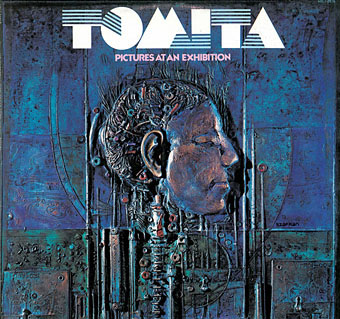
Pictures At An Exhibition (1975); artwork: bas-relief by Gene Szafran. The first appearance of the logo that became a fixture of Tomita’s albums. No designer is credited but I’d guess it was the work of Joseph J. Stelmach. The logo typeface is Sinaloa.

As for the covers, Tomita’s recordings may have been classical music but RCA targeted the albums at a rock audience so there’s no sign of the venerable composers heads that appear continually on the sleeves of orchestral recordings. The examples here are almost all the Western releases which, surprisingly, tended to have better covers than the Japanese originals. This is also a partial selection, favouring Tomita’s own releases (no soundtracks), and mostly the early albums. The later albums aren’t as impressive, and many of them were only released in Japan.

tomita03.jpg

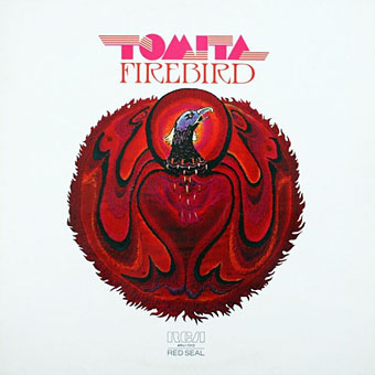
Firebird (1975). No design or art credit. I’d not noticed before that the logo evolves by degrees, here gaining some extensions.

Lastly, I’ll dedicate this post to my old friend Nik Green who died in March. Nik was a session musician of some note, and the first person I knew who owned a synthesizer (an ARP Odyssey). He was also a great Tomita enthusiast who shared Tomita’s sense of humour and relished the quirkier moments on many of these albums. I can’t listen to the opening of the Mars section of Tomita’s The Planets without remembering Nik shouting “That’s a Moog!” when a synthetic fanfare interrupts the sounds of a spacecraft lift-off.

Continue reading “Tomita album covers”

Weekend links 308

trochut.jpg

Frank Herbert’s Dune receives a new cover design by Alex Trochut together with other notable works of science fiction and fantasy for a new series from Penguin.

• “…poet, scholar and biographer Sandeep Parmar…has raised the possibility that a long poem by Hope Mirrlees, titled Paris and published by the Hogarth Press in 1919, was a strong influence on The Waste Land.” Alfred Corn on new TS Eliot scholarship.

• “[Evolution‘s] strain of body horror brings to mind an ethereal HP Lovecraft mixed with David Cronenberg.” Rachel Bowles talks to the film’s director, Lucile Hadžihalilović.

• Library music “is a sonic world of ‘weird beats, odd instrumentations, albums full of dark jazzy interludes or bizarre garage rock.'” Adrian Shaughnessy on innovation in banality.

Italy, which EM Forster called “the beautiful country where they say ‘yes’”, became another resort, especially the island of Capri, where a French poet staged a ceremonial flogging of his teenage Italian lover before the boy departed to do his military service and became the subject of a novel by his compatriot Roger Peyrefitte. In the Egyptian city of Alexandria, Forster observed the Greek poet Constantine Cavafy “standing absolutely motionless at a slight angle to the universe”, and the Australian novelist Patrick White met a local man who became his lifelong companion. For decades, the novelists Paul and Jane Bowles presided in Tangier, which Jack Kerouac was to call a “sinister international hive of queens”. William Burroughs arrived in 1954 with a teenage Spaniard named Kiki who, Woods writes, “was, famously, the boy who would blow smoke into his pubic hair and say ‘Abracadabra’ as his hardening cock emerged from the cloud”. Tangier was to figure in Burroughs’s novel Naked Lunch as a phantasmagoric, rubbery walled sex market called the Interzone.

Caleb Crain reviewing Homintern by Gregory Woods

• Beardsley biographer Matthew Sturgis reviews Aubrey Beardsley: A Catalogue Raisonné, a two-volume collection edited by Linda Gertner Zatlin.

• “He was the Bresson of Birkenhead.” Andrew Collins reviews the forthcoming collection of BBC dramas directed by Alan Clarke.

• “The postwar Hollywood western was more content to let strangeness be strange,” says Michael Newton.

• “Bosch’s work has always caused trouble for interpreters and critics,” says Morgan Meis.

Misplaced New York: a project by Anton Repponen and Jon Earle.

Wyrd Daze, Lvl2 Issue 6, is out, and as before is a free download.

Lessons we can learn from Robert Altman’s 3 Women.

• Mix of the week: FACT Mix 548 by Peder Mannerfelt.

Paris 1971 (1971) by Suzanne Ciani | Paris II (1987) by Jon Hassell | Dreaming Of Paris (2013) by Van Dyke Parks

Essex House book covers

essex01.jpg

I’ve known the name of American publisher Essex House for many years but the books they published, all of which appeared in a frenzy of activity from 1968 to 1969, have never been easy to find in the UK. The company is chiefly of note today for having three original Philip José Farmer novels on their list, all works of fantasy with the erotic side more dominant than in Farmer’s previous work. Erotic fiction with a generic slant was the Essex House speciality, and while the Farmer covers have appeared here before, I’d not seen any other Essex House covers until the discovery of this page which collects 38 of the 42 published titles.

essex13.jpg

It’s immediately evident looking down the list that the (uncredited) designer managed to forge a distinctive identity for the books at a time when any cover would suffice if the written material was sufficiently pornographic. Many of the covers borrow (or mutate) pre-existing artworks, while others emulate the watered-down psychedelic style that by the late 60s was visible everywhere in the US and much of Europe. These aren’t all great pieces of design but the graphics on erotic titles in the 60s either played safe by favouring text-only covers or sported technically crude emulations of paperback illustration. (For an example of just how technically crude, see this post about some of the many gay pulps on sale in the US.)

essex33.jpg

Essex House may not have been around for long but they seemed to be attempting something different, at least where the covers were concerned. I’ve only read the Farmer books so I can’t vouch for the other titles but the Encyclopedia of Science Fiction writes that

…about half the 42 titles published by Essex House were sf/fantasy; they included novels by Philip José Farmer, Richard E Geis, David Meltzer (perhaps the most distinguished), Michael Perkins and Hank Stine…of which a number were ambitious, some literary, and most somewhat joyless—even emetic—and redolent of 1960s radicalism.

Pornography as a tool of radical politics had a brief vogue in the late 60s and early 70s, something that’s particularly evident in the underground magazines of the period. The results may be “joyless” to some but then I find a lot of the alleged classics of science fiction joyless so it’s all a matter of taste. There was no equivalent of Essex House in the UK but in the 1970s France had the Chute Libre imprint which not only published all of the Essex House Farmer titles but did so with a collection of equally striking (or “joyless”) cover designs.

essex23.jpg

Artwork is a solarised version of Le Bout du monde (1949) by Leonor Fini.

Continue reading “Essex House book covers”

Weekend links 305

marchbank.jpg

Threads of Fate—The Weird Sisters from Macbeth (2013) by Fiona Marchbank.

• The week in books: Claire Cameron on the difference between US & UK cover designs | Jason Diamond asks “Why do cats love bookstores?” | Alan Moore’s cover art for his forthcoming novel, Jerusalem, has been revealed | Brian Phillips on the typefaces used by New English Library for their Dune covers in the 1970s.

• On writing: Poetry and horror “share a universally human quest toward intimacy” says Evan J. Peterson | “The best work neither shows nor tells: it says by being, not by saying,” says M. John Harrison.

• At the BFI this week: Where to begin with Jerzy Skolimowski, and 10 overlooked British horror films of the 1970s. Both lists include Skolimowski’s excellent The Shout (1978).

Cultures do not, and cannot, work through notions of ‘ownership’. The history of culture is the history of cultural appropriation—of cultures borrowing, stealing, changing, transforming.

Nor does preventing whites from wearing locks or practicing yoga challenge racism in any meaningful way. What the campaigns against cultural appropriation reveal is the disintegration of the meaning of ‘anti-racism’. Once it meant to struggle for equal treatment for all. Now it means defining the correct etiquette for a plural society. The campaign against cultural appropriation is about policing manners rather than transforming society.

Kenan Malik on ill-considered complaints against “cultural appropriation”. Malik isn’t the first to note the intersection of such complaints with those of white supremacists who also want cultural purity and segregation

OUT, DEMONS, OUT!: The 1967 Exorcism of the Pentagon and the Birth of Yippie! An oral history by Larry “Ratso” Sloman, Michael Simmons and Jay Babcock.

• The long-overdue republication of Moebius’s work in English will begin with a new edition of The World of Edena (1985).

• More from radioactive Russia: Nadav Kander’s photographs of Soviet nuclear test sites.

• Comic artist and illustrator Kris Guidio in conversation with Jonathan Barlow.

• Francesca Gavin meets Tadanori Yokoo, “the Grandmaster of Pop-Psych Art”.

• “LSD’s impact on the brain revealed in groundbreaking images”

• Mix of the week: Secret Thirteen Mix 182 by Paul Jebanasam.

• A trailer for Nicolas Winding Refn’s The Neon Demon.

• Tony Conrad: 1940–2016 by Geeta Dayal.

Brian Eno’s favourite records

Neonlicht (1994) by Mitja VS (with Enzo Fabiani Quartet) | On Demon Wings (2000) by Bohren & Der Club of Gore | Shout At The Devil (2002) by Jah Wobble & Temple Of Sound

Things to Come

thingstocome.jpg

Things to Come is a science fiction-themed art exhibition opening this week at the Petach Tikva Museum of Art, Israel. Among the works on display there will be a large print of the fish-shaped dirigible that I created for Jeff VanderMeer and SJ Chambers, editors of The Steampunk Bible, back in 2010. After publication I reworked the picture slightly, adding a frame and trying out various tints, the idea being to produce a large version for print sales. I still haven’t got round to making prints available but I did let the museum have a copy of the framed version so its appearance at Petach Tikva is a first.

airfish.jpg

My thanks to Doreet LeVitte Harten for selecting this piece, and to Avshalom Suliman for dealing with the printing and other details. The exhibition runs to 20th August, 2016.

Previously on { feuilleton }
Steampunk in the Tank