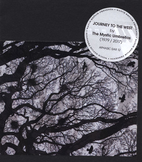
A pair of albums by friends of mine are released this month: the first, Journey to the West (1979–2017) by Watch Repair presents The Mystic Umbrellas, has been gestating for several years; the second, Dreaming Dangerous Rainbows by Albatross Project, came together very quickly earlier this year after song sketches led to an album that none of the participants had originally planned. I designed both releases so I have more than a passing interest.
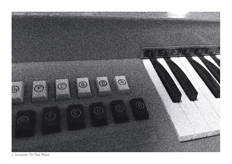
The Mystic Umbrellas project will probably be of most interest to regular readers since it evolved from a couple of very minimal organ recordings made in 1979 by Mark Valentine. Mark is well-known today as a writer of weird fiction, and also an editor and publisher of the same, but in the early 1980s he was involved briefly with the British wing of the independent cassette scene, a micro-budget offshoot of the post-punk DIY ethos which spurred many amateur (or non-) musicians to create and release their own musical works on limited-edition cassettes. The UK manifestation of this scene tended either to imitate higher profile post-punk artists (some of the better examples may be heard on the recent Cherry Red compilation, Close To The Noise Floor) or indulge in a very British form of what might be called Low Surrealism, although “absurdity” is probably a more accurate definition. (A UK label of the time was even named Absurd Records.)
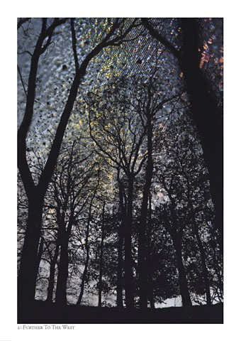
Photocard by Deborah Judd.
Mark’s Mystic Umbrellas pieces—Journey To The West, Radio Dromedary (a short-wave radio capture) and Rainsborough’s Grave 1 & 2—were released on separate cassette compilations, Deleted Funtime (1980) and National Grid (1981). My friend in Watch Repair (who is happy to remain otherwise anonymous) bought both cassettes, and marked out the Mystic Umbrellas pieces as favourites for their qualities of melancholy and restraint; the organ recordings were very different from the post-punk fumblings or the absurdity in evidence elsewhere. The cassettes sat in a box for years until the same friend decided to try using them as source material for some of his sound processing experiments; these experiments eventually yielded a suite of marvellously atmospheric extensions/transmutations which mutate the recordings beyond recognition but which remain faithful to the haunting qualities of the originals. The precedence for this kind of repurposing would include Jon Hassell’s Magic Realism (1983) and some of the recent works of Thomas Köner, but Mystic Umbrellas and Watch Repair are in a territory of their own.
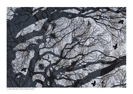
Photocard by Deborah Judd.
While working on the design for this release I kept ruminating on the curious net of connection and coincidence around these recordings. After buying the Deleted Funtime cassette my Watch Repair friend contacted one of the other artists, “Stabmental”, to ask about similar recordings. Stabmental was a name used by Geoff Rushton for his post-Throbbing Gristle musical experiments and an Industrial music fanzine; a couple of years later he joined Psychic TV and changed his name to John Balance. Geoff/John was later in Coil, of course, and a decade after this was in correspondence with me having been greatly impressed with my Lovecraft art in The Starry Wisdom anthology. My earlier Lovecraft story, The Haunter of the Dark, had been published in a large-format edition in 1988 by Caermaen Books, an imprint run by a pair of Arthur Machen enthusiasts, Roger Dobson and Mark Valentine. It was shortly after my first meeting with Mark and Roger that my Watch Repair friend realised that Mark must be the Mystic Umbrellas person so the Lovecraft artwork helped remind us of the Deleted Funtime cassette. The same cassette surfaced again a few years ago when it was sold to an obsessive Coil collector who wanted it for the Stabmental piece. That sale led to the cassette being digitised before it was let go, and the digitisation process led to these recordings.
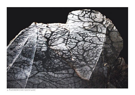
Photocard by Deborah Judd.
Things got even more tangled earlier this year when I was working on the final layout while also reading the expanded edition of England’s Hidden Reverse, David Keenan’s fascinating history of Coil, Current 93 and Nurse With Wound. Keenan discusses the independent cassette scene (and mentions Stabmental) so all the above was circling in my head once more; but I really wasn’t expecting the instance when Keenan goes into David Tibet’s enthusiasm for Arthur Machen by including a page of explanation from a Machen expert…Mark Valentine. In Mark’s notes for the Watch Repair release he describes the origin of the Mystic Umbrellas name which came about during a rainy day-trip to Glastonbury. Somerset’s most mystical town includes Chalice Well among its complement of New Age tourist traps; shortly after finishing England’s Hidden Reverse I was re-reading a typically wild interview with Alejandro Jodorowsky in which he proposes that the humble umbrella is in fact a black chalice, and that the knights of the Round Table are searching for a Holy Grail that’s actually an umbrella. A mystic umbrella, in other words. Elsewhere in the same interview he expounds on the symbolism of the Black Sun, a favourite symbol of Coil’s. (And Coil for a short while had a Chalice record label…) By this point I’d ceased to be surprised, the endless chain of connections seemed inevitable.
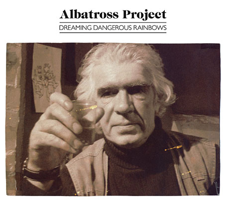
After all the above the album by Albatross Project risks seeming a little mundane, although grounded (one meaning of “mundane”) would be better. The origin this time was a series of poems written by Roger (that’s him on the cover) from 1972 to 1986. These were set to music by Dan of Warper’s Moss and Watch Repair. (Nobody in this group is offering their surnames so you’ll have to accept the circumspection.) Everyone involved was surprised by the quality of the resulting songs, not least Roger who wrote the words sporadically while travelling the world in his youth. Dan and friends have been writing songs and playing in bands since the 1980s which is why they were able to produce such an accomplished album in a matter of months. Musically, this is quite straightforward: well-crafted songs in a rock idiom which had me thinking at times of Pink Floyd circa 1972 (fitting since several of the musicians are from the Floyd-worshipping environs of Merseyside). But it also owes something to the Elektra years of the early 70s (as does my design), and the period flavour harks back to the time and experiences that Roger was writing about.
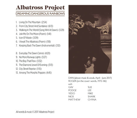
Both albums are available via Bandcamp. The hard format of Dreaming Dangerous Rainbows is a CD-R in a jewel case while the Mystic Umbrellas hard format is a lavish hand-crafted package that includes copious notes and four art cards, three of which feature Deborah Judd’s evocative photo montages. The latter package will be strictly limited. Original copies of the Deleted Funtime cassette command high prices among Coil collectors but the curious (or foolhardy) may download a copy at Die or DIY?
Previously on { feuilleton }
• The Polarities by Watch Repair
• Seven Harps by Warper’s Moss
• The Tidal Path by Watch Repair
• Watch Repair