Snowbound by Bram Stoker

snowbound00.jpg

The artwork is mine; the cover design is by Lookatcia.

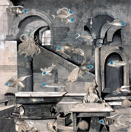
Presenting my latest book for Alma, the Spanish publisher for whom I’ve illustrated several classic novels and story collections. The new volume is my second Bram Stoker title after Dracula in 2018 which, for the sake of convenience, I’ll refer to it by its English title. Snowbound: The Record of a Theatrical Touring Party was a collection of connected stories first published in 1908, 11 years after Dracula had established Stoker’s reputation. I wouldn’t call Snowbound a bad book but if you’ve read Dracula or Stoker’s more popular short stories it’s a disappointment, with no supernatural content and little to recommend it elsewhere. The first episode introduces the framing device: a group of travelling players are marooned by heavy snow while travelling on a train through the wilds of Scotland. To pass a dark and freezing night the troupe entertain themselves by relating memorable anecdotes from their careers, anecdotes which I imagine Stoker either heard from others or experienced himself during his years working for actor-manager Henry Irving. In place of the spooky tales one might expect from such a premise we’re offered a succession of vaguely comic episodes mixed with more serious drama, with a couple of the pieces being related in very broad “Oirish” and Cockney accents. The Irish episode is especially bizarre considering that Stoker was Irish himself; it reads like the kind of thing you’d get from an English writer trotting out lazy stereotypes.

endpapers.jpg

My endpapers design.

There are other flaws I could mention but I’ve undersold the book enough as it is. Snowbound has never received much attention in the past, it wasn’t even reprinted in English until 2000. In my previous books for Alma I utilised a style which combined collaged backgrounds with hand-drawn elements in order to create illustrations whose engraved appearance made them seem like products of the period in which the stories were written. More recently I’ve been moving away from this style but the success of the previous Alma editions, Frankenstein in particular, obliged me to maintain some continuity with the look I’d created for Dracula. As it turned out, several of the Snowbound illustrations are entirely hand-drawn, with engraving-like textures used in the shading. The biggest departure from the previous books is the addition of an extra ink colour to the artwork, an effect that was fun to play with when creating different lighting effects. As to the pictorial details, several of the anedotes take place in the United States, hence the presence of an American steam train with an elevated smokestack, the spelling of the word “theater” on a poster, and so on.

snowbound01.jpg

Having mentioned Frankenstein I ought to also mention the recent Polish edition of the novel which reprints my Alma illustrations. This is a large-format hardback from Materia, a pubisher who don’t seem to have a proper web presence outside those Meta plague sites that I never link to. The book is on sale anyway. Meanwhile, I’m currently working on another new book for Alma which will feature ten full-colour double-page illustrations. More about this later.

snowbound02.jpg

snowbound03.jpg

snowbound04.jpg

Continue reading “Snowbound by Bram Stoker”

Christian Waller’s The Great Breath

waller09.jpg

In last week’s anniversary post I threw some barbs at social media to which this piece might act as a riposte; the poisoned waterholes still have their uses. A link on Bluesky to a book by James Hume-Cook, Australian Fairy Tales (1925), had me looking for more information about the book’s illustrator, Christian Yandell (1894–1954), an Australian artist whose illustrations are as good as those being produced in Britain or America at the height of the boom in illustrated books. Ms Yandell is better known today under her married name, Christian Waller. In addition to working as an illustrator she was a printmaker and stained-glass artist. She was also another early 20th-century artist whose work reflects an interest in Theosophy, most notably in a print series from 1932 which she titled The Great Breath.

The production of The Great Breath was entirely undertaken by Waller; all aspects from the cutting and printing of the linoblocks to the manufacture of the distinctive gold-painted emerald green cover was done by hand. She printed the blocks on her 1849 hand-press in her studio at Ivanhoe, each book taking about four days to make, hand-bound with green cord. Although it was intended to produce an edition of 150, it seems only about 30 were made, with some unbound impressions extant, usually untrimmed. Each consisted of a title page, colophon, contents page and seven linocut designs. The images were printed in solid black on white translucent tracing paper, trimmed and tipped onto the cream pages. The books were not numbered sequentially, but rather in relation to the numerology of the buyer.

waller08.jpg

The bound collection comprises seven prints plus an eighth plate presenting vague clues about the meaning of the series and some of the symbolism in the imagery. The prints themselves are in a bolder style than Waller’s storybook illustrations, resembling templates for stained-glass designs. What “The Great Breath” refers to isn’t explained at all, I’d guess you had to be a reader of Madame Blavatsky’s magnum opus, The Secret Doctrine, to be sufficiently enlightened. The explanatory plate features Blavatsky-derived concepts such as “Root Races” and “the World Cycle”, along with references to Atlantis, Hyperborea and Lemuria. The Secret Doctrine incorporates the alleged histories of these lost continents into its collage of myth, religion and mysticism, as a result of which Madame Blavatsky is almost solely responsible for the legend of Atlantis migrating from books of archaeological speculation and pseudo-history to the more rarified realms of occultism. You can trace a thread of Atlantis references from Theosophy to The Golden Dawn, and on into the 20th century, through weird fiction to the crank shelves, where the submerged continent may be found among all the flying saucers, pyramidology and “ancient astronauts”. Since Theosophy has few adherents today it might be said that the elevation of Atlantis to a mystical plane was Blavatsky’s most substantial legacy, if it wasn’t for all the artists who fed off the soup of borrowed ideas in The Secret Doctrine to elevate work of their own. I continue to believe, semi-mischievously, that Theosophy ought to be recognised as the primary force behind the development of abstract art, so many important artists (Hilma af Klint, Kandinsky, Mondrian) were inspired by Blavatsky’s writings. “Inspire” is apt in this context, being derived from Latin and Greek words meaning “to breathe”. Maybe the significance of Waller’s title isn’t so hard to divine after all.

waller01.jpg

Continue reading “Christian Waller’s The Great Breath”

Weekend links 816

rossignol.jpg

The Creative Power of the Spirit, No. 31 of A Goodly Company series, 1920–1933 by Ethel le Rossignol.

• “One moment it was a little blip. The next, our friends are dying”: the gay porn soundtrack composers lost to the Aids crisis. More gay porn: Pink Narcissus, James Bidgood’s micro-budget homoerotic fantasy, will receive a UK blu-ray release later this year.

• Old music: Thirst by Clock DVA gets a very welcome reissue later this year, having been unavailable in any form since 1992. I’m not so happy about the changes to Neville Brody’s original cover design but the album itself is a major post-punk statement.

• “Graphic design was thought to be a man’s discipline,” she says. “So I think it was quite a surprise for people to find me there.” A profile of Margaret Calvert, designer of (among other things) Britain’s road signs.

• At Colossal: A major survey in Paris chronicles Leonora Carrington’s esoteric Surrealism.

• At Public Domain Review: Sara Weiss’ Journeys to the Planet Mars (1903).

• At the BFI: The mystery music video for The Beatles’ Penny Lane.

Winners and entrants for Close-up Photographer of the Year 7.

• “Cats to blame for octopus deity enshrinement delay.”

• Steven Heller’s font of the month is Cattivo.

• At Dennis Cooper’s it’s Jack Arnold’s Day.

Pink Noir (1996) by David Toop | Pink Dust (2013) by Sqürl | The Pink Room 2 (2024) by Seigen Ono

Weekend links 815

hawksmoor.jpg

A photograph by FR Yerbury of St George’s-in-the-East, London. From Nicholas Hawksmoor (1924) by HS Goodhart-Rendel.

• “Sixty years later, the Spectacle saturates us in ways the Situationists never imagined. Online platforms structure our personal relationships; algorithms nudge us toward the platform owners’ preferred choices. ‘Intelligence’ is embedded into everything from our phones to our kitchen appliances. But back in the Sixties, the Situationists saw the physical environment of the city as an expression of the mass society created by consumerism and governed by the Spectacle, and they felt power closing in around them: ‘All space is occupied by the enemy. We are living under a permanent curfew. Not just the cops—the geometry.'” Hari Kunzru takes a psychogeographical dérive through the streets of London, encompassing the Hawksmoor churches, Iain Sinclair’s own peregrinations, Alan Moore’s Sinclair-influenced script for From Hell, Arthur Machen and more. (No mention of Alan’s ongoing Long London series, however, the first book of which is a deep dive into Machen territory.) Kunzru could be accused of being 30 years too late with his piece but for younger readers and many Americans these paths are worth retracing.

Enemies from Venus!: “The only surviving fragment of a Dutch science fiction series for children from the mid-sixties (that never was).” CGI animation by Ernst-Jan van Melle in the style of black-and-white puppet shows like Fireball XL5, Space Patrol, etc.

• “If this is a horror story, it’s a horror story about being desperate for love, and about the vulnerability, loneliness, and difficulty in understanding other people that might drive this state.” Olivia Laing on Jonathan Glazer’s second feature film, Birth.

• At the BFI: Rory Doherty selects 10 great British heist films.

• At The Daily Heller: Posting Posters about Fellini.

• RIP Sly Dunbar; James Sallis; Catherine O’Hara.

• At Dennis Cooper’s it’s Peter Whitehead’s Day.

• The Strange World of…Toumani Diabaté.

• New music: Errata by WF 98.

Birth (1971) by Keith Jarrett | Birth (1995) by Howie B | Birth (2013) by Roly Porter

Beautiful and macabre: two books from Century Guild

posters.jpg

Arriving in the mail last week, a pair of beautifully-produced volumes which Thomas Negovan very generously sent to me. Negovan’s Century Guild publishes the kind of art I’ve been writing about here for the past twenty years: Symbolist painting, Art Nouveau graphics, Decadent illustration and more. There’s some intersection between the publisher’s backlist and earlier titles from Dover Publications, but where Dover have mostly concentrated on mass-produced paperbacks Century Guild deploy the full range of finishings available to a publisher of high-quality art books: foil embossing, faux leather finishes, spot-varnished boards, edges sprayed in metallic ink, and ribbon place-markers. Beautiful Macabre is Negovan’s own selection of rare poster art from 1868 to 1981, rare enough for most of the material to be new to me: theatre posters, Expressionist film posters, exhibition posters, etc, with an emphasis on Decadence through the ages. This is another of those books that show how the morbid preoccupations of the 1890s became codified in the 20th century into generic horror.

seder.jpg

Cover design by Jack Hargreaves.

The Anton Seder book is a more singular study, reprinting the intricate plates from Das Thier in der Decorativen Kunst (The Animal in Decorative Art) and Moderne Malereien, a collection of Seder’s interior designs in the Art Nouveau style. Seder’s book of animal designs has its own Dover reprint (which may explain how Murray Tinkelman was able to incorporate some of the creatures into his Lovecraftian cover art) but the Century Guild collection includes much more than this, with biographical notes, and pages that place Seder’s books in the context of previous guides and templates for use by artists and craftspeople. This type of book was a common thing around 1900 (Alphonse Mucha produced three of them), while similar examples abound in previous centuries. The fragmentation of art and craft in the 20th century, and the turn against exuberant decoration, put an end to a form whose spirit survives today in reprints such as this. And it happens to have arrived at a time when its contents will be very useful reference for my current commission. Thanks, Thomas!

Previously on { feuilleton }
Eldritch Art Nouveau: Lovecraft at Ballantine
Moderne Malereien, 1903
Das Thier in der Decorativen Kunst