Lovecraft’s Monsters

Lovecraft's Monsters

Graphic for the title page and ends of chapters.

I don’t usually post things so far away from publication, but editor Ellen Datlow put these pictures on her Facebook page a few hours ago so I may as well do the same here.

Back in February I bought a Wacom Intuos drawing tablet, something I’ve been using with regularity for the past few months. The Alas Vegas Tarot cards I designed in the summer were the first major attempt at getting used to working with it; Lovecraft’s Monsters, a forthcoming fiction anthology for Tachyon is the second, and I now feel very comfortable working with it. More than that, I’m increasingly pleased with the way it’s possible to combine the drawing techniques I’ve been using for years with the additional possibilities provided by working in Photoshop. As always, it’s the end result that counts but arriving at an end result can be easy or difficult. Some of these illustrations look no different than they would have done had I used ink on paper but they took half the time to create, a considerable benefit when a deadline is looming.

The stories Ellen Datlow has chosen for this collection all present different aspects of monstrosity seen through the lens of Lovecraft’s fiction and his cosmic menagerie. Some are full-on extensions of the Mythos, others are more allusive; all the pieces bar one have been published before but I’d not read any of them so for me this was fresh material. Having spent the past few years saying I was finished with Lovecraft’s fiction I was excited to be working on this book. The stories are good, and I welcomed the challenge of having to illustrate such a variety of material.

Larger copies of all the pictures can be seen here.

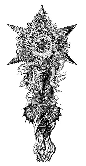
The star-headed thing at the top of this page is another amalgam of elements plundered from Haeckel’s Kunstformen der Natur and other sources. I’ve leaned rather heavily on Haeckel in the past, something I wanted to avoid here; this serves as a kind of visual punctuation separating the stories.
Lovecraft's Monsters

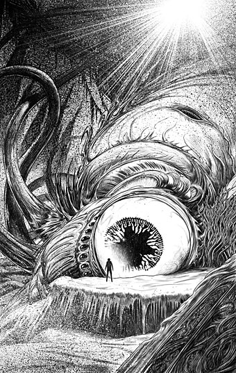
Cthulhu.

The drawing I’ve called Cthulhu is a piece for the introductory pages. Having already produced a lot of Cthulhoid art I didn’t want to repeat myself. The initial idea was of a tiny human figure faced with something enormous and nightmarish; that could be a vast eyeball or it could be a mouth or some other organ/aperture, the vagueness was intentional. Lovecraft continually impresses upon his readers how difficult things are to describe or apprehend but you seldom find this quality in art based upon his stories. Cthulhu especially has devolved into little more than an outsize man-in-a-rubber-suit à la the Creature from the Black Lagoon. In The Call of Cthulhu the figure on the mysterious statuette is described as having a humanoid shape but Lovecraft doesn’t describe the appalling reality in any detail at all. When Cthulhu is struck by a ship at the end of the story it breaks apart and is then seen recombining, the implication being that the creature is corporeally amorphous.
Lovecraft's Monsters

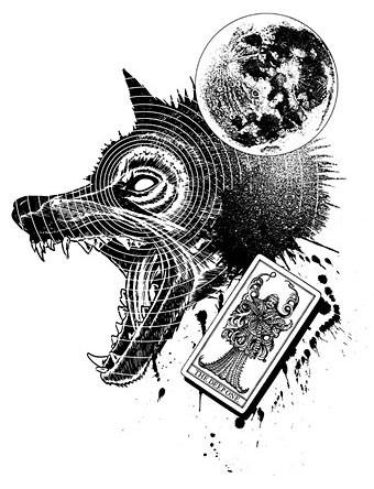
Only the End of the World Again by Neil Gaiman.

Neil Gaiman’s entry concerns a werewolf private detective in Innsmouth. Lovecraft’s decaying fishing village and its inhabitants turn up in several of the stories so care was taken to avoid repetition.
Lovecraft's Monsters

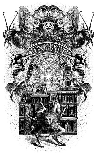
Bulldozer by Laird Barron.

A great story about another detective, a Pinkerton agent this time, hunting his quarry through the Old West. Collin de Plancy’s Dictionnaire Infernal is mentioned so I used some of Louis Breton’s illustrations from the third edition.
Continue reading “Lovecraft’s Monsters”

Martin Sharp, 1942–2013

sharp1.jpg

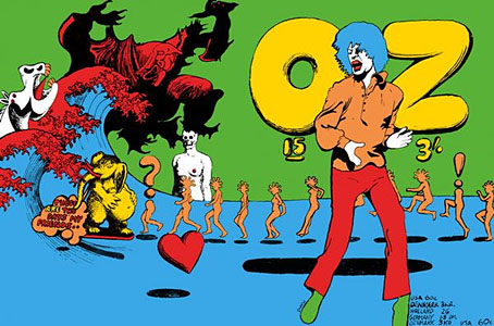
Oz magazine no. 15, October 1968.

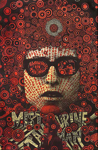
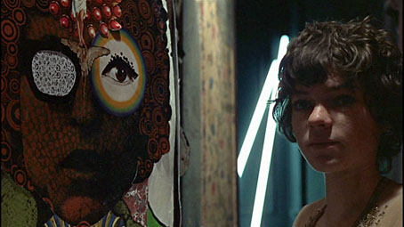
The psychedelic art of Australian artist Martin Sharp has featured here on several occasions. Unlike his British and American contemporaries who maintained a single graphic style, Sharp was a versatile artist whose work could range from loose, often cartoony drawing and painting to very detailed collage designs; he was also as happy as any other artist of the period to plunder art history, as the cover for issue 15 of Oz demonstrates. The Mick Jagger figure from that cover was later reworked as a poster for “Turner’s Purple Orchestra”, one of a number of pieces of Sharp art which can be glimpsed throughout Donald Cammell & Nicolas Roeg’s Performance (1970).

sharp7.jpg

Performance (1970): Michele Breton and a Martin Sharp collage.

Sharp’s involvement with Oz magazine, and the creation of a handful of endlessly reproduced designs—the Bob Dylan Mr Tambourine Man poster, Jimi Hendrix in a Jackson Pollock explosion, the sleeve art for Cream’s Disraeli Gears—makes his art some of the most visible of the period. People may not necessarily know the name but they’ll recognise the work.

In 2009 Sharp’s Oz colleague Germaine Greer wrote a warm appraisal of the artist and his work. A few more examples follow. There’s a great selection of posters and other art and design here.

The GuardianMartin Sharp, Australian artist who came to symbolise the ’60s | Martin Sharp in pictures

sharp2.jpg

Mister Tambourine Man (1966).

Continue reading “Martin Sharp, 1942–2013”

Weekend links 188

blackwell.jpg

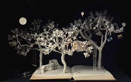
The Baron in the Trees (2011), a book-cut sculpture by Su Blackwell.

Kurt Andersen at Vanity Fair examines the latest claims that Vermeer used a combination of lenses and mirrors to aid the creation of his remarkable paintings. David Hockney caused a considerable fuss in 2006 when he made similar assertions. Andersen recounts how Tim Jenison (who isn’t an artist) decided to test the hypothesis by building a replica of the room from Vermeer’s The Music Lesson (1662–65) which he then painted with the assistance of a lens-and-mirror apparatus. I’m agnostic on this issue, and don’t regard it as a devaluing of the work of Vermeer (or any other artist) if some special apparatus was used to help create the paintings; artists for centuries have been using whatever technology was available.

One point which isn’t mentioned in the article: lens optics were being developed to a high standard in the Netherlands during Vermeer’s time. One of the developers of the microscope, Antonie van Leeuwenhoek, was a contemporary of Vermeer’s in Delft, and is even alleged to be portrayed in some of the artist’s paintings.

• Before Alfred Hitchcock’s film and Daphne Du Maurier’s short story, The Birds was an “eerie yet satirical and rather metaphysical novel” by Frank Baker, inspired in part by Arthur Machen. Michael Dirda reviews a new edition. Related: “The Day of the Claw: A Synoptic Account of Alfred Hitchcock’s The Birds“, an essay by Ken Mogg examining avian menace through the ages.

Kevin Brownlow and Carl Davis on how they brought Abel Gance’s 270-minute silent masterwork, Napoleon (1927), back to the screen.

Finally, he was asked about the growth of surveillance and the militarization of the police.

“The phenomenon itself shouldn’t be surprising—the scale was surprising—but the phenomenon itself is as American as apple pie,” Chomsky said. “You can be confident that any system of power is going to use technology against its enemy: the population. Power systems seek short-term domination and control, not security.”

Matthew Robare on “American Anarchist” Noam Chomsky in (of all places) The American Conservative.

• “Why the hell wouldn’t I?” Evan J. Peterson on reading/performing his poetry in public, and his new book, The Midnight Channel.

The adversaria of Google Books: captured mark of the hand and digitization as rephotography.

• No surprise that the rabies-haunted town of Scarfolk is soon to have its history fixed in print.

Mazzy Star made a rare TV appearance last week, playing a song from their recent album.

The Sorcerer Blog is obsessively devoted to William Friedkin’s cult film.

• Unexpected Artefacts: Pushing the envelope with Bristol’s Emptyset.

• Mix of the week: Secret Thirteen Mix 097 by Lee Gamble.

• At PingMag: Ryokudo—Tokyo’s Green Roads.

Norman Records’ Top 50 albums of 2013.

Birds Of Fire (1973) by Mahavishnu Orchestra | Attack Of The Killer Birds (2006) by Émilie Simon | One Thousand Birds (2012) by Six Organs of Admittance

Koloman Moser bookplates

moser3.jpg

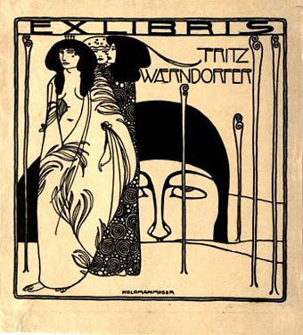
Ex libris Fritz Waerndorfer (1903).

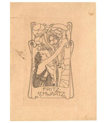
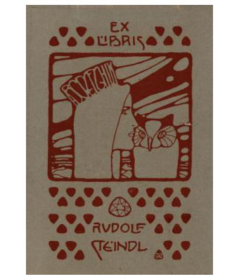
I could happily post things by the indefatigable Koloman Moser (1868–1918) all the time but he’s not exactly an unknown figure even if his work does get overshadowed by his colleague in the Vienna Secession, Gustav Klimt. This handful of ex libris plates almost all date from the Secession period, and include one for Adele Bloch-Bauer, a woman whose name is familiar these days for her being the subject of a very well-known Klimt portrait.

moser7.jpg

Ex libris Fritz Schwartz (1900).

moser6.jpg

Ex libris Rudolf Steindl (1900).

Continue reading “Koloman Moser bookplates”

Bookmark: Mervyn Peake

peake1.jpg

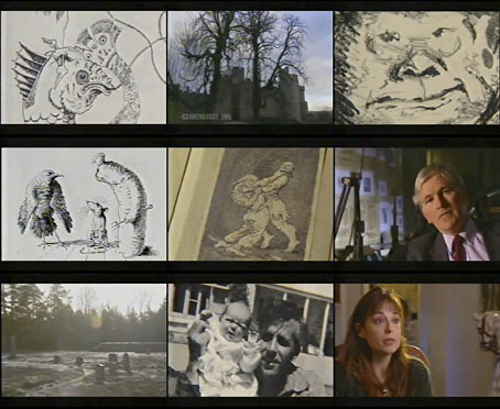
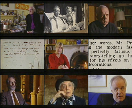
Another not-so-old TV documentary. It’s good to keep finding these as I have no means at the moment of viewing all the video tapes I’ve kept. Bookmark is (or was) a BBC series about the lives of various writers. This edition concerns author and artist Mervyn Peake, and was broadcast in 1998, shortly before the BBC screened their flawed dramatisation of the Gormenghast books.

Peake’s three children—Sebastian, Fabian and Clare—all recall life with their father, while other contributors, Quentin Crisp among them, discuss his work, his experiences during the Second World War, and life on the island of Sark. The narrator is Julian Glover, and the readings are by Simon Russell Beale. The catastrophic collapse of Peake’s health that occurred when he’d barely reached middle age means a journey through his biography is always a sombre business, but it does make the scale of his achievements seem all the more remarkable. The film is 48-minutes long, and may be viewed here.

peake2.jpg

Previously on { feuilleton }
The Web by Joan Ashworth
Peake’s glassblowers
Mervyn Peake in Coronation Street
The Worlds of Mervyn Peake
A profusion of Peake
Mervyn Peake at Maison d’Ailleurs
Peake’s Pan
Buccaneers #1
Mervyn Peake in Lilliput
The Illustrators of Alice