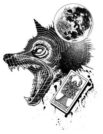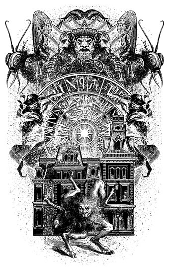
The King in Green

hastur.jpg

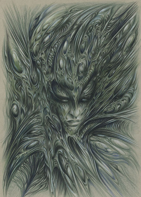
Hastur (1999) by John Coulthart.

Going through some of my old Lovecraft art this week it occurred to me that this drawing hadn’t been made public in its original colour form. Hastur appears as a murkier black-and-white illustration in the Great Old Ones series I produced in collaboration with Alan Moore for The Haunter of the Dark. The drawing was one of several improvised pieces made using coloured pencils on tinted paper. Some people may regard this and similar works as “Gigeresque” but I only apply that label to close imitations of HR Giger’s biomechanical style. This type of improvised drawing or painting predates Giger—Max Ernst’s decalcomania paintings being familiar examples—and you see similar fields of organic or mineral forms in the work of other Surrealist or Fantastic artists. If you have some ability with a pencil or paintbrush it’s relatively easy to produce a lot of this kind of work; the challenge is to do something more than create a mass of writhing abstraction.

Elsewhere on { feuilleton }
The Lovecraft archive

In the Key of Yellow

td1.jpg

My Easter weekend was profitably spent watching True Detective again, a series I enjoyed even more the second time around. For the past year I’ve been pondering off and on the connections the series makes with the suite of weird tales that Robert Chambers published in 1895 as The King in Yellow, and also the relationship between Chambers’ book and the chromatic preoccupations of the 1890s. The influence of Chambers on later writers such as HP Lovecraft is well established; this post traces some of the less obvious connections and correspondences.


1: À Rebours (1884) by JK Huysmans
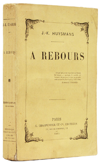
huysmans.jpg

It begins, as many things do, with the bible of the Decadence. Neither Huysmans’ novel nor its dissipated central character, Des Esseintes, have much to say about the colour yellow but the first edition came packaged in a yellow wrapper, a common feature of French novels of the period. This detail is significant in light of the following connection.


2: The Picture of Dorian Gray (1890) by Oscar Wilde
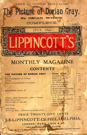
lippincott.jpg

The decade that came to be called the Yellow Nineties opened with the publication of Oscar Wilde’s only novel. The influence of À Rebours may be felt most strongly in the chapters where Dorian indulges his senses and a passion for precious stones. Then there’s this famous section describing the unnamed novel that Lord Henry gives him to read:

His eye fell on the yellow book that Lord Henry had sent him. What was it, he wondered. He went towards the little, pearl-coloured octagonal stand that had always looked to him like the work of some strange Egyptian bees that wrought in silver, and taking up the volume, flung himself into an arm-chair and began to turn over the leaves. After a few minutes he became absorbed. It was the strangest book that he had ever read. It seemed to him that in exquisite raiment, and to the delicate sound of flutes, the sins of the world were passing in dumb show before him. Things that he had dimly dreamed of were suddenly made real to him. Things of which he had never dreamed were gradually revealed.

It was a novel without a plot and with only one character, being, indeed, simply a psychological study of a certain young Parisian who spent his life trying to realize in the nineteenth century all the passions and modes of thought that belonged to every century except his own, and to sum up, as it were, in himself the various moods through which the world-spirit had ever passed, loving for their mere artificiality those renunciations that men have unwisely called virtue, as much as those natural rebellions that wise men still call sin. The style in which it was written was that curious jewelled style, vivid and obscure at once, full of argot and of archaisms, of technical expressions and of elaborate paraphrases, that characterizes the work of some of the finest artists of the French school of Symbolistes. There were in it metaphors as monstrous as orchids and as subtle in colour. The life of the senses was described in the terms of mystical philosophy. One hardly knew at times whether one was reading the spiritual ecstasies of some mediaeval saint or the morbid confessions of a modern sinner. It was a poisonous book. The heavy odour of incense seemed to cling about its pages and to trouble the brain. The mere cadence of the sentences, the subtle monotony of their music, so full as it was of complex refrains and movements elaborately repeated, produced in the mind of the lad, as he passed from chapter to chapter, a form of reverie, a malady of dreaming, that made him unconscious of the falling day and creeping shadows.

Two things are connected here that coalesce in Chambers’ stories: the colour yellow, and the idea of “a poisonous book”, compellingly readable and thrilling in its capacity to corrupt. The “repairer of reputations” in Chambers’ story of the same name (the first in the King in Yellow cycle) also happens to be a Mr Wilde. Yellow is still only a detail at this point, but not for long.


3: The Yellow Book (1894)
yellowbook.jpg

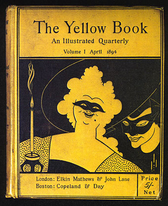
Cover design by Aubrey Beardsley. The second story in Chambers’ King in Yellow cycle is The Mask.

John Lane’s quarterly periodical almost lived up to its sensational reputation for the first year of its publication, a reputation derived in part from its implied association with scandalous French literature. Aubrey Beardsley was the art editor, and was well aware of these associations. The sight of his bold drawings on bright yellow covers was a shock to many Victorian readers even if the literary contents were more restrained. When Oscar Wilde was arrested in 1895 he was described by the newspapers as carrying “a yellow book”; many readers took this to refer to the yellow book, and there were protests at the publisher’s door. Guilt by unwholesome association led to the dismissal of Beardsley even though he and Wilde had never been close.


4: The King in Yellow (1895) by Robert W. Chambers
chambers.jpg

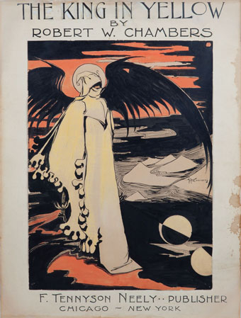
Chambers’ own design for the cover of his story collection.

Of the four stories that comprise the King in Yellow cycle, three concern some form of artistic activity. Prior to writing the stories Chambers had been studying and working as an artist in Paris, an experience that supplies the background to the third tale, In the Court of the Dragon. As an illustrator for Vogue and Life in the 1890s Chambers could hardly have been unaware of the fashion for yellow, especially when the colour is a feature not only of the title of the “poisonous” play and its central character, but is also central to the fourth story in the cycle, The Yellow Sign:

We had been speaking for some time in a dull monotonous strain before I realized that we were discussing The King in Yellow. Oh the sin of writing such words,—words which are clear as crystal, limpid and musical as bubbling springs, words which sparkle and glow like the poisoned diamonds of the Medicis! Oh the wickedness, the hopeless damnation of a soul who could fascinate and paralyze human creatures with such words,—words understood by the ignorant and wise alike, words which are more precious than jewels, more soothing than music, more awful than death!

In Chambers’ novel, The Common Law (1911), a disapproving description of an art club shows his familiarity with the avant-garde personalities of the Yellow Nineties:

A near-sighted study of various masters, brilliant, morbid, or essentially rotten, was the basis of this cult—not originality. Its devotees were the devotees of Richard Strauss, of Huysmans, of Manet, of Degas, Rops, Louis Le Grand, Forain, Monticelli…


5: The Boom in Yellow (1896) by Richard le Galliene
hardy.jpg

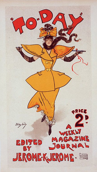
The Yellow Girl (c. 1895) by Dudley Hardy.

Richard le Galliene’s “prose fancy” describes at some length the colour of the decade:

Yellow is becoming more and more dominant in decoration—in wall-papers, and flowers cultivated with decorative intention, such as chrysanthemums. And one can easily understand why: seeing that, after white, yellow reflects more light than any other colour, and thus ministers to the growing preference for light and joyous rooms. A few yellow chrysanthemums will make a small room look twice its size, and when the sun comes out upon a yellow wall-paper the whole room seems suddenly to expand, to open like a flower. When it falls upon the pot of yellow chrysanthemums, and sets them ablaze, it seems as though one had an angel in the room. Bill-posters are beginning to discover the attractive qualities of the colour. Who can ever forget meeting for the first time upon a hoarding Mr. Dudley Hardy’s wonderful Yellow Girl, the pretty advance-guard of To-Day? But I suppose the honour of the discovery of the colour for advertising purposes rests with Mr. Colman; though its recent boom comes from the publishers, and particularly from the Bodley Head. The Yellow Book with any other colour would hardly have sold as well—the first private edition of Mr. Arthur Benson’s poems, by the way, came caparisoned in yellow, and with the identical name, Le Cahier Jaune; and no doubt it was largely its title that made the success of The Yellow Aster. In literature, indeed, yellow has long been the colour of romance. The word ‘yellow-back’ witnesses its close association with fiction; and in France, as we know, it is the all but universal custom to bind books in yellow paper. Mr. Heinemann and Mr. Unwin have endeavoured to naturalise the custom here; but, though in cloth yellow has emphatically ‘caught on,’ in paper it still hangs fire.


6: Il Giallo Mondadori (1929)
giallo.jpg

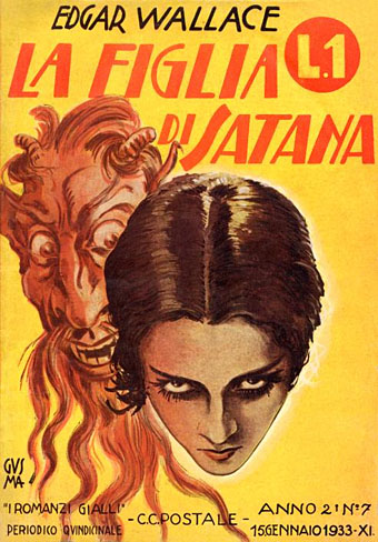
La Figlia di Satana (1933), an Italian edition of an Edgar Wallace crime novel. “I Romanzi Gialli”.

Everything associated with the 1890s was deeply unfashionable by the 1920s, florid Art Nouveau having been replaced by rectilinear Art Deco. Yellow slips at this point from a signifier of artistic and spiritual decadence to symbolise a more material form of corruption: crime. The giallo paperbacks published in Italy by Mondadori were so-named for their predominantly yellow covers. There’s nothing particularly weird or Chambers-related about these novels but their name was later transferred to a type of cinematic thriller being made in Italy in the 1960s. Those thrillers quickly mutated into supernatural horror films, and the giallo label went with them.


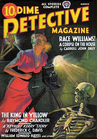
7: The King in Yellow (1938) by Raymond Chandler
chandler.jpg

The masked figures on the first number of The Yellow Book reminded me at this point that Raymond Chandler had been writing for Black Mask magazine in the 1920s. Chandler’s King in Yellow is a murder mystery which in its magazine version concerns an investigation by detective Steve Grayce into the death of jazz trumpeter King Leopardi:

The King wore yellow silk pajamas, the slip-on kind, with a turned collar. They were loose and thin. Over his breast they were dark with blood that had seeped into the silk as if into blotting-paper. There was a little blood on his bare brown neck.

Steve stared at him and said tonelessly: “The King in Yellow. I read a book with that title once. He liked yellow, I guess. I packed some of his stuff last night. And he wasn’t yellow either. Guys like him usually are—or are they?”

Grayce’s name was changed to Philip Marlowe when the story was reprinted in a collection in 1945. In 1983 Powers Boothe played Marlowe in a series of TV adaptations.


8: True Detective, series one (2014) by Nic Pizzolatto
td2.jpg

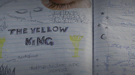
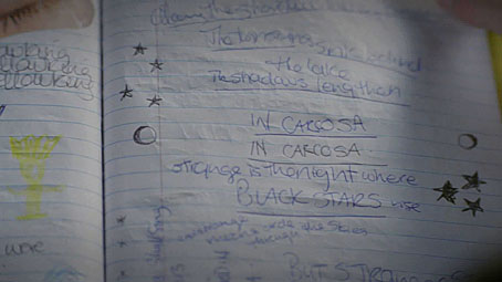
True Detective: pages from Dora Lange’s diary.
td3.jpg

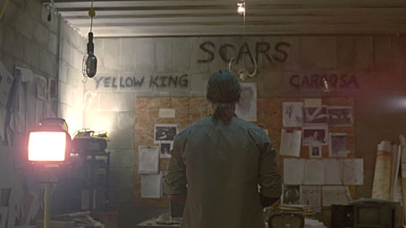
And so to the latest TV detectives. What struck me most about the Chambers thread this time round was how little is explained or revealed about the nature of “the yellow king” or Carcosa, and how much of the characterisation is concerned with figurative masks. Camilla’s words from the opening of Chambers’ The Mask—”You sir, should unmask”—are paraphrased by the killer in the final episode, something I missed the first time; elsewhere there’s a great deal of deception in the personal and professional spheres and, of course, Rust Cohle’s undercover exploits. Leaving all the Carcosa business unexplained is a strength; it’s what Chambers does himself in the stories, and it’s just what many of the lesser writers who’ve tried to expand his mythos don’t do at all.
td4.jpg

What next for the King in Yellow? As the old lady says in episode 7: “Death is not the end!” The sinister regent will be back again, all we have to do is wait.

Previously on { feuilleton }
Intertextuality
Lovecraft’s Monsters
The Court of the Dragon
The King in Yellow
Intertextuality

cthulhu17.jpg

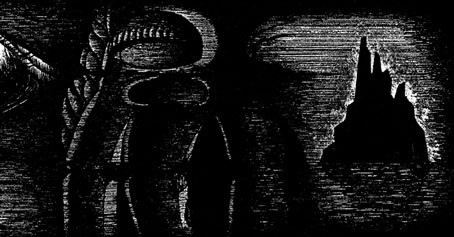
The Call of Cthulhu (1988): in the upper half there’s the big sun from Bob Peak’s poster for Apocalypse Now, in the lower half a radical reworking of Arnold Böcklin’s The Isle of the Dead.

In 1990, shortly after the first season of Twin Peaks had finished showing in the US, Video Watchdog magazine ran a feature by Tim Lucas which attempted to trace all the various cultural allusions in the character names and dialogue: references to old TV shows, song lyrics and the like. This was done in a spirit of celebration with Lucas and other contributors welcoming the opportunity to dig deeper into something they’d already enjoyed. This week we’ve had a similar unravelling of textual borrowings in a TV series, only now we have the internet which, with its boundless appetite for accusing and shaming, can often seem like something from the grand old days of the Cultural Revolution.

cthulhu01.jpg

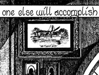
The Call of Cthulhu (1988): a more subtle allusion to Apocalypse Now.

The latest culprit ushered to the front of the assembly for the Great Internet Struggle Session is Nic Pizzolatto whose script for True Detective has indeed been celebrated for its nods to Robert Chambers and The King in Yellow. It’s also in the process of being condemned for having borrowed phrases or aphorisms from Thomas Ligotti’s The Conspiracy Against the Human Race (2011). See this post for chapter and verse.

cthulhu02.jpg

The Call of Cthulhu (1988): It’s not very clear but that’s a boat from The Creature from the Black Lagoon.

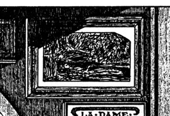
If I find it difficult to get worked up over all this pearl-clutching it’s because a) it shows a misunderstanding of art and the way many artists work, b) True Detective was an outstanding series, and I’d love to see more from Pizzolatto and co, and c) I’ve done more than enough borrowing of my own in a variety of media, as these samples from my adaptation of The Call of Cthulhu demonstrate, a 33-page comic strip where there’s a reference to a painting, artist or film on almost all the pages, sometimes several on the same page.

cthulhu03.jpg

The Call of Cthulhu (1988): Ophelia by Millais.

Cthulhu is a good choice here since Pizzolatto’s story edged towards Lovecraft via the repeated “Carcosa” references. You’d think a Lovecraft zine of all things would know better than to haul someone over the coals for borrowing from another writer when Lovecraft himself borrowed from Robert Chambers (and Arthur Machen and others), while “Carcosa” isn’t even original to Chambers’ The King in Yellow but a borrowing from an Ambrose Bierce story, An Inhabitant of Carcosa (1886). Furthermore, Lovecraft famously complained about his own tendencies to pastiche other writers in a 1929 letter to Elizabeth Toldridge: “There are my ‘Poe’ pieces and my ‘Dunsany pieces’—but alas—where are any Lovecraft pieces?”
Continue reading “Intertextuality”

The Court of the Dragon

atget.jpg

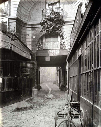
50 Rue de Rennes (1900) by Eugène Atget.

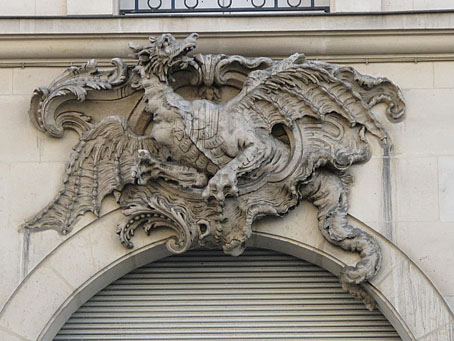
I live in the Court of the Dragon, a narrow passage that leads from the Rue de Rennes to the Rue du Dragon.

It is an “impasse”; traversable only for foot passengers. Over the entrance on the Rue de Rennes is a balcony, supported by an iron dragon. Within the court tall old houses rise on either side, and close the ends that give on the two streets. Huge gates, swung back during the day into the walls of the deep archways, close this court, after midnight, and one must enter then by ringing at certain small doors on the side. The sunken pavement collects unsavoury pools. Steep stairways pitch down to doors that open on the court. The ground floors are occupied by shops of second-hand dealers, and by iron workers. All day long the place rings with the clink of hammers and the clang of metal bars.

Unsavoury as it is below, there is cheerfulness, and comfort, and hard, honest work above.

Five flights up are the ateliers of architects and painters, and the hiding-places of middle-aged students like myself who want to live alone. When I first came here to live I was young, and not alone.

In the Court of the Dragon (1895) by Robert W. Chambers.

Drawing the King in Yellow for the Karl Edward Wagner story in Lovecraft’s Monsters (see yesterday’s post) sent me back to the Robert W. Chambers story collection where the strange and terrible regent first appears. Despite having written in the past about the covers for Chambers’ book I hadn’t read the stories for some time. Chambers’ blending of Bohemian romance, fantasy, horror, and early science fiction is just the thing to point to when people ask for a definition of weird fiction, writing that comes from a period before the straightjacket of genre definition had fastened itself about imaginative writing.
Chambers’ collection contains ten stories but only the first four are weird tales: The Repairer of Reputations, The Mask, In the Court of the Dragon, and The Yellow Sign. Of the four, In the Court of the Dragon is the weakest, although my re-reading caused some surprise when I realised that the story takes place in a location in Paris which the great photographer of the city, Eugène Atget, had memorably fixed five years after the book was published. Chambers was American but pursued a career as an artist in Paris before he took up writing; the description above can be taken as his own experience of the city.

ruederennes3.jpg

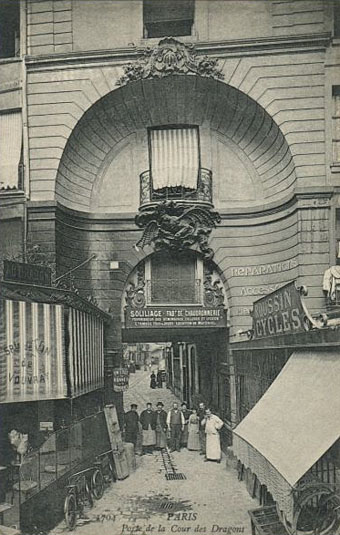
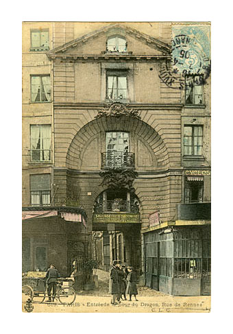
Undated postcards showing wider views.

ruederennes2.jpg

Atget is a photographer whose work I’m always happy to return to, especially his views of the streets and courtyards of a Paris now cleaned and tidied, if not altogether redeveloped. His view of the dragon balcony in the Rue de Rennes features everything I like about his street scenes: an unpeopled vista, weathered cobblestones, curious architectural detail, and the hazy distance of the courtyard itself. Chambers’ story may not communicate quite the same atmosphere but the pair for me are now inextricably linked. This place couldn’t have survived, could it?

ruederennes.jpg

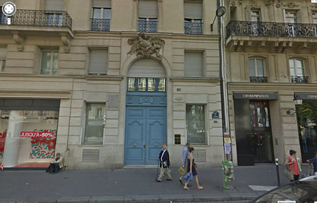
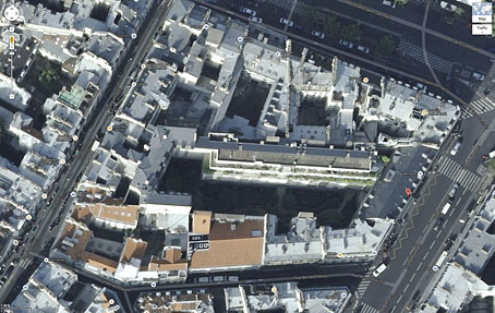
Well, yes and no. The dragon is still there on the wall at 50 Rue de Rennes but the court was apparently redeveloped in the 1950s. Behind those blue doors is a tidy little park for the use of the locals, a common feature in Paris although tourists seldom see more than a glimpse of these places when gates are opened.

dragon.jpg

The satellite view below shows the park, the red A marking the position of the blue doors. Nothing in Paris looks like Atget’s photos any more—that’s a part of their fascination—so these kinds of changes are no surprise. But I’m pleased to discover that the dragon still exists. Next time I’m there I’ll have to pay homage.

court.jpg

ernst.jpg

Fourth collage from the La Cour du Dragon chapter of Une Semaine de Bonté (1934) by Max Ernst.

The King in Yellow at the Internet Archive.
Update: Added a couple more pictures.

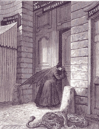
Update 2: Thanks to Herr Doktor Bimler for reminding me of Ernst’s collage novel, Une Semaine de Bonté, whose second chapter takes its title from the court. Considering this is a favourite book I really ought to have remembered it. Two of the collages show the entrance to the court but the dragon isn’t seen, its presence having been transferred to creatures lurking at the edges of the picture, and the Doré demon wings that many of the characters are sporting.

Update 3: Laurent drew my attention to this post which includes more photos and historical detail. Thanks, Laurent!

Previously on { feuilleton }
Atget’s corners
Rue St. Augustin, then and now
Brion Gysin’s walk, 1966
The King in Yellow
Lovecraft’s Monsters

Lovecraft's Monsters

Graphic for the title page and ends of chapters.

I don’t usually post things so far away from publication, but editor Ellen Datlow put these pictures on her Facebook page a few hours ago so I may as well do the same here.

Back in February I bought a Wacom Intuos drawing tablet, something I’ve been using with regularity for the past few months. The Alas Vegas Tarot cards I designed in the summer were the first major attempt at getting used to working with it; Lovecraft’s Monsters, a forthcoming fiction anthology for Tachyon is the second, and I now feel very comfortable working with it. More than that, I’m increasingly pleased with the way it’s possible to combine the drawing techniques I’ve been using for years with the additional possibilities provided by working in Photoshop. As always, it’s the end result that counts but arriving at an end result can be easy or difficult. Some of these illustrations look no different than they would have done had I used ink on paper but they took half the time to create, a considerable benefit when a deadline is looming.

The stories Ellen Datlow has chosen for this collection all present different aspects of monstrosity seen through the lens of Lovecraft’s fiction and his cosmic menagerie. Some are full-on extensions of the Mythos, others are more allusive; all the pieces bar one have been published before but I’d not read any of them so for me this was fresh material. Having spent the past few years saying I was finished with Lovecraft’s fiction I was excited to be working on this book. The stories are good, and I welcomed the challenge of having to illustrate such a variety of material.

Larger copies of all the pictures can be seen here.

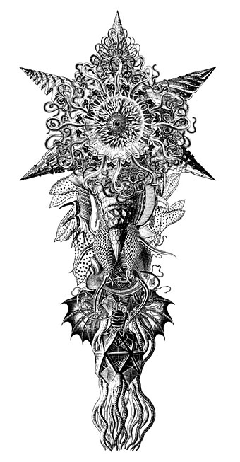
The star-headed thing at the top of this page is another amalgam of elements plundered from Haeckel’s Kunstformen der Natur and other sources. I’ve leaned rather heavily on Haeckel in the past, something I wanted to avoid here; this serves as a kind of visual punctuation separating the stories.

Lovecraft's Monsters

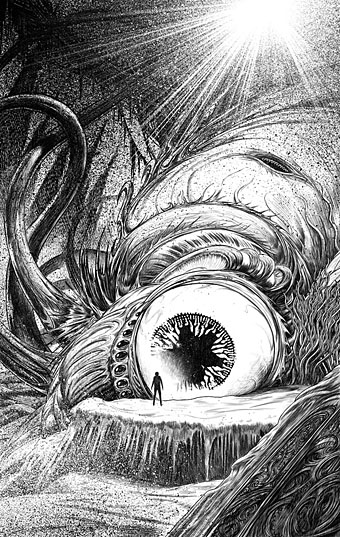
Cthulhu.

The drawing I’ve called Cthulhu is a piece for the introductory pages. Having already produced a lot of Cthulhoid art I didn’t want to repeat myself. The initial idea was of a tiny human figure faced with something enormous and nightmarish; that could be a vast eyeball or it could be a mouth or some other organ/aperture, the vagueness was intentional. Lovecraft continually impresses upon his readers how difficult things are to describe or apprehend but you seldom find this quality in art based upon his stories. Cthulhu especially has devolved into little more than an outsize man-in-a-rubber-suit à la the Creature from the Black Lagoon. In The Call of Cthulhu the figure on the mysterious statuette is described as having a humanoid shape but Lovecraft doesn’t describe the appalling reality in any detail at all. When Cthulhu is struck by a ship at the end of the story it breaks apart and is then seen recombining, the implication being that the creature is corporeally amorphous.

Lovecraft's Monsters

Only the End of the World Again by Neil Gaiman.

Neil Gaiman’s entry concerns a werewolf private detective in Innsmouth. Lovecraft’s decaying fishing village and its inhabitants turn up in several of the stories so care was taken to avoid repetition.

Lovecraft's Monsters

Bulldozer by Laird Barron.

A great story about another detective, a Pinkerton agent this time, hunting his quarry through the Old West. Collin de Plancy’s Dictionnaire Infernal is mentioned so I used some of Louis Breton’s illustrations from the third edition.

Continue reading “Lovecraft’s Monsters”