More vapour trails

jeter.jpg

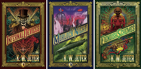
Those covers everyone likes. My designs for KW Jeter’s steampunk novels from Angry Robot and Tor Books.

When I wrote a brief history of steampunk for Eye magazine last year I ended by somewhat provocatively declaring that until something better appeared this was the defining aesthetic of the moment. A year later, the movement (if we can use that term) continues to evolve despite the steady drip of complaints that it’s all reactionary, historically illiterate, and so on. Much of the ire remains nonsensical, and often seems to boil down to a common disdain for people enjoying themselves in some unorthodox manner.

manual.jpg

Design by Galen Smith after the Hetzel editions of Jules Verne’s novels.

If I hadn’t got involved on the art side I would have found it difficult to avoid being attracted by steampunk in one form or another since so much of it originates in areas I was already interested in, not least HG Wells and Victorian science fiction. The rapid evolution of the past few years means we’re currently seeing an aesthetic leaving behind its origins to become an international subculture. What’s striking about this activity—and this is something that doesn’t seem to have been discussed very much—is the way the whole thing has been birthed by genre fiction rather than by pop music, as was the case for the second half of the 20th century. This piece is meant to be a news post, however, not another cultural critique, but if I happen to write any more on the subject there’s something there that’s worth exploring.

manual2.jpg

As to the news: this month finds my steampunk artwork manifesting in three very different locations in one of those odd coincidences of timing that occur now and then. First up there’s the Steampunk User’s Manual edited by Jeff VanderMeer & Desirina Boskovich, a follow-up to 2011’s Steampunk Bible. For the new volume I designed spreads for three entries by Jess Nevins from The Encyclopedia of Fantastic Victoriana: Alternative History Edition.
Continue reading “More vapour trails”

Weekend links 201

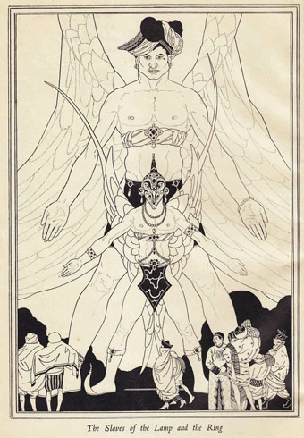
kettelwell.jpg

An illustration by John Kettelwell for The Story of Aladdin and the Wonderful Lamp (1928).

• “The strain in everything I write, of not being taken with the bounteousness of humankind, was also the attitude of both my parents.” Jonathan Meades talking to James Kidd about his forthcoming memoirs.

• 7 Trumps From the Tarot Cards and Pinions (1969), and album of electronic music by Ruth White, is being given a limited vinyl reissue. Related: Ruth White—An American Composer.

• 82 minutes of Michael Moorcock talking in 1972 to Jean-Pierre Turmel, co-founder of the Sordide Sentimental record label.

If Verne’s protagonists often seem to stop short of revelation, it’s because the revelation is not meant to be known. Revelation has a way of putting man back at the front of the evolution chart, moving neatly toward a happily progressing future, out of the darkness and into the light. The characters who embark upon the Voyages Extraordinares move backward and forward and all about, spun around like blindfolded children trying to pin the tail on the donkey. The point of the adventure, after all, is not to have a conclusion; it is to get knocked off your feet.

Stefany Anne Golberg on Journey to the Center of the Earth at 150.

• Photographs of pre-Haussmann Paris by Charles Marville, and photographs by Amy Heiden of industrial ruins.

• Mixes of the week: FACT Mix 427 by Wild Beasts, and Secret Thirteen Mix 108 by Kangding Ray.

• Hear Italo Calvino read selections from Invisible Cities, Mr Palomar and others.

William S. Burroughs in Dub conducted by Dub Spencer & Trance Hill.

• Cycles, Returns & Rebirth: Alexander Tucker on Derek Jarman.

Harold Budd: the composer with no urge to make music.

The Museum of Imaginary Musical Instruments.

• 80 minutes of Monolake playing live in 1999.

• At 50 Watts: Dyl’s Dance.

Owls And Flowers (2006) by Belbury Poly | Learning Owl Reappears (2011) by The Advisory Circle | The Owls (2013) by Félicia Atkinson

The Angel of the Revolution

aotr01.jpg

The British Library’s recent uploading of a million copyright-free images to Flickr has been a mixed blessing. On the one hand it’s an exemplary gesture on the Library’s part, on the other I wish they’d archived their images somewhere other than Flickr where the recent interface changes have made using the site for any length of time a very frustrating business.

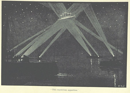
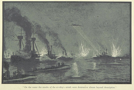
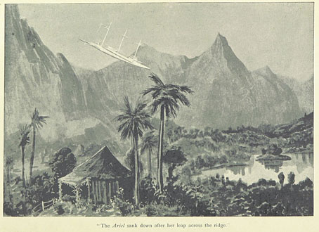
Complaints aside, the unsorted BL haul is being slowly sifted by those who aren’t dissuaded by Yahoo’s iniquities. A recent set labelled Science Fiction is comprised as much of science fact as fiction but it does include these illustrations from The Angel of the Revolution: A Tale of the Coming Terror (1893), a novel of aerial warfare and anarchist revolt by British author George Griffith. This is one of several works from the late Victorian era which show how lazy it is to characterise the period as a time of unthinking imperialism:

First published in 1893, The Angel of the Revolution is a fantastical tale of air warfare in which an intrepid group of Socialists, Anarchists and Nihilists defeat Capitalism with their superior knowledge of dirigibles. Led by a crippled, brilliant Russian Jew and his daughter, Natasha, The Brotherhood of Freedom establishes a ‘pax aeronautica’ over the world, thanks to the expertise of Richard Arnold, a young scientist. Arnold falls in love with Natasha (the eponymous Angel), and Griffith builds a utopian vision of Socialism and romance.

As well as writing a cracking good story, Griffith is also remarkably prescient in predicting future technology, including air travel, tidal power, and solar energy. He also engages with timeless debates over social responsibility. Griffith imagines a world in which the wealth of the obscenely rich is sequestered, their property seized for the public good, and their businesses nationalised. Those with unearned incomes are forced to either pay punitive tax, or to undertake equivalent labour in the community. Griffith’s message lacks subtlety, but it couldn’t be more pertinent in the twenty-first century. (Précis swiped from here.)

aotr02.jpg

Griffith’s novel is essentially Jules Verne’s Robur the Conqueror (1886) with a helping of revolutionary politics; even the aircraft are similar, with Griffith’s illustrator, Fred T. Jane, depicting an armed sky-boat held aloft by the same vertical propellers as those used by Robur’s machine. Jane (not “Janes” as they name him on the Flickr pages) later founded the Jane’s series of warship and aircraft catalogues so it’s fitting that his illustrations combine both those craft in a single design.

aotr03.jpg

Continue reading “The Angel of the Revolution”

Uncharted islands and lost souls

lostsouls1.jpg

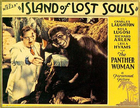
The pulp fiction of the early 20th century favoured remote or uncharted islands as locations for the bizarre and the fantastic; in isolated jungles all manner of savage and grotesque behaviour could take place out of sight of the civilised world. Islands are secure from interference; they can be visited by accident or intention, and later fled from when everything goes wrong. The Island of Doctor Moreau is an early example of the type although Jules Verne’s The Mysterious Island (1874) pre-dates it by twenty-two years. The Island of Lost Souls (1932), the first film adaptation of the Wells novel, is one of a crop of mysterious islands that appeared in the 1930s following the success of the Universal adaptations of Dracula (1931) and Frankenstein (1931). The recent Eureka DVD/Blu-ray edition of the film is the first UK release to present the film in its original, uncensored form. I watched it this weekend.

lostsouls3.jpg

Moreau (Charles Laughton) and Montgomery (Arthur Hohl) at work.

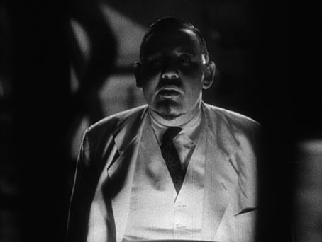
HG Wells famously hated the film, and his vociferous complaints helped to ensure it was banned in Britain until 1958. Even without Wells’ complaints there was enough there to bait the censors who declared it to be “against nature”: writers Philip Wylie and Waldemar Young push the erotic implications of Wells’ story to a degree that would have been impossible in 1896, and would be equally impossible two years later when the Hays Code clamped down on cinematic salaciousness. Charles Laughton’s Moreau is eager to discover whether Lota, the Panther Woman (Kathleen Burke), will show any sexual interest in the marooned Edward Parker (Richard Arlen). The bestiality theme continues when Parker’s fiancée arrives on the island and finds one of Moreau’s Beast People at her bedroom window. Add to this Moreau’s declaration that he feels like God (a similar line was cut from James Whale’s Frankenstein), a traditional British squeamishness towards maltreating animals (unless they’re foxes), and the Panther Woman’s skimpy outfit, and it’s no surprise that the authorities collapsed with the vapours.

lostsouls4.jpg

Sensationalism aside, this is one of the greatest horror films of the early 1930s, and one which follows its source material with much more fidelity than Universal’s Dracula and Frankenstein. The production had been commissioned by Paramount to capitalise on the success of the Universal films, hence the presence of a very hirsute Bela Lugosi as the Sayer of the Law. Cinematographer Karl Struss had worked the year before on Rouben Mamoulian’s excellent Dr. Jekyll and Mr. Hyde; prior to this he photographed Sunrise (1927) for Friedrich Murnau. The combination of Struss’s chiaroscuro compositions, some adept direction from Erle C. Kenton (including crane shots), and a tremendous performance by Charles Laughton puts The Island of Lost Souls in a different league entirely to Tod Browning’s stagey and over-rated Dracula. Laughton’s cherub-faced Mephistopheles is a performance that runs counter to the cod theatricals of the period: he’s sly, confident and completely authoritative even if he looks nothing like Wells’ white-haired doctor.

Continue reading “Uncharted islands and lost souls”

Harry Willock book covers

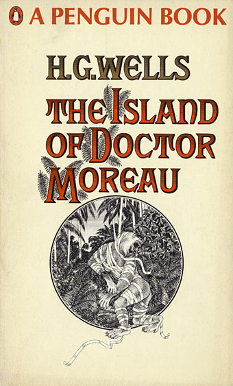
moreau.jpg

This time last year I happened to be re-reading my way through the collected short stories of HG Wells; this year I’ve been reading The Island of Doctor Moreau, not to continue the seasonal trend, I simply felt the urge. More about Moreau tomorrow.

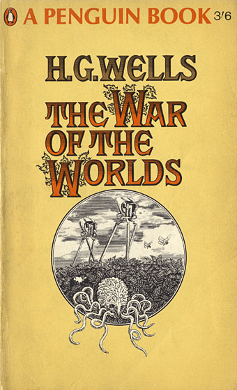
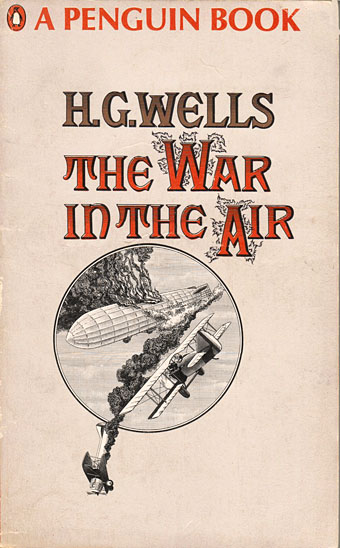
These covers are from a series of Penguin reprints which first appeared in 1967 and went through several editions. Harry Willock was the cover artist, and may also have been the designer of the Wells and Verne titles, other text-only Penguin covers from around this time being credited to Willock. The Penguin Science Fiction site describes the obtrusive “A Penguin Book” legend as the “panic top”, a heavy-handed attempt by Penguin’s management to reinforce their brand. Later reprints dropped this but it’s stamped across most of these editions.

war.jpg

This edition of The War of the Worlds was my first encounter with the novel so the cover has always been very familiar, a factor which probably prevented me from seeing how effectively all the Willock Wells covers work as a set. The Martian war machines aren’t very menacing—especially when they seem to have done little but arouse a pair of butterflies—but I do like the type layouts and the way the illustrations are concentrated into a circle. Willock’s drawings so closely imitate the style of Victorian engravings it’s easy to take them at first glance for the genuine article.

air.jpg

Continue reading “Harry Willock book covers”