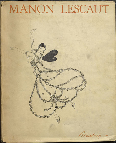
The illustrated works of Alastair aren’t always easy to find, not when Hans Henning Voigt (as the artist was known to his German parents) chose a nom de l’art shared by a large portion of Scottish manhood, past and present. This 1928 edition of Manon Lescaut by the Abbé Prévost is a recent arrival at the Internet Archive. The publisher, John Lane, specialised in illustrated editions, and their Manon Lescaut gives an idea of what we might have seen from Aubrey Beardsley had he survived into the 20th century. John Lane had published collections of Beardsley’s drawings together with related works like Robert Ross’s memories of the artist. It was in their interest to continue the posthumous association, hence the pairing of Alastair with a novel that Beardsley himself might have illustrated. Alastair not only positioned himself as an inheritor of Beardsley’s filigreed drawing style but in photographs appears to be adopting the persona of one of Beardsley’s etiolated characters.
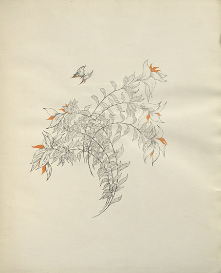
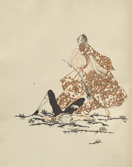
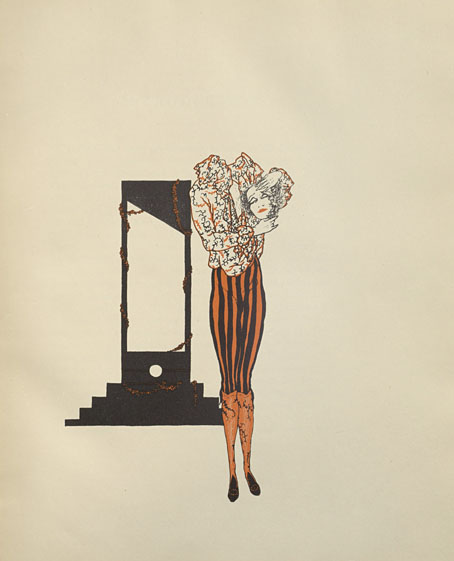
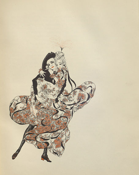
This edition of the novel is an English translation by DC Moylan, with an introduction by Arthur Symons, Beardsley’s friend and collaborator when the pair were teamed as editor and art editor of the short-lived Savoy magazine. Symons was an astute critic, his essays are always worth reading; he remembers his friend here while stepping lightly around Alastair’s imitation of Beardsley’s decorations. As for Alastair himself, he did a good job with the illustrations. The figure-drawing isn’t as uncertain as in some of his earlier works, and each piece is printed in two colours (“the colour of fire and night” as Symons describes it), a process he favoured elsewhere. The leading study of Alastair’s art, Alastair: Illustrator of Decadence (1979) by Victor Arwas, reproduces five of the fourteen drawings, only one of which is shown in colour.