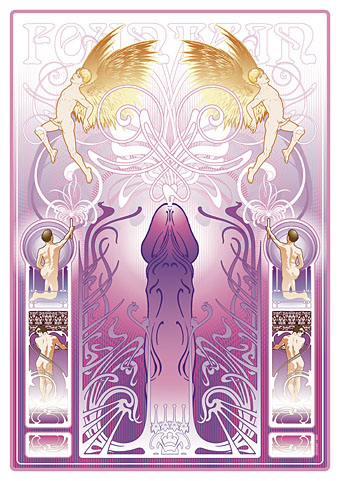
Ver Sacrum, 1898

vs-1898-01.jpg

There are art magazines, and then there’s Ver Sacrum. I’m tempted to say there are magazines, and then there’s Ver Sacrum but that’s going a little far. Suffice to say that among the many fine art magazines of the period 1890 to 1910, a number of which have been featured here already, Ver Sacrum stands apart for its design and the consistent quality of its contents. Having seen back numbers of Jugend and Pan made available at the University of Heidelberg I’d been hoping the archivists there would eventually turn their attention to the art journal of the Viennese Secession, and they finally have, with the first bound number digitised here.

vs-1898-01.jpg

The volume for 1898 collects the first year of the journal cum manifesto of the Union of Austrian Artists, as the Secession group called themselves. That union is represented by the triple shield symbol which recurs in different forms across all the media produced by the group, the shields representing painting, sculpture and architecture. (On the cover of the first issue, the shields are shown growing from a tree whose roots have burst the confines of their container.) Ver Sacrum was a team effort with design contributions by Koloman Moser, Alfred Roller, Josef Hoffmann and Gustav Klimt, and what really sets it apart for me is its striking square format and the wide margins which provided a very flexible template for presenting a variety of graphic content. Other magazines of the period such as Pan shared some of the content but their presentation didn’t greatly differ from the more staid magazines of the era. Ver Sacrum was a break with the style of 19th century journals, and its graphic design points the way to much of the magazine and book design which would follow. It’s also a superb showcase for the Austrian development of the Art Nouveau style, and the overlap between Art Nouveau and the final flourishes of the Symbolist movement.

vs-1898-01.jpg

There’s far too much in this first volume to easily select, all I can do is advise that anyone interested has a browse through the entire book. As with Deutsche Kunst und Dekoration some of the art is the typically conservative fare of the period but the presentation makes up for that, and there’s enough of interest elsewhere to prevent things from getting dull. Here’s hoping the other volumes are made available very soon.

Update: Paul in the comments draws my attention to additional scans of Ver Sacrum at the Österreichische Nationalbibliothek. Heidelberg does a better job of making the issues browsable but it’s still great to have more than one source for this material.

Continue reading “Ver Sacrum, 1898”

Weekend links 53

egyptian.jpg

Ancient Egyptian capitals from The Grammar of Ornament (1856) by Owen Jones at Egyptian Revival.

• Golden Age Comic Book Stories has been pulling out all the stops recently with entries for Will Bradley, Alphonse Mucha’s Documents Decoratifs (a companion volume to Combinaisons Ornementales), and pages from My Name is Paris (1987) illustrated by Michael Kaluta, an Art Nouveau-styled confection which features scenes from the Exposition Universelle of 1900. Related: Alphonse Mucha in high-resolution at Flickr.

The Sinking Of The Titanic by Gavin Bryars at Ubuweb, the first release on Brian Eno’s Obscure label in 1975. Bryars’ Titanic is an open composition which has subsequently been reworked and re-recorded as more information about the disaster has come to light. The accompanying piece on that album, Jesus’ Blood Never Failed Me Yet, is the only version you need unless you want Tom Waits ruining the whole thing in the later recording.

• Hayley Campbell claims to have the worst CV in the world but she has a better way with words than most people with bad CVs. She’ll be giving a talk with Tim Pilcher entitled Sex, Death, Hell & Superheroes at The Last Tuesday Society, 11 Mare Street, Bethnal Green, London, on April 8th. Just don’t shout “Xena!” if you attend.

Monolake live at the Dis-Patch Festival Belgrade, Serbia, 2007; 75 minutes of thumping grooves. Related: A video by Richard De Suza using Monolake’s Watching Clouds as the soundtrack.

• “I preached against homosexuality, but I was wrong.” Related: Gay Cliques, a chart, and Sashay shantay épée at Strange Flowers, the last (?) duel with swords fought in France.

• Mixtapes of the week: Electronica from John Foxx and Benge at The Quietus, and Ben Frost mashing up early Metallica, Krzysztof Penderecki, and late Talk Talk for FACT.

• A 40 gigpixel panorama of the Strahov Philosophical Library, Prague, described by 360 Cities as the world’s largest indoor photo.

How Hollywood Butchered Its Best Movie Posters; Steven Heller on Saul Bass.

• Back issues of Coilhouse magazine are now available to buy in PDF form.

Absinthe minded: The ruin of bohemians is back in all the best bars.

Fade Into You (1993) by Mazzy Star.

Deutsche Kunst und Dekoration #6

dkd06-01.jpg

Continuing the delve into back numbers of Deutsche Kunst und Dekoration, the German periodical of art and decoration. Volume 6 covers the period from April to September 1900, and the content is still Art Nouveau all the way, with a dash of Symbolism. Among the contributors in this edition there’s Otto Eckmann and more work from Hans Christiansen, both frequent contributors to Jugend magazine There are further examples of stylish Art Nouveau interiors, and of considerable interest to this Exposition Universelle obsessive, a look at the Paris exposition of 1900 from the German side of things. As before, anyone wishing to see these samples in greater detail is advised to download the entire volume at the Internet Archive. There’ll be more DK&D next week.

dkd06-02.jpg

The ubiquitous peacocks were never far away in 1900.

dkd06-03.jpg

Continue reading “Deutsche Kunst und Dekoration #6”

Philippe Jullian, connoisseur of the exotic

jullian01

Monsieur Jullian as seen on the back cover of Dreamers of Decadence (1971).

Here at last is the long-promised (and long!) piece about the life and work of Philippe Jullian (1919–1977), a French writer and illustrator who’s become something of a cult figure of mine in recent years. Why the fascination? First and foremost because at the end of the 1960s he wrote Esthètes et Magiciens, or Dreamers of Decadence as it’s known to English readers, a book which effectively launched the Symbolist art revival and which remains the best introduction to Symbolist art and the aesthetic hothouse that was the 1890s. If I had to choose five favourite books Dreamers of Decadence would always be on the list. This point of obsession, and Philip Core’s account of the writer, made me curious about the rest of Jullian’s career.

jullian13

An illustration from Wilson & Jullian’s For Whom the Cloche Tolls (1953). “Tata has called these his Krafft-Ebbing (sic) pictures of his friend Kuno, whatever that means.”

Philip Core was friends with Philippe Jullian, and Core’s essential Camp: The Lie that Tells the Truth (1984) has Jullian as one of its dedicatees. It’s to Core’s appraisal that we have to turn for details of the man’s life. There is an autobiography, La Brocante (1975), but, like a number of other Jullian works, this doesn’t seem to have been translated and my French is dismally pauvre. Core’s piece begins:

Philippe Jullian, born to the intellectual family of Bordeaux Protestants which produced the well-known French historian, Camille Jullian, was a last and lasting example of pre-war camp. His career began as an artist in Paris with a reputation for drag-acts parodying English spinsters. Snobbery, a talent for sensitive daydreaming, and a consuming passion for antiques, obscure art and social history, made a very different figure out of the thin and dreamy young man. Jullian suffered terribly during the Second World War; he managed to survive by visiting some disapproving cousins dressed as a maiden aunt, whom they were happy to feed. However, he made a mark in the world of Violet Trefusis, Natalie Barney and Vita Sackville-West by illustrating their books with his wiry and delicate doodles; this led to a social connection in England, where he produced many book jackets and covers for Vogue throughout the 1950s.

Having only seen Jullian in his besuited and bespectacled guise it’s difficult to imagine him dragged up, but the cross-dressing interest is apparent in his humorous collaboration with Angus Wilson and in a later novel, Flight into Egypt. As for the wiry and delicate doodles, they’re very much of their time, in style often resembling a less-assured Ronald Searle. One early commission in 1945 was for the first of what would become a celebrated series of artist labels for Château Mouton Rothschild. Later cover illustrations included a run for Penguin Books some of which can be found at Flickr.

Philip Core continues the story:

Elegant in the austerely tweedy way the French imagine to be English, Jullian exploited his very considerable talents as a writer, producing a series of camp novels throughout the 1950s (Scraps, Milord) which deal frankly but amusingly with the vicissitudes of handsome young men and face-lifted ladies, grey-haired antique dealers and criminals. One of the first to reconsider Symbolist painting, Jullian reached an enormous public in the 1960s with his gorgeous book, Dreamers of Decadence – where an encyclopaedic knowledge of the genre and its accompanying literature helped to create the boom in fin de siècle revivalism among dealers and museums.

An acerbic wit accompanied this vast worldly success; always docile to duchesses, Jullian could easily remark to a hostess who offered him a chocolate and cream pudding called Nègre en chemise, “I prefer them without.” Less kindly, to a gay friend who objected to Jullian’s poodles accompanying them into a country food shop by saying “Think where their noses have been”, he could also retort “Yes, that’s what I think whenever I see you kiss your mother.”

Continue reading “Philippe Jullian, connoisseur of the exotic”

Ten titles and a cover

cdlcover.jpg

The Very Best of Charles de Lint. Art by Charles Vess.

Over the weekend I found the time to finally update the book design section of the site, adding new pages for most of the titles I’ve been working on recently. There’s still a couple of things missing but I’ll add those in due course. Many of these design jobs have been for the interiors only so what follows is a comparison of title spreads from books I’ve worked on that have been published this year. Lest it seem that I have an army of clones at my service it should be emphasised that I was working on several of these last year (and Engelbrecht was completed in 2008) but the nature of release schedules means they all carry 2010 publication dates.

sr.jpg

Steampunk II: Steampunk Reloaded, edited by Ann & Jeff VanderMeer.

I invariably make a feature of title pages, usually creating them as a spread in order to heighten their impact. The title page is a kind of gateway to the rest of the book which gives you an opportunity to establish a mood for what follows. It’s also the area where you can be most lavish with your graphic treatment and, where necessary, add illustrative material without worrying too much about intruding on the content. With a number of these designs I was following typographic choices from pre-designed covers so the challenge was to find something that would match the cover and connect to the rest of the interior. The Charles de Lint book was a variation on this process in that the author had chosen a Charles Vess drawing for the cover art. I designed a cover to accommodate the drawing then carried the design inside. The colours were chosen to match Vess’s artwork while the general Art Nouveau style came from an Alphonse Mucha poster he’d placed on the wall. With a different cover picture the entire book would have had a very different design.

pkd.jpg

The Search for Philip K Dick by Anne R Dick.

Continue reading “Ten titles and a cover”