Ten titles and a cover

cdlcover.jpg

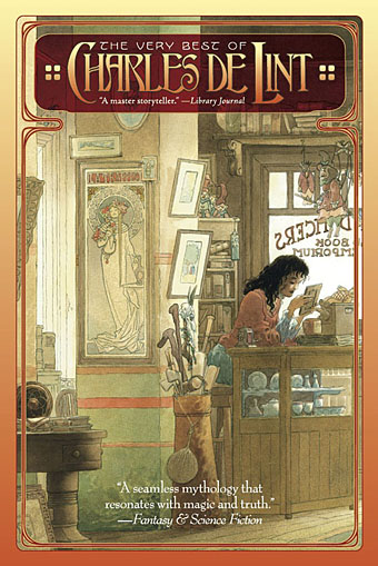
The Very Best of Charles de Lint. Art by Charles Vess.

Over the weekend I found the time to finally update the book design section of the site, adding new pages for most of the titles I’ve been working on recently. There’s still a couple of things missing but I’ll add those in due course. Many of these design jobs have been for the interiors only so what follows is a comparison of title spreads from books I’ve worked on that have been published this year. Lest it seem that I have an army of clones at my service it should be emphasised that I was working on several of these last year (and Engelbrecht was completed in 2008) but the nature of release schedules means they all carry 2010 publication dates.

sr.jpg

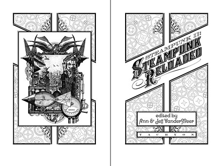
Steampunk II: Steampunk Reloaded, edited by Ann & Jeff VanderMeer.

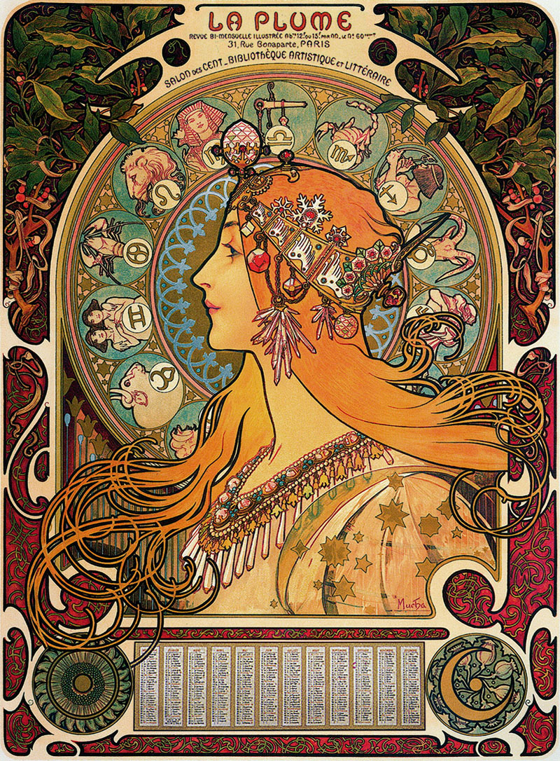
I invariably make a feature of title pages, usually creating them as a spread in order to heighten their impact. The title page is a kind of gateway to the rest of the book which gives you an opportunity to establish a mood for what follows. It’s also the area where you can be most lavish with your graphic treatment and, where necessary, add illustrative material without worrying too much about intruding on the content. With a number of these designs I was following typographic choices from pre-designed covers so the challenge was to find something that would match the cover and connect to the rest of the interior. The Charles de Lint book was a variation on this process in that the author had chosen a Charles Vess drawing for the cover art. I designed a cover to accommodate the drawing then carried the design inside. The colours were chosen to match Vess’s artwork while the general Art Nouveau style came from an Alphonse Mucha poster he’d placed on the wall. With a different cover picture the entire book would have had a very different design.

pkd.jpg

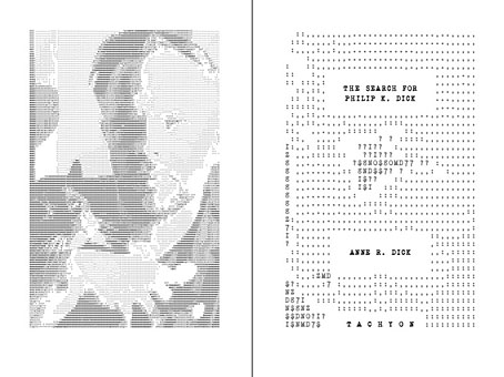
The Search for Philip K Dick by Anne R Dick.

Continue reading “Ten titles and a cover”

Esquisses Décoratives by René Binet

exposition1.jpg

The work of French architect and designer René Binet (1866–1911) has been featured here before with one of his most famous creations, the monumental gate he designed for the Paris Exposition Universelle of 1900. Philippe Jullian in his 1974 book about the exposition, The Triumph of Art Nouveau, calls the gate the “Porte Binet” and also notes that it was referred to as “the Salamander” for its resemblance to the salamander stoves of the period.

binet1.jpg

The reference to nature is apt, albeit for a different reason, since it was Ernst Haeckel’s Kunst-Formen der Natur which Binet used as inspiration for his designs, the encrustation on the gate being based on Haeckel’s studies of shell forms. This influence was developed four years later in Binet’s Esquisses Décoratives, a series of speculative designs which applied Haeckel’s work to architecture and interior design as a whole; the Porte Binet can be seen on the title plate above and the print there seems to have been either signed by or dedicated to Haeckel.

Art Nouveau design is usually thought of in terms of the curvaceous style derived from Alphonse Mucha and others, but there were several designers of the period looking to nature for inspiration in a way which went beyond William Morris’s application of plant forms to flat surfaces. Binet’s lamp designs below show how Haeckel’s sea-life could be transmuted into enclosures for electric lights. These designs hint at a direction which went unexplored in the 20th century; the Art Nouveau style was steadily vulgarised after the Exposition Universelle until it was replaced altogether by the development of Art Deco following the First World War. Binet went on to design the extension of the Paris department store, Printemps, but his huge Art Nouveau atrium was later destroyed by fire.

binet2.jpg

There aren’t many examples of Binet’s designs on web pages, the ones here are from this Flickr set and a vintage print seller. There is a recent study of Binet’s work available, however, René Binet: from Nature to Form by Olaf Breidbach. For an idea of how an entire city based on Haeckel might look, we have Schuiten and Peeters’ imaginary metropolis of Blossfeldtstad whose “Vegetalistic” architecture was featured in an earlier post.

Previously on { feuilleton }
Le Palais de l’Optique, 1900
Exposition Universelle films
Exposition jewellery
Exposition Universelle catalogue
Exposition Universelle publications
Exposition cornucopia
Return to the Exposition Universelle
The Palais Lumineux
Louis Bonnier’s exposition dreams
Exposition Universelle, 1900

Combinaisons Ornementales

combinaisons1.jpg

After writing about Charles J Strong’s Book of Designs a couple of days ago, it seems pertinent to point the way to a far more essential Art Nouveau design book which can also be found at the Internet Archive. Combinaisons Ornementales was a collaboration between Maurice Verneuil, George Auriol and Alphonse Mucha published in 1901, and comprises 60 plates of beautifully elegant designs (“multipliable to infinity with the aid of a mirror”) which range from Mucha’s abstractions to Verneuil’s flower motifs. The examples shown here are all by Mucha; I borrowed one of the flourishes and the peacock feather for the Dodgem Logic cover design earlier this year.

combinaisons2.jpg

For a quick look at all the plates, the NYPL Digital Gallery has scans. Mucha produced another design book the following year, Documents Decoratifs, although I’ve yet to see an edition of that online.

combinaisons3.jpg

Previously on { feuilleton }
Charles J Strong’s Book of Designs
Mucha’s Zodiac
Dodgem Logic #4
Peacocks

Charles J Strong’s Book of Designs

strong1.jpg

Another gem from the cornucopia of scanned books at the Internet Archive, Charles J Strong’s Book of Designs was a style guide and motif resource for artists and amateur craftspeople tasked with the creation of advertising show cards or shop display signs. The book was first published by the Detroit School of Lettering in 1910, hence the heavy reliance on Art Nouveau flourishes which by this stage had degenerated from their Mucha-derived elegance into unbridled, and frequently undisciplined, rococo embellishments.

strong9.jpg

If a few of the designs lack Mucha’s care there are still some great examples here of generic Art Nouveau in its final days before Art Deco streamlined all those curves away. In the examples below a poster suggestion shows everyone’s favourite fin de sìecle gal, Salomé, while the final example shows one of Strong’s typeface designs. For anyone who likes the look of these pages but would prefer them in better quality, Dover Publications have a reprint scheduled for later this year.

Continue reading “Charles J Strong’s Book of Designs”

Mucha’s Zodiac

mucha1.jpg

Another zodiac poster. Alphonse Mucha’s design was a calendar produced for arts review La Plume in 1896, and typically with Mucha great attention is paid to the decorative details. Close examination reveals a sunflower behind the sun symbol in the lower left while poppies accompany the symbol of the moon on the right.

mucha2.jpg

Mucha was also commissioned for the Exposition Universelle four years later, with work including these designs promoting the Austrian exhibits. This seems surprising when it was his work in France which made his name but there was a great deal of national prestige at stake in 1900 and the French authorities wouldn’t have wanted a foreign artist involved with their official art. Mucha was also a foreigner to the Austrians, of course, but they regarded him with more benevolence, and their decorative arts exhibit included one of his carpet designs. If it was galling to be ignored by France he at least had the satisfaction of seeing many of the participating nations showing work in the Art Nouveau style which he’d done so much to evolve.

mucha3.jpg

Previously on { feuilleton }
Le Palais de l’Optique, 1900
Owen Wood’s Zodiac
Palladini’s Zodiac
Exposition Universelle films
Exposition jewellery
Exposition Universelle catalogue
Exposition Universelle publications
Exposition cornucopia
Return to the Exposition Universelle
The Palais Lumineux
Louis Bonnier’s exposition dreams
Exposition Universelle, 1900
The Palais du Trocadéro