The art of Henricus Jansen, 1867–1921

henricus0.jpg

This week’s post is another by Sander Bink about a neglected artist of the Dutch fin de siècle. Once again, this is an artist whose work was new to me. The Mucha-like style of the later pictures (and the one above from the same series) are especially good. My thanks again to Sander for the post.

* * *

Henricus Jansen (1867–1921) was a Dutch painter, graphic artist and illustrator who used ‘Henricus’ as his artist’s name, ‘Jansen’ being a very common and decidedly unsexy surname. He originated from The Hague where Art Nouveau and symbolism flourished in the 1890s more than any other Dutch city.

In the little that has been written about Henricus he is usually considered not to be avant-garde or progressive enough to be an ‘important artist’ (whatever that may mean). He is, however, mentioned in the standard reference work Symbolism in Dutch Art by Polak from 1955. Extensive studies have never been published about him and my main source of information about his life and work is an unpublished university thesis from 1988 by Louis Baeten of which I happen to have a copy. Baeten had spoken to Henricus’s daughter who was then still alive. According to the thesis Henricus must have made hundreds of drawings and paintings but they seem to be quite rare nowadays and seldom come to auction.

henricus1.jpg

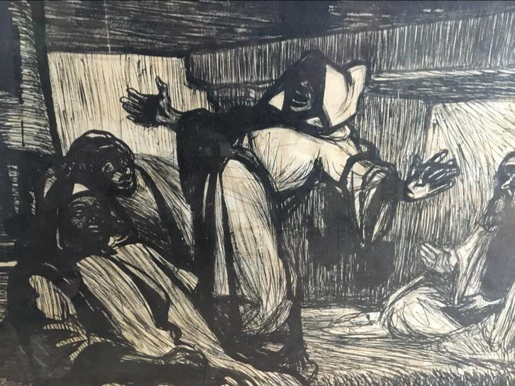
For example, Henricus visited Tunisia in 1901 where Baeten says he produced more than 67 pastels and drawings of which “only seven survive”. These were exhibited in The Hague in 1901, and Leiden in 1907. One of these is depicted here from a private collection: a charming, somewhat cartoon-like ink drawing of three Tunisian male figures.

henricus2.jpg

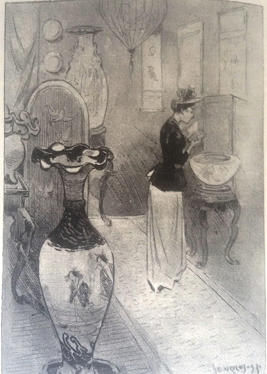
From 1887 till 1892 Henricus lived in Paris where he mingled in the bohemian and artistic circles around Le Chat Noir, and knew people like Rodolphe Salis and Paul Verlaine. The drawings and illustrations he produced from around 1890 are strongly influenced by Parisian graphic artists like Steinlen, Grasset and Willette, uncommon models in Dutch art of the 1890s. Examples like the drawing of a lady in an antique market (above) are to be found in his illustrations for a book by Johan Gram, ‘s-Gravenhage in onzen tijd (The Hague nowadays) from 1893.

henricus3.jpg

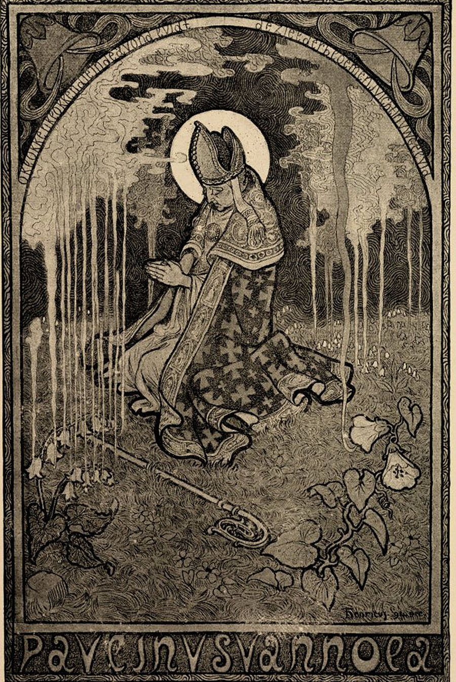
More Symbolist in style, and therefore probably more of interest to { feuilleton } readers, are his illustrations for the popular magazine Elsevier’s. The picture shown here is a lithograph he made for the poem ‘Paulinus van Nola’ by the Flemish poet Pol de Mont, published in 1895.

henricus4.jpg

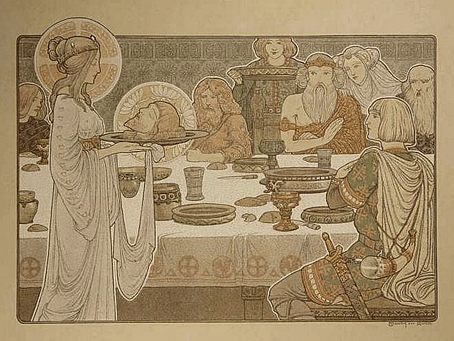
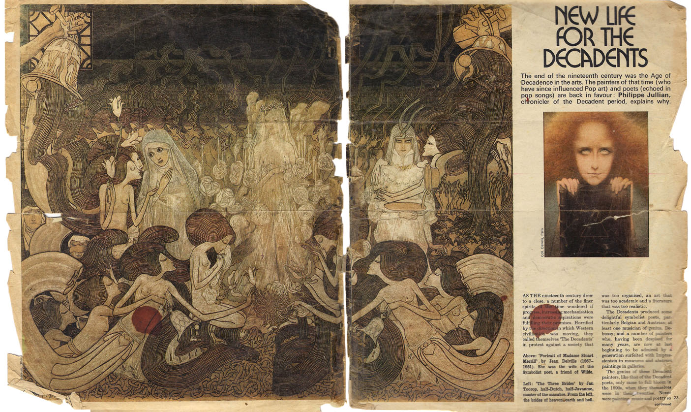
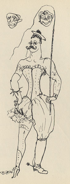
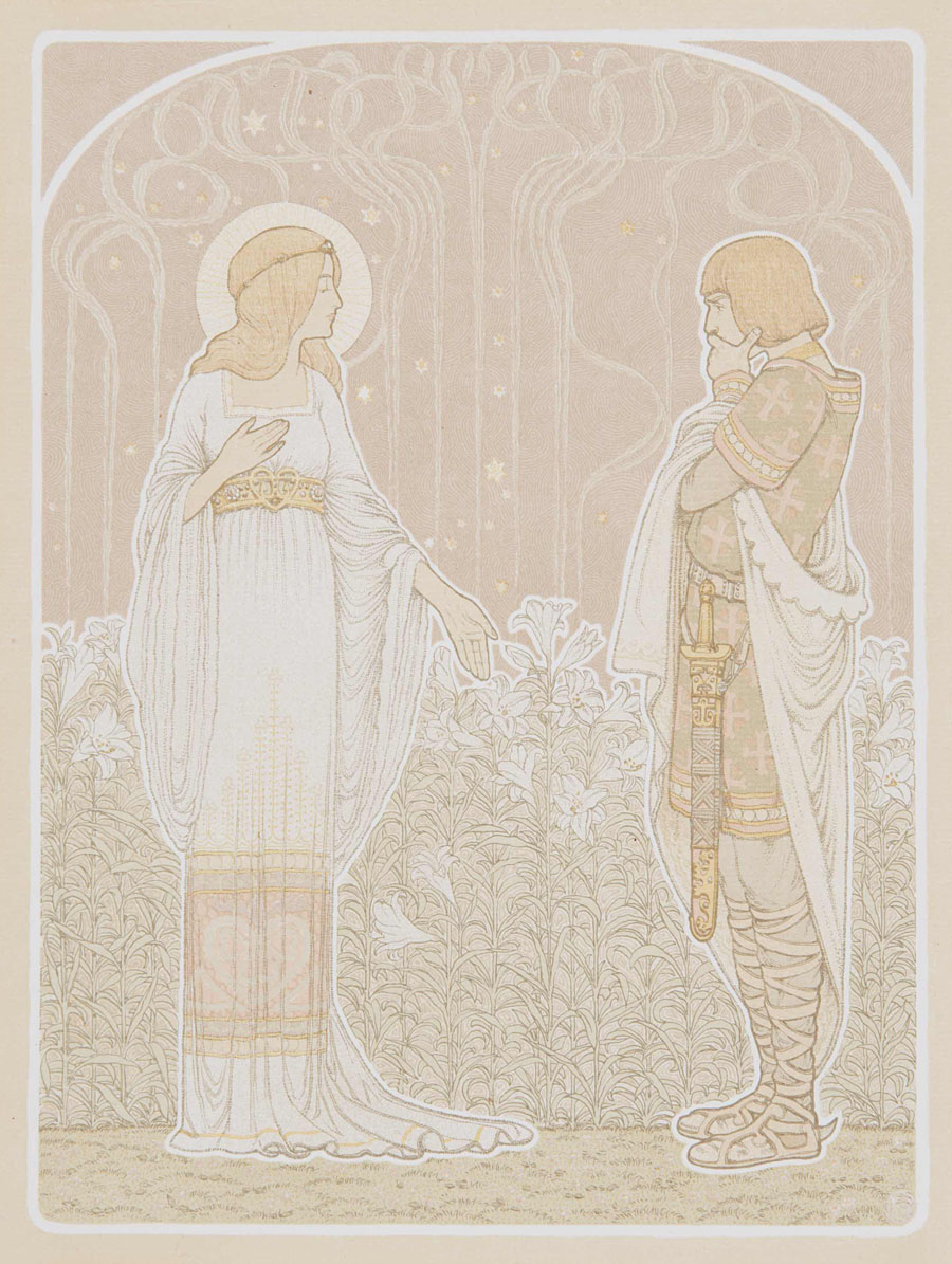
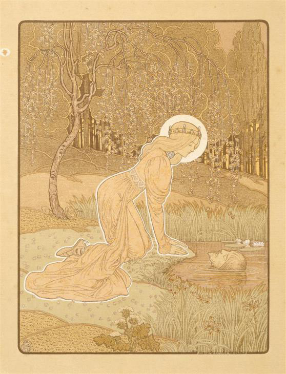
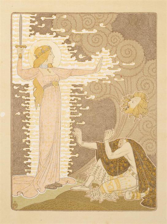
But his chef d’oeuvre is a series of lithographs inspired by the medieval folk song Heer Halewijn (Lord Halewijn), published in 1904 and exhibited in The Hague the same year, of which three are depicted here (from the collection Van der Peppel.) The most famous of the series is plate number sixteen in which Lord Halewijn’s head is decapitated by a charming lady. It is obviously inspired by Beardsley’s Salomé but is made with an entirely different technique and in colours. There is also a touch of Puvis de Chavannes and Carlos Schwabe to them. They are among the finest examples of Dutch fin de siècle graphic art.

Sander Bink

henricus5.jpg

henricus6.jpg

Previously on { feuilleton }
The art of Antoon van Welie, 1866–1956
The art of Simon Moulijn, 1866–1948
René Gockinga revisited
Gockinga’s Bacchanal and an unknown portrait of Fritz Klein
More from the Decadent Dutch

The case of the fin de siècle fleuron

artnouveau.jpg

I said yesterday that poppies are a common feature of the fin de siècle magazines for the convenient way they combine long-stemmed flowers—ideal for all those Art Nouveau flourishes—with narcotic connotations that signal Decadence. The spiralling fleuron above is one example that readers of Savoy books may recognise, an occasional company logo which has been in use since the mid-1980s. David Britton chose the design from one of the Dover Pictorial Archive books, Carol Belanger Grafton’s Treasury of Art Nouveau Design and Ornament, and I later made a digital version from this page scan.

heroes.jpg

One of the earliest Savoy uses, a label design for Heroes (1986) by PJ Proby.

Having spent a great deal of time in recent years trawling through Art Nouveau magazines I was sure I was going to run into the original printing of the fleuron eventually. Some of the page decorations in Jugend are very similar but it wasn’t there or in Pan, Deutsche Kunst und Dekoration or The Studio. I don’t have a copy of the Grafton book, and Dave says his copy is lost, so I’ve no idea whether there’s a credit for the source of the designs; not all Dover books credit their source material in any detail. Earlier this week I decided to look in Art et Décoration, a magazine that was the French equivalent of The Studio, since the header at the top of the scanned page implied that the other designs might be from the same magazine. Aside from a couple of copies at the Internet Archive this means looking through the poor-quality scans at Gallica; by a fluke—because they don’t seem to have a complete run of the early issues—the January 1898 edition contained the page below showing the Savoy fleuron, an endpiece for an article devoted to another French art magazine, L’Image.

Continue reading “The case of the fin de siècle fleuron”

New Life for the Decadents by Philippe Jullian

jullian1.jpg

This essay by cult writer Philippe Jullian appeared in an edition of the Observer colour supplement in 1971, shortly after Jullian’s chef d’oeuvre, Dreamers of Decadence, had been published in Britain. Esthètes et Magiciens (1969), as Jullian’s study was titled in France, was instrumental in raising the profile of the many Symbolist artists whose work had been either disparaged or ignored since the First World War. A year after the Observer piece, the Hayward Gallery in London staged a major exhibition of Symbolist art with an emphasis on the paintings of Gustave Moreau; Jullian alludes to the exhibition in his article, and also wrote the foreword to the catalogue. His Observer article is necessarily shorter and less detailed than his introductory essay, emphasising the reader-friendly “Decadence” over the more evasive “Symbolist”. But as a primer to a mysterious and neglected area of art the piece would have served its purpose for a general reader.

Many thanks to Nick for the recommendation, and to Alistair who went to the trouble of providing high-res scans that I could run through the OCR. The translators of the article, Francis King and John Haylock, had previously translated Jullian’s biography of Robert de Montesquiou.

*

New Life for the Decadents

The end of the nineteenth century was the Age of Decadence in the arts. The painters of that time (who have since influenced Pop art) and poets (echoed in pop songs) are back in favour: Philippe Jullian, chronicler of the Decadent period, explains why.

AS THE nineteenth century drew to a close, a number of the finer spirits of the time wondered if progress, increasing mechanisation and democratic aspirations were fulfilling their promises. Horrified by the direction in which Western civilisation was moving, they called themselves “The Decadents” in protest against a society that was too organised, an art that was too academic and a literature that was too realistic.

The Decadents produced some delightful symbolist poets, particularly Belgian and Austrian; at least one musician of genius, Debussy; and a number of painters who, having been despised for many years, are now at last beginning to be admired by a generation surfeited with Impressionists in museums and abstract paintings in galleries.

The genius of these Decadent painters, like that of the Decadent poets, only came to full bloom in the 1890s, when they themselves were in their twenties. Never were painting, music and poetry so close to one another. The gods of the Decadents were primarily Wagner and Baudelaire, then Swinburne and Poe. The Decadent movement, so active all over Europe, turned towards two great sources of inspiration: the Pre-Raphaelites, and a French painter whose glory was for a while eclipsed by the Impressionists but who is now once again accorded his place among the great—Gustave Moreau.

The women whom the Decadents loved and of whom they dreamt resembled the women created 30 years previously by Rossetti, Burne-Jones and Moreau.

Nothing could be more naturalistic than the artistic style elaborated by the Pre-Raphaelites in the middle of the nineteenth century. Dante Gabriel Rossetti’s model, inspiration, mistress and finally wife was the sweet and sad Elizabeth Siddal, on whom so many fin-de-siècle ladies had to model themselves on the Continent as did all the aesthetic ladies of England in the 1880s. She posed for Rossetti as Beatrix and as the Belle Dame sans Merci.

She was a rare spirit, about whom everything was nebulous and evanescent: the thick, wild hair; the tunic of a simplicity to challenge the elaboration of the crinolines then in vogue; the frail hands burdened with lilies; the gaze turned towards eternity. She also posed, fully dressed and lying in a bath, her hair outspread around her bloodless face, as Ophelia for another Pre-Raphaelite, Millais. Elizabeth died of pulmonary tuberculosis in 1862.

A macabre episode, which might have been imagined by Poe, was the exhumation of a sheaf of Rossetti’s poems that had been buried in Elizabeth Siddal’s coffin. When this symbol of the New Woman died, the grief-stricken poet had insisted on placing the poems inspired by her under her long hair before the coffin was sealed.

jullian4.jpg

Beata Beatrix (1864–1870) by Dante Gabriel Rossetti.

Continue reading “New Life for the Decadents by Philippe Jullian”

Philippe Jullian, connoisseur of the exotic

jullian01

Monsieur Jullian as seen on the back cover of Dreamers of Decadence (1971).

Here at last is the long-promised (and long!) piece about the life and work of Philippe Jullian (1919–1977), a French writer and illustrator who’s become something of a cult figure of mine in recent years. Why the fascination? First and foremost because at the end of the 1960s he wrote Esthètes et Magiciens, or Dreamers of Decadence as it’s known to English readers, a book which effectively launched the Symbolist art revival and which remains the best introduction to Symbolist art and the aesthetic hothouse that was the 1890s. If I had to choose five favourite books Dreamers of Decadence would always be on the list. This point of obsession, and Philip Core’s account of the writer, made me curious about the rest of Jullian’s career.

jullian13

An illustration from Wilson & Jullian’s For Whom the Cloche Tolls (1953). “Tata has called these his Krafft-Ebbing (sic) pictures of his friend Kuno, whatever that means.”

Philip Core was friends with Philippe Jullian, and Core’s essential Camp: The Lie that Tells the Truth (1984) has Jullian as one of its dedicatees. It’s to Core’s appraisal that we have to turn for details of the man’s life. There is an autobiography, La Brocante (1975), but, like a number of other Jullian works, this doesn’t seem to have been translated and my French is dismally pauvre. Core’s piece begins:

Philippe Jullian, born to the intellectual family of Bordeaux Protestants which produced the well-known French historian, Camille Jullian, was a last and lasting example of pre-war camp. His career began as an artist in Paris with a reputation for drag-acts parodying English spinsters. Snobbery, a talent for sensitive daydreaming, and a consuming passion for antiques, obscure art and social history, made a very different figure out of the thin and dreamy young man. Jullian suffered terribly during the Second World War; he managed to survive by visiting some disapproving cousins dressed as a maiden aunt, whom they were happy to feed. However, he made a mark in the world of Violet Trefusis, Natalie Barney and Vita Sackville-West by illustrating their books with his wiry and delicate doodles; this led to a social connection in England, where he produced many book jackets and covers for Vogue throughout the 1950s.

Having only seen Jullian in his besuited and bespectacled guise it’s difficult to imagine him dragged up, but the cross-dressing interest is apparent in his humorous collaboration with Angus Wilson and in a later novel, Flight into Egypt. As for the wiry and delicate doodles, they’re very much of their time, in style often resembling a less-assured Ronald Searle. One early commission in 1945 was for the first of what would become a celebrated series of artist labels for Château Mouton Rothschild. Later cover illustrations included a run for Penguin Books some of which can be found at Flickr.

Philip Core continues the story:

Elegant in the austerely tweedy way the French imagine to be English, Jullian exploited his very considerable talents as a writer, producing a series of camp novels throughout the 1950s (Scraps, Milord) which deal frankly but amusingly with the vicissitudes of handsome young men and face-lifted ladies, grey-haired antique dealers and criminals. One of the first to reconsider Symbolist painting, Jullian reached an enormous public in the 1960s with his gorgeous book, Dreamers of Decadence – where an encyclopaedic knowledge of the genre and its accompanying literature helped to create the boom in fin de siècle revivalism among dealers and museums.

An acerbic wit accompanied this vast worldly success; always docile to duchesses, Jullian could easily remark to a hostess who offered him a chocolate and cream pudding called Nègre en chemise, “I prefer them without.” Less kindly, to a gay friend who objected to Jullian’s poodles accompanying them into a country food shop by saying “Think where their noses have been”, he could also retort “Yes, that’s what I think whenever I see you kiss your mother.”

Continue reading “Philippe Jullian, connoisseur of the exotic”