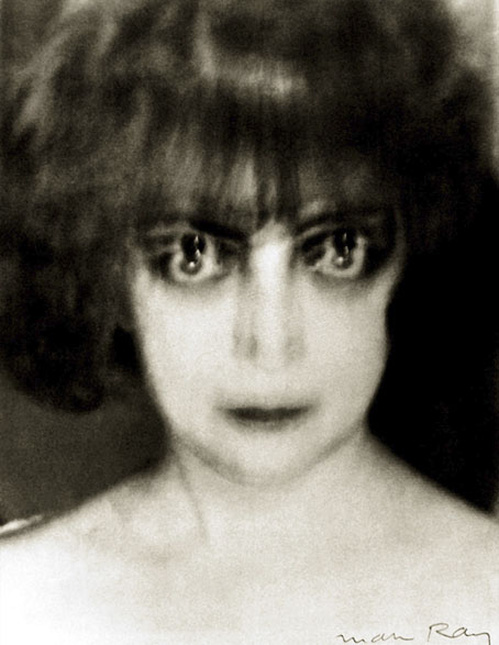
Luisa Casati (1922) by Man Ray.
Today’s post is another in the series of irregular art essays by Sander Bink. The subject this time is Luisa Casati (1881–1957), the Italian heiress who burnt through a fortune living extravagantly while being drawn or painted by many of the most notable artists of her time. (I did my own very stylised portrait of the Marchesa for Bruce Sterling’s Pirate Utopia, a novel where Casati briefly appears among the cast of real and fictional characters.) As before with Sander’s posts, Carel de Nerée tot Babberich is one of the artists under discussion. Thanks, Sander!
* * *
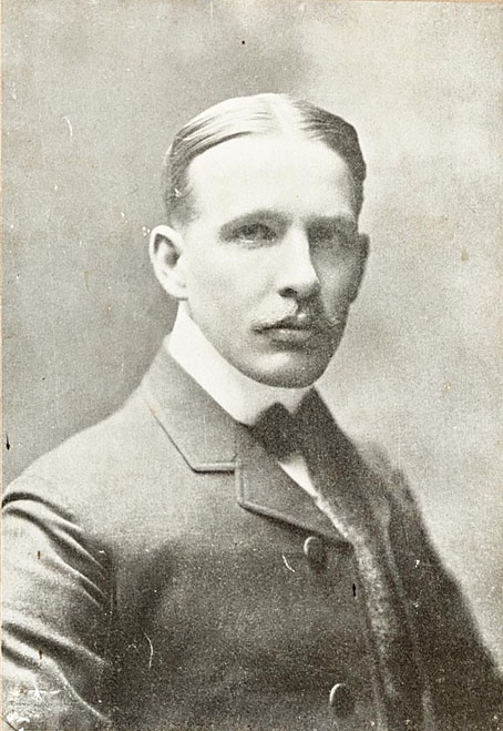
Carel de Nerée around 1905.
Many artists have paid homage to the ‘living artwork’ and legendary fashion icon Luisa Casati. Artists such as Man Ray, Paul-César Helleu, Giovanni Boldini, Léon Bakst, Kees van Dongen, Alastair, Romaine Brooks and Giacomo Balla have immortalised her. Legend has it that a certain fascinating Dutch artist should also be added to this list: Carel de Nerée tot Babberich (1880–1909). (Previously: 1 & 2)
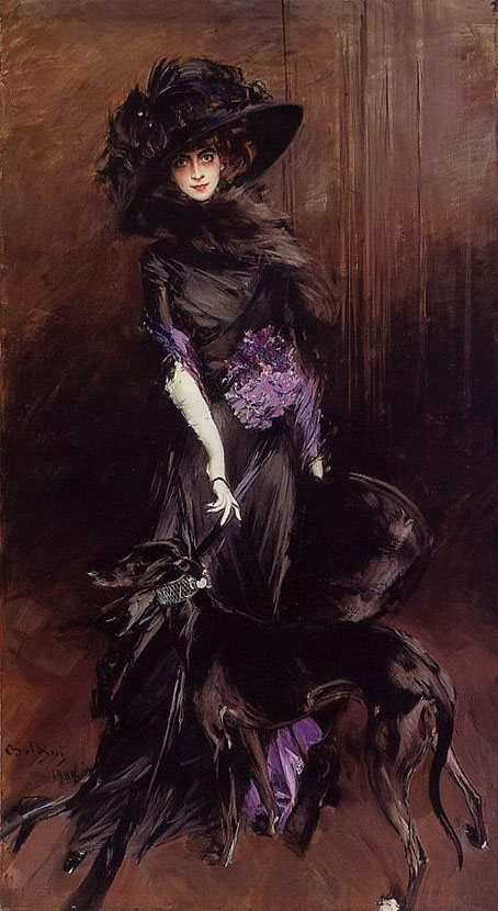
Luisa Casati with Greyhound (1908) by Giovanni Boldini. Private collection.
By 1930, Casati’s decadent and luxurious lifestyle had left her millions in debt. To escape her creditors, she moved to London. In the years before her death in 1957, she was seen scavenging for food in rubbish bins. In these final years, she naturally preferred to look to the past rather than the present, making lists of all those who had portrayed her then fading glory. Remarkably, one of these features De Nerée. Scot D. Ryersson and Michael Yaccarino, in their classic biography Infinite Variety: The Life and Legend of the Marchesa Casati, write about this period:
Whereas her evenings were absorbed by occult passions, the Marchesa spent part of her days writing lists. One was an inventory of the renowned personages she had known. There were others cataloguing the many artists, famous and lesser known, who had represented her. The difficulty of creating a comprehensive index of contributors to the ‘Casati Gallery’ is compounded both by Luisa’s incomplete and inaccurate records and by the lack of information concerning the minor portraitists, such as Mrs. Leslie Cotton and Karel de Nerée tot Babberich and those who were simply wealthy dilettantes. Boldini, John, van Dongen, and Epstein are noted alongside Hohenlohe, Nikolai Riabushinsky, theatrical designer Oliver Messel, and Eduardo Chicharro, director of the Spanish Academy of Fine Art in Rome.
The footnote to this paragraph states:
Christophe Henri Karel de Nerée tot Babberich (1880–1909) was a little-known Dutch artist whose pen and ink work is highly reminiscent of Martini and Alastair. Although there is little material documenting Casati’s association with or influence on the artist, many of the highly stylized and bizarre female subjects of his drawings share a more than coincidental resemblance to the Marchesa.
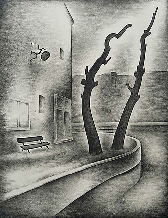
De Nerée did, indeed, draw several dark-eyed female figures in extravagant dresses, all of which could easily pass for a portrait of Casati. In the book The Marchesa Casati: Portraits of a Muse (2009), Ryersson and Yaccarino give an overview of all the works of art based on Casati. A drawing by De Nerée of a very slender figure with dark eyes is identified as a portrait of Casati and dated 1905.

Het schone beeld (The beautiful image, 1900–01) by Carel de Nerée. Private Collection. Estate of Barry Humphries.
The authors were not 100% sure of this identification, but due to the almost complete lack of documentation on De Nerée’s life and work at the time, they chose this drawing. In an email to me in 2010, the authors withdrew this identification because of this lack of documentation. It is actually a drawing dating from 1900–01, based on a story by Henri Borel. Of course, we immediately set about trying to find out which of De Nerée’s drawings could be a portrait of Casati.
In their email, Ryersson and Yaccarino give some more information:
In the papers left behind by the Marchesa, after her death in 1957, was a list she had made herself of those artists who had done her portraits. Babberich was on that list. His portrait of her, done in pencil, was from around 1905. We do not know how they met, but the Marchesa travelled frequently and extensively and was fond of the work of such symbolist artists as Alberto Martini, Gustav Mossa, and Alastair, so it is not surprising that Babberich caught her attention somehow.
De Nerée and Casati make an excellent match indeed. ‘She was only too pleased to promote artists whose aesthetic she felt an affinity with, and those whose work was so contrary to popular taste’, Ryersson and Yaccarino write in Portraits of a Muse. In 2015, I began working on what has now become the first full-length biography of De Nerée. Research showed that De Nerée actually deregistered from The Hague in October 1905 in order to settle in Rome.
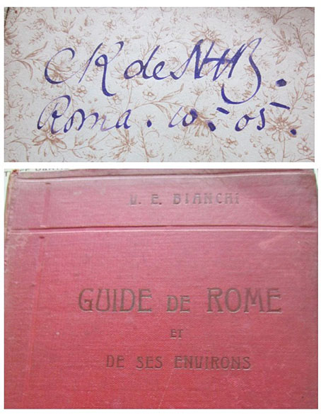
Rome travel guide with De Nerées’ annotation “Roma, October 1905”. Private collection.
One reason for this was that, from 1905, De Nerée’s life was increasingly set in the aristocratic and very wealthy circles of southern Europe. In 1907, for example, he met Gabriel d’Annunzio, a lover of Casati’s, in Florence. Perhaps he had met him before. And in 1908, for example, he drew a portrait of Baroness Clementine Maria von Reuter (1855–1941), daughter of the wealthy Baron Paul von Reuter (1816–1899), founder of Reuters news agency. (Private collection, Netherlands).