Weekend links 221

cornell.jpg

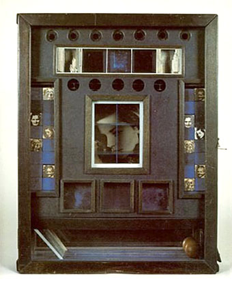
Untitled (Penny Arcade Portrait of Lauren Bacall) (1946) by Joseph Cornell.

• Having been a Bernard Szajner enthusiast for many years it’s good to see his music receiving some belated reappraisal. David McKenna talked to Szajner about his Visions Of Dune album (which is being reissued by InFiné next month), laser harps, The (Hypothetical) Prophets, and working with Howard Devoto.

• Priscilla Frank posts some big views of Marjorie Cameron’s occult paintings as a preview of the forthcoming exhibition at MOCA Pacific Design Center, Los Angeles.

• Fascinating reading in light of the recent kerfuffle over True Detective, Christopher Loring Knowles on the possible sources of HP Lovecraft’s Cthulhu Mythos.

Those who set up oppositions between the electronic technology and that of the printing press perpetuate Frollo’s fallacy. They want us to believe that the book—an instrument as perfect as the wheel or the knife, capable of holding memory and experience, an instrument that is truly interactive, allowing us to begin and end a text wherever we choose, to annotate in the margins, to give its reading a rhythm at will—should be discarded in favor of a newer tool. Such intransigent choices result in technocratic extremism. In an intelligent world, electronic devices and printed books share the space of our work desks and offer each of us different qualities and reading possibilities. Context, whether intellectual or material, matters, as most readers know.

Alberto Manguel, lucid as always, on the act and import of reading.

• “It’s time to give prog rock’s artist-in-residence Roger Dean his due,” says Amber Frost. No argument there, I did my bit in 2010.

• “Why do the covers of so many self-published books look like shit?” asks B. David Zarley.

• Mixes of the week: FACT mix 455 by Airhead, and Secret Thirteen mix 225 by Clock DVA.

• At Core77: Rain Noe chooses favourite skyscraper photos by Russian urban explorers.

• “O, Excellent Air Bag”: Mike Jay on the nitrous oxide fad of the early 19th century.

Nick Carr goes in search of Manhattan’s last remaining skybridges.

Lauren Bacall at Pinterest.

• Shaï Hulud (1979) by Zed (Bernard Szajner) | Welcome (To Death Row) (1980) by Bernard Szajner | Person To Person (1982) by The (Hypothetical) Prophets

The art of Frieda Harris, 1877–1962

harris01.jpg

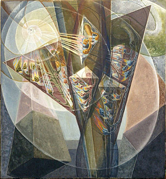
Searching around for artwork by Frieda Harris turned up a few examples I hadn’t seen before including the marvellous painting above which is unfortunately untitled and undated. Harris is very familiar to Aleister Crowley aficionados and those with an interest in the Tarot via her paintings for the Thoth Tarot deck, a project that she and Crowley worked on during the 1930s. The deck is justly celebrated for its modernising of the Tarot symbolism, and for its radical art style which wasn’t afraid to combine some of the developments in 20th-century art with Harris’s studies of Projective Synthetic Geometry.

harris05.jpg

Masonic Tracing Boards.

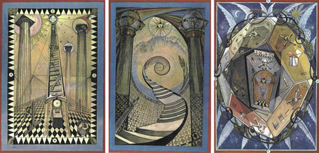
Less familiar is her work away from the Tarot deck, some of which can be seen here. Prior to meeting Crowley, Harris was involved with Freemasonry for which she produced three designs for the Masonic teaching aids known as Tracing Boards. (See larger copies here.) I used to think these looked like outtakes from the Tarot deck but seeing them in the light of the mysterious painting above it’s evident that the Tarot style wasn’t unique to that set of cards.

harris04.jpg

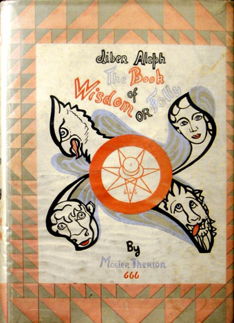
Liber Aleph vel CXI: The Book of Wisdom or Folly (1918) by Aleister Crowley.

A book cover which pre-dates the Tarot designs. The heads are the traditional embodiments of the four elements but with one change: the human figure has a feminine face rather than the usual masculine features. The same figures appear on her painting for the final Tarot Trump, The Universe (below), but in a more traditional guise.

Continue reading “The art of Frieda Harris, 1877–1962”

Konx om Pax

konx1.jpg

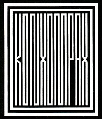
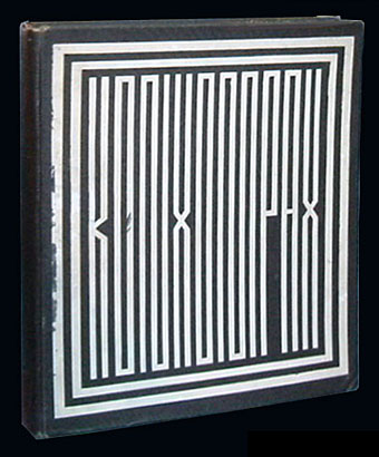
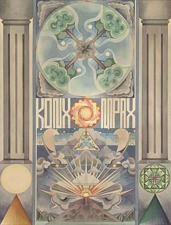
Not the musician but the book of “Essays in Light” published by Aleister Crowley in 1907. I’ve been familiar with this for years but only via the many reprints. It was only recently that I discovered the striking cover design of the first edition which, we’re told, was designed by Crowley himself during a hashish bout. I’ve not been able to find the source for this piece of information but it’s not in the chapter of his autobiography where he discusses the writing of the book. (Matters aren’t helped by Konx om Pax not being listed in the index.) If anyone has the relevant details then please leave a comment.

konx2.jpg

In design terms this cover might seem radical for 1907 but if Crowley did design it I’d guess he was thinking of a quite common geometric variation of Kufic script. Crowley travelled East as far as China, and had an abiding interest in languages of all kinds. Konx om Pax opens with a quote in Arabic from the Qur’an which is followed by a succession of quotes in different languages including Hebrew, Chinese, Ancient Greek, Sanskrit and hieroglyphic Egyptian.

konx3.jpg

Konx om Pax (2011) by Fredrik Söderberg.

Crowley’s lettering turns up much later in this painting by Fredrik Söderberg. The phrase was also referenced during the 1990s on many of Bill Laswell’s recordings, often by cryptic phrasing on CD stickers. The name forms part of one of the tracks on Laswell’s Axiom Ambient album from 1994, an album which includes a sample of Crowley’s voice. Also in the 1990s, Laswell was making frequent use of what MacGregor Mathers claimed was the English translation of the Egyptian origin of the phrase: “Khabs am Pekht” or “Light in extension”. One of Laswell’s many dub projects, Divination, released two compilation albums called Light In Extension, while the phrase “Khabs am Pekht” (which had me mystified for years) appears on the back of Material’s magnificent Hallucination Engine (1994). One of my favourite albums, which also includes a portion of a Crowley Tarot card in its James Koehnline artwork.

Previously on { feuilleton }
Burroughs at 100
Aleister Crowley: Wandering The Waste
Brush of Baphomet by Kenneth Anger
Rex Ingram’s The Magician
The Mysteries of Myra
Aleister Crowley on vinyl

Weekend links 220

waliszewska.jpg

Untitled painting by Aleksandra Waliszewska.

• Ben Wheatley’s forthcoming film of High-Rise by JG Ballard now has its own Tumblr. This will no doubt be spoilerific so I won’t keep on visiting but it’s there if you require it. More Ballardianism: “Worshipping the Crash” at BLDGBLOG.

• “Aickman wandered through the sixties fantasy landscape like some curmudgeonly fetch, returning from the fin de siècle heyday of the ghost story.” Boyd Tonkin profiles Robert Aickman, writer of peerless “strange stories”.

• At Dangerous Minds: “Raise a glass to Cthulhu at the Lovecraft Bar”. Looks more like a Captain Nemo bar to me (not that there’s anything wrong with that) but I appreciate the gesture.

But to demand that a work be “relatable” expresses a different expectation: that the work itself be somehow accommodating to, or reflective of, the experience of the reader or viewer. The reader or viewer remains passive in the face of the book or movie or play: she expects the work to be done for her.

Rebecca Mead on The Scourge of Relatability

• “Space as a paranoid, static rumble featuring: 20jfg, Ben Frost & Daníel Bjarnason, Coil & Eduard Artemiev”. 20 Jazz Funk Greats on the pleasures of the Solaris soundtrack.

• What do Hawkwind, Harry Nilsson, Stereolab and The Supremes have in common? David Stubbs examines the legacy of Neu! and Klaus Dinger’s “Dingerbeat”.

• A reminder that A Year in the Country features a host of worthwhile links and associations for the Hauntologically persuaded.

Rouge Louboutin, an ad by David Lynch. Related: An improptu biscuit ad by the Eccentronic Research Council.

• Mix of the week (a year old but no matter): JG Ballard Zoom Lens Mix by Bernholz.

• At 50 Watts: More illustrated sheet music covers by Einar Nerman.

Five book cover designers and the books that inspire them.

Tove Jansson would have been 100 this week.

Pangaea with modern borders

Solaris: Dream (1990) by Edward Artemyev [sic] | Solaris (2000) by Photek | Simulacra I (2011) by Ben Frost & Daníel Bjarnason

Intertextuality

cthulhu17.jpg

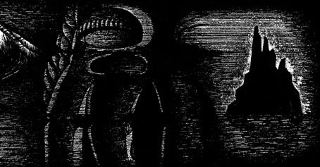
The Call of Cthulhu (1988): in the upper half there’s the big sun from Bob Peak’s poster for Apocalypse Now, in the lower half a radical reworking of Arnold Böcklin’s The Isle of the Dead.

In 1990, shortly after the first season of Twin Peaks had finished showing in the US, Video Watchdog magazine ran a feature by Tim Lucas which attempted to trace all the various cultural allusions in the character names and dialogue, references to old TV shows, song lyrics and the like. This was done in a spirit of celebration, with Lucas and other contributors welcoming the opportunity to dig deeper into something they’d already enjoyed. This week we’ve had a similar unravelling of textual borrowings in a TV series, only now we have the internet which, with its boundless appetite for accusing and shaming, can often seem like something from the grand old days of the Cultural Revolution.

cthulhu01.jpg

The Call of Cthulhu (1988): a more subtle allusion to Apocalypse Now.

The latest culprit ushered to the front of the assembly for the Great Internet Struggle Session is Nic Pizzolatto whose script for True Detective has indeed been celebrated for its nods to Robert Chambers and The King in Yellow. It’s also in the process of being condemned for having borrowed phrases or aphorisms from Thomas Ligotti’s The Conspiracy Against the Human Race (2011). See this post for chapter and verse.

cthulhu02.jpg

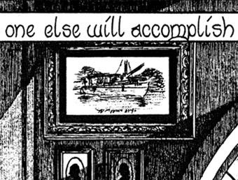
The Call of Cthulhu (1988): It’s not very clear but that’s a boat from The Creature from the Black Lagoon.

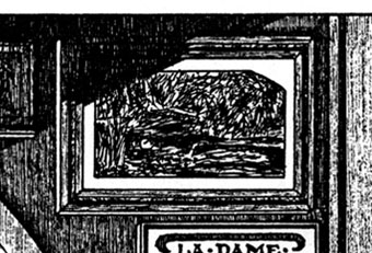
If I find it difficult to get worked up over all this pearl-clutching it’s because a) it shows a misunderstanding of art and the way many artists work; b) True Detective was an outstanding series, and I’d love to see more from Pizzolatto and co; and c) I’ve done more than enough borrowing of my own in a variety of media, as these samples from my adaptation of The Call of Cthulhu demonstrate, a 33-page comic strip where there’s a reference to a painting, artist or film on almost all the pages, sometimes several on the same page.

cthulhu03.jpg

The Call of Cthulhu (1988): Ophelia by Millais.

Cthulhu is a good choice here since Pizzolatto’s story edged towards Lovecraft via the repeated “Carcosa” references. You’d think a Lovecraft zine of all things would know better than to haul someone over the coals for borrowing from another writer when Lovecraft himself borrowed from Robert Chambers (and Arthur Machen and others), while “Carcosa” isn’t even original to Chambers’ The King in Yellow but a borrowing from an Ambrose Bierce story, An Inhabitant of Carcosa (1886). Furthermore, Lovecraft famously complained about his own tendencies to pastiche other writers in a 1929 letter to Elizabeth Toldridge: “There are my ‘Poe’ pieces and my ‘Dunsany pieces’—but alas—where are any Lovecraft pieces?”

Continue reading “Intertextuality”