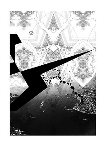
From the Ornamental Age series (2009) by Seher Shah.
Seher Shah has recently updated her website giving us a better view of her extraordinary art.
• The Demon Regent Asmodeus, my short film of Alan Moore’s reading from the first Moon & Serpent CD, has been posted to YouTube. In other self-promotion news, Mahakala, a drawing of mine from 1984, finds an audience on Tumblr.
• Yet more Moore: Alan Moore & Iain Sinclair “explore psychogeography” at the Cheltenham Festival in June. Alan will also be discussing science and fiction with Robin Ince. Then in July he’s performing with fine fellow Stephen O’Malley at Alexandra Palace as part of Portishead’s I’ll Be Your Mirror festival. They’ll be providing text and music for Harry Smith’s Heaven and Earth Magic.
In most countries, parents can tell their kids that if they work hard and do everything right, they could grow up to be the head of state and symbol of their nation. Not us. Our head of state is decided by one factor, and one factor alone: did he pass through the womb of one aristocratic Windsor woman living in a golden palace? The US head of state grew up with a mother on food stamps. The British head of state grew up with a mother on postage stamps. Is that a contrast that fills you with pride? (…) Earlier this month, David Cameron lamented that too many people in Britain get ahead because of who their parents are. A few minutes later, without missing a beat, he praised the monarchy as the best of British. Nobody laughed.
Johann Hari kicks the royals.
• Related to the above: Lydia Leith’s royal wedding sick bag.
• Beautiful Century relates a dispiriting (and very common) encounter with Google’s blog prudery. The new Beautiful Century is now at Tumblr.
• In the future, everything will be on Tumblr for fifteen minutes. Among this week’s discoveries there’s Writers and Kitties, attractive men and vintage photos at Stuff Doer, and all manner of things at Maggs Counterculture including a picture by Jim Leon I hadn’t seen before.
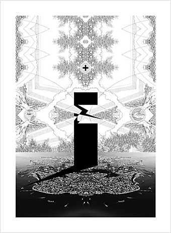
From the Ornamental Age series (2009) by Seher Shah.
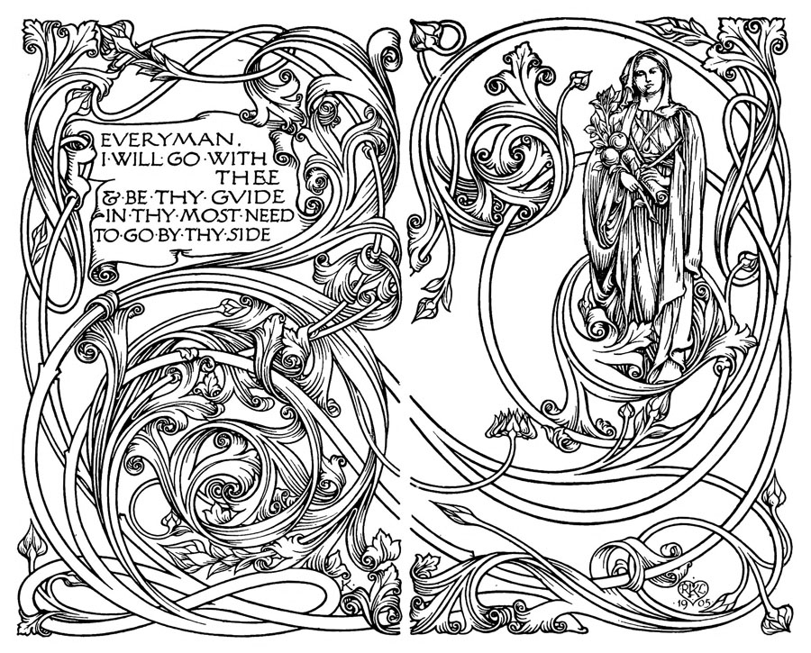
“Sidewalk cafés, free from conservative business attire…” Film of groovy Greenwich Village in the late 1960s. Related: groovier fashions in Art Nouveau Barcelona.
• Ai Weiwei’s Blog: Writings, Interviews, and Digital Rants, 2006-2009, a book from MIT Press.
• The Delian Mode, a film about electronic musician Delia Derbyshire by Kara Blake.
• Austin Osman Spare, a biography of the artist and occultist by Phil Baker.
• Lando Jones is giving away three limited edition prints of his artwork.
• Plano Creativo, a blog (in Spanish) by Alejandro Jodorowsky.
• B Magazine is a new publication for gay Americans.
• Diaghilev gets his due at Coilhouse.
• Baby’s On Fire (1973) by Brian Eno | Baby’s On Fire (1976) by 801 | Baby’s On Fire (from Velvet Goldmine) (1998) by The Venus In Furs.