Icons

icon1.jpg

“Iconic” is a much abused word these days but this book from UK publisher Counter-Print can claim the term with some justification:

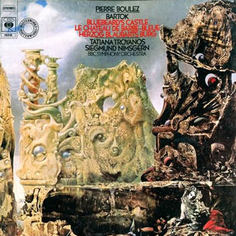
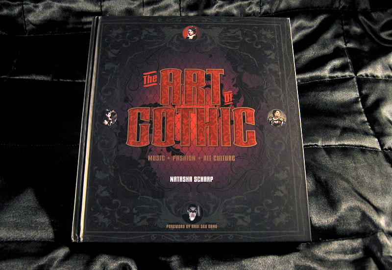
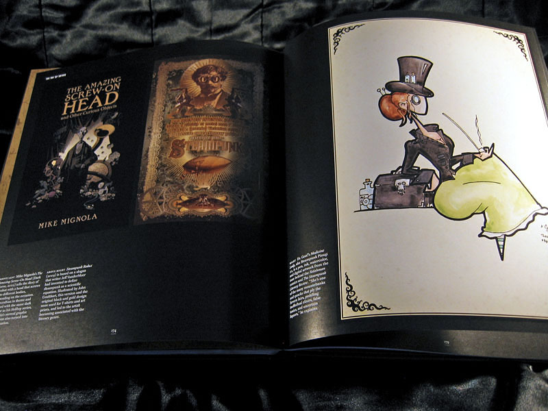
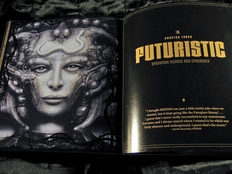
Icon contains over 200 examples of social media icons from many well-known, as well as up-and-coming, graphic designers and illustrators. This limited and concise canvas for self-expression is represented within this book through a host of examples collected from around the world, chosen for their creativity, intelligence and beauty.

My own icon/monogram/whatever is one of those featured in the “Shapes” section. It’s strange seeing this symbol subjected to any kind of attention even though it’s at the top of this web page and can also be found in much of my work. It appeared in drawings when I was about 15 or 16 and eventually became a personal identifier some time in the early 1980s. One reason I like it and continue to use it is because I don’t know what it is; it doesn’t originate out of any conscious expression, and doesn’t refer to any specific symbolic history even though it resembles other symbols. I always liked Whistler’s habit of using a peacock as his signature so he didn’t have to spoil his paintings with a scrawl; Aubrey Beardsley imitated his example for a while using three vertical lines as his signature. This icon has served a similar purpose for me although these days I’m as likely to use my surname and some Roman numerals.

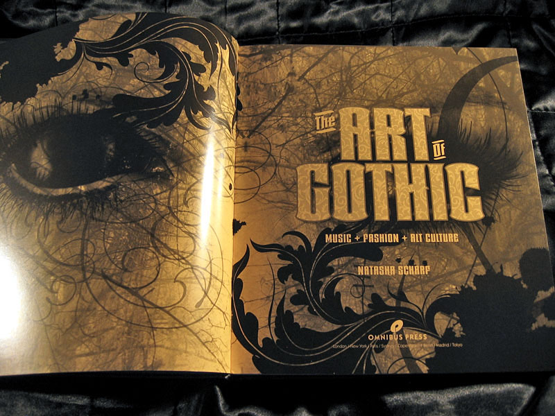
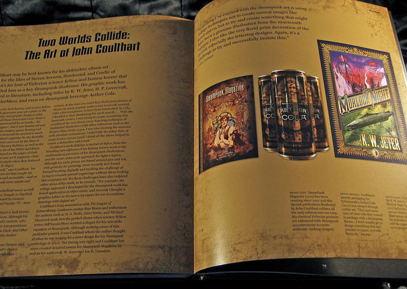
Icon is a great little book, smartly designed by Leterme Dowling and brimming with equally smart content. Some page samples follow.

icon2.jpg

icon3.jpg

Continue reading “Icons”

Weekend links 232

hackett.jpg

Forget Me Not (no date) by Caitlin Hackett.

• Halloween brings out the articles about weird fiction: “No one would now write of [HP Lovecraft] as the critic Edmund Wilson did, in the New Yorker in 1945: ‘The only real horror in most of these fictions is the horror of bad taste and bad art.’ The true horror was in fact that of judging Lovecraft by the standards of a defunct literary culture,” says John Gray. At The Atlantic there’s Jeff VanderMeer on the uncanny power of weird fiction, while Matt Seidel at The Millions explores the mysteries and attractions of Robert Aickman’s “strange stories”.

The Witching Hour is a video essay by Pam Grossman “examining the many different faces of witches in film”. Pam’s video opens with a scene from Suspiria; over at FACT, Goblin’s Claudio Simonetti talks about the creation of Suspiria‘s peerless soundtrack.

• David Rudkin and Alan Clarke’s uncanny television film, Penda’s Fen, is given a 40th anniversary screening later this month at the Horse Hospital, London. For those who can’t attend (and those who haven’t already read it) there’s my post from 2010.

Nabokov sees each day’s weather as a palette: “The weather this morning was soso: dullish, but warm, a boiled milk sky, with skin – but if you pushed it aside with a teaspoon, the sun was really nice, so I wore my white trousers”. He listens carefully to the sound of the rain, which his letters brilliantly orchestrate. He provides fantastic descriptions of puddles, some of which contain shifts in perspective reminiscent of the nearly cinematic transitions found in the novel he would write shortly afterwards, King, Queen, Knave:

“I looked out of the window and saw: a red-haired housepainter caught a mouse in his wheelbarrow and killed it with the stroke of a brush, then he tossed it in a puddle. The puddle reflected the dark-blue sky, quick black upsilons (reflections of swallows flying high) and the knees of a squatting child, who was attentively studying the little grey round corpse.”

Eric Naiman on Vladimir Nabokov’s Letters to Véra

• Occult rock: Peter Bebergal talks to Expanding Minds about his new book, Season of the Witch: How the Occult Saved Rock and Roll. There’s an hour-long film of Black Sabbath saving rock and roll in Paris, 1970, here.

• Mixes of the week: Burning The Existence, “a three-hour sonic exploration of the outer fringes of Goth”, and a horror soundtrack mix by Death Waltz.

• “‘Capital loathes the old,’ [Gareth] Evans said, ‘for anchoring us in the reality of the lived.'” Iain Sinclair on London’s lost cinemas.

Desirina Boskovich, co-editor of the Steampunk Users Manual, offers “7 Reasons Why Steampunk Is Totally ‘Now'”.

• Penguin has new collage covers by Julian House for The Cut-Up Trilogy by William Burroughs.

Hear a homemade synthesizer turn weather into music.

• Grotesque doodles by William Makepeace Thackeray.

full fathom five is Thom’s new blog.

Weird Dream (1976) by Harmonia 76 | Weird Caravan (1980) by Klaus Schulze | Weird Gear (1991) by Ultramarine

Heaven and Hell calendar

heavenhell00.jpg

Painting from the poster art for The Highbury Working (2000) by Alan Moore & Tim Perkins.

Unlike last year, this year’s CafePress calendar arrives on time, its creation being eased by the fact that it’s a reworking on an earlier version. The idea with the previous Heaven & Hell calendar had been to alternate various pieces of infernal Cradle of Filth artwork with contrasting imagery; as things turned out I had more offerings for Hell than for Heaven—no surprise there—so the reality wasn’t very satisfying.

This year I’ve managed to fill out the Heaven sequence with more recent works, all of which have been slightly adjusted to fit the square page ratio required by CafePress. So even though these are old pieces many of them are unique to this printing. Larger copies of the pages may be seen here while the CafePress purchase page is here. As always, my thanks to everyone who buys these things.

And as before, the calendars for previous years are now available all year round; see the full range here. Note that this means you need to select January as the starting month if you want the months to run for a single year only.

heavenhell01.jpg

JANUARY: Variation of the poster art for Angel Passage (2001) by Alan Moore & Tim Perkins.

Angel Passage was Alan and Tim’s album about the life and work of William Blake. I designed the CD, a poster, and also produced a video for the multi-media performance of the piece at the Purcell Room, London, in February 2001.

heavenhell02.jpg

FEBRUARY: Cover for Bitter Suites To Succubi by Cradle of Filth (2001).

My first piece of Cradle of Filth art. I was a little surprised when working on this that they really did want the wings and horns; Dani loved that kind of imagery. I was even more surprised when this cover was subsequently showcased in an entire window in Tower Records’ main London shop in Piccadilly.

Continue reading “Heaven and Hell calendar”

Weekend links 230

bebergal.jpg

Cover art by Arik Roper.

Peter Bebergal’s Season of the Witch: How the Occult Saved Rock and Roll was published this week. Articles about rock music’s occult preoccupations have been a recurrent feature of music magazines, especially around Halloween, but Bebergal’s book is the first attempt at a wide-ranging, full-length study. Despite the subtitle, the scope goes beyond the familiar—David Bowie’s Golden Dawn references, Jimmy Page’s Aleister Crowley obsession—to take in the pagan nature of the blues, pre-Beatles rock’n’roll, and the byways of electronic music. My old employers, Hawkwind, provide a title (Space Ritual) for one section, and I was pleased to see the Krautrock scene receiving some attention: years ago you couldn’t have counted on this from an American music study. As Bebergal notes, Can’s Aumgn on Tago Mago (1971) isn’t the hippy Aum/Om but originates in a mantra defined in Crowley’s Magick in Theory and Practice.

• “We don’t just have skeletons in our cupboard, we have an ossuary.” Another week, another Alan Moore interview, but Tim Martin‘s piece is as much a portrait of the man as a conversation about the usual subjects: art, science, magic, etc.

• “Europe’s history of penis worship was cast aside when the Catholic Church realized Jesus’s foreskin was too potent to control.” Stassa Edwards on venerated members.

Gays and horror actually have  somewhat of a lost history. FW Murnau, the director of Nosferatu, was openly gay. Frankenstein’s real creator, James Whale, was also out. Given the talent involved, and the illicit nature of the genre, amateur and professional critics have been divining queer themes from horror films for decades.

Patrick Rosenquist on Gory, Gay & Loving It: Why Homosexuals Heart Horror

• “I thought that fine art was fairly dishonest as an industry. It pretends to be about culture but it’s really about money.” Andy Butler interviews designer Neville Brody.

• Snapping, Humming, Buzzing, Banging: Richard B. Woodward on the creative partnership between David Lynch and sound-design genius Alan Splet.

• Also published this week: Discovering Scarfolk, Richard Littler’s guide to the occult-obsessed, rabies-infested English town.

• More rock music: When Art Rocked: San Francisco Music Posters, 1966–1971 by Ben Marks.

• The trailer for 808, a documentary about Roland’s celebrated drum machine.

• At The Millions: Devin Kelly on the collaborative art of words and images.

• More Crowley: Strange Flowers goes looking for Aleister Crowley’s Berlin.

• Mix of the week: Secret Thirteen Mix 130 by Gábor Lázár.

• Yello’s Boris Blank on his 10 favourite electronic records.

Richard Hirst‘s Top 5 Robert Aickman Stories.

I Put A Spell On You (1968) by Arthur Brown | I Put A Spell On You (1992) by Diamanda Galás | I Put A Spell On You (2004) by Queen Latifah

Saragossa Manuscript posters

saragossa1.jpg

Polish poster (1965) by Jerzy Skarzynski who was also the film’s production designer.

I love The Saragossa Manuscript, both the novel by Potocki and the movie by Has. I saw the film three times which, in my case, is absolutely exceptional.

Luis Buñuel in My Last Sigh (1983)

No surprise that a lifelong Surrealist was enamoured with Jan Potocki’s rambling collection of stories-within-stories. The 1965 Polish film by Wojciech Has had another famous enthusiast in Jerry Garcia whose efforts to restore and reissue The Saragossa Manuscript helped bring the film to a new generation of viewers in 1999. I was a beneficiary of this, having been intrigued for years by descriptions whilst hoping in vain that it might turn up on television. I prefer the film to the novel although to be fair to Potocki it’s a long time since I read his book.

saragossa2.jpg

Another Polish design showing Zbigniew Cybulski as Alphonse.

Watching The Saragossa Manuscript again this weekend sent me looking for posters, some of which can be seen below. There are odd omissions: plenty of examples from the Eastern Bloc countries but few at all from Western Europe. The film suffered by having its 3-hour running time hacked about by distributors which didn’t help its reception outside Poland. The manuscript of the title is a book discovered during a skirmish in the Napoleonic wars, an account of the strange adventures of Alphonse Van Worden in the Sierra Morena region of Spain; one of the soldiers reading the manuscript is Van Worden’s grandson, the first of many coincidental connections. Van Worden’s adventures seem macabre at first—there are more bones in the opening scenes than in many horror films—but they soon turn farcical. As a burgeoning cast of characters appears, many of whom have their own tales to tell, the mood veers into outright sex comedy, albeit with mild philosophical overtones. Some scenes aren’t very far removed from Monty Python, especially those that feature an inept band of Spanish Inquisitors.

saragossa10.jpg

Background drawings from the title sequence. Yes, the score is by Penderecki, his first.

All of which means this is another film that presents a challenge for a poster designer. Most of the early examples take their cues from the opening titles whose backgrounds feature drawings with a vaguely Surrealist and occult flavour that I’m guessing are also the work of Jerzy Skarzynski.

Continue reading “Saragossa Manuscript posters”