Albert Goodwin’s fantasies

viriconium-goodwin.jpg

Viriconium (Millennium/Gollancz, 2000). Painting: The Gates of the Inferno (no date).

The web continues to be an incomparable treat for anyone interested in art history. One of the great advantages of the BBC’s Your Paintings site is having the opportunity to see pictures by artists whose output would rarely be deemed important enough to appear in a book. Albert Goodwin (1845–1932) is one such artist, a painter of landscapes and seascapes with a sideline in fantastic scenes, some of which may have been inspired by the apocalyptic canvases of John Martin. The cover of the Viriconium anthology was my first sighting of anything by Goodwin. That particular painting appears to be in private hands so to date this is the only copy I’ve seen. The combination of minatory architecture and a nebulous atmosphere is just the kind of thing I enjoy so it’s disappointing to not find him producing anything similar.

The paintings below show some of Goodwin’s other forays into the fantastic, mostly illustration of one sort or another. The two final pictures wouldn’t be out-of-place on a collection of William Hope Hodgson sea stories; the devastated Armada isn’t fantastical per se but it reminds me of Hodgson’s descriptions of the Sargasso Sea.

goodwin7.jpg

Apocalypse (1903).

goodwin1.jpg

Ali Baba and the Forty Thieves (1901).

goodwin2.jpg

Sinbad Entering the Cavern (1879).

Continue reading “Albert Goodwin’s fantasies”

The Court of the Dragon

atget.jpg

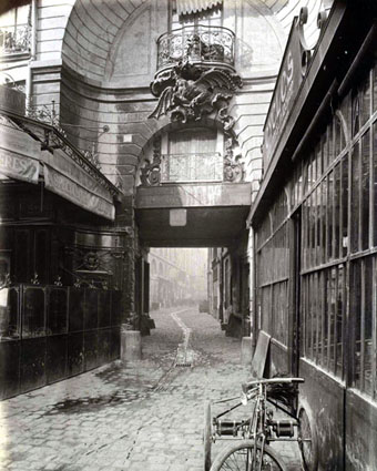
50 Rue de Rennes (1900) by Eugène Atget.

I live in the Court of the Dragon, a narrow passage that leads from the Rue de Rennes to the Rue du Dragon.

It is an “impasse”; traversable only for foot passengers. Over the entrance on the Rue de Rennes is a balcony, supported by an iron dragon. Within the court tall old houses rise on either side, and close the ends that give on the two streets. Huge gates, swung back during the day into the walls of the deep archways, close this court, after midnight, and one must enter then by ringing at certain small doors on the side. The sunken pavement collects unsavoury pools. Steep stairways pitch down to doors that open on the court. The ground floors are occupied by shops of second-hand dealers, and by iron workers. All day long the place rings with the clink of hammers and the clang of metal bars.

Unsavoury as it is below, there is cheerfulness, and comfort, and hard, honest work above.

Five flights up are the ateliers of architects and painters, and the hiding-places of middle-aged students like myself who want to live alone. When I first came here to live I was young, and not alone.

In the Court of the Dragon (1895) by Robert W. Chambers.

Drawing the King in Yellow for the Karl Edward Wagner story in Lovecraft’s Monsters (see yesterday’s post) sent me back to the Robert W. Chambers story collection where the strange and terrible regent first appears. Despite having written in the past about the covers for Chambers’ book I hadn’t read the stories for some time. Chambers’ blending of Bohemian romance, fantasy, horror, and early science fiction is just the thing to point to when people ask for a definition of weird fiction, writing that comes from a period before the straightjacket of genre definition had fastened itself about imaginative writing.

Chambers’ collection contains ten stories but only the first four are weird tales: The Repairer of Reputations, The Mask, In the Court of the Dragon, and The Yellow Sign. Of the four, In the Court of the Dragon is the weakest, although my re-reading caused some surprise when I realised that the story takes place in a location in Paris which the great photographer of the city, Eugène Atget, had memorably fixed five years after the book was published. Chambers was American but pursued a career as an artist in Paris before he took up writing; the description above can be taken as his own experience of the city.

ruederennes3.jpg

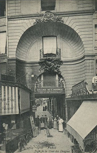
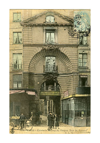
Undated postcards showing wider views.

ruederennes2.jpg

Atget is a photographer whose work I’m always happy to return to, especially his views of the streets and courtyards of a Paris now cleaned and tidied, if not altogether redeveloped. His view of the dragon balcony in the Rue de Rennes features everything I like about his street scenes: an unpeopled vista, weathered cobblestones, curious architectural detail, and the hazy distance of the courtyard itself. Chambers’ story may not communicate quite the same atmosphere but the pair for me are now inextricably linked. This place couldn’t have survived, could it?

ruederennes.jpg

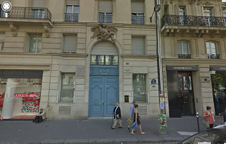
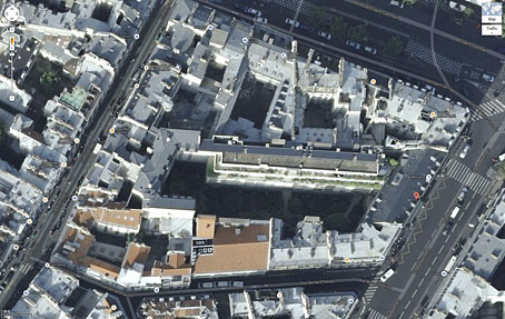
Well, yes and no. The dragon is still there on the wall at 50 Rue de Rennes but the court was apparently redeveloped in the 1950s. Behind those blue doors is a tidy little park for the use of the locals, a common feature in Paris although tourists seldom see more than a glimpse of these places when gates are opened.

dragon.jpg

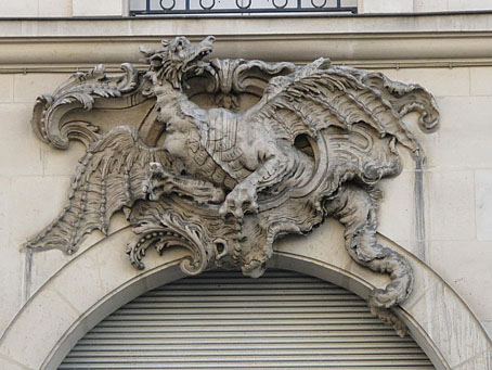
The satellite view below shows the park, the red A marking the position of the blue doors. Nothing in Paris looks like Atget’s photos any more—that’s a part of their fascination—so these kinds of changes are no surprise. But I’m pleased to discover that the dragon still exists. Next time I’m there I’ll have to pay homage.

court.jpg

ernst.jpg

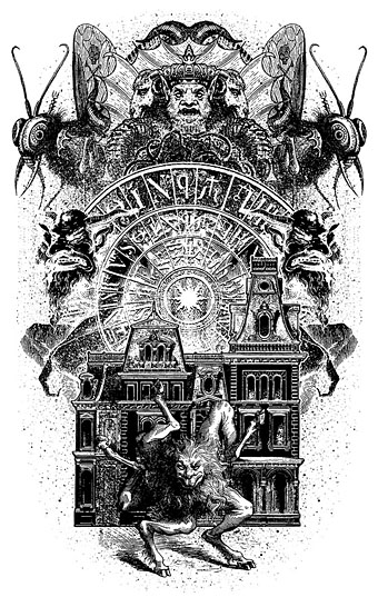
Fourth collage from the La Cour du Dragon chapter of Une Semaine de Bonté (1934) by Max Ernst.

The King in Yellow at the Internet Archive.

Update: Added a couple more pictures.

Update 2: Thanks to Herr Doktor Bimler for reminding me of Ernst’s collage novel, Une Semaine de Bonté, whose second chapter takes its title from the court. Considering this is a favourite book I really ought to have remembered it. Two of the collages show the entrance to the court but the dragon isn’t seen, its presence having been transferred to creatures lurking at the edges of the picture, and the Doré demon wings that many of the characters are sporting.

Update 3: Laurent drew my attention to this post which includes more photos and historical detail. Thanks, Laurent!

Previously on { feuilleton }
Atget’s corners
Rue St. Augustin, then and now
Brion Gysin’s walk, 1966
The King in Yellow

Lovecraft’s Monsters

Lovecraft's Monsters

Graphic for the title page and ends of chapters.

I don’t usually post things so far away from publication, but editor Ellen Datlow put these pictures on her Facebook page a few hours ago so I may as well do the same here.

Back in February I bought a Wacom Intuos drawing tablet, something I’ve been using with regularity for the past few months. The Alas Vegas Tarot cards I designed in the summer were the first major attempt at getting used to working with it; Lovecraft’s Monsters, a forthcoming fiction anthology for Tachyon is the second, and I now feel very comfortable working with it. More than that, I’m increasingly pleased with the way it’s possible to combine the drawing techniques I’ve been using for years with the additional possibilities provided by working in Photoshop. As always, it’s the end result that counts but arriving at an end result can be easy or difficult. Some of these illustrations look no different than they would have done had I used ink on paper but they took half the time to create, a considerable benefit when a deadline is looming.

The stories Ellen Datlow has chosen for this collection all present different aspects of monstrosity seen through the lens of Lovecraft’s fiction and his cosmic menagerie. Some are full-on extensions of the Mythos, others are more allusive; all the pieces bar one have been published before but I’d not read any of them so for me this was fresh material. Having spent the past few years saying I was finished with Lovecraft’s fiction I was excited to be working on this book. The stories are good, and I welcomed the challenge of having to illustrate such a variety of material.

Larger copies of all the pictures can be seen here.

The star-headed thing at the top of this page is another amalgam of elements plundered from Haeckel’s Kunstformen der Natur and other sources. I’ve leaned rather heavily on Haeckel in the past, something I wanted to avoid here; this serves as a kind of visual punctuation separating the stories.

Lovecraft's Monsters

Cthulhu.

The drawing I’ve called Cthulhu is a piece for the introductory pages. Having already produced a lot of Cthulhoid art I didn’t want to repeat myself. The initial idea was of a tiny human figure faced with something enormous and nightmarish; that could be a vast eyeball or it could be a mouth or some other organ/aperture, the vagueness was intentional. Lovecraft continually impresses upon his readers how difficult things are to describe or apprehend but you seldom find this quality in art based upon his stories. Cthulhu especially has devolved into little more than an outsize man-in-a-rubber-suit à la the Creature from the Black Lagoon. In The Call of Cthulhu the figure on the mysterious statuette is described as having a humanoid shape but Lovecraft doesn’t describe the appalling reality in any detail at all. When Cthulhu is struck by a ship at the end of the story it breaks apart and is then seen recombining, the implication being that the creature is corporeally amorphous.

Lovecraft's Monsters

Only the End of the World Again by Neil Gaiman.

Neil Gaiman’s entry concerns a werewolf private detective in Innsmouth. Lovecraft’s decaying fishing village and its inhabitants turn up in several of the stories so care was taken to avoid repetition.

Lovecraft's Monsters

Bulldozer by Laird Barron.

A great story about another detective, a Pinkerton agent this time, hunting his quarry through the Old West. Collin de Plancy’s Dictionnaire Infernal is mentioned so I used some of Louis Breton’s illustrations from the third edition.

Continue reading “Lovecraft’s Monsters”

Weekend links 188

blackwell.jpg

The Baron in the Trees (2011), a book-cut sculpture by Su Blackwell.

Kurt Andersen at Vanity Fair examines the latest claims that Vermeer used a combination of lenses and mirrors to aid the creation of his remarkable paintings. David Hockney caused a considerable fuss in 2006 when he made similar assertions. Andersen recounts how Tim Jenison (who isn’t an artist) decided to test the hypothesis by building a replica of the room from Vermeer’s The Music Lesson (1662–65) which he then painted with the assistance of a lens-and-mirror apparatus. I’m agnostic on this issue, and don’t regard it as a devaluing of the work of Vermeer (or any other artist) if some special apparatus was used to help create the paintings; artists for centuries have been using whatever technology was available.

One point which isn’t mentioned in the article: lens optics were being developed to a high standard in the Netherlands during Vermeer’s time. One of the developers of the microscope, Antonie van Leeuwenhoek, was a contemporary of Vermeer’s in Delft, and is even alleged to be portrayed in some of the artist’s paintings.

• Before Alfred Hitchcock’s film and Daphne Du Maurier’s short story, The Birds was an “eerie yet satirical and rather metaphysical novel” by Frank Baker, inspired in part by Arthur Machen. Michael Dirda reviews a new edition. Related: “The Day of the Claw: A Synoptic Account of Alfred Hitchcock’s The Birds“, an essay by Ken Mogg examining avian menace through the ages.

Kevin Brownlow and Carl Davis on how they brought Abel Gance’s 270-minute silent masterwork, Napoleon (1927), back to the screen.

Finally, he was asked about the growth of surveillance and the militarization of the police.

“The phenomenon itself shouldn’t be surprising—the scale was surprising—but the phenomenon itself is as American as apple pie,” Chomsky said. “You can be confident that any system of power is going to use technology against its enemy: the population. Power systems seek short-term domination and control, not security.”

Matthew Robare on “American Anarchist” Noam Chomsky in (of all places) The American Conservative.

• “Why the hell wouldn’t I?” Evan J. Peterson on reading/performing his poetry in public, and his new book, The Midnight Channel.

The adversaria of Google Books: captured mark of the hand and digitization as rephotography.

• No surprise that the rabies-haunted town of Scarfolk is soon to have its history fixed in print.

Mazzy Star made a rare TV appearance last week, playing a song from their recent album.

The Sorcerer Blog is obsessively devoted to William Friedkin’s cult film.

• Unexpected Artefacts: Pushing the envelope with Bristol’s Emptyset.

• Mix of the week: Secret Thirteen Mix 097 by Lee Gamble.

• At PingMag: Ryokudo—Tokyo’s Green Roads.

Norman Records’ Top 50 albums of 2013.

Birds Of Fire (1973) by Mahavishnu Orchestra | Attack Of The Killer Birds (2006) by Émilie Simon | One Thousand Birds (2012) by Six Organs of Admittance

Ulysses versus Maldoror

covers.jpg

Ulysses (1934), designed by Ernst Reichl; Complete Works of Isidore Ducasse (1967), designed by Pierre Faucheux.

On the design front, that is, not the writing one. Ernst Reichl’s design for the 1934 Random House edition of James Joyce’s Ulysses (the first US edition) has a cover which isn’t so different to the many Art Deco-style bindings from around this time. Inside, however, there’s a significant innovation with his title spread, and the dramatic imposition of a huge capital letter. Random House was presenting Ulysses as a major artistic statement, a quality which Reichl’s design reinforces when the page-filling capitals recur at the openings of each of the novel’s three sections.

ulysses1.jpg

I encountered the huge S on the opening page in a book about Joyce shortly after I’d started reading the novel for the first time, and for years was under the impression that this had been a specific instruction of the author’s, a typographic flourish to add to the rest of the formal manipulations. I’d suggest—insist, even—that all editions of Ulysses should adopt Reichl’s design. Martha Scotford at Design Observer looks at the book in more detail.

ulysses2.jpg

maldoror1.jpg

Les chants de Maldoror-Poésies-Lettres (1950) by Lautréamont. Le club français du livre.

Pierre Faucheux went one further with his grandiose opening for Les chants de Maldoror-Poésies-Lettres by filling the opening of the book with Didot capitals which spell out M-A-L-D-O-R-O-R on each page before the title is reached. This is the design equivalent of shouting in the reader’s face when the book is opened; given the nature of the text I can imagine the author approving. I’ve no idea whether the idea was borrowed from Reichl but Faucheux was a very inventive designer who was quite capable of arriving at such a layout on his own. His cover for a 1967 reprint of the book (above) spells out the title by tearing up the earlier Didot capitals. Rick Poynor at Design Observer (again) looked at more of Faucheux’s covers for the Livre de Poche imprint, while at Eye magazine there’s an essay by Richard Hollis about Faucheux’s innovations.

Continue reading “Ulysses versus Maldoror”