Frans De Geetere’s illustrated Maldoror

geetere1.jpg

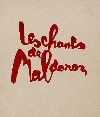
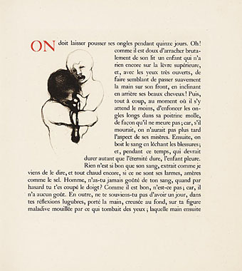
Calling this 1927 edition “illustrated” perhaps stretches the point seeing as Frans De Geetere’s illustrations are rather more minimal and restrained than you’d expect for Lautréamont’s proto-Surrealist masterwork. The Koopman Collection’s page for this book lists 65 Geetere’s etchings but only shows a handful. I’d like to see more of these even if the samples here are representative, Les Chants de Maldoror being a book more deserving of illustration than most.
geetere2.jpg

Frans De Geetere (1895–1968) was Belgian and there’s a Symbolist lineage in this work with his naming Fernand Khnopff and other Belgian Symbolists as influences. He was also a friend of the wealthy arts patron Harry Crosby whose note about the artist promises more than the artwork here delivers:

The darkness of the forest where he was born, the sombre curriculum of the monks together with the rich darkness of ecclesiastical music, the spark of revolt kindled at the Academy of Brussels and whipped into a flame of hatred by the frescoes his father compelled him to paint in the neighboring churches, his first escape (if artists can be said to escape), the year of hunger whitewashing the walls of houses (le soleil contre le mur blanc) and, at nineteen, night duty as guardian in a maison de fous, these were, for M. Frans de Geetere, the foundation stones of that strange building men call the soul. In the madhouse he worked at his painting by day, and by night snatched unsettled hours of sleep, and in this environment developed those queer, abnormal faces that stare out at us from the pages of Maldoror. …And if “Lautreamont has liberated the imagination and dispelled our fear to enter into darkness” as Mr. Jolas so significantly remarked, M. de Geetere with a smoldering rage and fearlessness of creation followed the poet into darkness–“into the occult beyond” to quote Mr. Jolas again, “where new and demonic visions” (I am reminded of Beardsley and Redon and Alastair) “people our solitude.”

geetere3.jpg

Elsewhere on {feuilleton }
The illustrators archive
The etching and engraving archive

Previously on {feuilleton }
The art of Sibylle Ruppert
Maldoror illustrated

Jugend, 1897

jugend-97-01

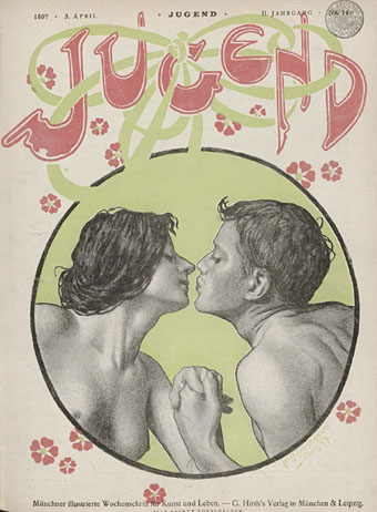
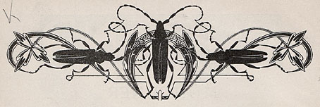
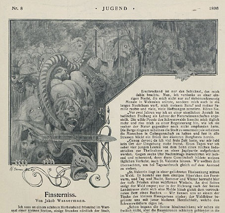
Continuing the series of posts about Jugend magazine, all these samples are from the issues for 1897. This is where things start getting really interesting graphically so I’m only posting a very small selection from 900 pages of content. As before, anyone interested is advised to examine the complete volumes which can be viewed and downloaded here and here.

jugend-97-02

jugend-97-03

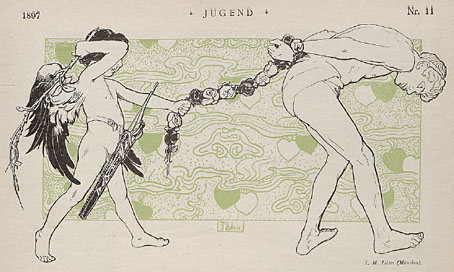
Cupid drawings abound in early issues of Jugend, with men and women falling prey to love’s vicissitudes. This is one of the more unusual examples.

Continue reading “Jugend, 1897”

The art of Melchior Lechter, 1865–1937

lechter1.jpg

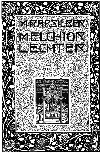
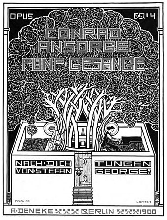
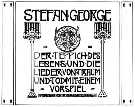
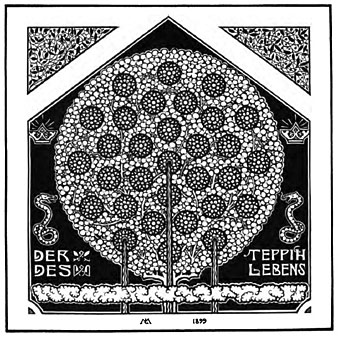
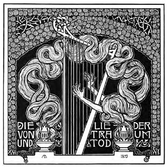
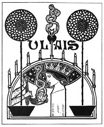
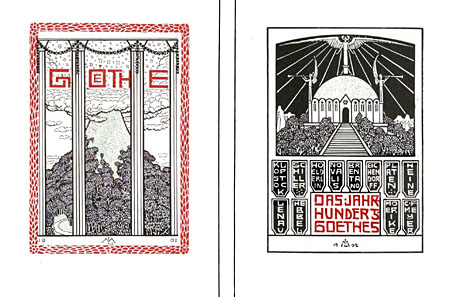
The first issue of yesterday’s arts and crafts magazine Deutsche Kunst und Dekoration includes an article about Melchior Lechter, a German artist and designer whose illustration work I knew from books by gay poet Stefan George but who seems unjustly neglected by fin de siècle art histories. The reminder prompted me to search a bit more actively and doing so turned up another Internet Archive document, Melchior Lechter, a monograph from 1904 by Maximilian Rapsilber. These are Google scans and the quality is very good for once, with a collection of impressive graphic works in Lechter’s religious Art Nouveau style, as well as photos of his furniture and stained glass window designs. I can’t say much more about artist since all the available documentation is in German but the visuals in Rapsilber’s book make me wish we could see more of his work.

(Note: if you want to download the full PDF, do so here.)

lechter2.jpg

lechter3.jpg

lechter4.jpg

lechter5.jpg

lechter6.jpg

lechter7.jpg

lechter8.jpg

Elsewhere on { feuilleton }
The illustrators archive

Previously on { feuilleton }
Deutsche Kunst und Dekoration

Weekend links 5

kamekura.jpg

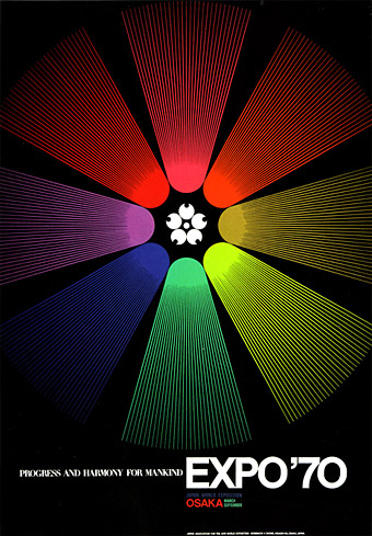
A poster design by Yusaku Kamekura. More here, via A Journey Round My Skull.

First of all this week, there’s a new interview posted which I gave last year to Crows ’n’ Bones magazine. The replies skate around the usual subjects (Cthulhu et al) and you also find out why I don’t think design and illustration for music is going to vanish as soon as some people think.

• A Journey Round My Skull has announced The Raymond Roussel Illustration Contest which is open to all.

• Cover designs: David Pearson on redesigning Cormac McCarthy’s UK covers, a huge improvement on the previous Picador series. Also, The Robert Lesser Pulp Art Collection.

• Last year I discussed Teleny, Or the Reverse of the Medal, the novel of gay erotica attributed to Oscar Wilde, giving a mention in passing to Jon Macy’s comic strip adaptation of the book. That adaptation has now been published and is available via his website.

bradley_kiss.jpg

The Kiss (1896) by Will Bradley.

• More Art Nouveau (because too much is never enough): Will Bradley’s work at Golden Age Comic Book Stories. Can’t understand how I missed this one.

• A discussion: The Magic Mystery and Melancholy of Five Leaves Left by Nick Drake.

• Sandi Vincent’s Flickr pages overflow with Graphis Annual goodness.

• A new edition of the Arthur Radio Voyage is available to download. And Trunk Records’ Jonny Trunk has a mix of obscure vinyl for you.

• Song of the week: We Want War by These New Puritans. Slow motion shots in the video are a plus.

Jugend, 1896

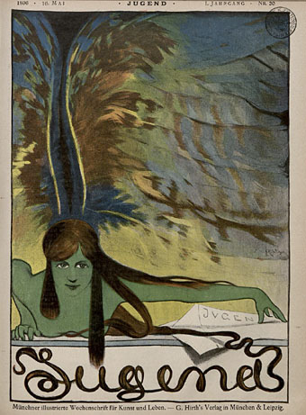
jugend-96-05.jpg

So, then, I’ve now looked through several thousand pages of Jugend magazine and a few things have become apparent. If you’re interested in fin de siècle art and design then all the most interesting material is in the first four years of the magazine’s run, from 1896 on. After 1900 there are still examples of the florid Art Nouveau motifs which filled their earlier pages but the overall style becomes progressively dull, with endless pictures of German towns and hearty country folk. The magazine also begins to reflect an obviously belligerent mood in the country as a whole, pictures of military types and patriotic themes proliferate and the satirical material grows overtly aggressive towards neighbouring nations. Racist cartoons are to be expected—British magazines of the period are much the same—but there’s also a vicious antisemitism boiling away in later issues of Jugend which creates a toxic mix when seen beside the war-mongering on display elsewhere.

jugend-96-01.jpg

Politics aside, these magazines are still a revelation. Pan magazine was being published at the same time (its entire run is also available in the Heidelberg archives) and is the finer journal if it’s art you’re interested in. But Jugend, being a lighter read, contains a wealth of strange and surprising illustrations. Many are naive or just plain bad, of course, but some are quite remarkable. This is the first of a number of posts I’ll make which highlight illustrations that catch my eye. I’ll also be making some follow-up posts about individual artists as the magazine has been a great introduction to minor illustrators I’ve not come across before. This first post is from the two volumes covering 1896 which can be browsed and downloaded here and here.

Continue reading “Jugend, 1896”