Saga de Xam revived

saga1.jpg

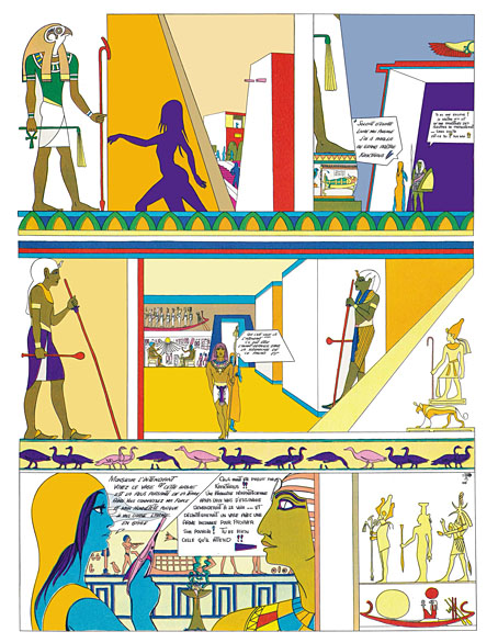
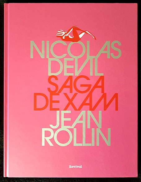
Saga est magnifique. Saga a la peau bleue. Saga est une extraterrestre. Envoyée par la reine de la planète Xam, la voici qui parcourt la Terre à plusieurs époques, traitées dans des styles différents. Son but: découvrir la quintessence artistique, politique et poétique de notre belle Terre. Marquée par l’Art nouveau, le psychédélisme américain, l’érotisme des années 1960 et la contreculture occidentale, Saga est une oeuvre hors norme et inclassable, dessinée sur des formats géants et publiée une première fois par Éric Losfeld en 1967. Hélas, le livre est très vite épuisé et devient un objet pour les collectionneurs. Cette édition reprend l’intégralité des planches de Saga, renumérisées et dotées d’une nouvelle mise en couleurs fidèle à l’originale. Saga peut enfin repartir dans une nouvelle… saga.

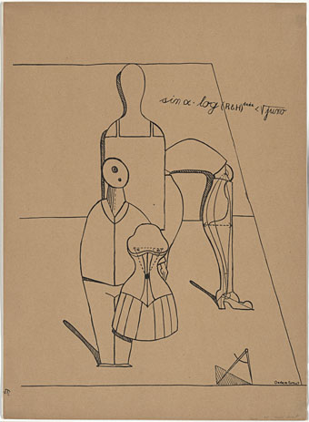
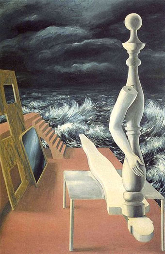
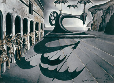
Here’s a book I never expected to see in a new edition. Saga de Xam is a 100-page bande dessinée depicting the time- and space-voyaging adventures of a blue-skinned alien woman, Saga, newly arrived on Earth from the planet Xam. The Xamians are a race of humanoid lesbians (their reproduction is parthenogenetic) whose planet is at war with the masculine Troggs; Saga has been sent to Earth to find a way to combat the Trogg invasion, an expedition that instructs her in the propensity of humans towards conflict and violence. The story was drawn by Nicolas Devil, with contributions from guest artists, and based on an outline by Jean Rollin which had been intended originally for a science-fiction film. There’s no need to go into detail about this cult item, I wrote about it at length several years ago after a couple of its pages stimulated my curiosity when they turned up in an exhibition catalogue. The book was published in 1967 by Éric Losfeld, an edition of 5000 which the publisher said he would never reprint, partly because of the expense, but also because he liked to think of the book becoming a rare object in the future. Rare it still is, although the embargo was broken in 1980, a year after Losfeld’s death, by the publication of a second edition. This was only a partial reprint, however, with a poor cover design and all the interior pages reproduced without their colour overlays.

saga2.jpg

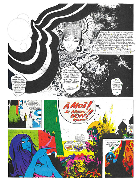
The new edition from Revival is slightly larger than the original (27.5 x 36 cm to the original 24 x 31 cm), and bound between heavy boards. A lengthy preface by Christian Staebler describes the book’s history, offering a few biographical details about Nicolas Deville (as he was known pre-1967), together with further information about the story’s creation. The wildness of the final pages is explained as an attempt by all involved to capture some of the delirium of an LSD trip, while also bringing the story of Saga’s investigation of the human race and its violent nature into the present day. Jean Rollin was apparently unhappy with this dénouement but I find the ending to be a satisfying one for a story where each chapter explores a different period of time (and of space, when Saga returns to her home planet).

saga3.jpg

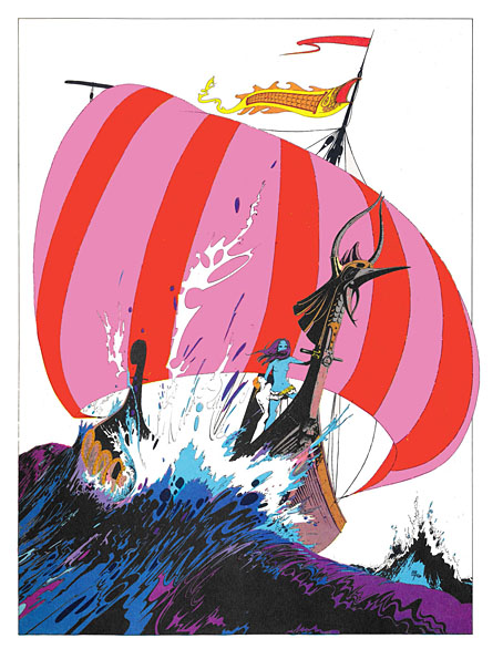
The icing on the cake is the appearance near the end of a few early drawings by Philippe Druillet, together with several beautiful pages by Devil, one of which found wider circulation when reprinted as a poster. The text in the new edition is still in French, of course, and even on slightly larger pages the legibility problem from the original remains. Devil was drawing on boards that were twice the size of their printed equivalents, without caring too much whether the story would be readable when scaled to a printable size. Losfeld’s solution was to provide a magnifying glass with each copy of the book. This isn’t too much of a problem; the story is easy enough to follow once you know the general outline, and for this story it’s the art that counts more than the words.

saga4.jpg

Continue reading “Saga de Xam revived”

Bugged by Jaffee

jaffee-bug1.jpg

This one is for my own benefit as much as anyone else’s. Last week, after reading about the late Al Jaffee, I went looking for the panel you see above, a minor item in a much longer Jaffee feature for an issue of Mad magazine from the 1960s. The flatbugs have been one of my favourite Jaffee jokes for many years, but never having kept a note of which issue they appeared in I’ve always had a problem finding them when I’ve wanted to tell someone about them or see them again. On this occasion searches for various combinations of “mad”, “magazine”, “jaffee”, “bugs”, “flatbugs”, “flat bugs” yielded nothing other than a brief mention on a Reddit thread, along with too many articles about insect infestation. Google Books is sometimes useful for search leads but not this time. Twitter still has its uses, however; someone there had mentioned the flatbugs a couple of years ago, as well as the issue they appeared in, Mad no. 107 for December 1966, so here they are at last.

jaffee2-bug2.jpg

The thing that made the flatbugs so memorable (if not locatable) was that this is a rare Mad joke that’s allowed to extend throughout the rest of the issue. Jaffee’s bug panels occupied two corners of a three-page collection of puzzles and visual gags which is why they’ve always been difficult to track down, you won’t see any mention of them in an index or table of contents. Despite this, issue 107 really ought to be called the flatbug issue. Once you’ve read about the breeding habits of the creatures you start seeing more of them on the pages that follow, even those by artists other than Jaffee; the last of the bugs appears on Jaffee’s fold-in page. This has some precedent in the tiny Sergio Aragones cartoons that appeared in the page margins but I’ve not seen any other one-off gags used like this. Jaffee is lauded for his fold-ins but this shows him playing with the form of the magazine in a different way, suggesting that these were real creatures, albeit motionless and almost two-dimensional.

jaffee-bug4.jpg

I only got to see issue 107 a few years ago when scanned copies of the magazine began to turn up online. Prior to this I knew the flatbugs from one of the reprint books which were all you got to see of older copies of Mad magazine outside the US. I might never have seen these either if it wasn’t for a friend at school who collected humour paperbacks. He had a huge stock of the things, not only the Mad books but many of their spin-offs by Al Jaffee, Don Martin and co. The book with the flatbugs, Rip Off Mad, dates from 1973 but most of the material inside is from the previous decade. I’ve not seen a copy of this since the 1970s but I know that the bugs spread throughout the book just as they did in the magazine, even though the contents were different to issue 107.

lambshead.jpg

In 2003 the flatbugs came to mind when I was writing my entry for the Thackery T. Lambshead Pocket Guide to Eccentric and Discredited Diseases. My disease, “Printer’s Evil”, is a fungal growth that infects paper, and thereby passes to anyone who touches an affected page. The entry itself was, of course, contaminated in this way. Ideally one of the pages for this section would have had a frayed edge but there wasn’t the budget for such indulgence. If you do have the budget then the possibilities expand for humorous invention. The first Monty Python book, Monty Python’s Big Red Book, features a die-cut page (below), while Eric Idle’s Rutland Dirty Weekend Book has a parody of Rolling Stone magazine (Rutland Stone) printed on smaller-sized newsprint pages bound into the centre of the book. The Python books were developing a convention established by Mad (and continued in National Lampoon) of parodying print media in exacting detail, matching fonts, layouts, graphics and so on. (See this article.)

python.jpg

From the Python books. Left: Monty Python’s Big Red Book (1971); right: The Brand New Monty Python Bok (1973).

The pinnacle in this sphere is The Brand New Monty Python Bok, with its smudged fingerprints printed on a white dust-jacket (which prompted complaints from booksellers), beneath which you find a cover for a very different book, Tits ’n Bums: A Weekly Look at Church Architecture, a cover that must cause problems for resale if the dust-jacket is missing. Inside the book there’s a tipped-in library card showing the names and signatures of previous owners, while two differently-sized supplemental sections are bound into the pages. In the early 1960s Terry Gilliam had worked for Harvey Kurtzman’s Help! magazine so there’s a direct line from Python back to Mad, especially when other artists on the Help! staff included Mad regulars Al Jaffee, Jack Davis and Will Elder; Kurtzman and Gilliam subsequently collaborated on a puzzle book where the graphics and the humour sit mid-way between Mad and Monty Python. The Mad-like quality of The Brand New Monty Python Bok is reinforced by a pair of Gilliam comic strips. Jaffee’s flatbugs would be (immovably) at home there.

Previously on { feuilleton }
Blivets
The Thackery T. Lambshead Cabinet of Curiosities
Gilliam’s shaver and Bovril by electrocution
Portuguese Diseases
Pasticheur’s Addiction

jaffee-bug3.jpg

Weekend links 669

claveloux.jpg

Love (1973), a poster by Nicole Claveloux.

• “Warner Brothers had been keen on a Rolling Stones movie. Jagger was keen on being a movie star. But Donald Cammell’s script was no Beatles’ jolly japes musical comedy…” Des Barry examines the ninth minute of Cammell & Roeg’s Performance.

• “…part of what made his 1970s work so original was the degree to which his band cross-pollinated guitar with synthesizer.” Aquarium Drunkard explores the esoteric jazz-rock of Steve Hillage.

• Magma, the cosmic jazz-rock group from France, have been around for 50 years without making a music video. Hakëhn Deïs is their first.

There was half-Tarkovsky embedded in async, “Solari” and “Stakra” and “Walker”, a hand outstretched to those great poems of living and light that we call films. “I had a strange dream last night,” Andrey Tarkovsky wrote in one of the diary entries collected in Instant Light, “I was looking up at the sky and it was very, very light and soft; and high, high above me it seemed to be slowly boiling, like light that had materialised like the fibres of a sunlit fabric, like silken living stitches in a piece of Japanese embroidery.”

David Toop remembers Ryuichi Sakamoto

• “Floor796 is an ever-expanding animation scene showing the life of the 796th floor of the huge space station…”

• The Electrifying Dreamworld of The Green Hand: Dan Clowes on the comic-art of Nicole Claveloux.

• At Bandcamp: Andy Thomas on the post-punk pop subversion of David Cunningham.

• At Unquiet Things: An enigmatic baroness and her collection of skulls.

• New music: River Of Dreams by Romance & Dean Hurley.

• Steven Heller’s font of the month is Ray Gun.

• Mix of the week: DreamScenes – April 2023.

• RIP Al Jaffee.

Skulls Of Broken Hill (1996) by Bill Laswell | The Bees Made Honey In The Lion’s Skull (2008) by Earth | Black Skulls (2018) by Jóhann Jóhannsson

Kris Guidio, 1953–2023

kris.jpg

A self-portrait, 2011.

Farewell to the artist I used to refer to as my partner in art-crime. We weren’t really criminals but in the 1990s we’d both seen our published works for Savoy Books condemned as obscene in British courts of law, a farcical set of circumstances looking back, although it all seemed serious enough while it was happening. Kris and I began working for Savoy in the late 1980s, during which time our creative confederacy might be characterised as familiarity at a distance. He lived in Liverpool, and generally remained there, while the rest of us were in Manchester, so I saw his drawings much more than I saw him in person. I don’t think I ever met him more than 10 times in 30 years, yet his art was as familiar as my own, especially when I was being called upon to add backgrounds to some of his figures. I even ended up making a font based on the lettering he used in his comic strips in order to standardise the captions in the later books.

cramps1.jpg

Kris and I shared a symbiotic relationship with writer David Britton, who pushed the pair of us to take our art into places we might otherwise have avoided, while we opened up artistic possibilities for Dave’s characters and the settings they occupied. We were an ideal team in this respect, each of us having strengths in different areas that suited the titles on which we worked. I brought a greater sense of realism to the Lord Horror comics, while Kris developed a hitherto unexplored flair for satire and caricature in the Meng & Ecker series. Kris was a natural cartoonist, as well as a natural humorist to a degree you wouldn’t have predicted looking at his early strips and illustrations featuring The Cramps.

cramps2.jpg

The Meng & Ecker comics provoked the ire of the authorities, thanks in part to Dave’s frequent digs at the Greater Manchester Police, but there was a lot more to Kris’s art than outrage, a quality which is always easy to generate if you push the right buttons. His Cramps strips are gems of that minor form, the rock’n’roll comic, while his later illustrations for the La Squab character had a lightness of touch that suited Dave’s conception of a world where fairy tales and childhood fantasies collide with adult themes and sensibilities. Kris’s art was analogue to the last (I don’t think he ever owned a computer), drawn with whatever pens he had to hand; watercolour-hued, and fuelled by endless cigarettes. Kris in person was generous, witty, and erudite in the autodidactic manner common to all at Savoy. Remote or not, we’ll miss him here.

Further reading:
Sinister Legends (1988)
The Adventures of Meng & Ecker (1997)
Fuck Off and Die (2005)
La Squab: The Black Rose of Auschwitz (2012)

cramps3.jpg

cramps4.jpg

Continue reading “Kris Guidio, 1953–2023”

Echoes of de Chirico

dechirico01.jpg

The Song of Love (1914) by Giorgio de Chirico.

His art studies, begun in Athens, were continued in Munich where he discovered the work of Max Klinger and Arnold Böcklin, not to mention the writings of Friedrich Nietzsche and Arthur Schopenhauer, whose influence is perceptible in the paintings he went on to produce in Florence and Turin. In addition, his melancholy temperament lay behind the works that Guillaume Apollinaire labelled “metaphysical,” works in which elements from the real world (deserted squares and arcades, factory chimneys, trains, clocks, gloves, artichokes) were imbued with a sense of strangeness.

Keith Aspley, Historical Dictionary of Surrealism


dechirico02.jpg

The Enigma of a Day (1914) by Giorgio de Chirico.


ernst.jpg

Plate II from Let There Be Fashion, Down With Art (Fiat modes pereat ars) (1920) by “Dadamax Ernst”.


magritte.jpg

The Birth of an Idol (1926) by René Magritte.

Some time during the latter part of 1923 [Magritte] came face-to-face with his destiny, in the form of a painting by Giorgio de Chirico, who was one of the painters most admired by the Paris Surrealists: Le Chant d’amour (The Song of Love, 1914); to be more precise, a black-and-white reproduction of that painting in the review Les Feuilles libres, a very contrasty reproduction, as Sylvester has it, which only heightened the drama of the outsize objects suspended in the foreground of one of de Chirico’s “metaphysical landscapes”… He was shown it by Lecomte, or Mesens, or both. He was overwhelmed. […] Magritte always spoke of de Chirico as his one and only master. As a rule, he was exceedingly parsimonious in his assessment of other artists, past and present. In his own time, de Chirico (1888–1978) and Ernst (1891–1976) appear as the only two he admired, more or less unconditionally.

Magritte: A Life by Alex Danchev


dali4.jpg

Sewing Machine with Umbrellas in a Surrealist Landscape (1941) by Salvador Dalí.

Continue reading “Echoes of de Chirico”