Weekend links 530

yoshino.jpg

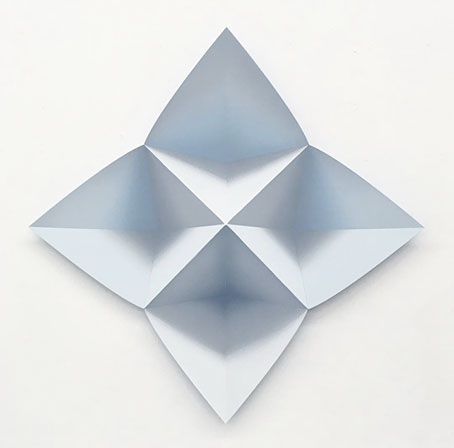
Kami #58 -bloom- (2019) by Momo Yoshino.

• “Set amid the countryside and the beaches of coastal Sussex, They depicts a world in which plundering bands of philistines prowl England destroying art, books, sculpture, musical instruments and scores, punishing those artistically and intellectually inclined outliers who refuse to abide by this new mob rule.” Lucy Scholes on They: A Sequence of Unease (1977) by Kay Dick, which she calls “a lost dystopian masterpiece”. This is revelatory in a minor way since for years I’ve remembered seeing a slim volume with the title They in a bookshop, and which I later thought might have been a Rudyard Kipling book (there’s a Kipling story with the same title). The timing is right, the sighting would have been in 1977 or 78. The combination of that short, one-word title with a stark cover image and a sinister description on the rear was hard to forget but I didn’t take note of the author’s name. (I also didn’t buy the book, opting instead for some inferior work.) A shame that it seems to be resolutely out of print.

• “The threat to civil liberties goes way beyond ‘cancel culture’,” says Leigh Phillips. It makes a change seeing this coming from Jacobin when so much of the left today can find nothing wrong with censorship so long as it’s in a good cause. (Every censor that ever lived believed they were acting in a good cause, were on “the right side of history”, etc, etc.) The piece includes a dismissal of the increasingly common riposte that “only the state can censor”: this would be news to my colleagues at Savoy Books who endured years of police harassment including the seizure and destruction of printed material; the same with the long history of police action against UK rap artists. Related: “Work that’s cancelled for being ‘of its time’ was probably objected to, at the time.” Dorian Lynskey on chronocentrism and “the narcissism of the present”.

• “Cruising baths, bars, and subway toilets, snorting poppers and ‘fist fucking with 40 guys for 14 hours’ (as he recalled in You Got to Burn to Shine, his 1993 collection of prose and poems), he found meaning in a religion of radical eros whose sacrament was anonymous sex.” Mark Dery reviewing Great Demon Kings: A Memoir of Poetry, Sex, Art, Death, and Enlightenment by John Giorno.
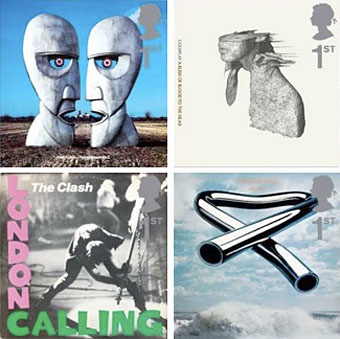
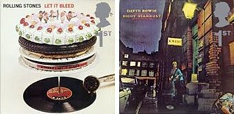
Aubrey Powell says his best photograph is the burning man from the cover of Wish You Were Here by Pink Floyd.

• Mixes of the week: Fact mix 770 by Lyra Pramuk, and mr.K’s Kooky Kuts Vol.4 by radioShirley & mr.K.

• The Alchemical Brothers: Brian Eno & Roger Eno interviewed by Wyndham Wallace.

• Origami-inspired optical illusion oil paintings by Momo Yoshino.

Alexander Larman on the demise of the second-hand bookshop.

• New music: Follow The Road by Yumah, and Röschen by Pole.

• At Dennis Cooper’s: Lighting.

• RIP Linda Manz.

My Boyfriend’s Back (1963) by The Angels | Carnival of the Animals, R. 125: VII. The Aquarium (Camille Saint-Saëns) (1975) by the Württemberg Chamber Orchestra, Heilbronn with Marylene Dosse & Anne Petit, conducted by Jörg Faerber | Kill All Hippies (2000) by Primal Scream

Weekend links 528

durer.jpg

The Rhinoceros (after 1620) by Albrecht Dürer.

• “Today—Tolkien, Lovecraft, Miéville and M John Harrison!” Paul StJohn Mackintosh at Greydogtales explores HP Lovecraft’s lack of interest in fictional worldbuilding. The piece includes one of my book covers (ta!) plus a link to an earlier post I wrote about the cover designs of M. John Harrison’s Viriconium books. Since I’m connected to the thesis I’ll suggest that Lovecraft was resistant to the worldbuilding impulse in part because he was almost always writing horror stories. Having studied the genre at length he was well aware of the need to leave suggestive voids for the reader’s imagination.

• RIP Denise Johnson. All the obituaries mention the big names she worked with, notably New Order and Primal Scream, but being in the pool of Manchester session artists she also appeared on a couple of records by my colleagues at Savoy. Her voice is one of those you first hear on the PJ Proby cover of I’m On Fire, while with friend Rowetta she improvised her way through a Hi-NRG original (and a favourite of Anohni’s), the scurrilous Shoot Yer Load.

• At the BFI: Axel Madsen interviews Fritz Lang in 1967; Serena Scateni on where to begin with Nobuhiko Obayashi; and Roger Luckhurst reviews the spomenik-infested  Last and First Men by Jóhann Jóhannsson.

• “Be more aware of the rest of the world!” says Jon Hassell, talking to Alexis Petridis about a life spent making music.

John Boardley on the Renaissance origins of the printed poster. Worth it for the selection of engraved details alone.

• “What Ever Happened To Chicken Fat?” Jackson Arn on a tendency to over-abundance in Jewish humour.

Erik Davis has a new writing home at Substack that he calls The Burning Shore. Bookmarked.

• Mix of the week: The Ivy-Strangled Path Vol. XXII by David Colohan.

• Garry Hensey on The Strange World of John Foxx.

• At Dennis Cooper’s: Sergei Parajanov Day.

Romantic Rhino (1981) by Ananda Shankar | The Lone Rhinoceros (1982) by Adrian Belew | Blastic Rhino (2000) by King Crimson

The Dukes declare it’s 25 O’Clock!

dukes1.jpg

25 O’Clock (1985). Andy Partridge’s great cover design.

The DUKES say it’s time…it’s time to visit the planet smile…it’s time the love bomb was dropped…it’s time to eat music…it’s time to kiss the sun…it’s time to drown yourself in SOUNDGASM and it’s time to dance through the mirror. The DUKES declare it’s 25 O’CLOCK.

It was twenty-five years today—April 1st, 1985—that Virgin Records released what was supposed to be a reissue of a lost psychedelic album from the late 1960s, 25 O’Clock by The Dukes of Stratosphear. The catalogue number was WOW 1 and the vinyl label was printed with the old black-and-white Virgin logo by Roger Dean even though Virgin Records wasn’t founded until 1972. No one was supposed to know that the album was really a pastiche project by XTC but I don’t recall anyone actually being fooled by this, all the reviews acknowledged XTC as the originators, and band members Andy Partridge and Colin Moulding were happy to give interviews enthusing about their musical obsessions. As well as being incredibly successful artistically the album was a surprising commercial success which led the bemused record label to ask for a sequel. Psonic Psunspot followed two years later, and the Dukes’ vibe infected XTC’s own work for a while, with their 1988 album, Oranges & Lemons, pitched somewhere between the pastiches and XTC’s more usual sound .

dukes2.jpg

Psonic Psunspot (1987). Design by Dave Dragon and Ken Ansell.

Continue reading “The Dukes declare it’s 25 O’Clock!”

Album cover postage stamps

albums1.jpg

top row: The Division Bell by Pink Floyd; A Rush of Blood to the Head by Coldplay.
bottom row: London Calling by The Clash; Tubular Bells by Mike Oldfield.

The Royal Mail follows its series of British Design Classics postage stamps with a series dedicated to what they call “classic” album covers. The design classics in the earlier series deserved the term—a  Mini motor car, a Penguin book cover, the London Underground map, etc—whereas here we have the word “classic” being used in its lazy journalist sense where it becomes a synonym for “popular” and “familiar”, two attributes which often diminish with time.

albums2.jpg

top row: Parklife by Blur; Power, Corruption and Lies by New Order.
bottom row: IV by Led Zeppelin; Screamadelica by Primal Scream.

It should be noted that the choice of cover art was limited to releases by UK artists, and the designs had to be readable at the very small size of a postage stamp. Even so, I can’t help but regard this as a missed opportunity. There was no need to feature the Beatles since they’d been given their own set of stamps in 2006, but I’ve never thought of the cover of Let It Bleed (below) as a classic, even though musically it’s one of the best Stones albums. I’d rather choose Andy Warhol’s cover for Sticky Fingers but you can imagine the upset at stamp users being forced to lick a picture of a bulging pair of jeans. As for Pink Floyd’s Division Bell, it’s a typically striking design from Storm Thorgerson but does anyone really think it’s more classic than earlier Floyd covers, not least the Dark Side of the Moon prism which even people who hate the band can instantly recognise? Nearly all these choices seem confused or compromised; the Clash cover is the token punk offering—Royal Mail wouldn’t dare choose Never Mind the Bollocks—but Ray Lowry’s design was copied from an Elvis Presley sleeve; Led Zeppelin’s IV is a great album but other releases had far better covers; Primal Scream, another great album but the whole sleeve design is perfunctory; the Blur choice is merely bewildering.

albums3.jpg

left: Let It Bleed by The Rolling Stones; right: The Rise and Fall of Ziggy Stardust and the Spiders from Mars by David Bowie.

As far as designers go, Hipgnosis (via Storm T), Peter Saville (New Order), and Stylorouge (Blur) are included here but there’s nothing from Barney Bubbles, Malcolm Garrett, 23 Envelope, Neville Brody, Designer’s Republic or any of the other pioneering British designers of the past 30 years. The trouble with those names, of course, is that many of the artists they worked for aren’t popular or familiar enough to the average British stamp purchaser so their work can’t be deemed “classic”. A best of British, then, which could have been a lot better.

Classic Album Covers will be issued on January 10th, 2010.

Elsewhere on { feuilleton }
The album covers archive

Previously on { feuilleton }
British Design Classics
Stamps of horror
Endangered insects postage stamps
James Bond postage stamps
Please Mr. Postman