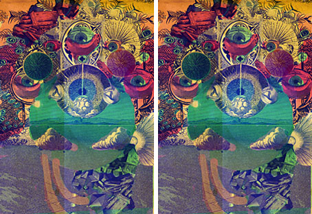
That essential journal of esoteric culture, Strange Attractor, announced a fourth number this week sporting a psychedelic cover which may be the work of Julian House (no credit is given on the SA site). As to the contents:
From Haiti and Hong Kong to the fourth dimension and beyond: discover the secrets of madness in animals; voodoo soul and dub music; ancient peacock deities; Chinese poisoning cults; the history of spider silk weaving; heathen mugwort magic; sentient lightning; Jesuit conspiracy theories; junkie explorers; Dali’s Atlantis; the resurgence of Pan (in London’s Crouch End); anarchist pirates on Madagascar; an ancient Greek Rip Van Winkle; French anatomical waxworks; Arthur Machen’s forgotten tales and Alan Moore’s unpublished John Dee opera.
Further details and the means to order a copy can be found here.
• Resonance FM’s Weird Tales For Winter has returned beginning with a presentation of The Gateway of the Monster, one of the better Carnaki tales by William Hope Hodgson. The story is read by Moon Wiring Club‘s Ian Hodgson (no relation) and the musical atmospheres are provided by The Advisory Circle. I ought to have posted this news yesterday since you’ll have missed the broadcasting of the first half but the second half will go out at midnight (UK time) on Monday. Details here, and the next release on the Café Kaput label in February will be the soundtrack, Music for Thomas Carnaki (Radiophonic Themes & Abstracts).
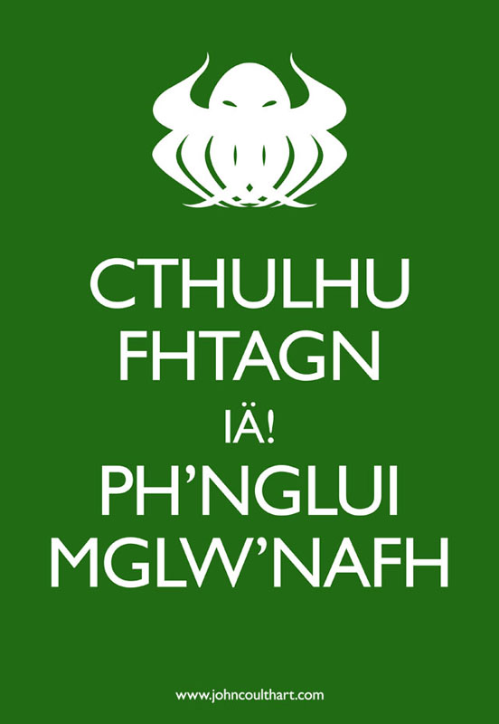
• The Keep Calm and Carry On Image Generator lets you work your own variations on the ubiquitous poster. It wouldn’t work for me, however, so I rolled up my sleeves and made my own. This may be good as a CafePress design, yes?
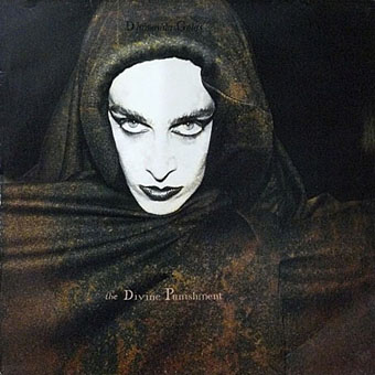
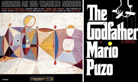
• Interplay is an album by John Foxx and The Maths due to be released on March 21st. As with last year’s collection of Foxx instrumental pieces, DNA, the package design is by Jonathan Barnbrook. John Foxx first came to prominence as the lead singer in Ultravox (do I need to say “of course”? Okay…“of course”) and Ultravox’s debut album was part-produced by Brian Eno. It’s been painfully obvious recently (and it pains me to say it) that Foxx’s DNA was a far more accomplished and engaging work than Eno’s recent collection of over-hyped instrumentals. Related: Barnbrook Design’s albums of 2010.
• Word Horde 2.0, “a substantial archive of manuscript material, correspondence, and books and printed matter, mostly signed” from the William Burroughs archives can be yours for $260,000. Related: William Burroughs’ Wild Boys photos. Also: Rudy Rucker on David Cronenberg’s Naked Lunch.
• “Nabokov described how ‘a modern taxonomist straddling a Wellsian time machine with the purpose of exploring the Cenozoic era’ would encounter the following series of events in the evolution of these butterflies…” The Royal Society confirms that a contentious theory of Vladimir Nabokov’s concerning the descent of butterfly populations was accurate.
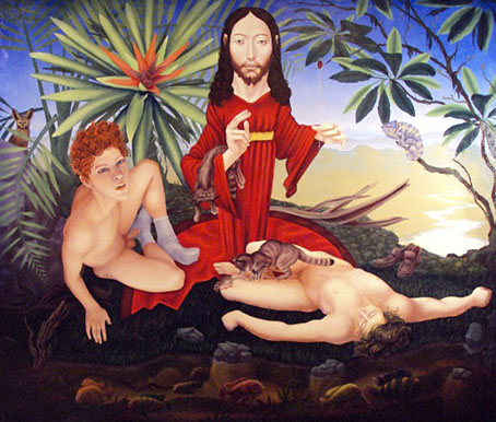
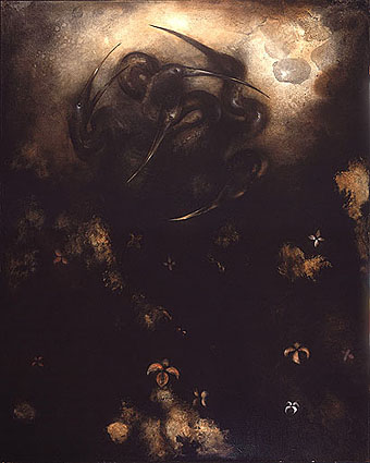
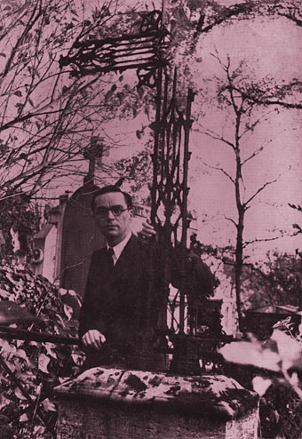
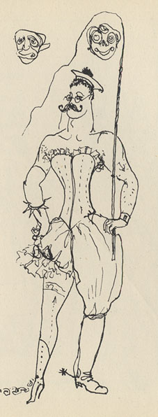
• The work of Gérald Bertot aka Thomas Owen, a Belgian author of weird fiction, is explored at A Journey Round My Skull.
• The Other Side of the Wind, Orson Welles’ unfinished film from 1972, may finally be given a release.
• Jon Savage celebrates Roy Harper and his extraordinary Stormcock album.
• Philip Pullman wants the Tory philistines to leave our libraries alone.
• Rick Poynor takes a dérive through the arcades of Paris.
• Young Savage (1977) by Ultravox | Clicktrack (2010) by John Foxx & Jonathan Barnbrook.