Cover design by Marian Bantjes for a 2009 series of Nabokov reprints.
• “It is quite unlike the bland featurelessnesses of the current fiction in which dull creative writing students chat to dull creative writing students (there is today a generalised fear of imaginative invention and giving offence).” Jonathan Meades on late style and Vladimir Nabokov’s Transparent Things.
• Cathi Unsworth remembers the late Roger K. Burton, founder of London’s unique exhibition and venue space, The Horse Hospital.
• New music: Interior of an Edifice Under the Sea by Pan American & Kramer; Glass Colored Lilly by Yuki Fujiwara.
• Mixes of the week: DreamScenes – August 2025 at Ambientblog, and Bleep Mix 307 by On-U Sound.
• At the BFI: Michael Brooke chooses 10 great Eastern European science-fiction films.
• At The Wire: David Toop and Ania Psenitsnikova on moving beyond music and dance.
• At Colossal: Weird Buildings celebrates architects who think outside the box.
• Verbal #12 includes new fiction by Michael Moorcock, among others.
• At Unquiet Things: Exquisite incantations in clay by Forest Rogers.
• Steven Heller’s font of the month is Experimo.
• Dale Cornish’s favourite albums.
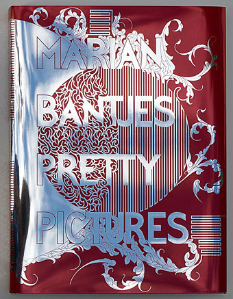
• Tenth Letter of the Alphabet
• Ecstasy Symphony/Transparent Radiation (Flashback) (1987) by Spacemen 3 | Almost Transparent Blue (1996) by David Toop | Transparent (1997) by Reflection