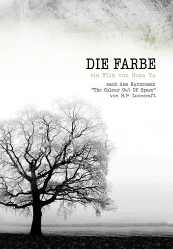
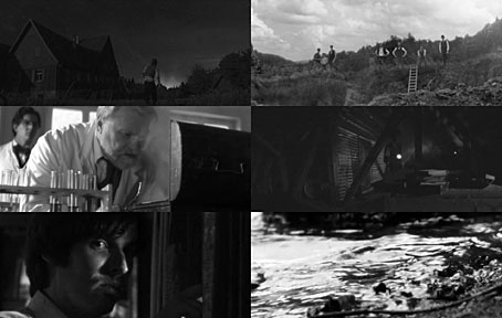
Die Farbe and The Colour Out of Space

farbe2.jpg

Die Farbe (2010).

The colour, which resembled some of the bands in the meteor’s strange spectrum, was almost impossible to describe; and it was only by analogy that they called it colour at all. Its texture was glossy, and upon tapping it appeared to promise both brittleness and hollowness.

The Colour Out of Space (1927).

Die Farbe (The Colour) is a German feature film by Huan Vu based on HP Lovecraft’s tremendous short story The Colour Out of Space. Vu’s film was completed last year, and has been well-received at film festivals and by Lovecraft aficionados but I’ve been rather tardy in hearing about it. Better late than never.

Having adapted two-and-a-half stories, I tend to take a more than cursory interest in works based on Lovecraft’s fiction. One of the reasons I tackled his works in the first place was out of frustration at the apparent inability of film producers and comic artists to treat the stories as they’d been written. The Colour Out of Space is one of the masterpieces of Lovecraft’s mature period, and was the favourite of his own stories, a skilful blending of horror and science fiction in the tale of a fallen meteorite infecting a farm with an inexplicable process of decay and physical mutation. The mysterious colour is the product of some unearthly substance inside the meteorite which corresponds to no known part of the visible spectrum. This wasn’t the first story of Lovecraft’s that I read—I’d earlier found The Moon-Bog in a ghost story anthology—but it was the first that made a serious impression when I came across it in another anthology at age 12 or 13. Since then, whenever people ask me which Lovecraft stories to read first The Colour Out of Space is always one I recommend.

farbe1.jpg

Continue reading “Die Farbe and The Colour Out of Space”

Early woodcut initials

initial1.jpg

More decorated initials, these being from Early Woodcut Initials (1908), a collection by Oscar Jennings of ornamental letters from books of the fifteenth and sixteenth centuries. By way of contrast with yesterday’s examples, not all of these feature the religious or mythological figures one would expect, some show early mathematical and astronomical devices.

initial2.jpg

initial3.jpg

Continue reading “Early woodcut initials”

Paulini’s mythological alphabet

paulini1.jpg

Whoever I. Paulini was, no one seems to know his (or, indeed, her) first name. Even the Metropolitan Museum of Art, NYC, which owns a copy of these plates, doesn’t elaborate. The copies here are scans from a Getty edition of Alphabeto, part of the collection of Getty Institute volumes at the Internet Archive. The book is usually dated 1570 but a note states that “The watermarks … suggest a printing date closer to the end of the 16th century than to 1570, the conjectural date of first publication.”

paulini2.jpg

Paulini gives use twenty engraved plates each showing an ornamented letter of the Roman alphabet with a background depicting a scene from Greek and Roman mythology; each letter is tied to a different character or scene, so here we have G for Ganymede, and N for Narcissus. Mister Aitch at the late, lamented Giornale Nuovo was a great enthusiast for these kinds of alphabets, and for engravings in general. He pursued his own researches into the Paulini mystery back in 2006 when copies of the complete set of letters were difficult to find.

Elsewhere on { feuilleton }
The etching and engraving archive

Previously on { feuilleton }
Joseph Balthazar Silvestre’s Alphabet-album
Johann Theodor de Bry’s Neiw Kunstliches Alphabet
The Book of Ornamental Alphabets
Paul Franck’s calligraphy
Gramato-graphices
John Bickham’s Fables and other short poems
Letters and Lettering
Studies in Pen Art
Flourishes

Weekend links 79

brody-va.jpg

Neville Brody creates a cover design for an issue of the V&A magazine tied to the museum’s current exhibition, Postmodernism: Style and Subversion 1970–1990. Brody’s comment amused me for the way he smartly explained the thinking behind the design whilst also distancing himself from its theme:

For me, Post Modernism felt like a kind of facade built to cover over the cracks of a divided world, a surface of plucked effects and stylistic devices emptied of meaning, an extrusion of hollow traces and flat outlines forcing 2D into apparent depth. I was never a Post Modernist, rather a Modernist exploring humanist lines of enquiry in the collapsing world behind a wall of decoration.

• It’s a common thing today to give images from the past a queer reappraisal, finding homoerotic qualities in pictures which, when they were made, would have seemed free of any sexual subtext. This post finds such a subtext in recruitment posters for US armed forces although none of the examples are as overt as this wartime magazine ad. Over at Front Free Endpaper Callum notes that many vintage photos which people regard today as evidence of gay relationships are unlikely to be quite that. The photo he posts, however, really does appear to show a pair of men who were more than just good friends.

• A play by Ororo Productions of HP Lovecraft’s The Dunwich Horror will be staged at the London Horror Festival from October 25th. Related: Horror Made Delightful: The Strange Stories of Sheridan Le Fanu, MR James, and Robert Aickman. “Aickman never spells out his meaning,” says Greer Mansfield, “His stories end abruptly and inconclusively, and in fact the ‘meaning’ is less important than the utter mysteriousness of what happens.” Which is just what some of us enjoy.

deville.jpg

Black Beauty, a decorated horse skull by Julia deVille.

• “Jackpot is a comedic short film about a 14-year-old gay boy in 1994 who sets off on a quest to find a stash of gay porn and get it home before anyone finds out.” Director Adam Baran is requesting completion funds at Kickstarter.

Gendai Shogyo Bijutsu Zenshu (The Complete Commercial Artist), published in Tokyo from 1927 to 1930.

Ishac Bertran tries some analogue sampling by chopping up vinyl discs with a laser cutter.

Steve Jobs does LSD and The Residents pay tribute to Steve Jobs.

• A rare post at Ballardian: Outpost 13: The Atrocity Exhibition.

• It’s all fun and games until Charles Manson turns up…again.

The Edgar Allan Poe Portfolio (1976) by Berni Wrightson.

• RIP David Bedford and Bert Jansch.

John Waters: Roles of a Lifetime.

Octopi Wall Street!

Homocomix.

Poison (1969) by Bert Jansch | Pentangle at the BBC (1970): Train Song | House Carpenter | Hunting Song | Light Flight

Somnium by Steve Moore

somnium.jpg

Another new piece of illustration and design. Somnium is an occult novel by Steve Moore being published this month by Strange Attractor. Some readers here may know Steve’s work as a comics writer, ex-editor of Fortean Times and also the subject of Alan Moore’s recent Unearthing text and recording. I’ve not seen the book yet but it comes laden with praise from Michael Moorcock and Iain Sinclair, and features an afterword by Alan Moore:

Written in the early years of the 21st century, when the author was engaged in dream-explorations and mystical practices centred on the Greek moon-goddess Selene, Somnium is an intensely personal and highly-embroidered fictional tapestry that weaves together numerous historical and stylistic variations on the enduring myth of Selene and Endymion. Ranging through the 16th to 21st centuries, it combines mediæval, Elizabethan, Gothic and Decadent elements in a fantastic romance of rare imagination.

With its delirious and heartbroken text spiralling out from the classical myth of Endymion and the Greek lunar goddess Selene, Somnium is an extraordinary odyssey through love and loss and lunacy, illuminated by the silvery moonlight of its exquisite language.

The printed version should incorporate metallic silver ink on the title and border, something you can never quite replicate on a web image, hence the gradient on the title lettering. Somnium is available in a range of signed or unsigned editions and can be purchased direct from the Strange Attractor Shoppe.

Previously on { feuilleton }
Dodgem Logic again
Of Moons and Serpents