The ceramic art of Eduard Stellmacher

stellmacher01.jpg

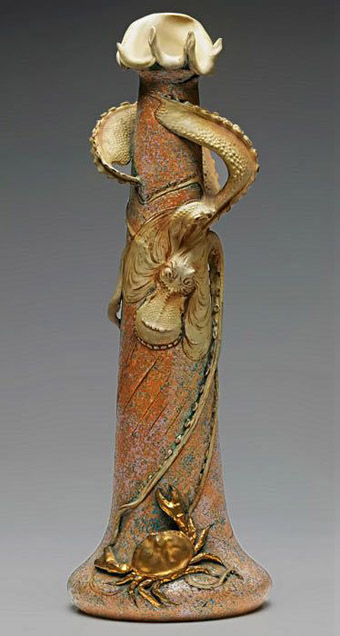
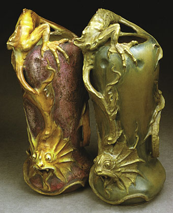
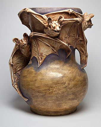
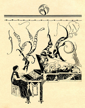
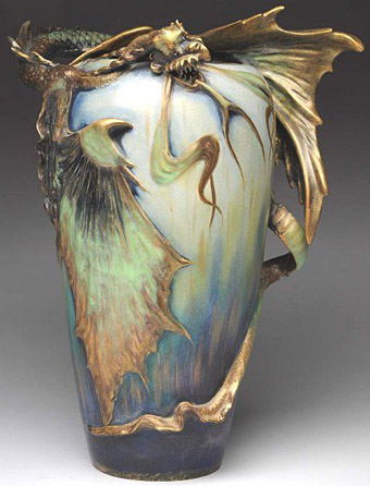
The Art Nouveau style is seldom more grotesque than in these vases and amphorae designed around the turn of the century by Eduard Stellmacher (1868–1945) for his father’s company, Amphora, in the Tur-Teplitz region of Bohemia. Art Nouveau (or Jugendstil as it was in Germany and Austria) emerged in Europe in the 1890s, and though its development ran parallel to the Decadence of the fin de siècle it wasn’t really a Decadent form in the literary sense of a dwelling on the perverse, the morbid or the blasphemous. The sinuous curves of Art Nouveau are too suggestive of vigorous life and energy to appear corrupt; Alphonse Mucha’s femmes are too healthy to be fatale, they’re nothing like the dissolute, hollow-eyed sirens seen in the drawings of Félicien Rops, an artist who wasn’t Nouveau (he died in 1898) but who was thoroughly Decadent.

stellmacher02.jpg

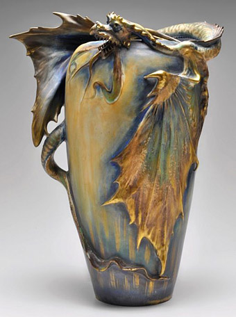
Stellmacher and co. created their share of delightful ceramic figures with Mucha-like tresses and flowing garments but Eduard’s designs around this time were preoccupied with ferocious creatures: bats, fish, lizards, octopuses, and a profusion of fire-breathing dragons. Even the plant forms have a diseased, unhealthy aspect. The designs may not have been intended as Decadent but they embody the quality more than anything used as vase decoration before or after this period. Art Deco also favoured predatory animals (snakes and leopards especially) but only in forms that were suitably sleek and abstracted.

stellmacher03.jpg

stellmacher04.jpg

stellmacher05.jpg

Continue reading “The ceramic art of Eduard Stellmacher”

Weekend links 506

caligari.jpg

• The late David Roback was a musician who would have been called “enigmatic” for his refusal of the interview treadmill, preferring instead to let his music speak for itself. I wouldn’t label myself a “fan” (a word I dislike at the best of times) but over the years I’ve collected just about everything that Roback was involved in, from the early Rain Parade albums (he co-wrote my favourite song of theirs, No Easy Way Down), to Opal (his collaboration with Kendra Smith and others), and Mazzy Star (with Hope Sandoval), the group whose songs perfected the somnolent blend of blues, country and rock that Roback had been aiming at all along. Some concerts:

Mazzy Star, The Black Sessions, Maison De La Radio, Paris, October 25, 1993
Mazzy Star at the The Metro, Chicago, November 12, 1994
Mazzy Star, KROQ Radio, Los Angeles, December 10, 1994

• “Like other early-modern architects, Lequeu’s drawings explore analogies between bodies and buildings and the erotic, multisensory dimensions of architectural design. In his annotations, he often describes in compulsive detail not only how buildings look but also how they feel, smell, and even taste.” Meredith Martin on the architecture of Jean-Jacques Lequeu.

• “She talks avidly about using pigs’ heads, plastic doll parts, fake blood, and real blood, recollecting with relish a performance where she transformed into a Statue of Liberty that projectile-vomited gore onto the audience…” Geeta Dayal on the performance art of Johanna Went.

Schütte teases out the many ambiguities in these concepts: trains, autobahns, radioactivity, men-machines. All have distinct negative connotations within Germany in particular. Yet Kraftwerk proposed a positive view. Their rigorous determination to deny autobiography forced listeners to focus on the ideas and the music, where apparent contradictions—local/global,  human/machine, past/future—were resolved in a sparkling, crystal-clear sound-world. This was not submission but interaction: as they said, “we are playing the machines, the machines play us”.

Jon Savage reviews Kraftwerk by Uwe Schütte

• “…it was clear that Miles wasn’t sure what he wanted…but he knew what he didn’t want. He didn’t want anything like what he had done before.” John McLaughlin on the recording of Bitches Brew by Miles Davis.

• “His panels are littered with figures standing on the edge of crowds, watching.” Toby Ferris on the paintings of Pieter Bruegel.

Alex Barrett on 100 years of The Cabinet of Dr. Caligari.

A Boy Called Conjuror by Teleplasmiste.

• At Dennis Cooper’s: Fires.

Smithsonian Open Access

• Picture P. Brueghel “Winter” / Solaris (1972) by Edward Artemyev | The Dream Dance Of Jane And The Somnambulist (1981) by Bill Nelson | St. Elmo’s Fire (1998) by Uilab

The poster art of Josef Vyleťal

vyletal11.jpg

The Hero is Afraid (1965).

Film posters by Czech artist Josef Vyleťal (1940-1989) have appeared here in the past, but after watching Juraj Herz’s gloomily Gothic Beauty and the Beast (1978) at the weekend—a film for which Vyleťal not only created a poster but also provided the title sequence and paintings seen within the film—I thought the artist deserved a post of his own.

Josef Vyleťal was a prolific poster artist and designer—the Terry Posters website states that he created 115 designs for the cinema—who also worked as a book illustrator. Between commercial assignments he produced paintings in a macabre Surrealist style that filtered into his commercial work, the Herz titles included. The absence of barriers between private obsessions and commercial imperatives is what makes the film posters created by Czech and Polish artists so attractive, as well as so surprising to Anglophone viewers. There’s no sense of these works being produced by committee, of a gaggle of marketing executives fretting over details behind the scenes. Some of Vyleťal’s interpretations are so extreme and uncompromising by Hollywood standards it’s impossible to imagine even an adventurous chain like Alamo Drafthouse commissioning them, never mind a risk-averse studio. One of the designs I singled out for an earlier post is an ideal example, a poster for Alfred Hitchcock’s The Birds which dispenses with any visual reference to the film in favour of a liberal borrowing of the bird-headed figures from Max Ernst’s The Robing of the Bride. It’s a commonplace when discussing the films of Jan Švankmajer to situate the director in the history of Czech Surrealism which remained a clandestine movement during the Communist years. But Vyleťal’s paintings demonstrate a confidence that the average Czech filmgoer could accept Surrealist imagery when being tempted by the latest fare from Hollywood.

vyletal07.jpg

The Naked Eye (1966).

Given my own tastes for Surrealist imagery many of the examples shown here tend in this direction. Vyleťal was a versatile artist who utilised a number of different styles, including collage and a bold graphic style of black shapes on coloured backgrounds. In addition to borrowing from Ernst he also borrowed (or swiped) figures from Aubrey Beardsley on at least two occasions (see below). Most of the examples here are collages augmented by or combined with paint, collage being a quicker solution when faced with deadlines. Terry Posters has many more examples.

vyletal13.jpg

The Black Tulip (1967).

vyletal01.jpg

The Heart is a Lonely Hunter (1968).

vyletal12.jpg

The Trygon Factor (1968).

Continue reading “The poster art of Josef Vyleťal”

Weekend links 505

brown.jpg

An imaginary book cover by Toby Melville-Brown.

• At the Internet Archive (for a change): Directory 1979, a collection of John Cooper Clarke’s poetry designed by Barney Bubbles; 25 issues of Wrapped in Plastic, the magazine devoted to all things David Lynch; and Cinefantastique, 1970–2002, the magazine about special effects in cinema whose making-of articles were often the first such analyses published anywhere. No contents list for the latter, unfortunately, but the covers shown here give an idea of the main features.

• “Physicist Andreas Schinner recounted a rumor that the Voynich manuscript can be ‘pure poison’ for a scholarly career, because when studying the manuscript there’s ‘always an easy option to make a ridiculous mistake.'” Jillian Foley on the strange quest to decipher the Voynich manuscript.

• At the BFI: Stephen Puddicombe examines six mysterious paintings on film, and Anna Bogutskaya selects ten examples of Lovecraftian cinema. Regarding the latter, I deplore the omission of Huan Vu’s Die Farbe (2011).

• In The Driver’s Seat: Neil Fox on the demented fun of Nicolas Winding Refn’s streaming site for cinematic obscurities, ByNWR.

• “Feed your head”: Akim Reinhardt on the progress of a White Rabbit from Charles Lutwidge Dodgson’s novel to Grace Slick’s song.

• Mixes of the week: Marshland: The Andrew Weatherall Mix, and Music’s Not For Everyone, hours of Weatherall mixes at NTS.

Borderland, an album of music by Fordell Research Unit based on The House on the Borderland by William Hope Hodgson.

• At Dangerous Minds: Thirteen-year-old Mariangela and her adventurous pop album, produced by Vangelis, 1975.

• Heavy Metal, Year One: Kory Grow on the inside story of Black Sabbath’s groundbreaking debut.

• “Theire Soe Admirable Herbe”: How the English Found Cannabis by Benjamin Breen.

Derek Jarman and friends in Dungeness: unseen pictures.

Closing periods at Flickr.

Heavy Rock (1976) by Sound Dimension | Heavy Denim (1994) by Stereolab | Heavy Soul (2002) by The Black Keys

Sculptured Melodies by Mera Sett

sett01.jpg

Another week, another link to the Internet Archive. It’s hard to resist reporting these discoveries when so many are either surprising, much-needed, or—as in this case—fantastically rare and obscure. Sculptured Melodies (1922) was a book of short stories published privately in Britain in an edition of 500 copies. The possibly pseudonymous author and illustrator, Mera Sett, is so off the map that almost all the available information seems to derive from a series of posts about the book by John Hirschhorn Smith of Side Real Press. (The Internet Archive scan is also from Smith’s own copy of the book.) Each story is inspired by a piece of music, and written “in a decadent style reminiscent of Pierre Louÿs”; Orientalist or Ancient World exotica is the predominant tone.

sett02.jpg

Whoever the author was, he (it does at least seem to be a he) illustrated his stories in the post-Beardsley idiom that continued to a feature of publishing in the 1920s. The drawings are very much the work of an enthusiastic amateur, although the same might be said of Sett’s better-known contemporary, Alastair (Hans Henning Voigt), another follower in Beardsley’s wake who compensated for his uneven figure drawing with copious decoration and outrageous costumes. Sett also uses decoration to disguise his shortcomings, borrowing some of Aubrey’s Japonisme peacocks along with other motifs from Persian and Indian art. The latter details suggest an unexplored artistic avenue that blends Beardsley’s black-and-white style with the tableaux of Persian miniatures.

sett03.jpg

sett04.jpg

sett05.jpg

Continue reading “Sculptured Melodies by Mera Sett”