Index, fist or manicule?

index5.jpg

Third revised specimen book and price list of printing material (1887), Palmer & Rey, San Francisco.

Browsing through old type foundry catalogues recently reminded me of a question posed by Callum James a few years ago over at Front Free Endpaper, namely: what is the official description of those pointing hands favoured by pre-20th century typesetters? Writer Mark Valentine in a follow-up post mentions a term invented by William H Sherman—”manicules”—since Sherman also believed that the pointing hands were nameless. That’s not quite the case, however, as these pages show, with two descriptors being used: “indexes” and “fists”. Just to confuse matters both terms are used on different pages of the same catalogue which implies that the names may have been a convenience term to avoid having to repeatedly discuss “those pointing hand things” with customers. “Manicule” seems a better choice since “index” already has a standard meaning in printing, while “fist” doesn’t suit at all.

These catalogues contain many pages of similar type decorations and embellishments. All can be downloaded at the Internet Archive, just follow the links.

index2.jpg

Third revised specimen book and price list of printing material (1887), Palmer & Rey, San Francisco.

index4.jpg

Catalogue and book of specimens of type faces and printing material and machinery (1895), Cleveland Type Foundry.

index1.jpg

Copper alloy type book (1901), Pettingill & Co., Boston.

index3.jpg

Copper alloy type book (1901), Pettingill & Co., Boston.

Update: Thanks to Alan in the comments for pointing the way (so to speak) to William Sherman’s Toward a History of the Manicule.

Update 2: See this manicule Flickr group for many contemporary examples.

Previously on { feuilleton }
Victorian typography

Joseph Balthazar Silvestre’s Alphabet-album

silvestre01.jpg

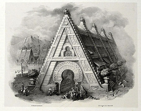
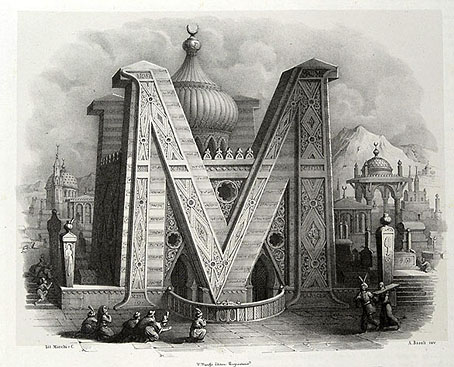
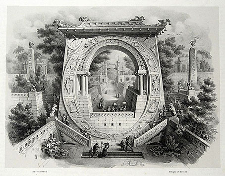
Monsieur Silvestre’s Alphabet-album, a collection of decorative alphabets, has a lengthy subtitle—Collection de Soixante Feuilles d’Alphabets Historiés et Fleuronnés, tirés des Principales Bibliothèques de l’Europe—and is a good example of how the 19th century, always characterised as a period of over-elaborate decoration, contains the seeds of 20th-century design. Silvestre’s book dates from 1843 yet contains several examples of sans serif or rectilinear lettering which wouldn’t have looked out of place a hundred years later. There’s also some fine examples of over-elaborate lettering, of course, with the usual embellishments and calligraphic flourishes, and also a page of letterforms based on tree shapes, a common sight in Victorian graphics.

silvestre02.jpg

silvestre03.jpg

Continue reading “Joseph Balthazar Silvestre’s Alphabet-album”

Anna & the Juniper Dog

juniper.jpg

The Juniper Dog strained its twisted roots against an ember red sky, snarling out swarms of night moths, barking flocks of owls from its splintery jaws. It howled the sea. Spat stars. Clouds roiled and clotted through the tree dog’s teeth.

Anna & the Juniper Dog was published this summer although it’s a tale which seems more suited to the gloom of autumn. (Having said that, summer this year was so persistently cold, wet and dreary it’s been autumn in all but name.) The story is by Geoff Cox, and the slim clothbound volume from Blackmaps Press comes profusely illustrated by Rohan Daniel Eason, and with an accompanying CD containing 30 minutes of beautiful instrumentals by Martin Roman Rebelski. This is the second book in a trilogy of tales about Cox’s Anna character, wherein we follow Anna through a succession of dream-like episodes freighted with mysteries, epiphanies and ritual moments.

eason.jpg

“Thorns burst from the Old Man’s mouth.”

The combination of another character named Boy, and various encounters with anthropomorphic animals, reminded me of Mervyn Peake’s wonderful Boy in Darkness, while the illustrations bring to mind the cross-hatched art of Edward Gorey. Eason’s drawings add a great deal to the fairytale atmosphere without merely replicating Cox’s evocative descriptions. The icing on the cake is a book design by La Boca with the attention to detail this kind of self-contained project requires: the typesetting uses the ligatures common to better typefaces but which one seldom sees employed today. A great example of the book as an object to be treasured, and ideal reading (and listening) for longer and chillier evenings.

Any Gun Can Play by Kevin Grant

anygun.jpg

This was something I put together last year for FAB Press but the book has only been published in the past month. The design was little more than an assembly job on my part, with Harvey at FAB requesting a montage of the three poster-art gunmen plus suitable Western typography. We went through a number of generic fonts then I added a little creative touch with the background for the title type which was a sheet of paper scorched and stained using tap water, a tea bag and a gas-ring. Forget Photoshop filters, you still can’t beat the trusty tea bag for random stains.

Cynical and stylish, bloody and baroque, Euro-westerns replaced straight-shooting sheriffs and courageous cowboys with amoral adventurers, whose murderous methods would shock the heroes of Hollywood Westerns. These films became box-office sensations around the world, and their influence can still be felt today.

Any Gun Can Play puts the phenomenon into perspective, exploring the films’ wider reaches, their recurrent themes, characters, quirks and motifs. It examines Euro-westerns in relation to their American ancestors and the mechanics of the Italian popular film industry, and spotlights the unsung actors, directors and other artists who subverted the ‘code’ of the Western and dragged it into the modern age.

Based on years of research backed up by interviews with many of the genre’s leading lights, including actors Franco Nero, Giuliano Gemma and Gianni Garko, writer Sergio Donati, and directors Sergio Sollima and Giuliano Carnimeo, Any Gun Can Play will satisfy both connoisseurs and the curious.

Despite my minimal contribution, this is a very handsome volume to be connected to. I’ve had Christopher Frayling’s Spaghetti Westerns (1981) book for years so I’m already disposed towards the subject. Frayling’s book is a semi-academic analysis which for a long time was the only serious study of the subgenre. Additional studies by Frayling and others have followed but Kevin Grant’s book, subtitled The Essential Guide to Euro-Westerns, looks like a tough one to beat: 480 pages, detailed analyses, a who’s who section, filmography, and a huge quantity of photos and poster graphics, many in colour. There’s also a foreword by actor Franco Nero, threatening everyone on the cover in his Django guise. To test the author’s thoroughness I looked up Se sei vivo spara (1967) (If You Live, Shoot!), a film also known as Django Kill! even though it’s nothing to do with the Django series. Giulio Questi’s film is a very bizarre (and occasionally inept) blend of Spaghetti tropes and horror-style scenes of graphic gore, featuring (among other things) a crucified hero, a vampire bat, and a band of black-clad homosexual cowboys. Frayling’s book devotes a few paragraphs to the film while Grant gives it two-and-a-half pages plus pictures. IMDB may tell us the facts about a film’s production but the barely-literate reviews and troll-filled discussion boards on that site are useless. For authoritative review and analysis you still need a book like this. Any Gun Can Play can be ordered direct from FAB Press where they’re selling a limited number signed by Franco Nero and the author.

Deutsche Kunst und Dekoration #24

dkd24-01.jpg

Continuing the delve into back numbers of Deutsche Kunst und Dekoration, the German periodical of art and decoration. Volume 24 covers the period from April 1909 to September 1909, and this is the penultimate edition that I’ll be posting samples from. The checkerboard designs of the Wiener Werkstätte are still being featured in this number but the focus here is on pictorial works rather than interior design. As before, anyone wishing to see these samples in greater detail is advised to download the entire number at the Internet Archive. There’ll be a final volume of DK&D next week.

dkd24-02.jpg

dkd24-03.jpg

Continue reading “Deutsche Kunst und Dekoration #24”