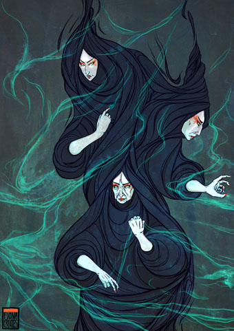
Weekend links 95

skidoo.jpg

Seven Songs (1982) by 23 Skidoo. Sleeve by Neville Brody.

The first volume of The Graphic Canon will be published in May by Seven Stories Press, a collection of comic strip adaptations and illustrations edited by Russ Kick. The anthology has already picked up some attention at the GuardianWestern canon to be rewritten as three-volume graphic novel—and Publishers’ WeeklyGraphic Canon: Comics Meet the Classics. I know someone who’ll bristle at the lazy use of “graphic novel”. The Graphic Canon isn’t anything of the sort, it’s a three-volume voyage through world literature presented in graphic form with a list of contributors including Robert Crumb, Will Eisner, Molly Crabapple, Rick Geary, and Roberta Gregory. My contribution is a very condensed adaptation of The Picture of Dorian Gray that will appear in volume 2. More about that closer to the publication date.

• LTM Records announces a vinyl reissue for Seven Songs (1982) by 23 Skidoo, an album produced by Ken Thomas, Genesis P Orridge & Peter Christopherson that still sounds like nothing else. Related: an extract from Tranquilizer (1984) by Richard Heslop, cut-up Super-8 film/video with audio collage by 23 Skidoo.

• New exhibitions: Another Air: The Czech–Slovak Surrealist Group, 1991–2011 at the Old Town City Hall, Prague (details in English here), and Ed Sanders – Fuck You / A Magazine of the Arts 1962–1965 at Boo-Hooray, NYC.

• “…we have a situation where the banks seem to be an untouchable monarchy beyond the reach of governmental restraint…” Alan Moore writes for the BBC about V for Vendetta and the rise of Anonymous.

Announcing Arc: “a new magazine about the future from the makers of New Scientist“. Digital-only for the time being, as they explain here. Their Tumblr has tasters of the contents.

• From another world: Acid Mothers Temple interviewed. Also at The Quietus: Jajouka or Joujouka? The conflicted legacy of the Master Musicians.

• More from Susan Cain on introverts versus extroverts. Related: Groupthink: The brainstorming myth by Jonah Lehrer.

Ten Thousand Waves, an installation by Isaac Julien.

Afterlife: mouldscapes photographed by Heikki Leis.

• The book covers of Ralph Steadman. And more.

• “James Joyce children’s book sparks feud

Arkitypo: the final alphabet.

Book Aesthete

Kundalini (1982) by 23 Skidoo | Vegas El Bandito (1982) by 23 Skidoo | IY (1982) by 23 Skidoo

Kafkaesque

kafkaesque1.jpg

Another book design of mine (interiors only) which I completed last September for Tachyon and about which I had this to say at the time:

Kafkaesque [is] edited by John Kessel and James Patrick Kelly. It’s a collection of short stories either inspired by Franz Kafka, or with a Kafka-like atmosphere, and features a high calibre of contributions from writers including JG Ballard, Jorge Luis Borges, Carol Emshwiller, Jeffrey Ford, Jonathan Lethem and Philip Roth, and also the comic strip adaptation of The Hunger Artist by Robert Crumb.

The book gained a positive review at SF Site recently, reminding me that I hadn’t written anything about the design. As with some of my other Tachyon work the interiors take their cue from a pre-determined cover by another designer, in this case Josh Beatman. I followed Josh’s type choices (Senator for the titles and headings) and also extended his use of an insect as a recurrent motif. Before I saw the contents I was fairly determined to avoid any further insect imagery but it became apparent that Kafka’s Metamorphosis is a repeated reference in many of the stories.

kafkaesque2.jpg

As for the recurrent “K”, that seemed inevitable given Kafka’s own use of the letter as well as its presence not only in Kafka’s own name but in the names of the editors. The frames were an idea borrowed from (and referring to) Steven Berkoff’s stage adaptation of The Trial in which portable frames serve on the stage as doorways, windows, corridors, picture frames and so on. I was hoping to do more with this idea but (as is often the case) ran out of time to develop it further.

kafkaesque3.jpg

And while we’re on the subject of Tachyon designs, I don’t seem to have mentioned my interiors for a Joe R Lansdale collection, Crucified Dreams, which also appeared last year. This is a hard-boiled anthology of Lansdale’s favourite stories for which I supplied suitably rough-and-tough graphics comprising scanned scalpel blades and lettering assembled from torn newspaper pages. I’m due to start on some new work for Tachyon this week. More about that at a later date.

Continue reading “Kafkaesque”

A London Street Scene

parry.jpg

A London Street Scene (1840) by John Parry.

If any painting requires the attentions of the Google Art Project it’s this depiction of a bill poster going about his work by John Orlando Parry (1810–1879). I know this from a cropped view (see here) which shows the care Parry applied to details of typography and the layering of the posters. There’s also some humour with the pickpocket boy on the left, and the artist himself as the subject of one poster in the centre of the picture. Wikipedia has a large version here but it’s too washed-out and blurred to be any use. For a view of the genuine article at work, see this LSE Library photo.

A note about the painting’s date: online sources give 1830 but the copy I have in a book from the V&A says 1840.

Koloman Moser posters

moser2

Secession poster (1899).

Since I’ve been delving over the past year into the fin de siècle culture of Germany and Austria, the name of Koloman Moser (1868–1918) has kept recurring. This is partly because of Moser’s associations with the Viennese Secession and the Wiener Werkstätte, of course, but I’ve made a point of drawing attention to his work since it’s struck me as some of the most remarkable being produced anywhere in Europe during the period 1895–1910. Moser’s poster designs are a good example of his authority as an artist and graphic designer who quickly evolved from Mucha-derived Art Nouveau flourishes to a degree of stylisation that was incredibly advanced for the early 1900s. The graphics of Moser and fellow artist/design Alfred Roller point the way to Art Deco twenty years later, and also to the psychedelic era whose poster artists eagerly borrowed motifs, figures and lettering designs from Moser, Roller, Mucha and others.

moser3

Frommes Kalender poster (1899).

Wikimedia Commons has a generous sampling of Moser’s work that shows his incredible versatility in a variety of media. The Secession designers, and Moser in particular, and memorialised in Paul Shaw’s typeface design, Kolo.

moser8

Illustrierte Zeitung poster (1900).

Continue reading “Koloman Moser posters”

The Crackdown by Cabaret Voltaire

crackdown1.jpg

I mentioned yesterday Richard H. Kirk’s announcement that Cabaret Voltaire’s albums on the Virgin label are to be reissued next year by Mute Records. The news gives me a topical excuse to write something about the first album in that series, The Crackdown, which happens to be my favourite of all their releases. Cabaret Voltaire, like 23 Skidoo, benefited a great deal from their association with designer Neville Brody in the early 1980s, and this post mostly concerns Brody’s design for The Crackdown and its accompanying singles. The Crackdown was released in 1983 with the advance from Virgin having allowed them to buy new equipment and add a degree of polish to their recordings which earlier albums had lacked. Brody had been designing their covers for the past two years, and continued to do so for the next few releases before leaving the music business to concentrate on magazine and other design work.

crackdown2.jpg

What I liked about this sleeve was the way it gets the most out of the careful arrangement of a few simple elements. The front photo showing Stephen Mallinder and Richard Kirk posing with video equipment (monitoring the viewer) is enlarged and cropped to provide backgrounds elsewhere. The sleeve photos wrap around front and back while the shape made by the titles determines the layout of track titles and credits. (The various CV graphics are credited to Phil Barnes.) The type wasn’t set digitally but was applied by hand using Letraset rub-down lettering which makes me wonder how much planning was required to get the track titles to perfectly fit their intended shape.

crackdown3.jpg

Continue reading “The Crackdown by Cabaret Voltaire”