Weekend links 413

bester.jpg

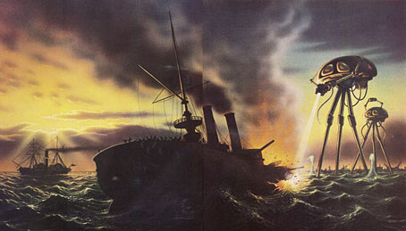
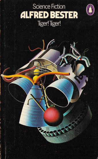
Cover art and design by David Pelham, 1974. The author’s name is set in Marvin (see below).

• Revelation of the week is a lengthy, career-spanning interview with Igor Wakhévitch, the French composer whose extraordinary run of albums from the 1970s are cult items in these parts. (Previously) Wakhévitch isn’t exactly reclusive but he lives in India, and hasn’t recorded anything since the 1980s, so in recent years he wasn’t visible or even known much at all outside France. The release in 1998 of a CD collection, Donc…, and a handful of vinyl reissues, brought him out of obscurity, although all the reissues to date have been in limited quantities. Work of this quality really warrants a wider release.

The Sky Torn Apart is a new album by Paul Schütze, his first for several years. Very good it is too, 56 minutes of growling and glittering atmospherics that could equally suit the enervating heights of summer (as in Wendy Carlos’s drone piece from Sonic Seasonings) as the depths of winter, the inspiration being the apocalyptic cycles of Norse mythology.

• At Lambda Literary: Cathy Camper talks to cartoonist Justin Hall about his planned film, No Straight Lines, about the history of queer comics. There’s a Kickstarter for the project, and more background detail at QueerClick (NSFW).

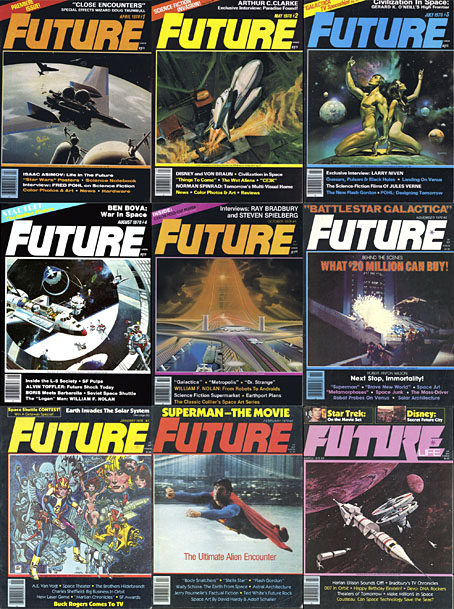
• Introducing Marvin Visions, a digital revival of Marvin, a photoset typeface first launched in 1969, and very popular during the 1970s on science-fiction cover designs. Marvin Visions is free for personal use.

• The second number of the relaunched Wyrd Daze—”The multimedia zine of speculative fiction + extra-ordinary music, art & writing”—has arrived.

• At New Noise: Dylan Carlson (again) talking about the influences on his solo album, Conquistador.

• Video Drone: Russell Cuzner talks to Rose Kallal about her audio-visual concerts.

• Mix of the week: a Dark Souls-inspired drone mix from Justin C. Meyers.

• RIP Glenn Branca

The Ascension (1981) by Glenn Branca | Ascension (1992) by O Yuki Conjugate | Ascension (2014) by The Bug

Daughters of Forgotten Light by Sean Grigsby

grigsby.jpg

I’ve spent most of the year so far working on more black-and-white illustrations for Editorial Alma—47 full-page pieces to date—so this cover design made a welcome break, especially since all the black-and-white art has a late-Victorian setting. More about that later. Sean Grigsby’s second novel for Angry Robot Books is previewed at the Barnes & Noble SF blog as follows:

A floating prison is home to Earth’s unwanted people, where they are forgotten…but not yet dead, in this wild science fiction adventure.

Deep space penal colony Oubliette, population: scum. Lena “Horror” Horowitz leads the Daughters of Forgotten Light, one of three vicious gangs fighting for survival on Oubliette. Their fragile truce is shaken when a new shipment arrives from Earth carrying a fresh batch of prisoners and supplies to squabble over. But the delivery includes two new surprises: a drone, and a baby. Earth Senator Linda Dolfuse wants evidence of the bloodthirsty gangs to justify the government finally eradicating the wasters dumped on Oubliette. There’s only one problem: the baby in the drone’s video may be hers.

The gangs are biker gangs, riding machines with wheels of light, so the brief was for a design as much reminiscent of a rock poster as a science-fiction cover. I don’t stray very often into the SF world so this again made a refreshing break from the 19th century and its heavy furnishings. There’s a touch of Syd Mead in the background, a reference suggested by the Tron-style bikes, but he’s long been a favourite visual futurist of mine even before Blade Runner (as I noted recently). The side panels and parts of the halo are adapted from Art Deco designs, the panels being based on embellishments for a New York skyscraper. It doesn’t take much to push the aerodynamic qualities of Deco style into the Space Age (the Soviet Monument to the Conquerors of Space could have been designed in 1930), a suggestion that William Gibson explored from a different angle in The Gernsback Continuum.

The Barnes & Noble post linked above also has an extract from the beginning of the novel. The book itself will be out on 4th September, 2018.

The artists of Future Life

future.jpg

My earlier post about Future Life magazine mentioned the regular Portfolio series which featured interviews with illustrators and space artists, the latter group being the people who providing conceptual paintings for astronomy books and government entities such as NASA. Since the magazine files at the Internet Archive aren’t searchable I thought it worth making note of the interviews here, for my own benefit as much as anything else. (This blog has often served as a useful notebook.)

fl01-bonestell.jpg

Issue 1: Chesley Bonestell.

Many of the artists featured in Future Life were receiving their first (in some cases, only) high-profile feature at a time when little attention was given to the producers of this kind of work even in popular science-fiction magazines. The story magazines have always run interviews with writers but prior to Future Life, Science Fiction Monthly was the only magazine that I’d seen with a regular illustration feature, and that title didn’t last very long. Future Life covered some of the same people, Chris Foss, for example, while seeking out the prominent figures of the US illustration world. Not all the art is to my taste at all but the interviews are of interest even if you don’t like the pictures. One surprise was finding an interview in one of the issues that I’d missed with Ludek Pesek, a Czech artist whose views of the Solar System and depictions of the evolution of life on Earth I knew from the Puffin books he worked on with Peter Ryan. Those books were aimed at a young readership and were great favourites of mine before I’d seen anything by Foss and co. Another of the space artists interviewed is David Hardy, a British contemporary of Pesek’s whose view of an alien planet will be familiar to Hawkwind enthusiasts on the back cover of Hall Of The Mountain Grill. Another notable feature of the series is the lack of women artists, although this isn’t so surprising given that women creating pictures of space hardware are few even today. All the same, they might have featured Rowena Morrill, a popular cover artist for SF and fantasy novels at the time, and someone whose work I prefer to many of the people they did profile.

fl03-boris.jpg

Issue 3: Boris Vallejo.

fl04-mccall.jpg

Issue 4: Robert McCall.

fl05-nagaoka.jpg

Issue 5: Shusei Nagaoka.

A Japanese artist best known in the West for his album-cover art for ELO, Earth, Wind and Fire, and many others.

fl06-miller.jpg

Issue 6: Ron Miller.

fl07-hildebrandt.jpg

Issue 7: The Brothers Hildebrandt.

fl08-hardy.jpg

Issue 8: David Hardy.

Continue reading “The artists of Future Life”

Future Life magazine

future1.jpg

One thing I never expected about the future was that so many of my youthful enthusiasms would keep rising from the past, but here’s another, stumbling into the room reeking of cemetery earth and old newsprint. Future Life was a spinoff from Starlog magazine, and where the parent title concerned itself with science fiction and fantasy in film and television, the focus of Future Life was technology, popular science, scientific speculation, and written science fiction (all from an American perspective, of course); film and TV productions were there to attract general readers but never dominated the proceedings. Future Life ran for 31 issues from 1978 to 1981, and in many ways the magazine was a kind of OMNI-lite: not as lavish as its rival but not as expensive either. For a while this was a magazine I always looked out for (together with Heavy Metal, with whom it shared a music writer, Lou Stathis) but I missed the first nine issues, and many of the later ones before it vanished altogether, so it’s gratifying to find the complete run available as a job lot at the Internet Archive.

future2.jpg

It’s become commonplace today to regard Generation X as the first generation with no optimistic future to look forward to, but Future Life shows how much optimism there was at the beginning of the 1980s. The mood darkened just as the magazine expired, with genuine fears of a nuclear war persisting through much of the decade, and the Challenger disaster reminding everyone that leaving the planet was still a hazardous business. Future Life wasn’t blind to the problems posed by technology—there were features about the dangers posed by nuclear power and climate change—but it remained upbeat about the potentials, especially where space colonies were concerned. Most issues carried an art feature although these were generally about realistic space artists or spaceship painters, with none of the eye-popping weirdness favoured by OMNI. But this magazine was my first introduction to the work of Syd Mead, a few years before Blade Runner made him deservedly famous. On the writing side, many of the articles were by popular science fiction writers—Roger Zelazny on computer crime, Norman Spinrad on a pet theme, the future of drug-taking—which you can now read with the full benefit of hindsight. In later issues there was Harlan Ellison filing a succession of lengthy and inimitable film essays; several pieces by Robert Anton Wilson; and some good music articles with features on Larry Fast (issue 12) and Robert Fripp (issue 14), while Lou Stathis profiled and interviewed Bernie Krause (issue 18), The Residents (issue 19), Patrick Gleeson (issue 22), Jon Hassell (issue 24), Captain Beefheart (issue 25), and everyone’s favourite robots, Kraftwerk (issue 31).

future3.jpg

The Internet Archive currently has all the files stuck on a single page so most people will either have to download everything at once (I’d advise using the torrent file) or sample issues at random. Fortunately there’s a very thorough breakdown of the entire run of magazines here for those who prefer to pick through the detail. In the universe next door we’re reading these back issues while floating above the earth in our L5 space colonies.

Previously on { feuilleton }
Science Fiction Monthly

The man who wasn’t Tesla

tesla1.jpg

Searching through old emails last week reminded me that a couple of years ago I’d supplied some art for use in a steampunk-themed bar in Gran Canaria. I would have mentioned this before now but, as is often the way with freelance commissions, once the negotiations were over I dispatched the art then heard nothing more about the project.

tesla2.jpg

A search for the bar this week revealed a number of things: the place in question is the Tesla Steampunk Bar in Las Palmas de Gran Canaria; the artwork did indeed get used to prominent effect, with the main elements of my picture being positioned behind the bar itself; and it wasn’t immediately obvious whether the place was still open. Subsequent searching (and some Google translating of the bar’s Facebook page) further revealed that the bar has been closed but is in the process of relaunching itself.

tesla3.jpg

As to the artwork, this was adapted from the second version of a design I produced for Jeff VanderMeer in 2008 to illustrate a semi-serious steampunk slogan of Jeff’s devising. Ten years ago steampunk was still a very minor subgenre, and one with few visual signifiers. I quickly hacked together a piece using imagery taken from the Dover Pictorial Archive series, a collection of books which are useful but whose engraved illustrations have since been plundered endlessly for this type of work.

steampunk1.jpg

When I’m collaging things today I try and avoid using too much from the Dover books so I’ve been pained that this particular design, especially the goggle-wearing head, has proved so popular. Even when people haven’t asked to use the head itself I’ve been asked to do something similar, as was the case with the Aether Cola can I designed in 2012. The Tesla people used a stripped-down version of the colour design which I scaled to very large size. They also have a picture of the flying man on their wall but I’ve not found any good photos of him.

steampunk2.jpg

The original head, meanwhile, was used again last year in a new design for yet another business. Dr Pieper is a steampunk-themed chip shop (yes, really) in Amsterdam, a place with very nice antique decor by the looks of their Instagram page. My variant designs may be seen in the window and in their advertising graphics.

pieper.jpg

The head itself was found in Men, one of several collections of engraved illustrations edited for Dover Publications by Jim Harter. Some of Harter’s other books identify the pictures but not this one, so the identity of the portrait was unknown until, in my attempts to avoid the Dover books, I found a picture of Joseph Edgar Boehm in Hill’s Album of Biography and Art (1882). Boehm was a sculptor of a rather staid and respectable kind, being commissioned for royal portraiture among other things. I can’t imagine he’d be thrilled to find his posthumous image looking down on a drinking house and a chip shop, but sculptors often seem to be more easily forgotten than painters so he’s doing better than many of his contemporaries.

boehme.jpg

And while on the subject of steampunk, I ought to note that there’s a steampunk convention taking place in Morecambe at the beginning of June. I won’t be in attendance (they did ask) but I said I’d mention the event here.

Previously on { feuilleton }
The George Dower Trilogy by KW Jeter
Steampunk in the Tank
More vapour trails
Steampunk catalogued
Steampunk: The Art of Victorian Futurism
Steampunk Calendar
Words and pictures
Nathanial Krill at the Time Node
Fiendish Schemes
Ghosts in Gaslight, Monsters in Steam
Steampunk Revolution
The Bookman Histories
Aether Cola
Crafting steampunk illustrations
SteamPunk Magazine
Morlocks, airships and curious cabinets
The Steampunk Bible
Steampunk Reloaded
Steampunk overloaded!
More Steampunk and the Crawling Chaos
Steampunk Redux
Steampunk framed
Steampunk Horror Shortcuts