Glaser goes POP

glaser1.jpg

The purchase of big art and design books requires careful consideration round here, what with shelf space being stressed in multiple ways. (One of the shelves bearing the heavier volumes sags alarmingly.) But this one was recommended to me by a couple of people, and I’d also had a book token hanging around unused for over a year so here we are.
glaser2.jpg

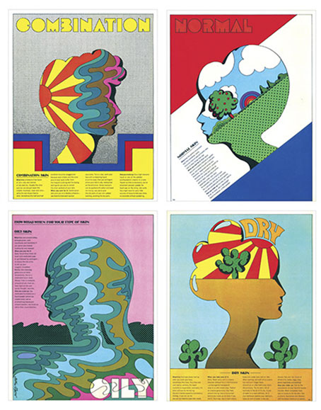
Skin types for Seventeen magazine, 1967.

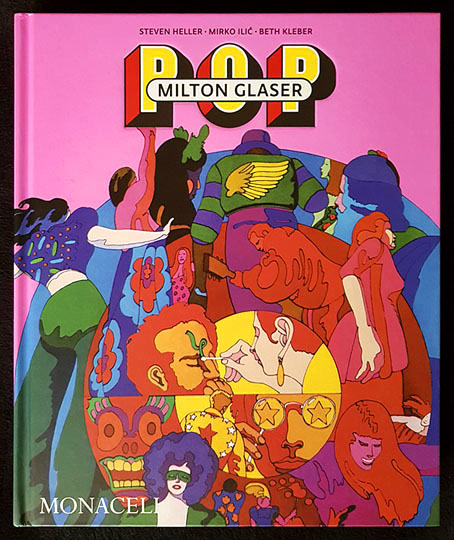
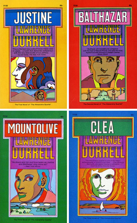
Milton Glaser: POP is a copiously-illustrated 288-page study of the work produced by Milton Glaser and his colleagues at Push Pin Studio, with an emphasis, as the title and cover art suggests, on the company’s prime decade of the 1960s. The book was compiled and edited by the redoubtable Steven Heller, together with Mirko Ilic and Beth Kleber, and presents an overview of Glaser’s remarkable career as designer and illustrator. Glaser was an exceptionally versatile artist, something which has often made appraisal of his career a difficult business. You could easily choose ten of his book or album covers from the many examples assembled by Heller and co., and all would look like the work of different people.
glaser3.jpg

The Alexandria Quartet by Lawrence Durrell; Pocket Books, 1969. I’d much rather have this set than my Faber collection which packages the four books into an unwieldy brick.

Matters are further complicated by the often collaborative nature of the work at Push Pin, and the fact that designers and illustrators aren’t always given credit for their commissions. In the past I’ve gone looking for Glaser’s work then given up when I seemed to be encountering designs that weren’t by him at all. In addition to demonstrating Glaser’s range, Heller, Ilic and Kleber have done everyone a service by showing unused illustrations and crediting work that was previously debatable. Some years ago I wrote a post about the uncredited cover art for the first budget sampler album, The Rock Machine Turns You On (1968), an entry which didn’t manage to resolve the issue of whether or not the cover art was Glaser’s work. It turns out it was by him after all, collage being one of the techniques he employed from time to time.
glaser5.jpg

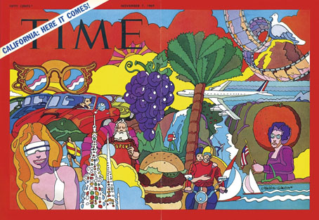
TIME magazine gets groovy. A fold-out cover from 1969.

On a more personal level, Glaser’s versatility and multi-disciplinary approach is encouraging if you find yourself being led in a similar direction. Designer-illustrators are no longer as rare as they used to be, but illustrators, like many fine artists, still tend to develop a favourable style which they then stay with year after year. Illustrators who change their style according to their mood, or the nature of the brief, or a desire to experiment, remain in the minority. Glaser’s illustration ranges more widely than any other artist I’ve seen, from realistic pen-work and watercolour sketches, through bold, stylised designs, to complete abstraction. He could also be playful and frivolous in a manner you can’t imagine from some of his more serious contemporaries, while also being adept enough at illustrating children’s stories that he might easily have spent his career doing this alone.
glaser4.jpg

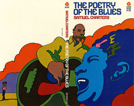
Avon Books, 1970.

But the main attraction of Milton Glaser: POP for this reader is the focus on all those bold graphics, especially the commissions that reworked the emerging psychedelic styles for the commercial sphere. The cover illustration is emblematic of many other examples. This drawing first appeared in a New York magazine supplement in 1967 to accompany an article about LSD, before being reused on the dustjacket of Tom Wolfe’s book about Ken Kesey and friends, The Electric Kool-Aid Acid Test. Glaser and his colleagues at Push Pin were prime exponents of something I’ve taken to calling “the groovy look“, a term I reserve for commercially oriented quasi-psychedelic art. This isn’t meant to be a serious label, it’s a private term that I used to attach to anything resembling the art styles seen in the Yellow Submarine feature film. Serious or not, the label persists when I continue to feel the need for a suitable descriptor for this type of art. “Psychedelic” is the most common label (and one which obviously suits Yellow Submarine) but it seems inappropriate when discussing magazine adverts for household products or illustrations in children’s books. Steven Heller prefers the term “Pop”, but this strikes me as too loose, risking confusion with the many varieties of Pop Art which seldom resemble the vivid, stylised creations of Glaser et al. Pop would also seem misapplied as a description for commercial art when Pop Art was all about the appropriation (ironic or otherwise) of commercial iconography. If you start to label a swathe of commercial art as Pop along with the gallery art that was borrowing from it then the term becomes so diffuse it loses its meaning. The “groovy style” had a long reach, and evolved beyond the decade it was born in. Plenty of examples may be found in the early 1970s by which time Pop Art (in the gallery sense) had lost its momentum.
glaser6.jpg

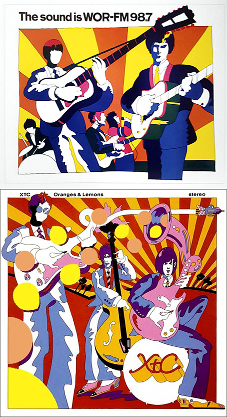
Above: Glaser ad art, 1966. Below: Dave Dragon’s cover art for XTC, 1989.

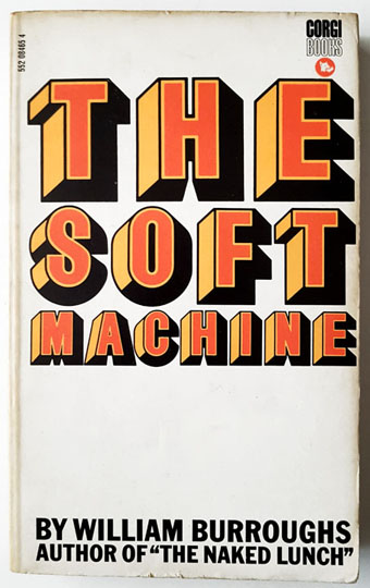
I’ll no doubt return to this question, especially when I’ve just done something in the groovy style myself. (You’ll have to wait a few months before you see the results.) In the meantime there’s a lot to enjoy in this book. I haven’t yet mentioned Glaser’s unused promotional art for the Saul Bass feature film, Phase IV, or the many typeface designs that Glaser created with his associates, and the way one of them—Baby Fat—is used on the cover of the first UK paperback of The Soft Machine. I think this was the first William Burroughs book I ever bought, and it’s been sitting on my shelves all this time without my realising it was a Glaser production. That’s how it often is with graphic designers; they shape our world almost as much as architects do yet their specific influence isn’t always recognised.
glaser7.jpg

Corgi Books, 1970.

And by coincidence, the latest post at The Daily Heller is about a Glaser exhibition tied to the publication of the book. If you’re in New York it’ll be running for the next two weeks.

Previously on { feuilleton }
The groovy look
Milton Glaser album covers

Consulting the Oracle

sfo01.jpg

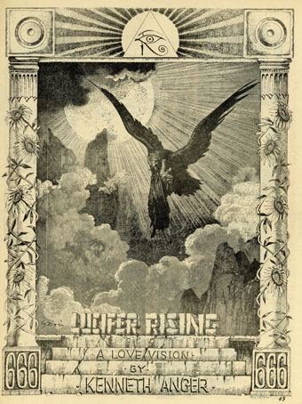
Good to find such a pristine reproduction of this Rick Griffin poster. Kenneth Anger commissioned the design in 1967 when he was putting together a package of promotional items to stimulate the interest of potential investors in his new film. Bill Landis in the unofficial Anger biography says the ploy was a successful one, investors were forthcoming although it would be several years before Anger had enough footage for the ill-fated first version of Lucifer Rising to appear in public. While we’re on the subject, I’ll note again that the Gustave Doré engraving used here is from the Purgatorio section of The Divine Comedy, not Paradise Lost as some people continue to claim. Milton’s Lucifer had wings of his own, as well as god-like powers, he didn’t need to be ferried around by a giant bird.

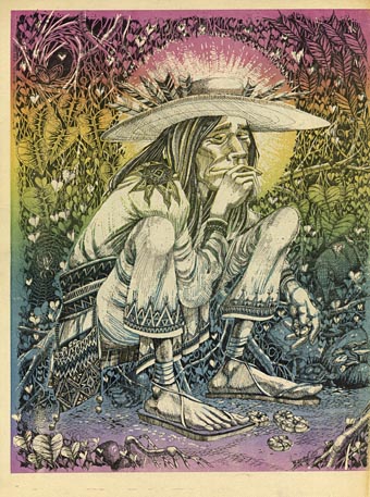
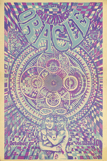
This copy of Griffin’s poster is from issue 7 of the Oracle, or the San Francisco Oracle as it was later titled and known outside the city, an underground newspaper, and one of the best where graphics are concerned.

sfo02.jpg

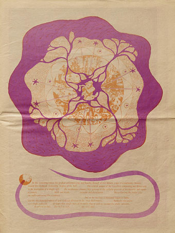
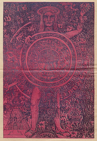
Underground papers and magazines of the late 1960s often followed the form of other amateur or semi-professional publications, with attractive cover art wrapped around more prosaic interiors. The Oracle ran for 12 issues, from 1966 to 1968, and in its later issues gave as much attention to the appearance of its inner pages as its covers, assisted by artists like Griffin and Bruce Conner. Being based in the city that gave the world so many exceptional concert posters was an obvious advantage.

sfo03.jpg

I was hoping the Internet Archive might have a complete run of the Oracle but only four of the highly-decorated issues are currently available. There’s no Wilfried Sätty artwork in evidence either, although I’m not sure he ever worked for the undergrounds despite there being many titles to choose from in the Bay area. Of note in one of the later issues is a full-page announcement for the forthcoming march on the Pentagon, an anti-war protest that took place in October 1967. Kenneth Anger attended the event although the exact nature of his involvement, like so many other Anger stories, varies according to the reporter.

San Francisco Oracle – Vol 1, No 7
San Francisco Oracle – Vol 1, No 9
San Francisco Oracle – Vol 1, No 10
San Francisco Oracle – Vol 1, No 12

sfo04.jpg

sfo05.jpg

Continue reading “Consulting the Oracle”

Weekend links 670

mutzel.jpg

An octopus catching a lobster (1894) by Gustav Mützel.

• RIP Barry Humphries. He emailed me a couple of years ago in his capacity as a collector of fin-de-siècle art, hoping I might answer a question about a very obscure artist. If you require justifications for the blogging habit then add this to the list. Humphries’ first book, Bizarre (1965), is a more cerebral counterpart to Charles Addams’ Dear Dead Days, and a compendium of oddities that I’d buy if I ever saw it in a secondhand shop. RIP also to incendiary singer Mark Stewart.

• “Schulz gets compared to Kafka because of his dreamy, disconcerting stories, but in Balint’s book, a version of Schulz emerges that is closer to one of Kafka’s characters—a man on the run who can’t get past the city walls; an artist exiled by a shape-shifting, unknowable tormentor—than to Franz himself.” Leo Lasdun reviewing a new biography of Bruno Schulz by Benjamin Balint.

• “Instead of asking whether an octopus shows aspects of human intelligence, perhaps the better question is whether humans can show aspects of octopus intelligence.” David Borkenhagen on octopuses and what they might teach us about the perception of time.

• “Uproar was my element, I wanted to get people moving, the more they roared, the bolder I became.” The pioneering theatrical performances of Valeska Gert are explored at Strange Flowers.

• Digital copies of albums by the mighty Earth may currently be purchased at the group’s Bandcamp page for $1 each. I’ve got everything already but you may wish to sample something.

Charles Drazin on the director who dared to tell uncomfortable truths: Lindsay Anderson at 100.

Steven Heller on Commercial Art, a magazine from the 1920s that chronicled UK design.

• At Unquiet Things: The luminous drama of Frants Diderik Bøe’s bejewelled floral still lifes.

• New music: This Vibrating Earth by Field Lines Cartographer, and Draw/Orb by Extra.

• Mix of the week: XLR8R podcast 796 by Gold Panda.

• The Strange World of…Andrzej Korzynski.

The Jewel In The Lotus (1974) by Bennie Maupin | Jewel (1985) by Propaganda | Black Jewelled Serpent Of Sound (1985) by The Dukes Of Stratosphear

Bugged by Jaffee

jaffee-bug1.jpg

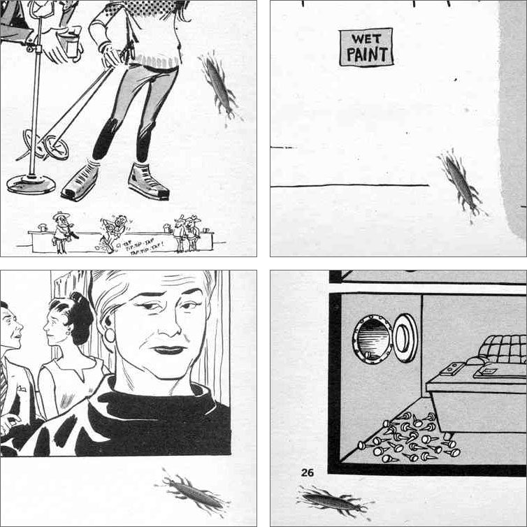
This one is for my own benefit as much as anyone else’s. Last week, after reading about the late Al Jaffee, I went looking for the panel you see above, a minor item in a much longer Jaffee feature for an issue of Mad magazine from the 1960s. The flatbugs have been one of my favourite Jaffee jokes for many years, but never having kept a note of which issue they appeared in I’ve always had a problem finding them when I’ve wanted to tell someone about them or see them again. On this occasion searches for various combinations of “mad”, “magazine”, “jaffee”, “bugs”, “flatbugs”, “flat bugs” yielded nothing other than a brief mention on a Reddit thread, along with too many articles about insect infestation. Google Books is sometimes useful for search leads but not this time. Twitter still has its uses, however; someone there had mentioned the flatbugs a couple of years ago, as well as the issue they appeared in, Mad no. 107 for December 1966, so here they are at last.

jaffee2-bug2.jpg

The thing that made the flatbugs so memorable (if not locatable) was that this is a rare Mad joke that’s allowed to extend throughout the rest of the issue. Jaffee’s bug panels occupied two corners of a three-page collection of puzzles and visual gags which is why they’ve always been difficult to track down, you won’t see any mention of them in an index or table of contents. Despite this, issue 107 really ought to be called the flatbug issue. Once you’ve read about the breeding habits of the creatures you start seeing more of them on the pages that follow, even those by artists other than Jaffee; the last of the bugs appears on Jaffee’s fold-in page. This has some precedent in the tiny Sergio Aragones cartoons that appeared in the page margins but I’ve not seen any other one-off gags used like this. Jaffee is lauded for his fold-ins but this shows him playing with the form of the magazine in a different way, suggesting that these were real creatures, albeit motionless and almost two-dimensional.

jaffee-bug4.jpg

I only got to see issue 107 a few years ago when scanned copies of the magazine began to turn up online. Prior to this I knew the flatbugs from one of the reprint books which were all you got to see of older copies of Mad magazine outside the US. I might never have seen these either if it wasn’t for a friend at school who collected humour paperbacks. He had a huge stock of the things, not only the Mad books but many of their spin-offs by Al Jaffee, Don Martin and co. The book with the flatbugs, Rip Off Mad, dates from 1973 but most of the material inside is from the previous decade. I’ve not seen a copy of this since the 1970s but I know that the bugs spread throughout the book just as they did in the magazine, even though the contents were different to issue 107.

lambshead.jpg

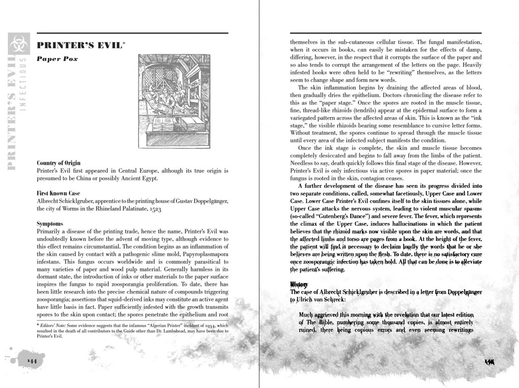
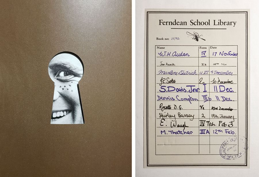
In 2003 the flatbugs came to mind when I was writing my entry for the Thackery T. Lambshead Pocket Guide to Eccentric and Discredited Diseases. My disease, “Printer’s Evil”, is a fungal growth that infects paper, and thereby passes to anyone who touches an affected page. The entry itself was, of course, contaminated in this way. Ideally one of the pages for this section would have had a frayed edge but there wasn’t the budget for such indulgence. If you do have the budget then the possibilities expand for humorous invention. The first Monty Python book, Monty Python’s Big Red Book, features a die-cut page (below), while Eric Idle’s Rutland Dirty Weekend Book has a parody of Rolling Stone magazine (Rutland Stone) printed on smaller-sized newsprint pages bound into the centre of the book. The Python books were developing a convention established by Mad (and continued in National Lampoon) of parodying print media in exacting detail, matching fonts, layouts, graphics and so on. (See this article.)

python.jpg

From the Python books. Left: Monty Python’s Big Red Book (1971); right: The Brand New Monty Python Bok (1973).

The pinnacle in this sphere is The Brand New Monty Python Bok, with its smudged fingerprints printed on a white dust-jacket (which prompted complaints from booksellers), beneath which you find a cover for a very different book, Tits ’n Bums: A Weekly Look at Church Architecture, a cover that must cause problems for resale if the dust-jacket is missing. Inside the book there’s a tipped-in library card showing the names and signatures of previous owners, while two differently-sized supplemental sections are bound into the pages. In the early 1960s Terry Gilliam had worked for Harvey Kurtzman’s Help! magazine so there’s a direct line from Python back to Mad, especially when other artists on the Help! staff included Mad regulars Al Jaffee, Jack Davis and Will Elder; Kurtzman and Gilliam subsequently collaborated on a puzzle book where the graphics and the humour sit mid-way between Mad and Monty Python. The Mad-like quality of The Brand New Monty Python Bok is reinforced by a pair of Gilliam comic strips. Jaffee’s flatbugs would be (immovably) at home there.

Previously on { feuilleton }
Blivets
The Thackery T. Lambshead Cabinet of Curiosities
Gilliam’s shaver and Bovril by electrocution
Portuguese Diseases
Pasticheur’s Addiction

jaffee-bug3.jpg

New Wave Strangeness: Hawkwind’s Calvert years

days.jpg

Antique badges not included.

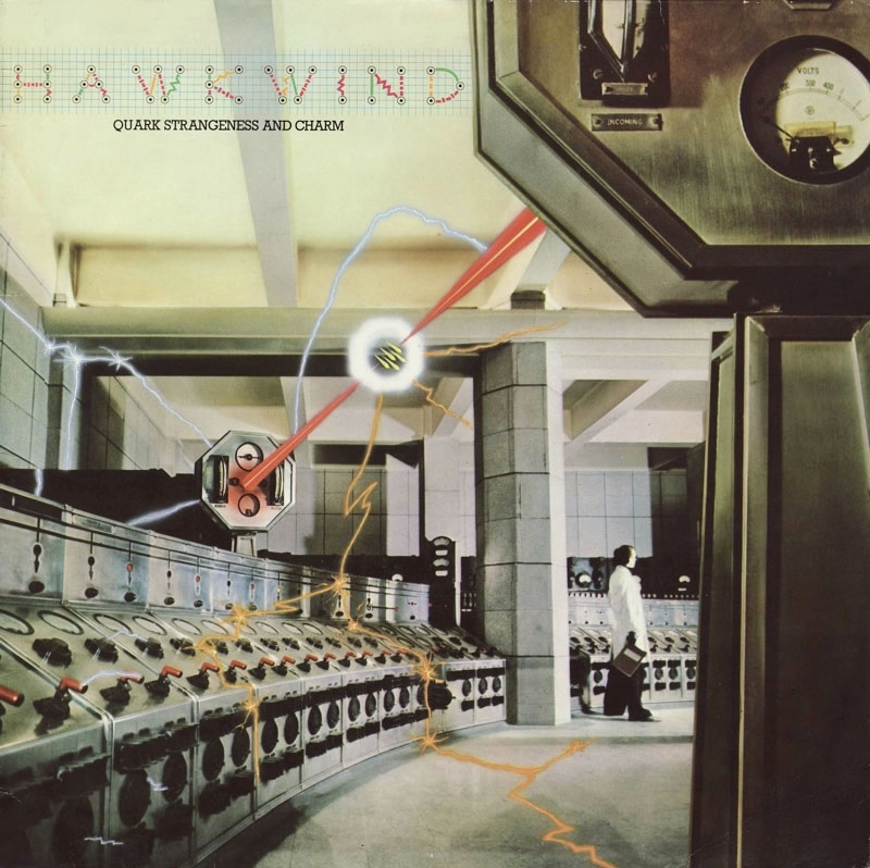
My weekend has been spent immersed in Days Of The Underground, the latest box of Hawkwind albums from Cherry Red Records. I’d avoided many of the earlier sets but this one was irresistible for being a 10-disc collection (8 CDs and 2 blu-rays), the core of which is three of the four albums recorded by the group for the Charisma label–Quark, Strangeness And Charm (1977), 25 Years On (credited to Hawklords, 1978), and PXR 5 (1979)–with all three albums being given the Steven Wilson remix treatment. The studio material is complemented by further Wilson mixes of live recordings and alternate takes, plus demo tracks (previously available but I didn’t have them). You also get three bonus video clips: Hawkwind (minus Dave Brock) playing the Quark single on Marc Bolan’s TV show in 1977, together with two promo films from the 1978 Hawklords concert at Brunel University. Absent from the set is the group’s first album for Charisma, Astounding Sounds, Amazing Music (1976), also the two singles that were released that year. I’ve not seen any explanation for these omissions but reasons may include the uneven quality of the music (recorded shortly before the group imploded), and Dave Brock’s lasting dislike of the album.

quark.jpg

Cover design by Hipgnosis; photography by Peter Christopherson with graphics by Geoff Halpin. Aubrey Powell says that Robert Calvert commissioned this one after the pair met each other at a party. The photography made use of the interior of Battersea Power Station in the same year that Hipgnosis used the building for a rather more famous album cover.

Steven Wilson did a great job of remixing the Warrior On The Edge Of Time album so I had high hopes for this set, hopes that have been substantially fulfilled. Many of the adjustments are individually minor–boosted bass, more prominent keyboards, some extended intros–but taken together they offer a refreshed experience of three very familiar albums. The packaging has been well-designed by the estimable Phil Smee with a booklet that presents a snapshot of the graphics produced for the group during this period, not only album artwork but also posters, ads and pages from the tour programmes. As a bonus there’s a small reproduction of the 1977 tour poster, a welcome inclusion since I used to own an original one of these which I’ve either misplaced or lost altogether. The attention to detail extends to the animated graphics of the blu-ray interface; when the Quark album is playing you can watch sparks dancing around the control room. The Marc Bolan TV appearance was something I’d seen many times before (including its original broadcast) but the live Hawklords films are revelatory when there’s so little footage of the band from the 1970s with synched sound. The performances of PSI Power and 25 Years offer a frustratingly brief taste of Robert Calvert’s magnetic stage presence, and make me hope that a video of the entire concert may be released eventually.

pxr5.jpg

Cover art by Philip Tonkyn.

Robert Calvert is the key figure here, to a degree that Hawkwind’s Charisma years are also known as the Calvert years, this being the period when the group’s part-time lyricist, occasional singer and conceptual contributor graduated to lead vocalist and songwriter. Calvert’s new role as front man changed Hawkwind from an ensemble of underground freaks into a more typical rock group, albeit one with a very theatrical singer prone to changing outfits to suit the songs, and with props that included a loudhailer, a machine-gun (fake) and a sabre (real). The songs became shorter and, in places, poppier, although none of the singles managed to repeat the chart success of the Calvert-penned Silver Machine. Nevertheless, Brock and Calvert were a great song-writing team, and the lyrics that Calvert wrote from 1976 to 1978 are better than anything else in the discography: witty, alliterative, and filled with clever rhymes that range widely in their subject matter, from the usual science-fiction fare to Calvert’s own obsessions, especially aircraft and flying. Calvert’s approach to science fiction was more sophisticated than the freaks-in-space approach of the group’s UA years. You get a sense of this from his contributions to the Space Ritual album (only Calvert would have known what an orgone accumulator was), but his Charisma songs go much further, condensing whole novels—Roger Zelazny’s Damnation Alley and Jack of Shadows, Ray Bradbury’s Fahrenheit 451—while maintaining the spirit of the New Wave of SF, where the emphasis was as much on inner as outer space.

Continue reading “New Wave Strangeness: Hawkwind’s Calvert years”