Weekend links 680

wijdeveld.jpg

15 Miles into the Earth (1944) by Hendrik Wijdeveld.

• “He realized that there were individuals around him who had never appeared in the great altarpieces and frescoes, individuals who had been marginalized by the cultural ideology of the previous two centuries. And there were hours of the day—transient, yet unequivocal in their lighting—which had never been reproduced, and which were pushed so far from habit and use that they had become scandalous, and therefore repressed.” Pasolini on Caravaggio.

• “Reading Albert Camus and Mikhail Bulgakov by day, by night, crucially, they were listening to Chic, Kraftwerk, Donna Summer, Michael Rother and Grace Jones in the clubs.” Graeme Thomson on the atmosphere and influences that helped create my favourite album by Simple Minds, Empires And Dance. Borges was also a minor influence, apparently, which wasn’t something I knew until this week. I like it when your favourite things join up this way.

• “This being England, a ‘tea shop’ is not a shop that sells tea. That would be a tea merchant. A tea shop serves tea.” Mark Valentine on the perennial connections between rambling and tea-drinking.

Talking about generations as if they really existed and had sway over people is much more respectable and widespread than the belief that events and personalities are governed by the movements of the planets. But is there really much more substance and reality to “generations”? If not “a bunch of bullshit”, the discourse of generations is certainly generative of bullshit: tenuously grounded overviews and opinion pieces, specious analysis and analogies, platitudes and truisms. And yet, like astrology, it is a fun game to play along with. And far more than astrology, it’s a mode of talk that partially constitutes its object: generalizing about a generation actually brings it into semi-existence, shaping how people perceive themselves and how they are perceived by earlier or later generations. What may just be an illusion, a shaky set of alleged affinities, becomes a social fact.

Simon Reynolds analyses the generation game

• More Milton Glaser: PDFs of the Glaser Gazette, a memorial publication in three parts: Vol 1 | Vol 2 | Vol 3

• New music: Tractatus Lyra-Organismus by Lyonel Bauchet, and Grounded Rectangle by Ambidextrous.

• “A digital archive of graphic design related items that are available on the Internet Archives.”

• DJ Food found a handful of psychedelic posters by Nicole Claveloux.

• “Rights to Jorge Luis Borges’s work go to his wife’s nephews.”

• “Is this the earliest known phallic art?

Young Generation Dub (1976) by Augustus Pablo | Chile Of The Bass Generation (1990) by Mental Cube | Invisible Generation (1992) by Cabaret Voltaire

Toytown psychedelia

alala2.jpg

The Teletrips of Alala (1970).

The imaginative landscapes of childhood were always close at hand in the psychedelic culture of the 1960s, more so in Britain than the USA, and especially where music was concerned. Grace Slick may have given the world White Rabbit but there’s a whole sub-genre of British psychedelic song-writing devoted to children’s games, children’s dreams, sweetshops, fairy tales and the like. Rob Chapman in his essential study of the form, Psychedelia and Other Colours, refers to this tendency as “infantasia”. With psychedelic art being so vivid and playful it’s a small step from lysergic wonderlands to children’s books styled in a quasi-psychedelic manner, which is what we have here. There was a lot of this around in the early 1970s, not all of it very memorable. Some of the best examples were published by Harlin Quist, a US/French imprint who specialised in beautiful books illustrated by exceptional talents. A few of these may be seen at The Peculiar Manicule.


Gertrude and the Mermaid (1968)
by Richard Hughes, illustrated by Nicole Claveloux.

gertrude1.jpg

“This is the story a little girl, her doll named Gertrude, and a mysterious mermaid-child.” The first of several books by Nicole Claveloux for Harlin Quist.

gertrude2.jpg

gertrude3.jpg


Help, Help, the Globolinks! (1970)
by Gian Carlo Menotti, translated and adapted by Leigh Dean, illustrated by Milton Glaser.

globolinks1.jpg

“Recounts the events following the landing of the outer-space Globolinks on Earth.” A German comic opera from 1968 in which a group of children encounter an alien invasion.

globolinks2.jpg

globolinks3.jpg

globolinks4.jpg


The Teletrips of Alala (1970)
by Guy Monreal, illustrated by Nicole Claveloux.

alala1.jpg

“With her unique power to enter the television set and change the course of the programs, Alala creates havoc in the world.” Nicole Claveloux puts her own twist on the Yellow Submarine art style. A few years after this she was creating comic strips for Métal Hurlant. Her more recent work includes erotic retellings of fairy tales. (more pages)

alala3.jpg

alala4.jpg


Andromedar SR1 (1971)
by Martin Ripkens & Hans Stempel, illustrated by Heinz Edelmann.

andromedar1.jpg

“Two astronauts under the spell of an evil octopus are ordered to steal the cobalt-blue flowers from the Martian Mice.” Ripkens and Stempel were better known for their work as cinema critics and film-makers. (more pages)

andromedar2.jpg

andromedar3.jpg


Cartulino: El asombroso doctor Zas (1971)
by Miguel Agustí, illustrated by Alberto Solsona.

solsona02.jpg

A comic strip from a Spanish title, Strong. Alberto Solsona also drew Agar-Agar, the grooviest strip in the short-lived Dracula comic. Cartulino had a number of different adventures but online examples are scarce.

solsona03.jpg


Los Doce Trabajos de Hércules (1973)
by Miguel Calatayud.

hercules1.jpg

“Serie de episodios sobre la penitencia llevada a cabo por Hércules el mayor de los héroes griegos.” A comic adaptation rather than a story book but the art style is a good example of the general trend.

hercules2.jpg

hercules3.jpg


Update: Added Alberto Solsona.

Previously on { feuilleton }
Glaser goes POP
Return to Pepperland
The groovy look
The psychedelic art of Nicole Claveloux
Psychedelia and Other Colours by Rob Chapman
David Chestnutt’s psychedelic fairy tales

Glaser goes POP

glaser1.jpg

The purchase of big art and design books requires careful consideration round here, what with shelf space being stressed in multiple ways. (One of the shelves bearing the heavier volumes sags alarmingly.) But this one was recommended to me by a couple of people, and I’d also had a book token hanging around unused for over a year so here we are.

glaser2.jpg

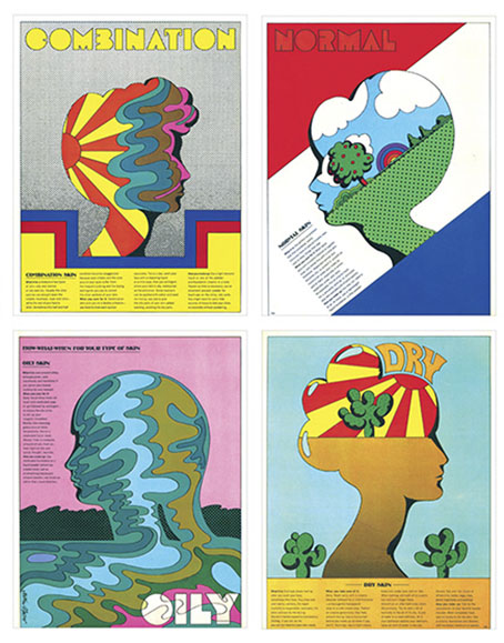
Skin types for Seventeen magazine, 1967.

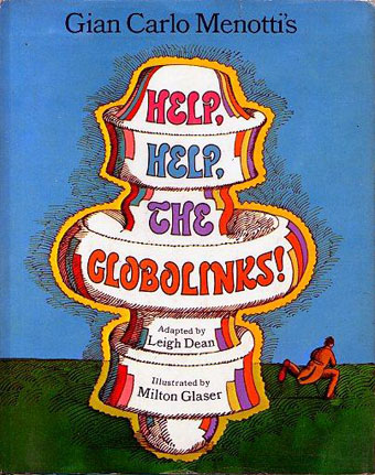
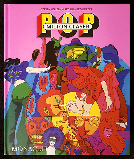
Milton Glaser: POP is a copiously-illustrated 288-page study of the work produced by Milton Glaser and his colleagues at Push Pin Studio, with an emphasis, as the title and cover art suggests, on the company’s prime decade of the 1960s. The book was compiled and edited by the redoubtable Steven Heller, together with Mirko Ilic and Beth Kleber, and presents an overview of Glaser’s remarkable career as designer and illustrator. Glaser was an exceptionally versatile artist, something which has often made appraisal of his career a difficult business. You could easily choose ten of his book or album covers from the many examples assembled by Heller and co., and all would look like the work of different people.

glaser3.jpg

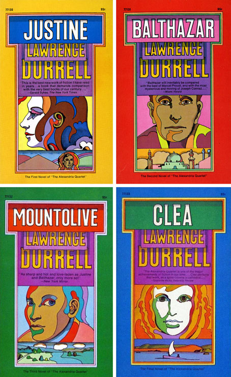
The Alexandria Quartet by Lawrence Durrell; Pocket Books, 1969. I’d much rather have this set than my Faber collection which packages the four books into an unwieldy brick.

Matters are further complicated by the often collaborative nature of the work at Push Pin, and the fact that designers and illustrators aren’t always given credit for their commissions. In the past I’ve gone looking for Glaser’s work then given up when I seemed to be encountering designs that weren’t by him at all. In addition to demonstrating Glaser’s range, Heller, Ilic and Kleber have done everyone a service by showing unused illustrations and crediting work that was previously debatable. Some years ago I wrote a post about the uncredited cover art for the first budget sampler album, The Rock Machine Turns You On (1968), an entry which didn’t manage to resolve the issue of whether or not the cover art was Glaser’s work. It turns out it was by him after all, collage being one of the techniques he employed from time to time.

glaser5.jpg

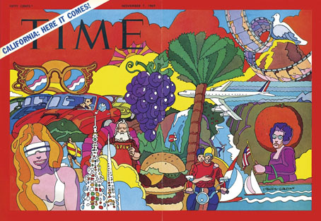
TIME magazine gets groovy. A fold-out cover from 1969.

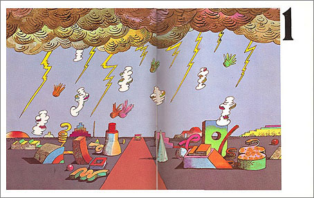
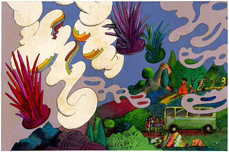
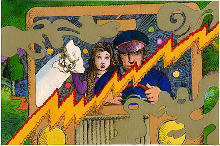
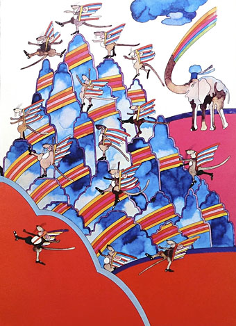
On a more personal level, Glaser’s versatility and multi-disciplinary approach is encouraging if you find yourself being led in a similar direction. Designer-illustrators are no longer as rare as they used to be, but illustrators, like many fine artists, still tend to develop a favourable style which they then stay with year after year. Illustrators who change their style according to their mood, or the nature of the brief, or a desire to experiment, remain in the minority. Glaser’s illustration ranges more widely than any other artist I’ve seen, from realistic pen-work and watercolour sketches, through bold, stylised designs, to complete abstraction. He could also be playful and frivolous in a manner you can’t imagine from some of his more serious contemporaries, while also being adept enough at illustrating children’s stories that he might easily have spent his career doing this alone.
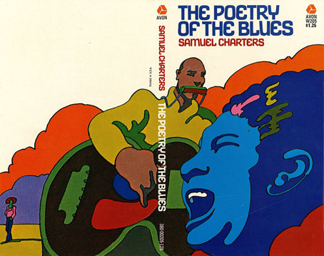
glaser4.jpg

Avon Books, 1970.

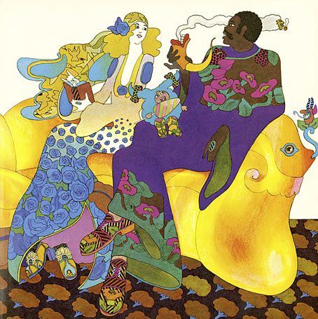
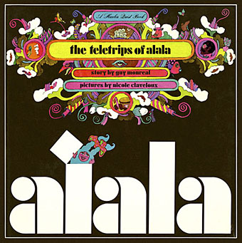
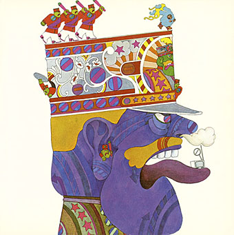
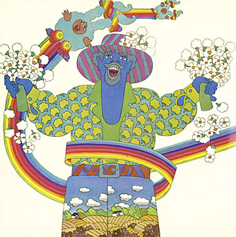
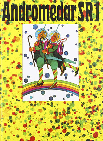
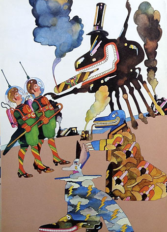
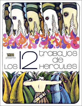
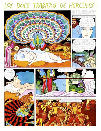
But the main attraction of Milton Glaser: POP for this reader is the focus on all those bold graphics, especially the commissions that reworked the emerging psychedelic styles for the commercial sphere. The cover illustration is emblematic of many other examples. This drawing first appeared in a New York magazine supplement in 1967 to accompany an article about LSD, before being reused on the dustjacket of Tom Wolfe’s book about Ken Kesey and friends, The Electric Kool-Aid Acid Test. Glaser and his colleagues at Push Pin were prime exponents of something I’ve taken to calling “the groovy look“, a term I reserve for commercially oriented quasi-psychedelic art. This isn’t meant to be a serious label, it’s a private term that I used to attach to anything resembling the art styles seen in the Yellow Submarine feature film. Serious or not, the label persists when I continue to feel the need for a suitable descriptor for this type of art. “Psychedelic” is the most common label (and one which obviously suits Yellow Submarine) but it seems inappropriate when discussing magazine adverts for household products or illustrations in children’s books. Steven Heller prefers the term “Pop”, but this strikes me as too loose, risking confusion with the many varieties of Pop Art which seldom resemble the vivid, stylised creations of Glaser et al. Pop would also seem misapplied as a description for commercial art when Pop Art was all about the appropriation (ironic or otherwise) of commercial iconography. If you start to label a swathe of commercial art as Pop along with the gallery art that was borrowing from it then the term becomes so diffuse it loses its meaning. The “groovy style” had a long reach, and evolved beyond the decade it was born in. Plenty of examples may be found in the early 1970s by which time Pop Art (in the gallery sense) had lost its momentum.

glaser6.jpg

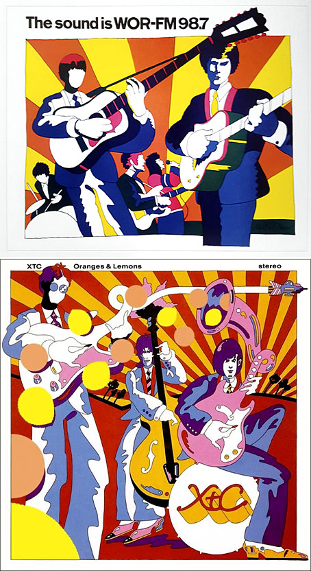
Above: Glaser ad art, 1966. Below: Dave Dragon’s cover art for XTC, 1989.

I’ll no doubt return to this question, especially when I’ve just done something in the groovy style myself. (You’ll have to wait a few months before you see the results.) In the meantime there’s a lot to enjoy in this book. I haven’t yet mentioned Glaser’s unused promotional art for the Saul Bass feature film, Phase IV, or the many typeface designs that Glaser created with his associates, and the way one of them—Baby Fat—is used on the cover of the first UK paperback of The Soft Machine. I think this was the first William Burroughs book I ever bought, and it’s been sitting on my shelves all this time without my realising it was a Glaser production. That’s how it often is with graphic designers; they shape our world almost as much as architects do yet their specific influence isn’t always recognised.
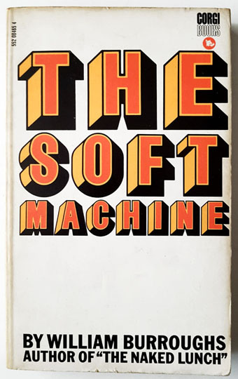
glaser7.jpg

Corgi Books, 1970.

And by coincidence, the latest post at The Daily Heller is about a Glaser exhibition tied to the publication of the book. If you’re in New York it’ll be running for the next two weeks.

Previously on { feuilleton }
The groovy look
Milton Glaser album covers

The art of John Alcorn, 1935–1992

alcorn16.jpg

Ad art for Seventeen magazine, August 1970.

Another member of the Groovy Set, John Alcorn was a very prolific illustrator and designer whose career included a period at Milton Glaser and Seymour Chwast’s Push Pin Studios. Alcorn’s art predates the groovy look, and also extends beyond it, but since I have a taste for this quasi-psychedelic style all the examples here are from the late 1960s/early 1970s. An overview of Alcorn’s career may be found in John Alcorn: Evolution by Design, a book edited by Stephen Alcorn and Marta Sironi which was featured at 50 Watts. And since I keep referring back to it, I’ve added some updates to the original groovy post.

alcorn12.jpg

The Astrology Album, 1967.

From an astrological album to astrological covers for Sydney Omarr’s books, 12 of which were published by Signet in 1969.

alcorn04.jpg

alcorn05.jpg

alcorn06.jpg

Continue reading “The art of John Alcorn, 1935–1992”

Weekend links 523

miller.jpg

One of Ian Miller‘s drawings from the illustrated edition of Ray Bradbury’s The Martian Chronicles, 1979.

• “I always said we were kind of an electronic punk band, really. We were never New Romantics, I don’t like it when we get lumped in with that.” Dave Ball of Soft Cell and The Grid talking to Duncan Seaman about his autobiography, Electronic Boy: My Life In and Out of Soft Cell. I’ll now be waiting impatiently for the unreleased Robert Fripp/Grid album to appear.

• “[Patricia] Highsmith’s writing—often eviscerating, always uncomfortable—has never been more relevant,” says Sarah Hilary.

• Ron Peck’s debut feature, Nighthawks (1978), is “a nuanced look at gay life in London,” says Melissa Anderson.

And then there are those figures who seem to flit around the edges of movements without ever being fully involved in any of them, who pursue their own eccentric paths no matter what is going on around them. These are the writers who make up the secret history of literature, the hidden history that’s not easily reduced to movements or trends, and who always waver on the verge of invisibility until you stumble by accident onto one of their books and realize how good they actually are, and wonder, Why wasn’t I told to read this before? But of course you already know the answer: You were not told because it doesn’t fit smoothly into the story those in authority made up about what literature is—it disrupts, it can’t be reduced to the literary equivalent of a meme.

That’s the kind of writer Pierre Klossowski (1905–2001) is. He is not a joiner. He has his own particular and often peculiar concerns, and pursues them. He does not particularly welcome you in. The content of his writing, too, has the feel of a gnostic text, as if you are reading something that, if only you were properly initiated, you would understand in a different way. In that sense his work has an esoteric or occult quality to it—and likewise in the sense that it returns again and again to the intersection of religion and pornography, the sacred and the profane.

Brian Evenson on The Suspended Vocation by Pierre Klossowski

• Chad Van Gaalen creates a psychedelic animation for Seductive Fantasy by the Sun Ra Arkestra.

• More sneak peeks from the forthcoming The Art Of The Occult by S. Elizabeth.

• More Robert Fripp: Richard Metzger on Fripp’s sui generis solo album, Exposure.

Pamela Hutchinson on the pleasures of David Lynch’s YouTube channel.

• Mix of the week: a second Jon Hassell tribute mix by Dave Maier.

• At Dennis Cooper’s: Ferdinand presents…Dark Entries Day.

15 fascinating art documentaries to watch now.

Soft Power by Patten.

• RIP Milton Glaser.

hauntología

Aquarium (1992) by The Grid (with Robert Fripp) | Soft Power (2005) by Ladytron | The Martian Chronicles (2007) by Dimension X