The art of Simon Moulijn, 1866–1948

moulijn5.jpg

Landscape, Drenthe (1896). Collection Hein Klaver.

Sander Bink’s previous guest posts here concerned some of the forgotten artists of the Dutch fin de siècle, in particular the Beardsley-inspired work of René Gockinga. This new post from Sander is more Symbolist-oriented, with a look at the work of another Dutch artist.

* * *

Simon Moulijn was a Dutch painter and graphic artist whose work shows a striking affinity with European Symbolism, in particular his prints and paintings made in the 1890s which would appear to provide a link between Dutch Realism and mystical Symbolism. Beyond their historical context, these are simply beautiful pictures which is, of course, the most important thing.
moulijn6.jpg

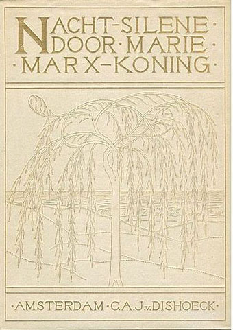
Cover design for Nachtsilene, 1902.

Landscapes were Moulijn’s main theme; some bring to mind the land- and cityscapes of Fernand Khnopff in which the world has become silent: a serene, quiet world, free from the noise and misery of modern life. “Anywhere out of this world”, but within the world we already know. Although not “Decadent” like Khnopff—there are no femmes fatales in his landscapes—Moulijn must certainly have been inspired by Khnopff and similar artists. Van Gogh and Jan Toorop were important for Moulijn as well. That Moulijn was well-versed in Symbolism and other new art forms at the time such as Art Nouveau is evidenced by his exhibition at Siegfried Bing’s Paris Gallery in 1895. Like many of the artists of his generation, he was greatly inspired by the mystical writing of Maeterlinck. No wonder, then, that he designed book covers and illustrations for Marie Marx-Koning, a Dutch writer unjustly neglected today, whose novels and stories also show a strong affinity with European mystical Symbolism.

moulijn1.jpg

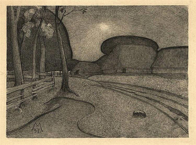
Night (1893). Lithograph.

These qualities are already exemplified by Moulijn’s first printed work, the lithograph Night from 1893 which depicts a traditional Dutch subject, a farm; but there are no peasants, and the nightly tones and silence make it look more like a farm from an Ingmar Bergman film than a landscape by his painter contemporaries from The Hague School.

moulijn2.jpg

Farm at Diphorn (1896). Gemeentemuseum Den Haag.

moulijn4.jpg

Spring (1896). Drents Museum.

moulijn3.jpg

Autumn (1895). Drents Museum.

An 1896 painting with the same subject, Farm at Diphorn, brings to mind the imaginary landscapes of Félix Vallotton, as do, more or less, two pastels which I personally feel to be his best: Spring and Autumn. Once again, the coloured areas in these Symbolist landscapes are reminiscent of a Vallotton or Franz Melchers. But where Vallotton’s landscapes might be characterised as psychological landscapes, these two by Moulijn are almost abstract experiments in colour.
moulijn7.jpg

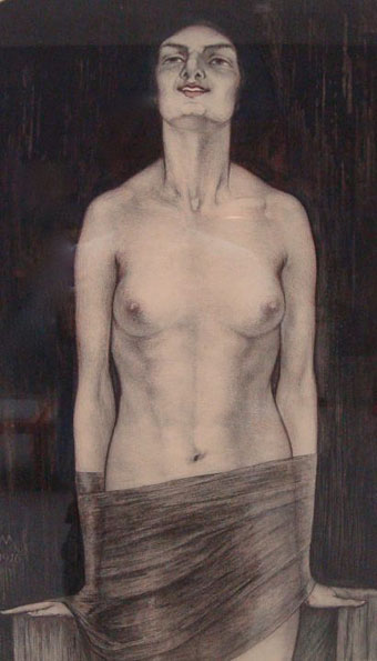
Vampire (1916). Collection Van Wezel.

Finally mention must be made, for curiosity’s sake and to satisfy the reader’s Decadent needs, of the 1916 coloured lithograph Vampire. This demonstrates Moulijn’s affinity with a more Decadent Symbolism, although by this time the style was increasingly outmoded.

Sander Bink

Previously on { feuilleton }
• René Gockinga revisited
• Gockinga’s Bacchanal and an unknown portrait of Fritz Klein
• More from the Decadent Dutch
Weekend links 410

hog.jpg

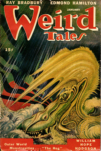
William Hope Hodgson’s final Carnacki mystery, The Hog, received its first magazine publication in January 1947. The cover art by AR Tilburne may not have been originally created for Hodgson’s tale but it complements the story’s atmosphere of febrile dread.

• It’s still April so that means it’s still the month that saw the 100th anniversary of the death of William Hope Hodgson, bodybuilder, manacler of Harry Houdini, and the author of several novels of weird fiction that continue to entrance new generations of readers. The edition of Hodgson’s The House on the Borderland that I illustrated for Swan River Press would have been on sale this month but print problems have caused delays with the run as a whole; anyone interested is advised to contact the publisher for news. • Meanwhile, Jon Mueller (composer of the book’s accompanying soundtrack CD) and myself talked to Swan River Press about the attractions of Hodgson’s novel. • More Hodgsoniana: Greydogtales acknowledged the Hodgson centenary via a discussion with Hodgson scholar Sam Gafford, while Michael Dirda reviewed the new edition of The House on the Borderland and another SRP title, The Scarlet Soul (whose cover I also designed), for The Washington Post.

• “From the ashes of countless decayed Modernities comes Neo-Decadence, a profaned cathedral whose broken stained glass windows still glitter irregularly in the harsh light of a Symbolist sun. Behind this marvellously vandalised edifice, a motley band of revellers picnic in the graveyard of the Real, leaving behind all manner of rotting delicacies and toxic baubles in their wake.” Drowning in Beauty: The Neo-Decadent Anthology edited by Daniel Corrick & Justin Isis is published this month by Snuggly Books, an imprint whose catalogue of new books and first-time translations will be of interest to anyone who comes here for Decadence, Symbolism or anything related. Related to the above: A Neo-Decadence Day at Dennis Cooper’s.

• “Witches are change-makers. They’re transgressive beings who dwell on the fringes of society, and so they’re the perfect icon for rebels, outsiders, and rabble-rousers, especially those of the female persuasion.” Pam Grossman talks to Grimoire about witchcraft and related arts.

• Mixes of the week: Resident Advisor Podcast 621 by Grouper, and Bacchus Beltane 5: The Owl Service by The Ephemeral Man.

• Back in black: Publisher/translator James Conway and designer Cara Schwartz on the cover designs of Rixdorf Editions.

• I was talking again this week at The Writer’s Corner where JKA Short asked me about working as an illustrator.

• All Gates Open: The Story of Can by Rob Young is published next week. The Wire has an extract.

• Delusional Albion: Brad Stevens on how foreign directors saw Britain in the Swinging Sixties.

• “There’s no book I love more than Derek Jarman’s Modern Nature,” says Olivia Laing.

• Eden Tizard on Soliloquy For Lilith, the drone album by Nurse With Wound.

• Owls (1969) by Ruth White | Decadent & Symmetrical (1995) by ELpH vs Coil | The Owls (2013) by Félicia Atkinson

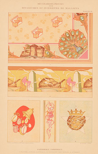
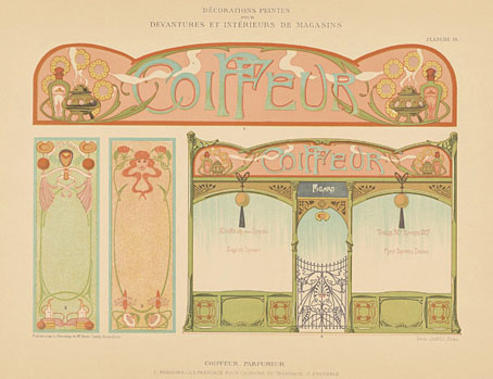
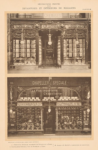
Décorations Peintes pour Devantures et Intérieurs de Magasins

guedy01.jpg

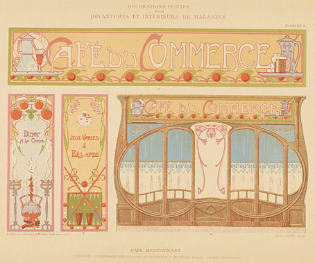
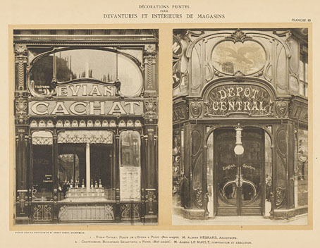
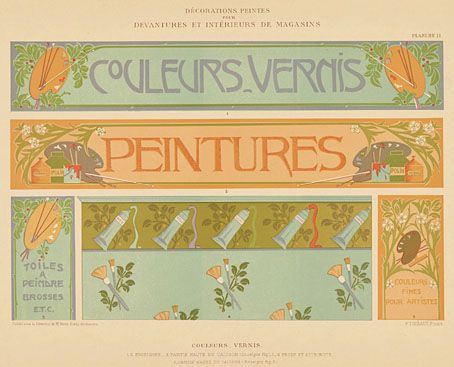
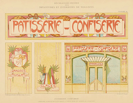
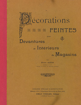
Once again, I was going to post something more substantial this week but I’m still exceptionally busy, and my plans were further thwarted by the arrival in my RSS feed of this new upload at the Internet Archive. Décorations Peintes pour Devantures et Intérieurs de Magasins is a short but beautiful collection of Art Nouveau signs and shopfronts compiled by Henry Guédy. The date—1905—places it near the end of the Art Nouveau movement but the style was evidently still popular enough at this point to warrant a guide for sign painters looking for something à la mode. The shopfront photos show the commercial application of the style in Parisian streets, although many of these façades will have since been replaced by less adventurous designs (see this post for an example). Monsieur Guédy’s book may be viewed in full and downloaded here.

guedy02.jpg

guedy03.jpg

guedy04.jpg

guedy05.jpg

guedy06.jpg

guedy07.jpg

guedy08.jpg

Previously on { feuilleton }
• Hector Guimard’s Castel Béranger
• Chemiserie Niguet
• Rue St. Augustin, then and now
• Hector Guimard elevations
• Infernal entrances
• Hector Guimard sketches
• Temples for Future Religions by François Garas
• Elizabetes Iela 10b, Riga
• Atelier Elvira
• Louis Bonnier’s exposition dreams
• The Maison Lavirotte
• The House with Chimaeras

Weekend links 406

tac.jpg

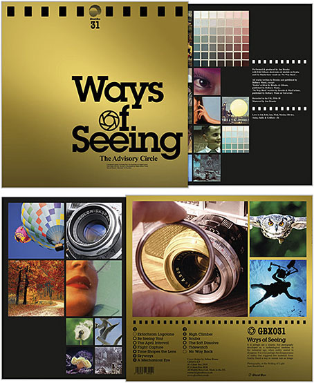
Ways Of Seeing will be the next release by The Advisory Circle on the Ghost Box label, and with metallic gold cover art by Julian House.

• “The structure came to Argento while he was tripping on some good acid, a fevered dream logic piecing everything together. […] ‘People came running out, screaming, telling people in the queue “Don’t go in! Don’t go in! It’s all witches!” It just made everyone in line want to get in even more… it was amazing.'” Ben Cobb talks to Dario Argento about the making of a horror masterpiece, Suspiria.

• Mixes of the week: The Wire Playlist by Mary Halvorson, XLR8R Podcast 535 by Sofie, and Out of the Wood Show 93 by Robin The Fog.

• Death by Balloon: Chris Mautner on the horrifying and hilarious world of comic artist Junji Ito.

Look, any honest estimation of the new translation, by Michael Hofmann, of Alfred Döblin’s Berlin Alexanderplatz from NYRB Classics is bound to begin with duteous piety, lauding it, since it is a one-and-done masterpiece that’s basically impossible to oversell, as (why not) the single biggest event in publishing in a lifetime, a crucial refurbishment of something English-language readers have been missing out on for a century, and a long-missing piece of Modernism’s ponderous jigsaw. All of which is the case of course. But when we’re talking about a dense, all-but-untranslatable Weimar-era novel, whose only point of reference for Anglophone audiences until now has been Rainer Werner Fassbinder’s meticulous fifteen-hour adaptation from 1980 (one heck of a tease) it feels important to attempt a slight rescue from its own forbidding reputation, because Alexanderplatz is less a book than a living thing, and one that joyously resists the dust heap of bourgeois literary scholarship with its every line.

JW McCormack on the new translation of Alfred Döblin’s Modernist classic

• Section 28 protesters 30 years on: “We were arrested and put in a cell up by Big Ben”.

• Angelique Kidjo talks reinventing Talking Heads’ Remain In Light on new LP.

• The hidden lives of gay men in the Middle East: photographs by Hoda Afshar.

• Al Pacino’s journey with Wilde’s Salomé.

• Tenebrous Kate

• Are You Seeing (1969) by Ora | Seeing Out The Angel (1981) by Simple Minds | Sine Seeing (2014) by The Advisory Circle

The man who wasn’t Tesla

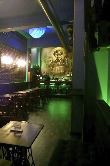
tesla1.jpg

Searching through old emails last week reminded me that a couple of years ago I’d supplied some art for use in a steampunk-themed bar in Gran Canaria. I would have mentioned this before now but, as is often the way with freelance commissions, once the negotiations were over I dispatched the art then heard nothing more about the project.

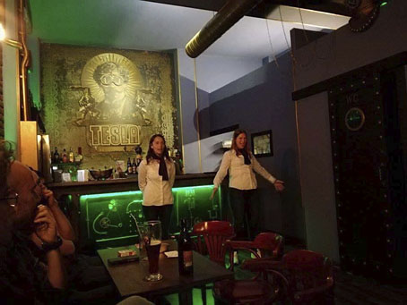
tesla2.jpg

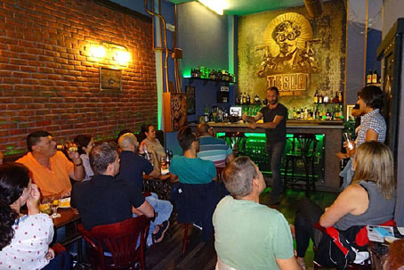
A search for the bar this week revealed a number of things: the place in question is the Tesla Steampunk Bar in Las Palmas de Gran Canaria; the artwork did indeed get used to prominent effect, with the main elements of my picture being positioned behind the bar itself; and it wasn’t immediately obvious whether the place was still open. Subsequent searching (and some Google translating of the bar’s Facebook page) further revealed that the bar has been closed but is in the process of relaunching itself.

tesla3.jpg

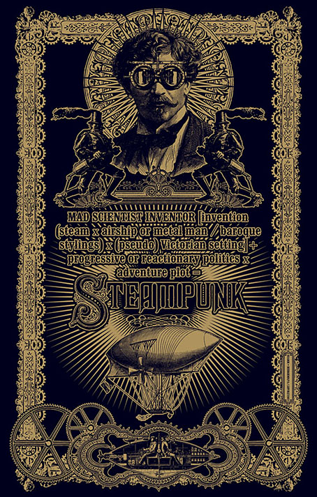
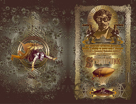
As to the artwork, this was adapted from the second version of a design I produced for Jeff VanderMeer in 2008 to illustrate a semi-serious steampunk slogan of Jeff’s devising. Ten years ago steampunk was still a very minor subgenre, and one with few visual signifiers. I quickly hacked together a piece using imagery taken from the Dover Pictorial Archive series, a collection of books which are useful but whose engraved illustrations have since been plundered endlessly for this type of work.

steampunk1.jpg

When I’m collaging things today I try and avoid using too much from the Dover books so I’ve been pained that this particular design, especially the goggle-wearing head, has proved so popular. Even when people haven’t asked to use the head itself I’ve been asked to do something similar, as was the case with the Aether Cola can I designed in 2012. The Tesla people used a stripped-down version of the colour design which I scaled to very large size. They also have a picture of the flying man on their wall but I’ve not found any good photos of him.

steampunk2.jpg

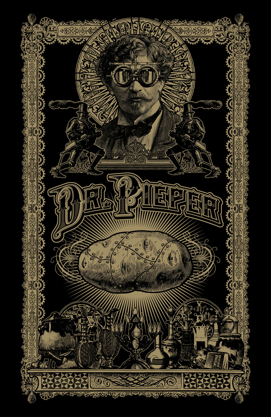
The original head, meanwhile, was used again last year in a new design for yet another business. Dr Pieper is a steampunk-themed chip shop (yes, really) in Amsterdam, a place with very nice antique decor by the looks of their Instagram page. My variant designs may be seen in the window and in their advertising graphics.

pieper.jpg

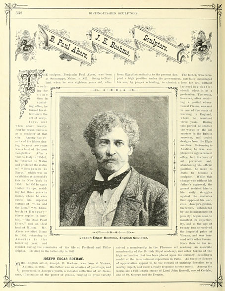
The head itself was found in Men, one of several collections of engraved illustrations edited for Dover Publications by Jim Harter. Some of Harter’s other books identify the pictures but not this one, so the identity of the portrait was unknown until, in my attempts to avoid the Dover books, I found a picture of Joseph Edgar Boehm in Hill’s Album of Biography and Art (1882). Boehm was a sculptor of a rather staid and respectable kind, being commissioned for royal portraiture among other things. I can’t imagine he’d be thrilled to find his posthumous image looking down on a drinking house and a chip shop, but sculptors often seem to be more easily forgotten than painters so he’s doing better than many of his contemporaries.

boehme.jpg

And while on the subject of steampunk, I ought to note that there’s a steampunk convention taking place in Morecambe at the beginning of June. I won’t be in attendance (they did ask) but I said I’d mention the event here.

Previously on { feuilleton }
• The George Dower Trilogy by KW Jeter
• Steampunk in the Tank
• More vapour trails
• Steampunk catalogued
• Steampunk: The Art of Victorian Futurism
• Steampunk Calendar
• Words and pictures
• Nathanial Krill at the Time Node
• Fiendish Schemes
• Ghosts in Gaslight, Monsters in Steam
• Steampunk Revolution
• The Bookman Histories
• Aether Cola
• Crafting steampunk illustrations
• SteamPunk Magazine
• Morlocks, airships and curious cabinets
• The Steampunk Bible
• Steampunk Reloaded
• Steampunk overloaded!
• More Steampunk and the Crawling Chaos
• Steampunk Redux
• Steampunk framed
• Steampunk Horror Shortcuts