Prints update

tarot.jpg

The Major Arcana (2006): a C-type print on Fuji gloss paper. A1 or A2 sizes.

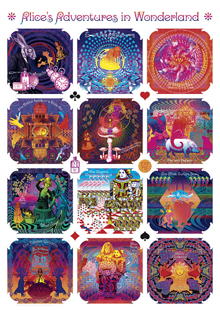
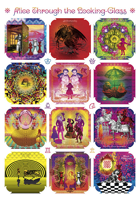
I’m continuing to add artwork to Etsy which will be available as prints in a variety of sizes and papers. I would have done more of this by now but I’m still very busy working through the commissions of the past few months so progress has been slow. The system does actually work as intended, however, with orders being routed automatically to the printer then printed and shipped within 24 hours. The initial setup may take longer than places like CafePress but the benefits are multiple, not only a faster turnaround (and cheaper worldwide postage) but now I can create prints of any size I want, and with a variety of papers and finishes. Most of the items there at the moment are the things I consider “greatest hits” so the latest additions include new poster versions of my psychedelic Alice in Wonderland artwork, together with the International Symbols Tarot poster and yet more Lovecraftiana. Requests are, of course, still welcome.

wonderland.jpg

Psychedelic Wonderland (2009): a C-type print on Fuji gloss paper. A1 or A2 sizes.

looking-glass.jpg

Psychedelic Looking-Glass (2010): a C-type print on Fuji gloss paper. A1 or A2 sizes.

cthulhu.jpg

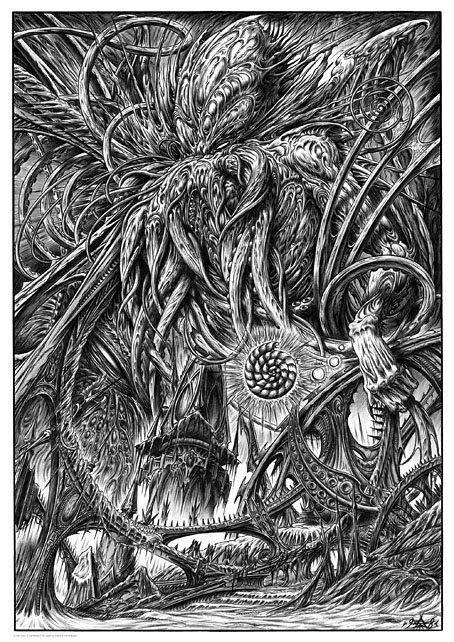
Cthulhu (1998): a giclée print on Canson Aquarelle rag paper. A3 size.

dagon.jpg

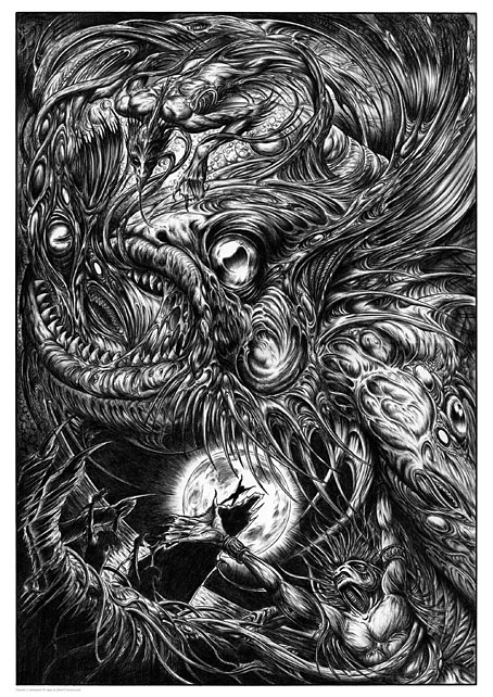
Dagon (1999): a giclée print on Canson Aquarelle rag paper. A3 size.

Previously on { feuilleton }
• Prints at Etsy

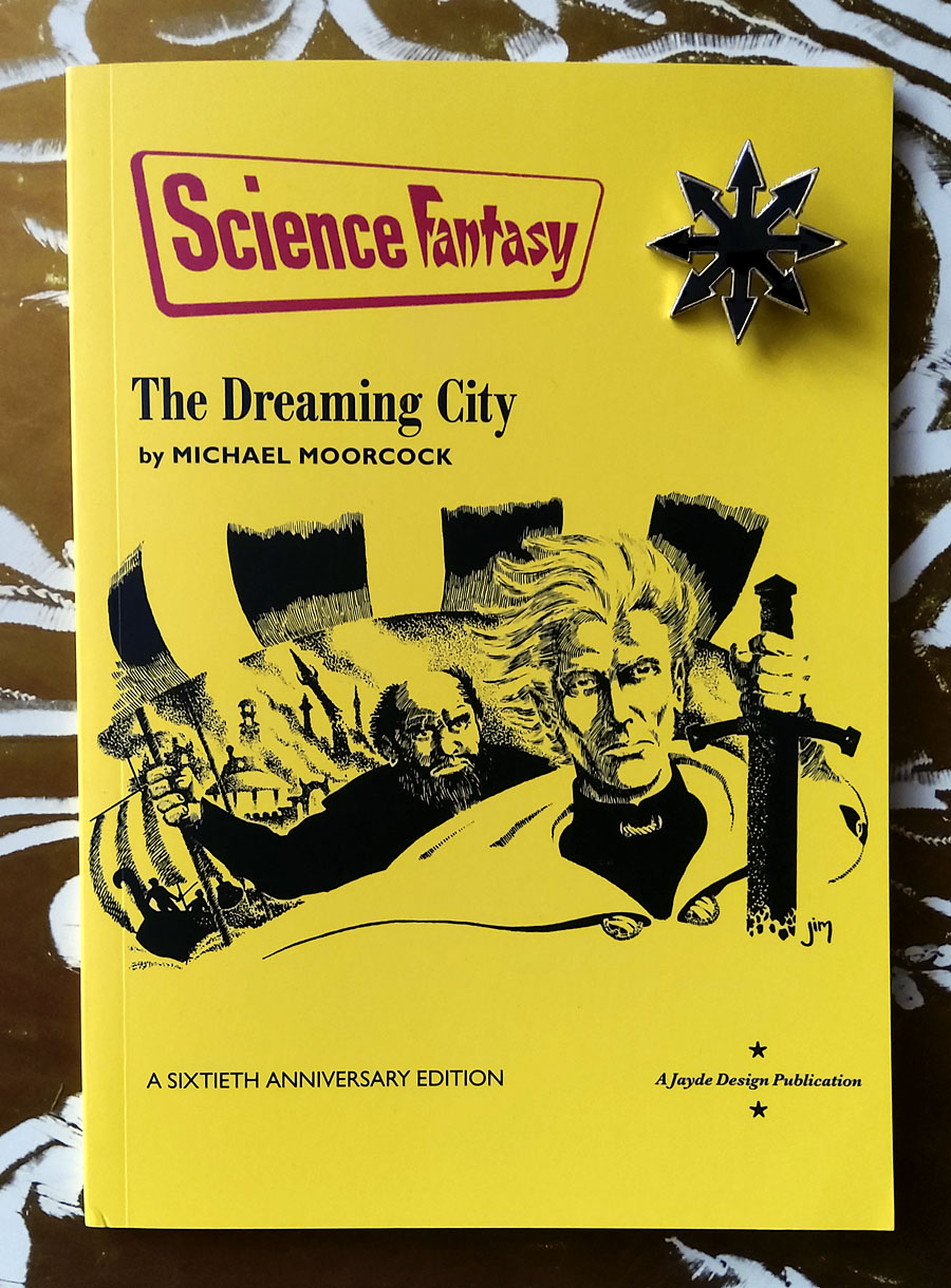
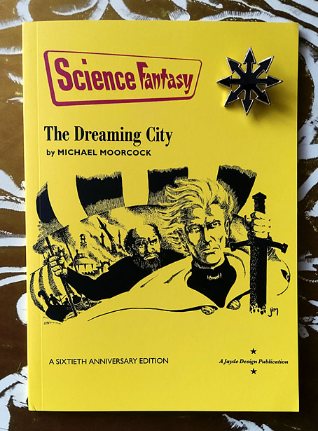
The Dreaming City by Michael Moorcock

dreaming.jpg

Cover art by James Cawthorn. Chaos pin not included.

More sword and sorcery. Last month I was asked to design a reprinting of the very first Elric story by Michael Moorcock, a standalone publication from Jayde Design intended to commemorate the 60th anniversary of Moorcock’s most popular character. The Dreaming City was published in issue 47 of Science Fantasy magazine in June 1961, following a request from the editor, John Carnell, for Moorcock to write a new series of fantasy stories. Over the next three years Science Fantasy published all ten of the novellas that established Elric’s character and his world, ending with Doomed Lord’s Passing in April 1964, the entry which saw Moorcock destroy his creation in a Boschian apocalyptic finale.

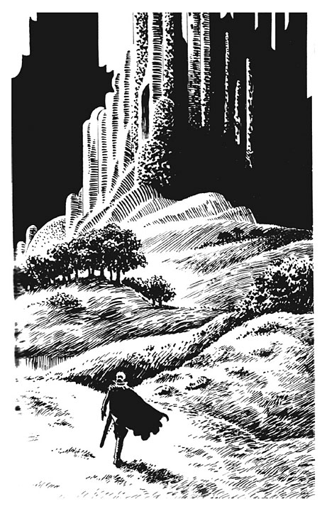
The Dreaming City: A Sixtieth Anniversary Edition is a compound facsimile of these publications. The interior design follows the template of the magazine interiors while the front cover is based on one of the later numbers which ran the fifth Elric story, The Flame Bringers, with a cover illustration by James Cawthorn. That illustration may have been attached to a different story but it actually depicts a scene from the end of The Dreaming City when Elric is leaving Imrryr in burning ruins after the place has been sacked by the raiding party he led there. It’s also a much better illustration than the one by Brian Lewis that appeared on the cover of the June 1961 issue. In addition to recreating the cover we’ve also restored the drawing, which in its printed form was slightly cropped at one side, with the complete version taken from Cawthorn’s original. Jim Cawthorn was closely involved with the creation of Elric, and even co-wrote Kings in Darkness, another of the stories in the Science Fantasy sequence. Inside the new edition there are four further illustrations which Cawthorn produced for a German collection of Elric stories published by Heyne in 1979.
dreaming2.jpg

One of James Cawthorn’s interior illustrations.

This small publication will only be of interest to collectors but it was a good thing to be involved with. In the past I’ve designed an Elric-themed album cover for Hawkwind, and last year designed The Stormbringer Sessions, a very limited publication of Jim Cawthorn’s sketched outline for his unfinished Elric graphic novel. The Dreaming City is the first Elric design of mine that features Moorcock’s own text. For an opening shot in what would become a saga spanning several decades and a variety of media The Dreaming City is a remarkably confident piece of work, even more so when you consider that the author was only 21 at the time. Elric begins and ends the story as an outsider, exiled and alone, and with his existence bound to his cursed sword, Stormbringer. Subsequent novels and stories would fill in the history before pitching Elric into the multiverse along with many of Moorcock’s other characters. But this is where it all begins, with six Sea Lords waiting in a tavern wondering whether the albino prince will turn up at all.

The Dreaming City: A Sixtieth Anniversary Edition is available here.

Previously on { feuilleton }
• The Stormbringer Sessions by James Cawthorn
• James Cawthorn: The Man and His Art
• The Chronicle of the Cursed Sleeve
• Moorcock: Faith, Hope and Anxiety
• Elric 1: Le trône de rubis
• The Sonic Assassins
• Jim Cawthorn, 1929–2008


Weekend links 596

hoshiyama.jpg

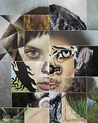
Jam III (2021) by Kotaro Hoshiyama.

• “Powell and Pressburger are peerless in realizing what Orson Welles would term plotless scenes—extra bits that ostensibly do not advance the story, but are a story unto themselves, and aggregate such that they’re vital to how we understand the characters who are living the story.” Colin Fleming says thanks for the Archers.

• A short promo for The Incal: The Movie. Hmm, okay. A film that adapted all 300 pages of the original story without changing anything or trying to explain away the weirdness would be worth seeing. But I doubt that’s what this will be. Read the book.

• “If a single word distills the New Wave aesthetic, it’s plastic…ironically flaunted artificiality became a leitmotif of the era.” Simon Reynolds reviews Reversing Into the Future: New Wave Graphics 1977–1990 by Andrew Krivine.

• Mixes of the week: a mix by Princess Diana Of Wales (not that one) for The Wire, and At The Outer Marker Part I, a Grateful Dead Twilight Zone mix by David Colohan.

• The Bloomingdale Story: read the never-before published Patricia Highsmith draft that would become Carol (aka The Price of Salt).

• At Spoon & Tamago: Multiple panels form collaged portraits painted by Kotaro Hoshiyama.

• New music: Pyroclasts F (excerpt) by Sunn O))), and Loop return with Halo.

• At Dennis Cooper’s: William E. Jones Day.

• Plastic Bamboo (1978) by Ryuichi Sakamoto | Barock-Plastik (2000) by Stereolab | Black Plastic (2002) by Ladytron

Weekend links 595

dunwich.jpg

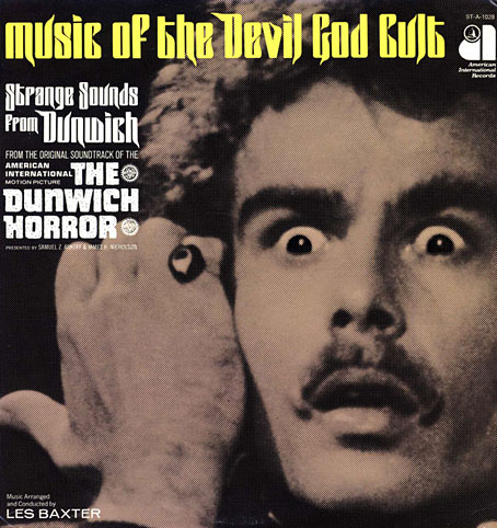
Dig the eldritch letterforms, man. Dean Stockwell as Wilbur Whateley making the High Sign on the cover of Les Baxter’s soundtrack album, 1970. That gesture, incidentally, goes back a long way.

• If you have an abundance of interstellar credits burning a hole in your stillsuit then you may be interested in bidding for the original of the book commonly known as The Dune Bible, the complete set of storyboards by Jean “Moebius” Giraud, together with designs by other artists for Alejandro Jodorowsky’s abandoned feature film. I keep hoping someone might turn this into an animated feature, something like René Laloux’s Time Masters but on a grander scale and with better animation (hello, Japan). 46 pages of scans from a limited printing of the book may be seen here.

• RIP Dean Stockwell. His 1995 interview in Psychotronic Video magazine is much better value than any potted biography.

• Bed-hopping, martinis and self-loathing: Emma Brockes on Patricia Highsmith’s unpublished diaries.

• At Spoon & Tamago: Tracing the footsteps of travelling Ukiyoe artist Kawase Hasui.

• Culture.pl examines the theoretical revolution of Nicolaus Copernicus.

• Killian Fox on the cover designs for Penguin’s Modern Classics.

• Nick Mamatas on his favourite genre-breaking mysteries.

• New music: HYbr:ID oval p-dance by Alva Noto.

• Mix of the week: Isolatedmix 114 by R.A.D.E.

• Justin Robertson’s favourite music.

• At Dennis Cooper’s: Clock.

• Jay Babcock at Substack.

• The Clock (1968) by Ruth White | Clock Factory (1993) by The Sabres Of Paradise | Internal Clock (2009) by Monolake

Byam Shaw’s illustrated Poe

shaw01.jpg

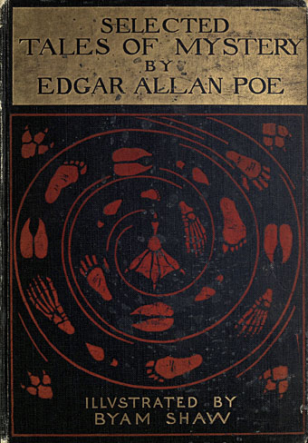
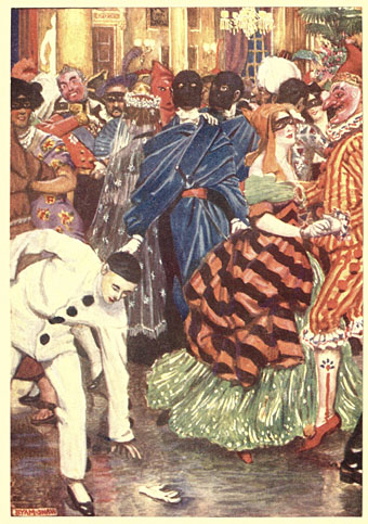
There’s always more Poe. Selected Tales of Mystery was published in 1909, and is one of several illustrated editions produced by British artist Byam Shaw (1872–1919), a painter like Frederick Simpson Coburn who was better suited to the one-off canvas than the illustrated text. There ought to be a term for this kind of illustration—”The Easel School”, perhaps—in which all the techniques and staging of the academic artist are applied to stories or novels, techniques which too often lead to a succession of well-painted figures gesticulating to each other in well-painted rooms. The canvas painter in the first years of the 20th century was also subject to the limitations of print technology which at the time could only reproduce a narrow range of colours.

shaw02.jpg

William Wilson

The question of how best to illustrate a story using realism rather than stylistisation has been a recurrent one recently with regard to a commission of my own. I’ll be discussing this later but something that occurred to me while considering the issue was that illustrators today have access to a visual vocabulary derived from cinema that didn’t really exist until the 1920s. An artist like Byam Shaw would never think to depict a scene from a very high or very low angle, even though high- and low-angle views of dramatic scenes had been familiar to theatre audiences for many centuries. (He does use a high angle for A Descent into the Maelström but so do most artists who illustrate that particular story.) Virgil Finlay’s 1952 illustration for The Tell-Tale Heart is a cinematic view with its combination of flattened perspective and deep focus. In the same issue of Fantastic there’s an illustration by Gaylord Welker that could be a still from any film noir of the 1940s.

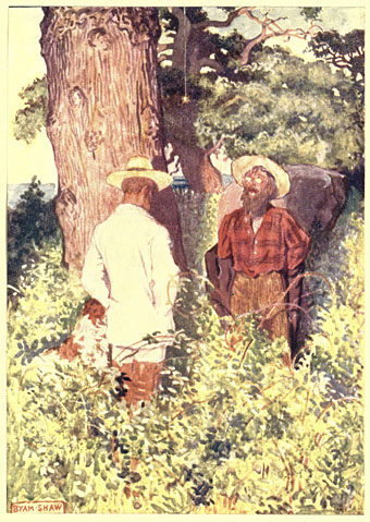
shaw03.jpg

The Gold Bug

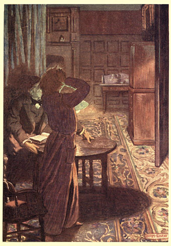
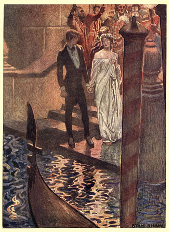
Reservations aside, Shaw’s Poe is worth a look if only to see which moments he chooses to highlight from each of the stories…or those he doesn’t. One of the problems with illustrating a popular writer like Edgar Allan Poe is that you have the choice of attempting to compete with other artists by illustrating the same scene as everybody else or you avoid the obvious moments in favour of something new. Shaw had an advantage in working without the burden of precedent but his climax for The Masque of the Red Death is overwhelmed today by our acquaintance with Harry Clarke’s definitive illustration. The most original thing about the Shaw edition is its cover, with a trail of human and animal footprints spiralling into a maelström towards…what? A webbed foot? This curious design suggests a set of illustrations that the contents don’t deliver.

shaw04.jpg

The Fall of the House of Usher

shaw05.jpg

The Assignation

Continue reading “Byam Shaw’s illustrated Poe”