Ten titles and a cover

cdlcover.jpg

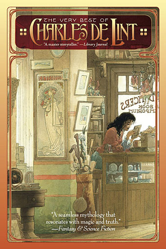
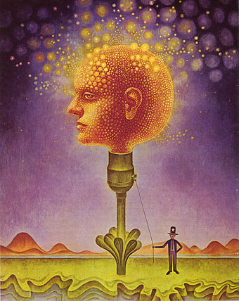
The Very Best of Charles de Lint. Art by Charles Vess.

Over the weekend I found the time to finally update the book design section of the site, adding new pages for most of the titles I’ve been working on recently. There’s still a couple of things missing but I’ll add those in due course. Many of these design jobs have been for the interiors only so what follows is a comparison of title spreads from books I’ve worked on that have been published this year. Lest it seem that I have an army of clones at my service it should be emphasised that I was working on several of these last year (and Engelbrecht was completed in 2008) but the nature of release schedules means they all carry 2010 publication dates.

sr.jpg

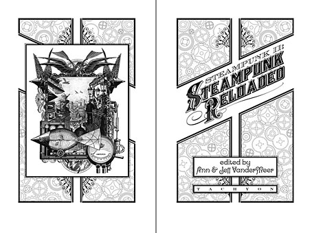
Steampunk II: Steampunk Reloaded, edited by Ann & Jeff VanderMeer.

I invariably make a feature of title pages, usually creating them as a spread in order to heighten their impact. The title page is a kind of gateway to the rest of the book which gives you an opportunity to establish a mood for what follows. It’s also the area where you can be most lavish with your graphic treatment and, where necessary, add illustrative material without worrying too much about intruding on the content. With a number of these designs I was following typographic choices from pre-designed covers so the challenge was to find something that would match the cover and connect to the rest of the interior. The Charles de Lint book was a variation on this process in that the author had chosen a Charles Vess drawing for the cover art. I designed a cover to accommodate the drawing then carried the design inside. The colours were chosen to match Vess’s artwork while the general Art Nouveau style came from an Alphonse Mucha poster he’d placed on the wall. With a different cover picture the entire book would have had a very different design.

pkd.jpg

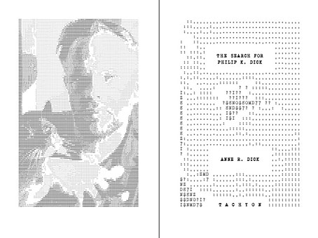
The Search for Philip K Dick by Anne R Dick.

Continue reading “Ten titles and a cover”

Weekend links 38

lovecraftbaw.jpg

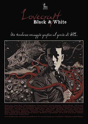
Arriving in the post this week was Lovecraft Black & White, an Italian book whose contents are spelled out in the title, black-and-white illustrations based on the work of the Providence master. Among the featured works is my 1999 rendering of Azathoth. There’s more about the book here and here.

Also on the work front, one of the books I designed interiors for a couple of months back was The Search for Philip K. Dick, a sombre biography and memoir by Anne R. Dick, the author’s third wife. Ms Dick discussed the book with the NYT a few days ago. The design was mostly straightforward layout but I did make a quick ASCII portrait of PKD from one of Anne Dick’s photos.

• Farewell, the documentary film about Lady Grace Drummond-Hay’s flight around the world in the Graf Zeppelin, can be viewed here.

• “I personally think that the pages look better on the iPad than they do in real life.” Artist Tom Phillips again on the Humument iPad app.

• The Birds Are Flying Elsewhere: singer/songwriter Linda Perhacs. Related: Parallelograms – A Short Film About Linda Perhacs.

• St Eia, guitar improvisations by Zali Krishna, “Keywords: jazzgazing; entropy circus; st ives; cornwall; psychogeography”.

• Moon Wiring Club and DD Denham: music for children, by children. Related: Moon Wiring Club’s Jayston Mix.

kirkland.jpg

The 1970s was another country, they did things differently there. One of a number of illustrations for science textbooks by Phil Kirkland at A Journey Round My Skull.

• “Fellatio has become a recurrent theme in your work hasn’t it, I say.” Alan Bennett sheds some inhibitions.

• Talking To The Sci-Fi Lord: Regenerations & Ruminations With Michael Moorcock.

• Time and the Gods (1906) by Lord Dunsany, illustrated by Sidney Sime.

• City of Silence, a calendar for 2011 by Thom Ayres.

• Scientists glimpse universe before the Big Bang.

• Photography by Josef Sudek (1896–1976).

• Aurora photo gallery, November 2010.

• The Last Tuesday Society.

• Parallelograms (1970) by Linda Perhacs | Six AM (1979) by Thomas Leer & Robert Rental | Rockin’ Back Inside My Heart (1989) by Julee Cruise.

Peter Christopherson, 1955–2010

coil.jpg

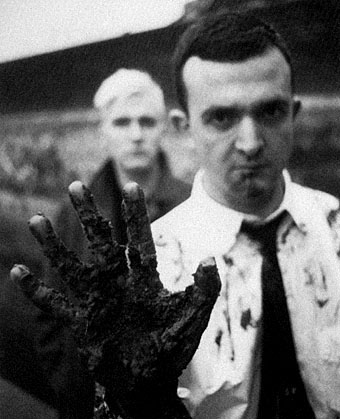
Coil, circa 1984. John Balance (left) & Peter Christopherson (right). Photo by Lawrence Watson.

The depths of the night sky
Reflects in his eye
He says “Everything changes
And everyone dies.”

Coil, Blood From The Air (1986)

Yes, everyone dies but you don’t always expect it this soon, six years after the sudden loss of John Balance. Coil and Throbbing Gristle were refreshingly direct about the transience of existence so we should no doubt regard these moments with the necessary degree of philosophy. And yet… I’ve said for years that we lack an adequate complement of innovators, genuine creators, rare minds, and what Robert Anton Wilson used to call Intelligence Agents; such people always seem too few, especially in a world where hatred and ignorance are encouraged by those eager to keep us unfulfilled, the easier to manipulate and control. There’s a natural desire each time you discover a like-minded soul to want them to stay around for as long as possible, to help shine a thousand lights in a darkened room.

I never met Peter Christopherson but I saw him on stage with Psychic TV in Manchester in 1983, and as part of Coil for their thrilling performance at the Royal Festival Hall, London, in 2000. We corresponded sporadically via letter and email throughout the 1990s, and spoke on the phone a couple of times. Coil wanted me to create a cover for one of their releases and we talked about this on and off for several years but nothing ever came of the plans, something I regret to this day. Peter bought a drawing off me ten years ago (this one), and he remains one of the few people I’ve sold any artwork to. I broke my usual rule on that occasion out of respect for his work. That work is mostly acknowledged as being musical, and it’s the music—as a member of Throbbing Gristle, Psychic TV, Coil, and TG again—that other obituaries will rightly celebrate. But he was also a talented photographer and graphic designer whose earliest public works were for the design group Hipgnosis in the 1970s. He joined Storm Thorgerson and Aubrey Powell as an assistant in the mid-70s and became a full partner in 1980. As a freelance photographer he shot the first promo pictures of the Sex Pistols in 1976, photos which (if I remember correctly) Malcolm McLaren decided not to use because they looked too heavy. Or maybe too queer…see this appraisal by John Gill from his book Queer Noises. It was Peter Christopherson’s design authority that gave the Throbbing Gristle releases a quality many other independent productions lacked in the post-punk era. He brought the same visual finesse to Psychic TV in 1982 and it was painfully obvious when that finesse was withdrawn after he and John Balance left PTV in 1983 to form Coil. I owe Coil more than I can easily articulate. I’ve spent hours and hours listening to their music whilst working; the full range of their interests probably matched mine more completely than any other group I’ve encountered. It was a real shock when everything crashed to an end in 2004. It’s good to know that the Coil site at Brainwashed has a wealth of interviews and articles going back through the years. And there’s still the music, of course.

Fellow TG members Cosey Fanni Tutti and Chris Carter issued some words of remembrance a few hours ago which they end by saying: “Peter was a kind and beautiful soul. No words can express how much he will be missed.” A few examples of his photography and design work follow.

Update: Full Guardian obituary by Alexis Petridis | Genesis P-Orridge Pays Tribute To Sleazy.

Continue reading “Peter Christopherson, 1955–2010”

Weekend links 37

peeping.jpg

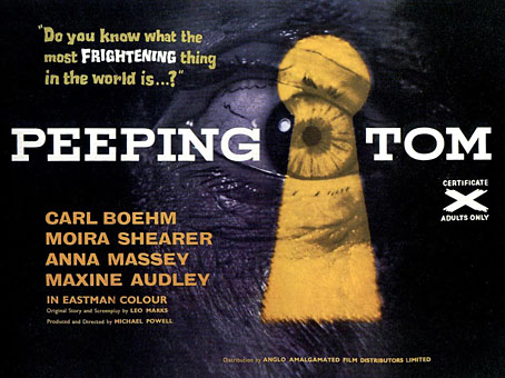
Michael Powell’s Peeping Tom is fifty-years old this year, an occasion celebrated with a limited UK cinema run and a reissue on Blu-ray and regular DVD. This was the film which famously ended Powell’s career as a director in Britain for reasons which have never been quite clear. Was the film’s critical vilification the culmination of an impatience with the director’s alleged excesses over the years? Was it an unarticulated discomfort at the way Powell and screenwriter Leo Marks implicated themselves and the audience in the sordid murders they (we) were watching in the dark? Or was the film withdrawn simply because producer Nat Cohen wanted a knighthood and was worried over his reputation as a peddler of “filth”? The bitterest blow for Powell would have been seeing his long-time rival Alfred Hitchcock have another success a few months later with Psycho, a film which allows its audience similar female-slaughtering thrills without questioning the role of the viewer in sustaining the drama. Hitchcock spent much of his career “punishing” women in a manner that verges on outright misogyny yet was indulged all along by audience and critics; Powell made a single film about a murderer and was himself punished for it. His other films often featured strong female characters, and I’ve long regarded him as the superior artist.

• The Guardian this week celebrated Powell’s film with a number of articles: Peeping Tom may have been nasty but it didn’t deserve critics’ cold shoulder, Peeping Tom, pornography and the press, The Peeping Tom timebomb.

• A Wizard of Earthsea: an unfilmed screenplay from 1983 by Michael Powell and Ursula K Le Guin based on Le Guin’s first two Earthsea novels.
1860.jpg

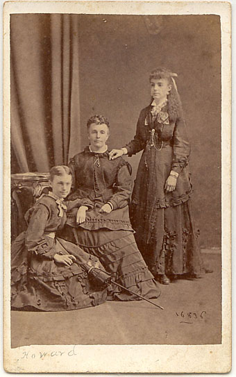
A boy in a dress with mother and sister, 1860. Yesterday was the 12th Annual Transgender Day of Remembrance.

• Quaintance by Reed Massengill and Dian Hanson, in which the pioneer of 20th century beefcake art gets the heavyweight Taschen treatment. Expensive but they’re making these volumes for obsessives. Related: Hide/Seek: Difference and Desire in American Portraiture, an exhibition of gay and lesbian art at the Smithsonian’s National Portrait Gallery. The gallery has a preview of the exhibition here. On a more humble level, BUTT magazine has a recreation of Quentin Crisp’s inevitably messy New York City apartment.

• From gay art to gay song and dance: Queer To The Core!: Queer Rock From The Vaults! Super-rare novelty singles with titles like Queer Police by Billy Devroe and The Devilaires. Meanwhile Cleveland Street: The Musical is a forthcoming stage celebration of Victorian London’s notorious male brothel. By Glenn Chandler, creator of the popular TV detective series Taggart (!) whose earlier musicals have titles like Boys of the Empire and Scouts in Bondage.

pejic.jpg

Strikingly androgynous male model Andrej Pejic photographed by Armin Morbach. There’s a lot more Andrej Pejic at Homotography.

• Thrilling Wonder Stories II, “eight hours of architectural futurism featuring an unbelievable line-up of novelists, game designers, animators, scientists, comic book artists, architects, and more”. At the Architectural Association, London, November 26.

• “The iPad is one of the oldest things in the world…a pad or a slate.” Artist Tom Phillips reworks A Humument for a new medium. Related: Creating new books from old, in which Jonathan Safran Foer follows Phillips’ lead by cutting words from Bruno Schulz’s Street of Crocodiles to create a new work, Tree of Codes.

• “Technology is turning us into switchboard operators in the communication networks of our own lives.” I know the feeling. Rick Poynor on the seductive tyranny of design technology.

• Comic artist Moebius gets the Tumblr treatment. And speaking of Tumblr, my thanks to everyone who’s been reblogging the Cephalopod Bride.

• Skull Comics, 1970–72, at Golden Age Comic Book Stories. Underground artists excavate Lovecraftian horrors, among other things.

• The lost town of Dunwich.

• The Bells of Dunwich (1975) by Stone Angel | Dunwich Beach, Autumn, 1960 (1982) by Brian Eno.

Compass Road by Iain Sinclair

sinclair.jpg

I was hoping to get my delayed 2011 calendar launched today but other work needed completing so here’s an interim post.

Think of your journey through mortality as a sequence of valid movies and the pain is ameliorated. Forget the tedious 60-minute division of the lecture hall or dead television (quartered by adverts): arrange just enough markers for the 90-minute slots of Golden Age cinema. And then it’s only a question of nominating the eight guides, culture-figures who will dominate your thoughts (and reveries) for as long as you stay upright. The road is endless, you aren’t. Iain Sinclair

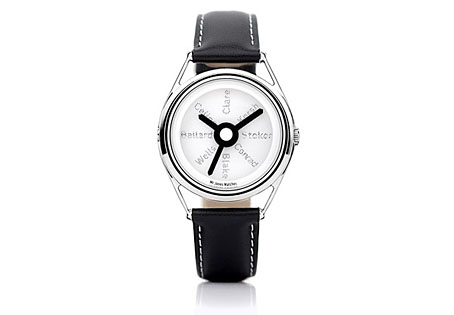
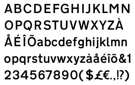
There may be a recession on but people still keep putting out the luxury goods; maybe the bankers are buying all this stuff with their unwarranted bonuses. Compass Road is a limited edition wristwatch from Mr Jones Watches, London, and sports a design commissioned from writer Iain Sinclair, a somewhat surprising choice given that these things are more usually farmed out to those individuals we have to call celebrities. Sinclair is too intelligent and interesting to be a mere celebrity and consequently designs a watch I’d probably buy if I had an excessive income. The watch middle and the hands are based on the British road signs designed by Margaret Calvert and Jock Kinneir while the typeface used for the compass points is Calvert and Kinneir’s Transport (below) which is also used across Britain’s road signs. For the destinations Sinclair has chosen eight writers with London associations: John Clare, Gerald Kersh, Bram Stoker, Joseph Conrad, William Blake, HG Wells, JG Ballard and Louis-Ferdinand Céline. The last seems an odd choice but he did work in London for a while.

transport.jpg

Sinclair’s design is a flexible enough to be applied to other literary cities which raises the question of which names you’d choose for Paris, say, or New York. And which signage systems? Subways or the local roads? Compass Road meanwhile can be yours for £145.