Tom Phillips album covers

phillips00.jpg

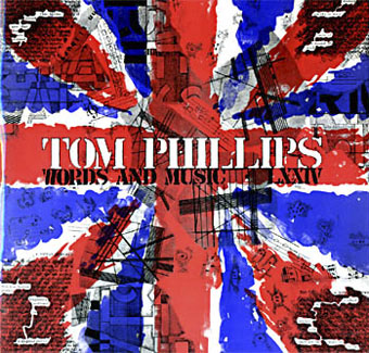
Words and Music (1975) by Tom Phillips.

Two related posts is coincidence, three is a series. Earlier posts from the past couple of weeks looked at album covers created by designers better known for their work in other areas. Tom Phillips is a British artist, writer and composer who I continue to insist is one of our greatest living artists, a figure of singular intelligence, invention and versatility whose lack of grandstanding has never raised his profile to, say, the Hockney level. Phillips’ involvement with the music world, both as composer/librettist, and his oft-cited position as Brian Eno’s art teacher in the 1960s, have led to the creation of a handful of record and CD covers from the mid-70s on. Before we get onto those I’ll note that Phillips has a piece in the latest edition of Eye magazine where he reviews a book of postcards from the Wiener Werkstätte. I happen to have a review in the same issue looking at a republished Kenneth Anger study.

Words and Music above has a January 1975 release date although the cover clearly states “LXXIV” in Phillips’ customary stencil lettering. The pressing was limited to 500 copies and doesn’t seem to have been reissued since which means that copies for sale command excessive prices. Side A comprises recordings of Phillips’ compositions while on the flip the artist/author reads extracts from A Humument, the treated book/experimental novel which is not only his most celebrated work but a project whose influence permeates all of the Phillips oeuvre, including the sleeve art.

phillips01.jpg

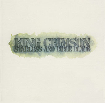
Starless and Bible Black (1974) by King Crimson.

phillips02.jpg

A year before Words and Music, Phillips created the cover art for this King Crimson album, and he’s also credited with the design. The fractured stencil lettering on the gatefold interior resembles similar effects in some of Phillips’ paintings while on the back cover there’s a tiny extract from A Humument bearing the enigmatic phrase “this night wounds time”. I’ve wondered for years how this cover came about: Robert Fripp often selects the art for King Crimson’s covers so was Phillips his choice as artist/designer? Or was it a result of the Fripp and Eno connection? If anyone knows the answer, please leave a comment.

Continue reading “Tom Phillips album covers”

Weekend links 88

zarnowerowna.jpg

Typographic Composition (1924) by Teresa Zarnowerówna from a post about Polish graphic design at 50 Watts.

• “Direct action is a matter of acting as if you were already free… […] …the link between military and money systems remains the dirty secret of capitalism.” A lengthy and essential interview with “anarchist anthropologist” David Graeber, author of Debt: The First 5000 Years.

• “…it was after being told by an art director that he preferred her images of women to men that Toyin [Ibidapo] began to shoot boys in an attempt to prove him wrong. Something that Cult of Boys does perfectly.”

The pornographic imagination is deeply intertwined with the pain and horror of life. Some of that comes from our basic biological reality, which is unpleasant enough, and much of it comes from our social structures. Biological life has been completely degraded and continues to become more and more degraded in novel and more horrific ways, so it is inevitable that our horrible social structures – our schools, prisons, families, slaughterhouses and farms – become sites for the pornographic imagination.

Stephen Beachy discusses his novel, boneyard.

• “To my right is a wall bracket that, on closer inspection, turns out to be a human face made of porcelain fruits. The anteater rests on top of the television.” Jonathan Jones meets Jan Švankmajer.

Anselm Kiefer‘s new exhibtion at White Cube, London, takes its name and some inspiration from Fulcanelli’s alchemical exegesis, Le Mystère des Cathédrales (1926).

• Today (Sunday, 11th December) on Resonance FM at 8.00pm GMT, Alex Fitch talks to Alan Moore about HP Lovecraft and related matters.

Nick Hydra is putting all 112 issues of occult encyclopaedia Man, Myth & Magic online.

• Ira Cohen ‘s 1968 film The Invasion of Thunderbolt Pagoda is available again on DVD.

• Colleen Corradi Brannigan’s paintings of Italo Calvino’s Invisible Cities.

• “Margate’s a bloody toilet!” Can you handle The Reprisalizer?

• Bibliothèque Gay on Cocteau’s Le livre blanc (in French).

• Josie & the Pussycats in A Clockwork Orange.

Lovely Book Covers

Words With The Shaman (1985) by David Sylvian w/ Jon Hassell, Steve Jansen & Holger Czukay – I: Ancient Evening | II: Incantation | III: Awakening (Songs From The Treetops).

Thought-Forms and Auras

leadbeater01.jpg

Like yesterday’s squid, some of these Theosophist illustrations from Thought-Forms (1905) by Charles Webster Leadbeater & Annie Besant, and Man Visible and Invisible: Examples of different types of men as seen by means of trained clairvoyance (1902) by Leadbeater alone, have been reproduced for years in books yet you seldom see the complete set. The University of Heidelberg has scans of both volumes so I’ll direct the curious there for detailed explanations of the illustrations which were intended to graphically portray mental states, and the auras which Theosophists believed surrounded the human body. The diagrams above are harmonographs created by pendulum motion, and evidently seemed sufficiently strange for Leadbeater and Besant to interpret them as representations of emotional experience. They’ve always made me think of the similar pendulum drawings used by Saul Bass in his Vertigo title sequence, although I’ve never seen any indication that Bass had these particular diagrams in mind. In the pictures below there’s also a suitably spiky depiction of an angry person’s aura, and representations of music emerging from a cathedral in the form of polychrome mushroom clouds.

leadbeater02.jpg

leadbeater03.jpg

Continue reading “Thought-Forms and Auras”

Weekend links 87

scott.jpg

Untitled art by Katie Scott.

“…the very fact that people cannot get published by the big-name publishers in the way that they used to has meant that you’ve got some really interesting and often really beautiful little small publishing houses that are springing up and coming into existence. And the stuff that they’re providing is actually a lot better. I’m thinking of people like Tartarus Press, Strange Attractor and various other commendable small publishers that do a beautiful job and that are producing books that are good to have on your bookshelf.”

Alan Moore discussing books old and new in a lengthy interview at Honest Publishing. In part two he takes to task hardboiled moron Frank Miller and offers his thoughts on the Occupy movement. Elsewhere the Guardian finally paid some attention to the importance of design in the book world. Some of us who do this for a living have been saying for years that if publishers want to see physical books thriving they need to maintain (or improve) the quality of their design and materials. Related: The Truth About Amazon Publishing, Laura Hazard Owen at paidContent examines some the figures behind Amazon’s PR.

• “Tenniel argued for several changes to the characters as conceived by Carroll. The croquet mallets are ostriches in the original drawings, and the hoops are footmen bent over with the tails of their coats hanging down over their bottoms like an animal’s. Tenniel left them out. He told the author that a girl might manage a flamingo, but not an ostrich.” Marina Warner again on John Tenniel, Lewis Carroll and the Alice books.

schoeler.jpg

Untitled painting by Christian Schoeler who was interviewed for a second time at East Village Boys.

Shamanism and the City: Psychedelic Spiritual Tourism Comes Home and Scientists finding new uses for hallucinogens and street drugs. Related: LSD – A Documentary Report (1966), “a totally new kind of record album”.

• More books: Interview with a Book Collector. Mark Valentine, author, biographer and editor was also the co-publisher in 1988 of my adaptation of HP Lovecraft’s The Haunter of the Dark.

• The Priapus Chandelier “features six hand-sculpted phalluses cast in translucent resin, which radiate an atmospheric light.”

Stewart Lee on Top Gear, in which the comedian and Dodgem Logic contributor eviscerates the BBC’s pet trolls.

• The Beinecke Rare Book and Manuscript Library put the Voynich Manuscript online.

• The 432-page SteamPunk Magazine collection with my cover art is now on sale.

Hubble, Bubble, Toil & Trouble: The Haxan Cloak Interviewed

• The Sunn O))) chapter of The Electric Drone by Gilles Paté.

Colonel Blimp: The masterpiece Churchill hated

Submergence (2006) by Greg Haines | Reyja (2011) by Ben Frost & Daníel Bjarnason | The Fall (2011) by The Haxan Cloak.

Cover versions

whippedcream1.jpg

Design by Peter Whorf Graphics.

Another album cover post, and one I’ve wanted to do for a while. Parody covers are a curious sub-genre of sleeve design, and this post was prompted in part by an email from Easy On The Eye books alerting me to the publication this month of Covered, a collection of cover parodies compiled by Jan Bellekens. Hundreds of different examples are featured, many of them by artists few people will have heard of, the parody cover having always been a good way for unknowns to grab some attention on the back (or should that be the front?) of the very famous.

Some covers inspire more parodies than others. One of my favourites is the perennial inspiration provided by Whipped Cream & Other Delights, Herb Alpert’s hugely popular 1965 album whose cover by Peter Whorf Graphics may now be more well-known than the music it packaged. Dolores Erickson was the model, the “cream” was foam, and the modish typography shows (as did the hand-drawn title on Rubber Soul) that the trend for fluid lettering styles slightly preceded the psychedelic explosion. My mother had a copy of this album so the sleeve was the first album cover to make a memorable impression; my sister and I always thought it slightly “rude” since Ms. Erickson is obviously naked under her cream.

whippedcream3.jpg

Sour Cream & Other Delights (1966) by The Frivolous Five.

The success of the design can be gauged by how swiftly the parodies followed, and how they show no sign of abating, the most recent one below being from 2008. The selections here are among the better examples, there are many more to be found. Needless to say, Jan Bellekens’ book makes note of this lineage. Covered can be ordered direct from Easy On The Eye.

whippedcream4.jpg

Spaghetti Sauce & Other Delights (1967) by Pat Cooper.

Continue reading “Cover versions”