Flamboyant excess: the art of Steven Arnold

arnold1.jpg

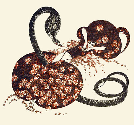
Invitation to Yin and Yang by Steven Arnold.

“Less is NOT more, MORE is more, less is less.”

Steven Arnold

Thanks to Monsieur Thombeau for pointing the way to The Steven Arnold Archive, a respository of biographical and career detail about Steven Arnold (1943–1994):

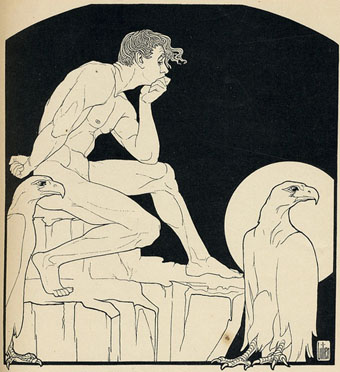
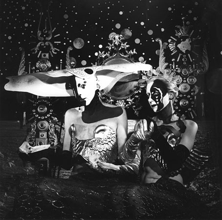
…a California-based multi-media artist, spiritualist, gender bender, and protégée of Salvador Dalí. His work consisted of drawings, paintings, rock and film posters, makeup design, costume design, set design, photography, and film.

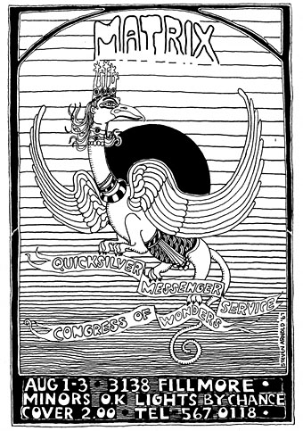
Arnold’s work with outrageous performance troupe The Cockettes seems to receive more attention today than his other creations so it’s good to see the balance being redressed. It was a surprise, for instance, to find he’d drawn a poster in 1967 for The Matrix club, San Francisco. Similar works are mentioned but the site doesn’t have any examples and I’ve yet to see any elsewhere.

arnold2.jpg

arnold3.jpg

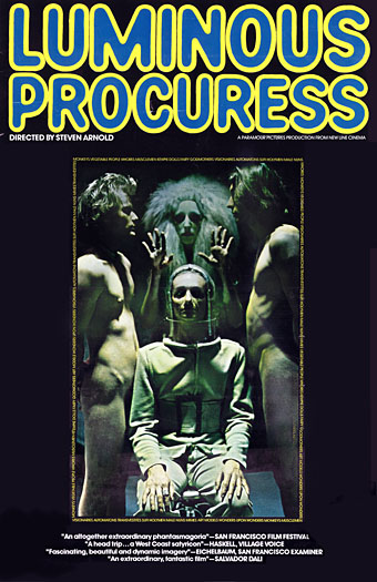
And I haven’t seen the Cockettes film, Luminous Procuress (1971) either. Salvador Dalí unsurprisingly responded with enthusiasm to its atmosphere of androgynous weirdness:

Luminous Procuress is an altogether extraordinary, individualistic phantasmagoria. It was filmed entirely in San Francisco over a two-year period, and describes the adventures of two wandering youths in San Francisco who visit the home of a mysterious woman, the Procuress. She is an elegant emblem of sorcery, her vivid features glowing under bizarre, striking maquillage, and one is not certain who she is or where she intends to lead the protagonists. Although the language she speaks is vaguely Russian, it appears that the Procuress has psychic powers. She discerns a sympathetic response to her on the part of the youths, and by magical means, conducts them through fantastic rooms, on a psychic journey… (more)

Definitely one for the future viewing list. Meanwhile, one of Arnold’s tableaux photos, The Advantages of Modern Marriage, is currently on display in Cruising the Archive: Queer Art and Culture in Los Angeles, 1945–1980 at the ONE National Gay & Lesbian Archives, Los Angeles. The exhibition runs to April 1st, 2012.

Previously on { feuilleton }
James Bidgood

Milton Glaser album covers

glaser01.jpg

Music For Space Squirrels (1958) by Al Caiola’s Magic Guitars.

Having sought out Saul Bass’s album cover designs recently, curiosity impelled me to see what fellow New York designer Milton Glaser had been doing during the same period. I already knew some of Glaser’s covers for the Tomato label in the 1970s but Discogs has many more, including a handful in the Pop/psychedelic style he used most famously for his Bob Dylan poster. Not all of these are to my taste—illustration-wise I prefer Bob Pepper’s art—but Glaser was nothing if not versatile. I’ve no idea what Music for Space Squirrels sounds like although it’s probably less interesting than the promise of those floating rodents.

glaser02.jpg

Medium (1968) by The Mandrake Memorial.

glaser03.jpg

Grieg’s Greatest Hits (1969).

Continue reading “Milton Glaser album covers”

Weekend links 86

alastair.jpg

Salammbô by Alastair (Hans Henning Voigt) from Harry Crosby‘s Red Skeletons (1927). Dover published a new collection of Alastair’s drawings in September.

A Taste of Honey showed working-class women from a working-class woman’s point of view, had a gay man as a central and sympathetic figure, and a black character who was neither idealised nor a racial stereotype.” RIP Shelagh Delaney. Related: Shelagh Delaney’s Salford (1960), directed by Ken Russell, and all 47 minutes (!) of The White Bus (1967), Lindsay Anderson’s strange, pre-If…. short, written by Shelagh Delaney, filmed in and around Manchester.

Since birth I’ve craved all things psychedelic, the energy and beauty of it. The pleasure… […] But in the US the exploration of consciousness and its powers—or really any curiosity about anything at all—is actively discouraged, because the system is so corrupt that it depends on people being virtually unconscious all the time. Burroughs cracked that code long ago. Spirituality here equals money; no one seems to be able to think, never mind explore their own consciousness.

Laurie Weeks: Making Magic Out of the Real

• Ian Albinson shows us The Title Design of Saul Bass while Ace Jet 170 has a copy of the new Bass monograph.

Kris Kool (1970) at 50 Watts, Philip Caza’s lurid, erotic, psychedelic comic strip.

lilien.jpg

Götz Krafft by EM Lilien from a collection at Flickr.

Serious Listeners: The Strange and Frightening World of Coil.

The Octopus Chronicles, a new blog at Scientific American.

• We now live in a world where there are Ghost Box badges.

Kilian Eng interviewed at Sci-Fi-O-Rama.

Dalí Planet

Bedabbled!

A Taste of Honey (1962) by Acker Bilk | A Taste of Honey (1965) by Herb Alpert’s Tijuana Brass | A Taste of Honey (Moog version) (1969) by Martin Denny.

Ver Sacrum, 1903

vs-1903-01.jpg

Concluding the series of posts about Ver Sacrum, the art journal of the Viennese Secession. The volume of issues for 1903 continues the bi-monthly format from the previous year only this time the calendar supplement is at the end of the volume. This was the last year for the journal, unfortunately, not least because the Secession had run its course, having perhaps proved its point in providing an alternative to the prevailing trends in Austrian art and design. Koloman Moser, Alfred Roller and Josef Hoffmann left to found the Wiener Werkstätte while Gustav Klimt, who again has an issue devoted to his drawings, went on to paint some of his most famous pictures, including The Kiss.

Ver Sacrum certainly ended on a high note. Most of the issues for 1903 contain woodcuts by a variety of artists with some superb examples of the form. For once there’s work by women—Irma von Dutczynska, Nora Exner and Hilde Exner—there’s more strange art from Marcus Behmer, and also a translated extract from the memorial book written by Arthur Symons following Aubrey Beardsley’s death in 1898. As before, anyone wishing to see more can browse all 498 pages or download the entire volume here.

vs-1903-02.jpg

vs-1903-03.jpg

Continue reading “Ver Sacrum, 1903”

Koloman Moser posters

moser2

Secession poster (1899).

Since I’ve been delving over the past year into the fin de siècle culture of Germany and Austria, the name of Koloman Moser (1868–1918) has kept recurring. This is partly because of Moser’s associations with the Viennese Secession and the Wiener Werkstätte, of course, but I’ve made a point of drawing attention to his work since it’s struck me as some of the most remarkable being produced anywhere in Europe during the period 1895–1910. Moser’s poster designs are a good example of his authority as an artist and graphic designer who quickly evolved from Mucha-derived Art Nouveau flourishes to a degree of stylisation that was incredibly advanced for the early 1900s. The graphics of Moser and fellow artist/design Alfred Roller point the way to Art Deco twenty years later, and also to the psychedelic era whose poster artists eagerly borrowed motifs, figures and lettering designs from Moser, Roller, Mucha and others.

moser3

Frommes Kalender poster (1899).

Wikimedia Commons has a generous sampling of Moser’s work that shows his incredible versatility in a variety of media. The Secession designers, and Moser in particular, and memorialised in Paul Shaw’s typeface design, Kolo.

moser8

Illustrierte Zeitung poster (1900).

Continue reading “Koloman Moser posters”