The Occult Explosion

occult01.jpg

So here’s a strange thing: having spent another working week sifting through scanned books at the Internet Archive what do I find but scans of album booklet art by Wilfried Sätty only a couple of days after writing about his album covers. The album in question may be familiar to some readers but it was a new one to me. The Occult Explosion (1973) was a collection of recorded interviews with people such as Alan Watts and Anton LaVey discussing subjects pertinent to the title, although the general tone is more in the direction of catch-all mysticism than occultism as such. Anton LaVey is there to pronounce about Satanism, of course, and the album also features two songs by British rock band Black Widow, one of which, Come To The Sabbat, has since achieved a kind of novelty notoriety. (There’s a nice video-feedback recording of them playing the song live on Beat Club in 1970.)

Nat Freedland was the author of a book entitled The Occult Explosion for which the album acts as an audio appendix. This is all so typically 1970s: witchcraft, Satanism, rock music, yoga, Alan Watts, UFOs, ESP, and the whole thing packaged in Sätty’s post-psychedelia collages. The entire album is available at the Internet Archive: the recordings are here while the badly-scanned insert pages are here. (There’s a better view of the cover art at Flickr.) Some of the more impressive pieces of Sätty’s art follow, work which has been buried for almost forty years. Just to add to the net of coincidences this week, the last of the pictures below borrows a demon from Gustave Doré’s Divine Comedy, the same source as yesterday’s Rick Griffin poster.

occult08.jpg

occult02.jpg

occult03.jpg

occult04.jpg

Continue reading “The Occult Explosion”

Lucifer Rising posters

lucifer1.jpg

Lucifer Rising: A Love Vision by Kenneth Anger (1967) by Rick Griffin.

The status of Kenneth Anger’s Lucifer Rising as a kind of poly-cultural crossroads even extends to its poster art. The original poster by Rick Griffin dates back to the earliest drafts of the film, and with its swipe from Gustave Doré makes me think it’s the kind of thing Wilfried Sätty might have produced for Anger had he been asked. (They were both living in San Francisco at this time.)

dore.jpg

The San Francisco poster artists happily plundered the past for unusual images; Doré was a popular choice since his images are frequently striking and copies of the books (or reprints) would have been easy to find. This is one of the illustrations from the Purgatorio section of his illustrated Divine Comedy (1867) showing Dante being ferried up Mount Purgatory (“like Ganymede”) by a giant eagle.

lucifer2.jpg

From Dante and Virgil to Virgil Finlay, one of whose illustrations was used on this promo sheet advertising a limited run of Bobby Beausoleil’s soundtrack for the film.

finlay.jpg

Earth’s Last Citadel (1950) by Virgil Finlay.

The illustration this time is for a reprint of Earth’s Last Citadel by CL Moore and Henry Kuttner in Fantastic Novels Magazine for July 1950. I’ve never seen any mention of William Burroughs meeting Kenneth Anger which is a shame since they had acquaintances in common and Burroughs occasionally showed an interest in some of Aleister Crowley’s ideas. The Henry Kuttner connection in this case would provide a link to some of the borrowings Burroughs himself made from Kuttner’s writing. But no, it’s too much of a reach.

lucifer3.jpg

Lucifer Rising (1980) by Page Wood.

After all that the final poster is an original piece of work by Page Wood for a premier screening at the Whitney Museum, New York in 1980. The art avoids the overt occultism in favour of making a resolutely low-budget piece seem like a Hollywood epic. Given Anger’s lifelong obsession with Hollywood’s myths and tragedies I think he would have appreciated that.

Previously on { feuilleton }
Externsteine panoramas
San Francisco by Anthony Stern
The art of Alia Penner
Missoni by Kenneth Anger
Anger in London
Arabesque for Kenneth Anger by Marie Menken
Edmund Teske
Kenneth Anger on DVD again
Mouse Heaven by Kenneth Anger
The Man We Want to Hang by Kenneth Anger
Relighting the Magick Lantern
Kenneth Anger on DVD…finally

Green Pipes: Poems and Pictures

jpf01.jpg

This is a strange book. Green Pipes: Poems and Pictures (1929) was written and illustrated by Joseph Rous Paget-Fredericks (1903–1963), a man better known these days for a substantial collection of memorabilia and archive material related to 20th-century dance. Paget-Fredericks studied with Léon Bakst then went on to create his own costume designs as well as producing some books for children of which this is an example. In style the poems aim at AA Milne’s When We Were Very Young but succumb to tweeness with a superfluity of fairies and pixies. At first glance the illustrations seem just as twee until you notice remarkable details such as costumes and foliage created from a wealth of disconnected lines and squiggles. The drawing of a Smoke Sprite is closer to something by Alastair than EH Shepard, while the Snow Fairy is the vaguest outline in a dress composed of circles, lines and dots. The Green Pipes of the title are the pipes of Pan, and so we get a late eruption of that peculiar flourishing of Pan Mania that extends from the 1890s to the 1930s. A book of children’s poetry isn’t the place you’d expect to encounter flower children kneeling before a piping faun but after the openly Pantheist chapter of The Wind in the Willows anything is possible. Far more out of place among all the fairies is a painting of a pirate brandishing a bloody cutlass. And what are we to make of the lines at the end of Elfin Children?

Then from the windowed heights we stream
By silent starlit mire…

The Starlit Mire (1911) was a book of epigrams by James Bertram & F. Russell illustrated by Austin Osman Spare (with a head of Pan blocked onto the cover). It’s not at all a book for children so the occurrence of that phrase in Paget-Fredericks’ poem is very surprising. Is “starlit mire” a quote that precedes the Bertram & Russell book? Please leave a comment if you know.

Read Green Pipes online here or download it here.

jpf02.jpg

jpf03.jpg

Continue reading “Green Pipes: Poems and Pictures”

Covering Viriconium

pennington-pastel.jpg

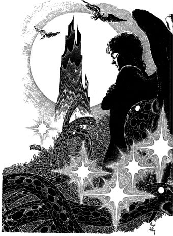
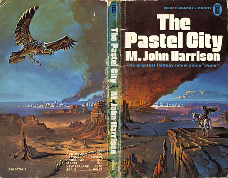
The Pastel City (New English Library, 1971). Illustration by Bruce Pennington.

There are writers’ writers, of course, and M. John Harrison is one of those. He moves elegantly, passionately, from genre to genre, his prose lucent and wise, his stories published as sf or as fantasy, as horror or as mainstream fiction. […] His prose is deceptively simple, each word considered and placed where it can sink deepest and do the most damage.

Neil Gaiman in the introduction to the Bantam/Spectra edition of Viriconium (2005)

This is a lengthy post of potentially minority interest for which I make no apologies. It’s often been a function of the writing here to think aloud while communicating an enthusiasm; as enthusiasms go this one runs deeper than usual. I love these books indecently. If they were people I’d want to sleep with them even though doing so might mean contracting some debilitating illness. When you’re employed as a book designer and illustrator it’s impossible to avoid taking a professional interest in the packaging of your favourite books. M. John Harrison‘s Viriconium books—three novels and a collection of short stories—present challenges that the illustrators and art directors of the past have invariably failed to meet. This post looks at prior cover designs while a subsequent post will suggest some solutions to the challenges. But first it’s necessary to say something about Viriconium itself.

In the distant future of the Earth, when the human race has flourished then lapsed into a state of terminal decay, only one city of note remains: Viriconium, the Pastel City, surrounded by the wastes and fens of a ruined world. Or so we’re told in the first book of a series which begins as outright fantasy and moves by an astonishing feat of authorial dexterity closer to our world and our time. (A shorthand description might describe a series that starts out reading like Jack Vance and ends up closer to Bruno Schulz.) It becomes apparent that Viriconium stands for all the cities that have ever been, and with its avenues, rues and strasses often seems to be a composite of them all. Aside from the unspecified future its fixture in time is indeterminate: one story may concern events which are in the distant past of another while the streets and quarters never remain anchored enough for any kind of map to be drawn. Areas of continuity rise like towers from a sea of vapour. Even the city’s name slips its mooring: the origin is Viroconium Cornoviorum, a Roman town in Shropshire, and Viroconium, a poem by Mary Webb. In the later books we’re told the city is also called Uriconium or Vriko but whether these variants lie in the past or future of Viriconium is unclear. The indeterminacy was deliberate, a riposte to what Harrison calls “fauxthenticity”, and the tendency of genre readers to reduce the subtleties of fiction to the schematics of role-playing games, spaceship diagrams and books with titles like The Science of Middle-Earth. It’s this indeterminacy and a refusal to offer neat resolutions (or that awful term “closure”) that no doubt explains why Harrison’s books often seem to attract more praise than actual readers.

The most remarkable aspect of the books presents the greatest problems in design terms. In the fourteen years that Harrison worked on his series he used its mutable qualities to pull the entire project to pieces without actually destroying it or turning the whole thing into a self-regarding postmodern game. The early books critique the lazy assumptions of the fantasy genre while the later books recast the earlier stories as myths or half-remembered dreams. The first two books may use the apparatus of the fantasy genre but that doesn’t mean the tired imagery of fantasy illustration necessarily suits their covers. The very last story, A Young Man’s Journey to Viriconium, is set in the north of England in our own time. Changing the name Viriconium to London throughout the text, which Harrison has done when the story has been published elsewhere, dissolves the remaining genre trappings. The process is akin to watching those Buddhist monks who construct elaborate mandalas of coloured sand only to sweep them away when the work is finished. All this makes the Viriconium books unique, it’s one of many reasons why I hold them in such high regard and it’s also why they frequently irritate those who want simpler fare. The problem of appealing to a reactionary readership may explain why many of the following covers have failed to honour the content of the books.

pastel-minor.jpg

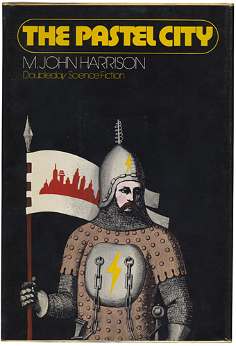
The Pastel City (Doubleday, 1972) Illustration by Wendell Minor.

Dustjacket summaries do none of the books any favours but for the unacquainted they help give a flavour of each volume. They also show how the presentation gradually shifts emphasis. Here’s the Doubleday edition:

An intriguing fantasy in which past and future blend uniquely on an Earth far different from any known to man.

There, in the Empire of Viriconium, a world of chivalry, of magic and strange powers, two Queens clash in bloody warfare for control of the Pastel City and all of its domains. The armies of the defender, Queen Methvet, are led by Lord tegeus-Cromis and the rest of a legendary band of knights, while their attackers are the vicious and cunning Northmen who serve the rival Queen Moidart.

More is involved than a struggle for a throne however, for in their lust for victory the forces of Queen Moidart have unleashed creatures from Earth’s dim past whose terrible potential they little realize until too late. And as Lord Cromis and the rest of his band seek to meet the challenge of these nightmare apparitions, their quest leads them on a perilous journey across many weird lands to a deadly climax in a buried city where a solution is revealed that is as old as time itself.

It’s apposite that a series about an indeterminate city begins with some confusion evident from the outset. The Pastel City in its first UK printing was described on the cover as a fantasy yet compared to Dune which is generally regarded as science fiction; the Doubleday edition is labelled science fiction yet the cover illustration shows a mailed and armoured warrior; the narrative is situated somewhere between the genres in what used to be called science fantasy. While the story concerns the distant future many of the props are the familiar material of heroic fantasy: horses, swords, feuding queens, an axe-wielding dwarf. What technology remains is either defunct or barely functioning. The ruin and decay of Harrison’s world is part of the pleasure, as is the vacillating and ambivalent nature of the characters, a quality which increases as the series develops. None of the publishers dare to reflect this ambivalence in the cover art. Unaware readers would be led to believe from subsequent editions that these books contain the determined and super-efficient heroes they’d find in other books. Compared to what follows the first two covers aren’t so bad; Bruce Pennington gives us one of his flying saucer apocalypses while Wendell Minor’s avoidance of a genre scene is an approach that might have been deployed a lot more often later on.

Continue reading “Covering Viriconium”

Weekend links 112

venus.jpg

“Venus moves across the Sun in this image captured by Japan’s satellite Hinode, on June 6, 2012.” Via.

The imagery in Ah Pook covered a wide range of ideas. A train full of Mayan Gods for instance travelled through various time zones to end up alongside a carnival in a red brick town outside St Louis. Then they got out…out of the books Mr. Hart was reading on the train. Fact also alternated with fiction. We could be chugging along with Lizard boys in a Mayan City one moment then switch to a history of Immigration Laws in the US or the development of tape recorders and Speech Scramblers. Then switch to a bright red Shrew boy with a hard-on on a bicycle in Palm Beach at the end of the world. Time was what the book was about: defining it, controlling it and moving back and forth within it.

Malcolm McNeill

Malcolm McNeill talks to The White Review about working with William Burroughs on Ah Pook Is Here. Related: Jan Herman as Publisher of Nova Broadcast Press. Reality Studio has all the Nova Broadcast publications as downloadable PDFs.

• More Graphic Canon news: design historian Steven Heller reports on the project while at Nashville Scene editor Russ Kick talks to Joe Nolan about the books.

• There’s still a couple of days left to hear Martyn Wade’s Blue Veils and Golden Sands, a BBC radio drama about electronic composer Delia Derbyshire.

venus2.jpg

“Venus in silhouette, seen between the Earth and Sun, from NASA’s orbiting Solar Dynamics Observatory, on June 5, 2012.” Via.

• From 2010: Video of an hour-long lecture by Alberto Manguel at Yale University on “Borges and the Impossibility of Writing”.

• Bauhaus reflections: Frank Whitford on the design school and the exhibition currently running at the Barbican, London.

• “It’s easier to be gay in the US army than it is to be gay in hip-hop.” Zebra Katz, Mykki Blanco and the rise of queer rap.

• Back at the event site: Another extract from M. John Harrison’s forthcoming novel Empty Space.

• Rare 1959 audio: Flannery O’Connor reads A Good Man is Hard to Find.

Venus Transit 2012 – Ultra-high Definition View (NASA/ESA).

• The kitties just don’t care: Indifferent cats in amateur porn.

What happened to Dorothy Parker’s ashes?

Space Teriyaki 5 at 50 Watts.

Venus/Upper Egypt (1991) by Sonny Sharrock | Venus (1996) by Funki Porcini | Venus (2003) by Air