The Rock Machine Turns You On

rockmachine.jpg

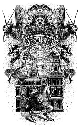
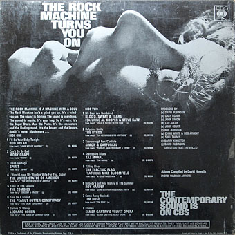
Discovered via the latest issue of The Wire magazine in a feature about compilation albums, The Rock Machine Turns You On (1968) was the first budget sampler album. Given the success of this release I’m sure I must have seen it over the years but that cover wasn’t familiar at all. I have to assume that the “Hey, pop kids!” title would have been enough of a turn-off to ensure the fingers kept flipping through the sleeves. Priorities change with the passing of time, however, and my attention was caught by the cover art alone, another example of the engraving-collage style whose evolution I’ve been tracing over the past few years. The only design credit on the sleeve is for the back cover photo by Wadham Artists. The front cover is credited online to Milton Glaser, some of whose album covers have already featured here. He was working for Columbia/CBS in the late 60s so it’s a possibility. If anyone out there has a copy of the vinyl then maybe they can tell me if that’s an artist credit in the lower right of the picture. A CD reissue in 1996 only copied the album credits.
rockmachine2.jpg

As to the music, it’s a pretty good compilation, lots of familiar names together with a track from cult favourites of mine The United States of America whose one and only self-titled album had been released that year. One of the few negatives about the superb United States of America album is the cover design which isn’t bad but does nothing to reflect the extraordinary musical invention within. It’s a shame that whoever designed The Rock Machine… couldn’t have worked on that sleeve as well.

Update: Rick Poynor writes to say that this cover appears in Milton Glaser: Pop, so the Glaser attribution is accurate.

Elsewhere on { feuilleton }
The album covers archive

Weekend links 194

roberts.jpg

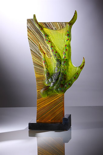
Untitled glass sculpture by Richard Roberts.

Lord Horror: Reverbstorm, my collaboration with David Britton, makes The Quietus list of Literary Highlights of 2013. At the same site there’s Russell Cuzner talking to English Heretic. “His methodology takes in magick, psychogeography and horror film geekdom, along with firm roots in Britain’s industrial music culture of the early 1980s, to form potent, novel topographies of an otherwise unconnected world of occultists and psychopaths.”

• A slew of London links this week: Geoff Manaugh on how the capital was redesigned to survive wartime blackouts, a piece which inadvertently explains why you see so much black-and-white street furniture in post-war films | Bob Mazzer’s photos of the London Underground in the 1970s and 1980s | Philipp Ebeling’s photos of the capital and its inhabitants today.

• “Science has become an international bully. Nowhere is its bullying more outrageous than in its assault on the phenomenon known as subjectivity.” David Gelernter on “The Closing of the Scientific Mind”. Related: “When Science Becomes Scientism” by Stanislav Grof.

• My favourite book about Orson Welles is This is Orson Welles (1992), a collection of Peter Bogdanovich’s interviews with Welles edited by Jonathan Rosenbaum. Bogdanovich’s interview tapes can now be heard at the Internet Archive.

• Brian Dillon on Dada collagist Hannah Höch who he calls “art’s original punk”, and Sean O’Hagan talking to another collage artist, Linder Sterling, who says “Lady Gaga didn’t acknowledge I wore a meat dress first”.

• One Hundred Years Of Weird Fear: Daniel José Older on HP Lovecraft’s literature of genealogical terror. More fear (and Lovecraft): Will Wiles on the growth of Creepypasta.

The Last Alan Moore Interview? A lengthy discussion with Pádraig Ó Méalóid. Shunning interviews hasn’t done Cormac McCarthy any harm so if I was Alan I wouldn’t worry.

• And speaking of Cormac McCarthy, the headline of the week: “Cormac McCarthy’s ex-wife busted after pulling gun from vagina during alien argument“.

• Where the bodies are buried: Mick Brown presents a potted biography of Kenneth Anger who offers a few reluctant quotes.

• A short animation for gore-obsessed kids: Pingu’s The Thing by Lee Hardcastle.

Helen Yentus designs a 3D-printed slipcase for a novel by Chang-rae Lee.

Ralph Steadman‘s illustrations for Alice’s Adventures in Wonderland.

• Mix of the week: Secret Thirteen Mix 103 by Lustmord.

Collage art at Pinterest.

No Escape (1966) by The Seeds | Pushin’ Too Hard (1966) by The Seeds | No Escape (1979) by Cabaret Voltaire | Pushin’ Too Hard (1982) by Paul Parker

Lovecraft’s Monsters

Lovecraft's Monsters

Graphic for the title page and ends of chapters.

I don’t usually post things so far away from publication, but editor Ellen Datlow put these pictures on her Facebook page a few hours ago so I may as well do the same here.

Back in February I bought a Wacom Intuos drawing tablet, something I’ve been using with regularity for the past few months. The Alas Vegas Tarot cards I designed in the summer were the first major attempt at getting used to working with it; Lovecraft’s Monsters, a forthcoming fiction anthology for Tachyon is the second, and I now feel very comfortable working with it. More than that, I’m increasingly pleased with the way it’s possible to combine the drawing techniques I’ve been using for years with the additional possibilities provided by working in Photoshop. As always, it’s the end result that counts but arriving at an end result can be easy or difficult. Some of these illustrations look no different than they would have done had I used ink on paper but they took half the time to create, a considerable benefit when a deadline is looming.

The stories Ellen Datlow has chosen for this collection all present different aspects of monstrosity seen through the lens of Lovecraft’s fiction and his cosmic menagerie. Some are full-on extensions of the Mythos, others are more allusive; all the pieces bar one have been published before but I’d not read any of them so for me this was fresh material. Having spent the past few years saying I was finished with Lovecraft’s fiction I was excited to be working on this book. The stories are good, and I welcomed the challenge of having to illustrate such a variety of material.

Larger copies of all the pictures can be seen here.

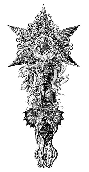
The star-headed thing at the top of this page is another amalgam of elements plundered from Haeckel’s Kunstformen der Natur and other sources. I’ve leaned rather heavily on Haeckel in the past, something I wanted to avoid here; this serves as a kind of visual punctuation separating the stories.

Lovecraft's Monsters

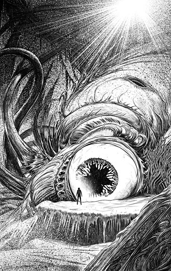
Cthulhu.

The drawing I’ve called Cthulhu is a piece for the introductory pages. Having already produced a lot of Cthulhoid art I didn’t want to repeat myself. The initial idea was of a tiny human figure faced with something enormous and nightmarish; that could be a vast eyeball or it could be a mouth or some other organ/aperture, the vagueness was intentional. Lovecraft continually impresses upon his readers how difficult things are to describe or apprehend but you seldom find this quality in art based upon his stories. Cthulhu especially has devolved into little more than an outsize man-in-a-rubber-suit à la the Creature from the Black Lagoon. In The Call of Cthulhu the figure on the mysterious statuette is described as having a humanoid shape but Lovecraft doesn’t describe the appalling reality in any detail at all. When Cthulhu is struck by a ship at the end of the story it breaks apart and is then seen recombining, the implication being that the creature is corporeally amorphous.

Lovecraft's Monsters

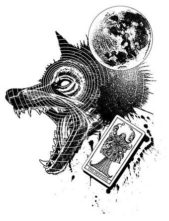
Only the End of the World Again by Neil Gaiman.

Neil Gaiman’s entry concerns a werewolf private detective in Innsmouth. Lovecraft’s decaying fishing village and its inhabitants turn up in several of the stories so care was taken to avoid repetition.

Lovecraft's Monsters

Bulldozer by Laird Barron.

A great story about another detective, a Pinkerton agent this time, hunting his quarry through the Old West. Collin de Plancy’s Dictionnaire Infernal is mentioned so I used some of Louis Breton’s illustrations from the third edition.

Continue reading “Lovecraft’s Monsters”

Martin Sharp, 1942–2013

sharp1.jpg

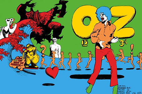
Oz magazine no. 15, October 1968.

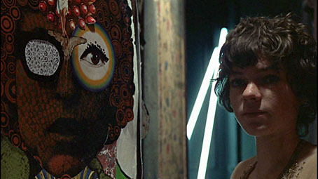
The psychedelic art of Australian artist Martin Sharp has featured here on several occasions. Unlike his British and American contemporaries who maintained a single graphic style, Sharp was a versatile artist whose work could range from loose, often cartoony drawing and painting to very detailed collage designs; he was also as happy as any other artist of the period to plunder art history, as the cover for issue 15 of Oz demonstrates. The Mick Jagger figure from that cover was later reworked as a poster for “Turner’s Purple Orchestra”, one of a number of pieces of Sharp art which can be glimpsed throughout Donald Cammell & Nicolas Roeg’s Performance (1970).

sharp7.jpg

Performance (1970): Michele Breton and a Martin Sharp collage.

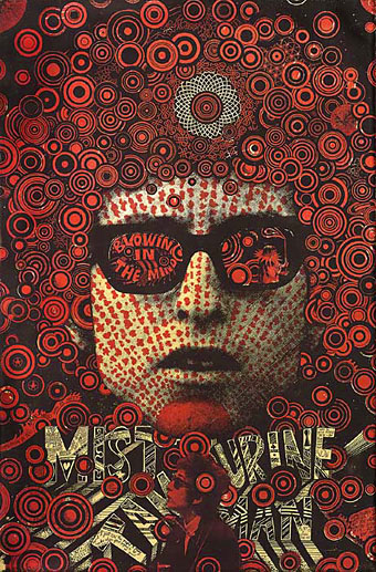
Sharp’s involvement with Oz magazine, and the creation of a handful of endlessly reproduced designs—the Bob Dylan Mr Tambourine Man poster, Jimi Hendrix in a Jackson Pollock explosion, the sleeve art for Cream’s Disraeli Gears—makes his art some of the most visible of the period. People may not necessarily know the name but they’ll recognise the work.

In 2009 Sharp’s Oz colleague Germaine Greer wrote a warm appraisal of the artist and his work. A few more examples follow. There’s a great selection of posters and other art and design here.

The GuardianMartin Sharp, Australian artist who came to symbolise the ’60s | Martin Sharp in pictures

sharp2.jpg

Mister Tambourine Man (1966).

Continue reading “Martin Sharp, 1942–2013”

Weekend links 180

andrew.jpg

One of Jonathan Andrew‘s photos of coastal bunkers and concrete defences from the Second World War. In 2006 JG Ballard looked at the way these structures embody the functional nature of Modernist architecture.

• “Utamaro, whose prints of famous courtesans were regarded as the very models of sober beauty by 19th-century Western collectors, in fact produced more Shunga books and albums than non-erotic works.” Adrian Hamilton on the Shunga: Sex and Pleasure in Japanese Art exhibition.

• “…in Samoa, as in many traditional cultures around the world, androphilic males occupy a special transgendered category.” Alice Dreger on gay male couples and evolution.

• Robert Fuest’s film of Michael Moorcock’s first Jerry Cornelius novel, The Final Programme (1973), is out on (Region 2) DVD this month.

Masked by reticence and cloaked in tweeds, [Herbert] Read was the unexpectedly ardent and frighteningly prolific champion of nearly everything that was radical in the first half of the twentieth century: Imagism, Surrealism, abstraction, the Bauhaus, Marxism, anarchism, Freud and Jung, progressive education, Gandhian nonviolent resistance. Though now somewhat dimly remembered, he was, for decades, the Victoria Station of the arts, England’s primary explainer of the modern.

Eliot Weinberger introduces Herbert Read’s strange fantasy novel, The Green Child (1935).

• KW Jeter’s steampunk novel Fiendish Schemes is published (with my cover art) by Tor on the 15th. There’s an extract here.

• Mix of the week: An early Halloween mix (and interview) from Joseph Stannard of The Outer Church.

• At Dangerous Minds: Codex Seraphinianus: A New Edition of the Strangest Book in the World.

A trailer for the forthcoming Blu-ray release of Murnau’s Nosferatu: A Symphony of Horror.

• Kenneth Halliwell: lover, killer… artist? Philip Hoare on the collages of Joe Orton’s partner.

• Clive Hicks-Jenkins looks back at Cocteau’s La Belle et la Bête here, here and here.

Anastasia Ivanova‘s photo portraits of lesbian couples in Russia.

Christopher Fox on electronic music’s sound of futures past.

• At Strange Flowers: Melchior Lechter’s book designs.

Vaughan Oliver‘s favourite 4AD album covers.

Swinging Sixties Japanese film posters.

John Foxx’s favourite albums

Beauty And The Beast (1977) by David Bowie | Slow Motion (1978) by Ultravox | I Am The Green Child (2000) by Coil