Weekend links 528

durer.jpg

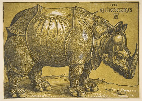
The Rhinoceros (after 1620) by Albrecht Dürer.

• “Today—Tolkien, Lovecraft, Miéville and M John Harrison!” Paul StJohn Mackintosh at Greydogtales explores HP Lovecraft’s lack of interest in fictional worldbuilding. The piece includes one of my book covers (ta!) plus a link to an earlier post I wrote about the cover designs of M. John Harrison’s Viriconium books. Since I’m connected to the thesis I’ll suggest that Lovecraft was resistant to the worldbuilding impulse in part because he was almost always writing horror stories. Having studied the genre at length he was well aware of the need to leave suggestive voids for the reader’s imagination.

• RIP Denise Johnson. All the obituaries mention the big names she worked with, notably New Order and Primal Scream, but being in the pool of Manchester session artists she also appeared on a couple of records by my colleagues at Savoy. Her voice is one of those you first hear on the PJ Proby cover of I’m On Fire, while with friend Rowetta she improvised her way through a Hi-NRG original (and a favourite of Anohni’s), the scurrilous Shoot Yer Load.

• At the BFI: Axel Madsen interviews Fritz Lang in 1967; Serena Scateni on where to begin with Nobuhiko Obayashi; and Roger Luckhurst reviews the spomenik-infested  Last and First Men by Jóhann Jóhannsson.

• “Be more aware of the rest of the world!” says Jon Hassell, talking to Alexis Petridis about a life spent making music.

John Boardley on the Renaissance origins of the printed poster. Worth it for the selection of engraved details alone.

• “What Ever Happened To Chicken Fat?” Jackson Arn on a tendency to over-abundance in Jewish humour.

Erik Davis has a new writing home at Substack that he calls The Burning Shore. Bookmarked.

• Mix of the week: The Ivy-Strangled Path Vol. XXII by David Colohan.

• Garry Hensey on The Strange World of John Foxx.

• At Dennis Cooper’s: Sergei Parajanov Day.

Romantic Rhino (1981) by Ananda Shankar | The Lone Rhinoceros (1982) by Adrian Belew | Blastic Rhino (2000) by King Crimson

James Cawthorn: The Man and His Art

cawthorn-cover.jpg

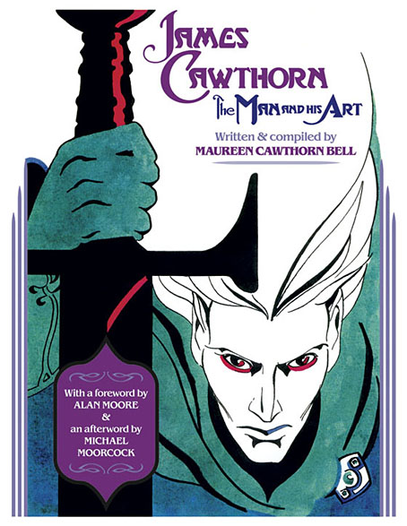
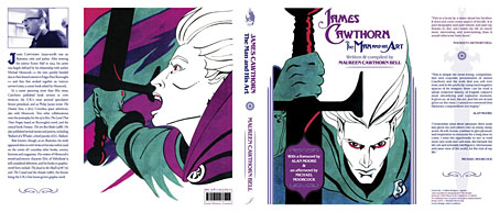
The past year would have been busier than usual with the amount of illustration work I had to deal with, but it was made even busier with my having to design this book at the same time. James Cawthorn: The Man and His Art was originally intended to be a modest memorial by Maureen Cawthorn Bell for her artist brother following his death in 2008, but the book grew into a heavyweight volume of 448 pages containing over 800 individual pieces of art: book covers, illustrations for magazines and fanzines, private pieces for friends and relatives, and many sketches or preliminary works, most of which have never seen print before.
cawthorn-coverspread.jpg

Given Jim Cawthorn’s long association with Michael Moorcock, as both friend and collaborator, the task of collating the artwork and editing the book went to Moorcock bibliographer John Davey, who also serves as the book’s publisher. John spent three years locating over 3000 pieces of artwork, large and small. Some of these pieces are now lodged with the Moorcock archives in the Bodleian Library, Oxford, while others may only be found in the pages of the many science fiction and fantasy fanzines that Jim illustrated, copies of which are stored at the British Library. From this body of material Maureen and John selected a core of representative work from Jim’s private as well as public life, although no-one at the outset of the project was expecting the final picture tally to be so high.
cawthorn-spread-01.jpg

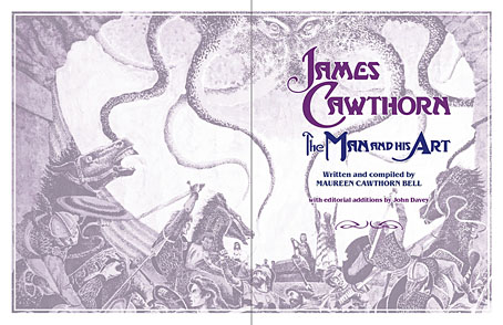
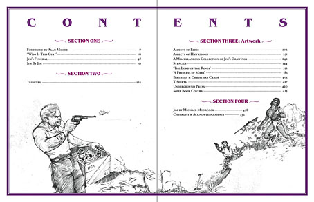
My task as the book’s designer involved making the text presentable (easy) and corralling the artwork (not so easy, and I also had to either clean or colour-adjust every single piece). Maureen had divided the book into several sections, beginning with a lengthy biographical reminiscence. Following this was “Jim by Jim”, a selection of interviews, magazine pieces, some fiction, essays and book reviews. There was also a lengthy extract from Fantasy: 100 Best Novels (1988), a book credited to Jim and Michael Moorcock but, by Moorcock’s admission, mostly Jim’s work. Jim Cawthorn was very well-read, especially in the genres—he was old enough and interested enough to have read The Lord of the Rings when it was first published—and could also present his erudition engagingly for a reader, so the text section of Maureen’s book is far from indulgent.
cawthorn-spread-02.jpg

The book design isn’t as elaborate as some I’ve worked on but it didn’t need to be when the pictorial material is rich with what Moorcock calls “wizardry and wild romance”. Maureen wanted a particular picture of Moorcock’s Elric character on the cover so I took details and motifs from some of Jim’s many Elric illustrations to give the book a thematic thread and internal consistency. Cawthorn was present at the creation of Elric in the early 1960s; he not only provided Moorcock’s characters with their first illustrations but even helped plot one of the earliest stories, Kings in Darkness.

cawthorn-number.jpg

Page numbers are framed by the swords from the Elric stories.

Using motifs such as the sword silhouette and Elric head is something I frequently do with book designs but for this book I also went to the trouble of creating a one-off font for the drop capitals based on Jim’s hand-drawn lettering. Jim drew titles and other lettering throughout his career, so again this was a decision warranted by the book’s contents. The few times we met I never asked him about this but I’ve always thought his lettering designs were derived from the stylised titles that J. Allen St. John created for many of the early Edgar Rice Burroughs books. Jim spent most of his life drawing Burroughs’ characters, and was very familiar with the work of Burroughs’ original illustrators. I was hoping to find a title design of Jim’s that I could rework for the book’s title but none of the examples worked as well as I hoped. For this reason the title lettering is based on different styles from the John Carter novels that were Jim’s favourites among Burroughs’ works.
cawthorn-spread-03.jpg

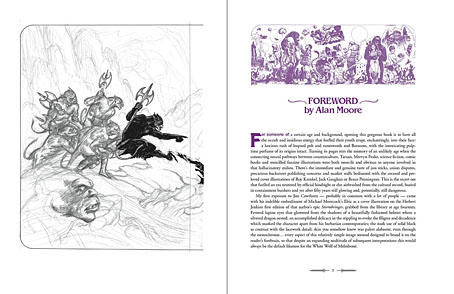
Other features include a foreword by Alan Moore, an afterword by Michael Moorcock, a gallery of Jim’s Lord of the Rings drawings and character sketches from the early 1960s (which predate all others bar those by Tolkien himself), artwork for Hawkwind (including Dave Brock’s “Meliadus” T-shirt), and even a handful of photos from the set of The Land that Time Forgot (1975), the ER Burroughs-derived feature film scripted by Jim with Michael Moorcock. The page samples here are necessarily few given the size of the book.
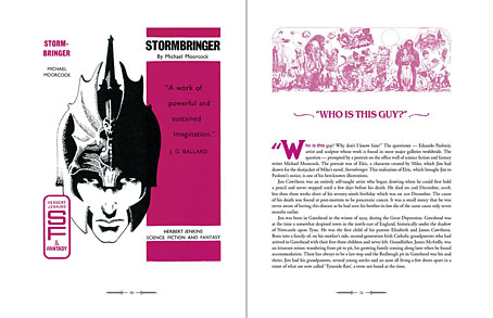
cawthorn-spread-04.jpg

For the moment James Cawthorn: The Man and His Art is available exclusively from publishers Jayde Design at a special pre-publication price of £20. After publication on 6th August the price will rise to £35. Further page samples follow.

Continue reading “James Cawthorn: The Man and His Art”

Weekend links 240

wiley.jpg

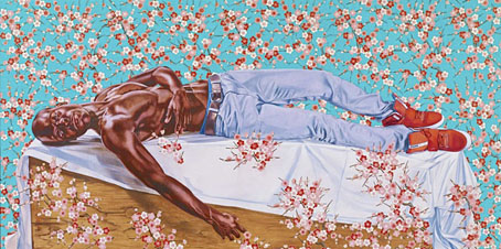
The Death of Chatterton (2014) by Kehinde Wiley.

• Mixes of the week (and the week before that): The Conjurer’s Hexmas: Second Rite by SeraphicManta; Secret Thirteen Mix 140 by Deaf Center; Best of 2014: A Highly Opinionated Mix by Robin The Fog.

• Never mind Music for Airports, how about Music for Neurosurgery? The Tegos Tapes Edits are extracts from “12 hours of unheard Vangelis music soundtracking films of various surgical operations”.

• “It was one of the first magazines that, with science-fiction and comics together, proposed comics for adults.” Aug Stone on 40 years of publisher Les Humanoïdes Associés and Métal Hurlant.

• Zinesters Do It on the Photocopier: Stephanie Schroeder on the Queer Zine Archive Project. Related: Holy Titclamps by Larry-bob Roberts.

A Year In The Country reached the end of its 365 posts. The archive is well worth a browse.

• “These people love to collect radioactive glass. Are they nuts?” asks Ben Marks.

• Think before you share: 86 viral images from 2014 that were totally fake.

• The Anti-Tolkien: Peter Bebergal on Michael Moorcock.

• Extracts from Alan Bennett‘s diary for 2014.

John Cage 4’33” Autotune

Alpha (1976) by Vangelis | Reve (1979) by Vangelis | L’Enfant (1979) by Vangelis

A profusion of Peake

gormenghast_box.jpg

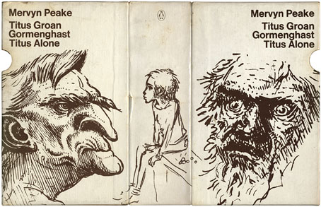
Bellgrove, young Titus and Barquentine by Mervyn Peake. Case designed by Robert Hollingsworth.

I’d thought about posting the covers of my boxed set of Gormenghast paperbacks a couple of years back when there was a flurry of blogospheric attention being given to Penguin cover designs…thought about it then never got round to it. The reason for doing so now is twofold: firstly I’ve been re-reading the books, and secondly some Gormenghast-related news emerged this week which gives this post an additional relevance.

gormenghast1.jpg

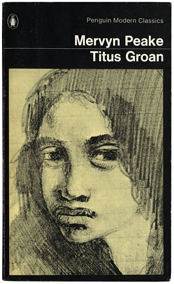
Fuchsia by Mervyn Peake.

The set of Peake paperbacks which Penguin published in 1968 (and their subsequent reprints) were the first editions of Peake’s trilogy which I encountered so I can’t help but regard them as the ones, the only copies I could countenance reading. That may change, however (see below). I’ve no idea how scarce the boxed edition is but the books are reprintings from 1970 so I presume Penguin put out a boxed gift set to make the most of Peake’s posthumous success. I always liked the presentation which is the standard Penguin Modern Classics format of the period, it leaves to you how much you want to regard the books as works of fantasy or simply novels of a rather grotesque and highly imaginative reality. Titus Groan‘s sketch of a glowering and thoroughly unglamorous Fuchsia was a daring choice for a cover intended to lure a newer, younger audience to Peake’s work. The drawing says a great deal about the author’s unsentimental attitude towards his creations; compared to the florid and often delicate covers of the fantasy books being published by Ballantine in the late Sixties (a series which included the Gormenghast trilogy), it seems shockingly unpleasant.

Continue reading “A profusion of Peake”

Pauline Baynes, 1922–2008

baynes1.jpg

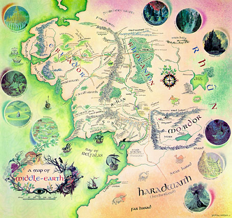
Pauline Baynes, who died earlier this week, was for a long while the only Tolkien illustrator of note. Her work was approved by Tolkien himself but faded from view as the JRRT spin-off industry began to expand in the late Seventies and other artists quickly crowded the field, many of whom lacked her subtlety and sympathy for the material. It was her artwork which Allen & Unwin used on their single-volume edition of Lord of the Rings and in the late Sixties they also produced a poster of her Middle Earth map (above; complete version here). That poster hung on my bedroom wall and fascinated me with its view of the now over-familiar characters and the vignette details of various locations.

baynes3.jpg

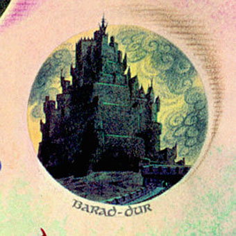
Those vignettes, such as her tiny rendering of Sauron’s Dark Tower, seemed at the time a perfect summation of Tolkien’s world and I still prefer her hulking Barad-dûr to the spiny monolith seen in Peter Jackson’s films. Her friendship with Tolkien led to a similar commission for maps and illustrations from CS Lewis and it’s as the illustrator of the Narnia books that she’s most celebrated. I never read Lewis’s work, and came to Lord of the Rings late, so the infatuation with this brand of heroic fantasy swiftly gave way to the ambivalent moralities of Michael Moorcock‘s Elric, Fritz Leiber‘s Lankhmar and Mervyn Peake’s Gormenghast. Her work wouldn’t have suited those writers but for Tolkien and Lewis she was ideal.

baynes2.jpg

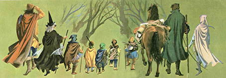
The Fellowship of the Ring from the Middle Earth map.

One of the newspaper obituaries notes:

It was somewhat to her chagrin that she developed a reputation over the years as an illustrator of mostly Christian works and, to redress the balance, one of her last creations (her “children” as she called them) was a series of designs for selections from the Qur’an, scheduled for publication in 2009.

These days Charles Williams is the writer who interests me still from the Oxford group known as “the Inklings”, of whom Tolkien and Lewis were the most famous members. Williams was also a Christian propagandist but his use of fantasy was more sophisticated and, in the extraordinary Many Dimensions (1931), he too managed to depart from the Christian sphere by blending HG Wells-style science fantasy with Islamic mysticism.

Brian Sibley wrote a Pauline Baynes obituary for The Independent and his blog features an excellent overview of her life and work.

Elsewhere on { feuilleton }
The illustrators archive

Previously on { feuilleton }
Mervyn Peake in Lilliput