L’outrageant Lord Horror

shoah1.jpg

Cover art by Enki Bilal.

Arriving in the post this week was the catalogue for the Shoah et bande dessinée exhibition which is currently running in Paris at Mémorial de la Shoah. I’ve mentioned previously that the exhibition includes some of my pages from my first collaboration with David Britton/Savoy, the death-camp issue of the first Lord Horror series, Hard Core Horror, but until the catalogue arrived I wasn’t sure how that work would be presented. Consequently, I’m surprised to find the comic and Britton’s wider Lord Horror project given a section of its own in the catalogue, with a lengthy appraisal by British comics historian Paul Gravett. The text is French throughout so I can’t follow Gravett’s piece very well but it looks to be an expansion of earlier pieces he’s written about the Savoy comics and their troubled history.

shoah2.jpg

The book itself is a solid production that I’m pleased to find following the hardback “album” format used by Continental comics. Denoël Graphic, a publisher of bandes dessinées, is the publisher. Among the other artists represented are Will Eisner and Art Spiegelman (of course), plus many French artists whose work I hadn’t seen before. The exhibition runs throughout the year to 30th October, 2017.

shoah3.jpg

shoah4.jpg

Previously on { feuilleton }
Exhibitionism

Old Weird and New Weird

savdreams.jpg

Savoy Books, 1984.

A couple more recent arrivals that feature my work. These are of minority interest but worth noting since academic articles don’t always travel beyond a small audience of subscribers.

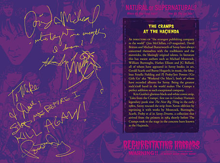
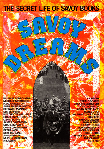
A recent issue of Foundation (The International Review of Science Fiction), Volume 45.1, number 123, contains an article by Mark P. Williams, Underground Assemblages: Savoy Dreams and The Starry Wisdom. This examines the legacy of New Worlds magazine under the editorship of Michael Moorcock (from 1964 to 1974) via two writing collections, Savoy Dreams (Savoy Books, 1984) and The Starry Wisdom (Creation Books, 1994). The two collections are very different: Savoy Dreams, edited by David Britton and Michael Butterworth, was an eclectic overview of Savoy’s publishing endeavours up to that point. Among the original writing there’s fiction by Butterworth, M. John Harrison (the first publication of the Viriconium story, Lords of Misrule) and others, plus a reaction by Michael Moorcock to William Burroughs’ Cities of the Red Night, a book that Savoy had contracted to publish before police harassment forced the company’s bankruptcy. The rest of the book is taken up with press reviews of Savoy books.

starrywisdom.jpg

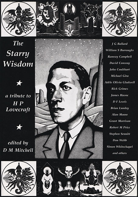
Creation Books, 1994. Cover art by Peter Smith.

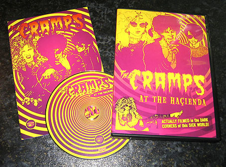
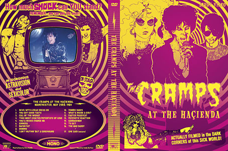
The Starry Wisdom should require less of an introduction since the book has been in print since 1994, and has a small, possibly notorious, reputation among HP Lovecraft enthusiasts. Editor DM Mitchell felt that the assembling of post-Lovecraftian fiction up to that point had been too cosy and insular: too many story collections were being edited and written by groups of friends in the genre fiction “community”, with the result that the stories were often stale and complacent. The startling newness of Lovecraft’s imagination in comparison to many of his contemporaries in Weird Tales seemed to have been bled away into pastiche, a process that began soon after Lovecraft’s death. Mitchell’s solution was to commission original pieces of Lovecraft-inspired work from writers outside the genre world, notably Alan Moore, Grant Morrison, and newcomer David Conway; he also reprinted pieces that would never appear elsewhere as Lovecraftian fiction, including Wind Die. You Die. We Die. by William Burroughs, and Prisoner of the Coral Deep by JG Ballard. Burroughs and Ballard connect directly to New Worlds, of course (Ballard wrote about Burroughs for the magazine), while the pair cast a shadow over many of Savoy’s book productions. Both Savoy Dreams and The Starry Wisdom featured comic strips; Tales of the Cramps by Kris Guidio appeared in Savoy Dreams, while The Starry Wisdom contained strips by Mike Philbin & James Havoc, Rick Grimes, and the first publication of my own adaptation of The Call of Cthulhu.

I was surprised—and pleased—that my comic strip receives a fair amount of scrutiny in Williams’ piece. My Lovecraft strips have received almost no attention from the comics world, a consequence of having been printed by book publishers and distributed to book shops. (A rare exception was this recent piece by Matt Maxwell.) When you’ve been overlooked in this manner it’s a surprise to find your work receiving serious evaluation from an entirely different quarter. Mark P. Williams’ essay examines the contents of both collections, my strip included, as “assemblages”. This is a valid critique in the case of the Cthulhu strip since Lovecraft’s story is itself an assemblage of what seems at first to be unrelated data. The comic adaptation assembles a range of cultural references—some genuine, others invented—to parallel the narrator’s investigation, and even uses genuine documents in places, including columns from The New York Times. I don’t know if Williams has seen the blog post I made that points out many of the cultural references but he notes some of the more overt ones, such as Joseph Conrad appearing as the doomed Professor Angell, Arnold Böcklin’s The Isle of the Dead, and so on. While I was drawing the strip I was trying to imagine the story as an RKO production, a hybrid of two island films—The Most Dangerous Game and King Kong—and Orson Welles’ unmade Heart of Darkness. These references, many of which aren’t very obvious, were largely for my own amusement. The series I created with David Britton that followed the Lovecraft strips, Reverbstorm, puts assemblage and cultural reference at the forefront.

genre.jpg

Cover art is my illustration for Remnants from Lovecraft’s Monsters, edited by Ellen Datlow.

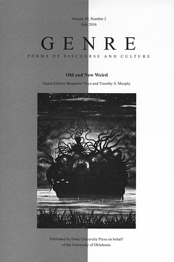
The Cthulhu strip and the Reverbstorm series—now collected as Lord Horror: Reverbstorm—are the subject of a very perceptive piece by Benjamin Noys in the latest edition of Genre, an academic journal published by Duke University Press. This number of the journal is a kind of Weird special edited by Benjamin Noys and Timothy S. Murphy. Noys’ Full Spectrum Offence: Savoy’s Reverbstorm and the Weirding of Modernity is the final article in a publication that examines aspects of the “Old Weird” (ie: the Lovecraft-era Weird Tales) and contrasts it with the more recent “New Weird”. The latter was a short-lived label coined by M. John Harrison in 2003 for a range of fiction that was ignoring genre boundaries, and consciously developing the Weird as a project. China Miéville was one of the most visible proponents of the New Weird, and Harrison’s term emerged in part as a response to Miéville’s fiction. Miéville is interviewed in this issue of Genre where, as usual, he has some very worthwhile things to say. He prefers the term “haute Weird” for the original manifestation, possibly because it avoids the negative connotations of the word “old”.

reverbstorm.jpg

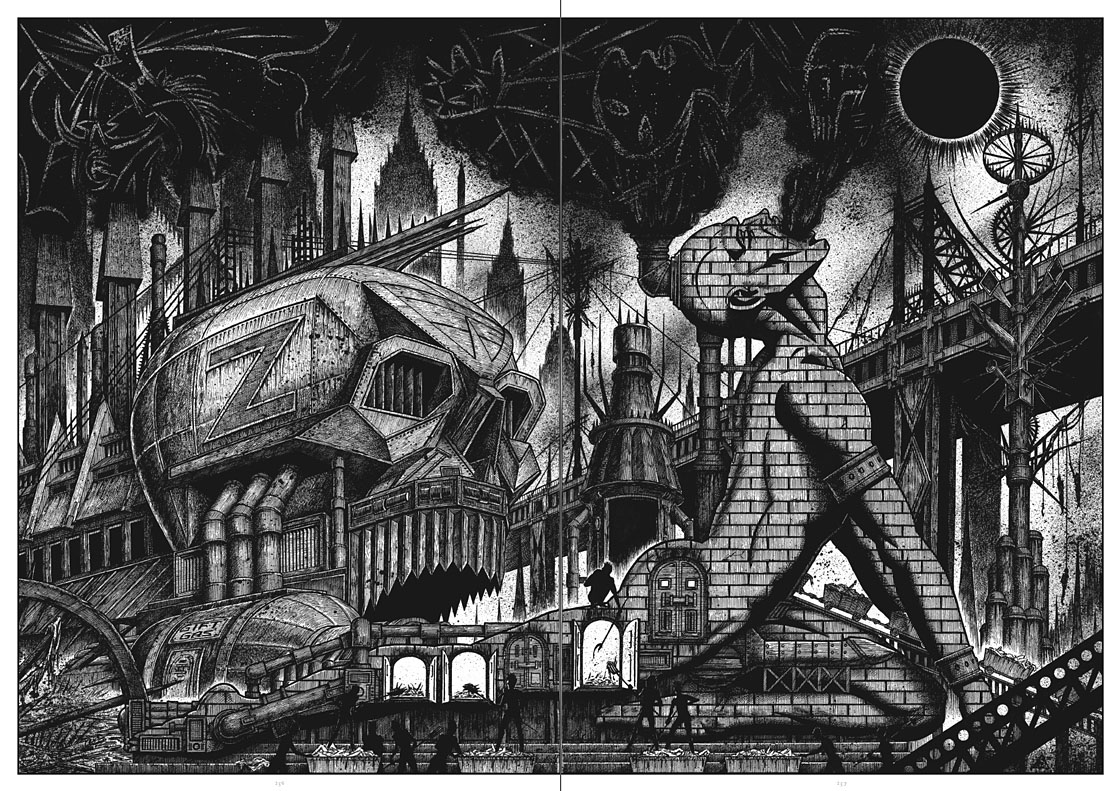
A spread from part 7 of Reverbstorm.

Benjamin Noys’ article is lengthy and resists easy summary, but it begins by investigating the way my work on the Lovecraft strips permeated the Lord Horror comics and dictated some of the imagery, in particular the architectural forms and eruptions of monstrosity. Later discussion concerns the way that Reverbstorm forces the Weird and Modernism together, a collision that I believe is still unique anywhere, never mind in the comics medium. Noys’ piece has given me a lot to think about, not least for its being the first substantial critical appraisal of Reverbstorm. The series is a difficult one, being deliberately excessive and avant-garde, and presenting the reader with a torrent of interrelating cultural references. Many of these are itemised in the appendix but the success (or not) of their working together, and the potential sparking of connections, depends very much on the prior knowledge of the individual reader. Noys is not only knowledgeable but adept at forging his own connections while situating the series in the larger context of the Weird, old (or haute) and new. Even without the inclusion of my work inside the journal and on the cover, I’d recommend this issue of Genre to anyone with an interest in the subject. One of the reasons I favour the Weird as a chosen work label is the way it evades (or ignores) generic boundaries. Years ago I realised that many of the things I liked the best in the arts were the chimeras, those works that transgress boundaries and created new hybrids. No surprise then that I enjoy a genre that refuses easy definition. There aren’t many masts I pin my colours to but the Weird is one of them.

Previously on { feuilleton }
The Weird

Weekend links 309

witch.jpg

From What is a Witch, “an illuminated manifesto on witchcraft” by Pam Grossman and Tin Can Forest.

• “The other strand of influence for me from dance music was a production house called Savoy in Manchester, England. They were a super underground publishing house that printed cartoons and comic books, and they also released a series of underground dance records. And they were always being shut down by the police and all their stuff was being confiscated, because it was considered ‘anti-society’ in England.” Anohni giving a shout to my colleagues at Savoy Books in a new interview.

Belladonna of Sadness (1973), a feature-length animated film by Eiichi Yamamoto, has been restored, and is being given a premier release in the US. There’s a review here and a trailer here. No news as yet of a UK release but Finders Keepers has the soundtrack album.

Alejandro Jodorowsky talks to Daniel Kalder about his new novel, Albina and the Dog-Men, while Jodorowsky’s comic-book collaborator, Ladrönn, talks to Smoky Man about their new graphic novel, The Sons of El Topo.

Pretty little watercolours these are not. Made by bulldozers and dynamite instead of a paintbrush and easel, the works—often sited on baking sandscapes—fuse minimalism and modern industrial aesthetics to evoke the otherworldly structures of ancient civilisations, from Stonehenge to Mayan temples and the Egyptian pyramids.

Alex Needham on America’s land artists. A few years ago I tracked down some of the structures he describes using Google Maps.

• In every dream home a heartache: High Rise director Ben Wheatley on adapting Ballard, practical special effects and ’70s parenting.

Tom Phillips: From Prequel To Sequel, an exhibition of pages from A Humument at Shandy Hall Gallery.

• From fresh food to magic mushrooms: Michael Pollan probes the medicinal uses of psychedelic drugs.

• “Let’s not forget graphic design is an artistic discipline,” says Jonathan Barnbrook.

Supervert discusses censorship and related matters at SomethingDark.

• “I’ve sung gospel music when in great despair,” says Diamanda Galás.

• Mix of the week: FACT Mix 550 by James K.

Boy Club is a new gay magazine.

Gospel Trane (1968) by Alice Coltrane | The Gospel Comes To New Guinea (1981) by 23 Skidoo | Gospel Train (1990) by African Head Charge

The Cramps at the Haçienda

cramps1.jpg

At last: something that has no connection with HP Lovecraft… This was one of several design jobs during a very busy summer, a long-delayed DVD release by Savoy of the Cramps playing Manchester’s trendiest club of the 1980s, the Haçienda. The posthumous reputation of the Hac (as it was locally known) has been inflated in recent years; you’ll hear much about its thriving dance nights but little about the early days when the huge and often chilly space was seldom even half full. The Cramps played there twice in 1984, and like many bands with a cult following, managed to fill the floor with eager fans; Savoy’s video captures the second performance on May 23rd. It was standard policy at the Haçienda to film every event, and some of the more popular performances—William Burroughs’ reading, a concert by The Birthday Party—were later released by Ikon, the video wing of Factory Records. Two cameras on either side of the Haçienda balcony covered the stage but on the night of the Cramps’ performance none of the Ikon staff wanted to assist Linda Dutton in filming the gig. So this recording is a rudimentary one—a single U-matic camera and mono sound—but Linda captured a tremendous hour-long concert with an outstanding Iggy Pop-like performance from Lux Interior.

cramps2.jpg

For my design I wanted to avoid Goth clichés and create something in keeping with the band’s trashy rock’n’roll aesthetic. All the portraits are by Kris Guidio from the comic strips he was producing in the early 1980s for Lindsay Hutton’s Next Big Thing zine; the lurid headlines are lifted from film posters found in back issues of Psychotronic Video magazine. The DVD has an 8-page booklet and an interface which I also designed although this is merely functional, nothing like the elaborate animated affair I created for The Mindscape of Alan Moore. When concerts such as this are routinely put onto YouTube for free it hardly seems worth going to all this trouble, but for Savoy it provides another connection to a favourite band. The PAL DVD is priced at £10, and may be ordered direct.

cramps3.jpg

Previously on { feuilleton }
Haçienda ephemera
Lux Interior, 1946–2009
The Final Academy

The case of the fin de siècle fleuron

artnouveau.jpg

I said yesterday that poppies are a common feature of the fin de siècle magazines for the convenient way they combine long-stemmed flowers—ideal for all those Art Nouveau flourishes—with narcotic connotations that signal Decadence. The spiralling fleuron above is one example that readers of Savoy books may recognise, an occasional company logo which has been in use since the mid-1980s. David Britton chose the design from one of the Dover Pictorial Archive books, Carol Belanger Grafton’s Treasury of Art Nouveau Design and Ornament, and I later made a digital version from this page scan.

heroes.jpg

One of the earliest Savoy uses, a label design for Heroes (1986) by PJ Proby.

Having spent a great deal of time in recent years trawling through Art Nouveau magazines I was sure I was going to run into the original printing of the fleuron eventually. Some of the page decorations in Jugend are very similar but it wasn’t there or in Pan, Deutsche Kunst und Dekoration or The Studio. I don’t have a copy of the Grafton book, and Dave says his copy is lost, so I’ve no idea whether there’s a credit for the source of the designs; not all Dover books credit their source material in any detail. Earlier this week I decided to look in Art et Décoration, a magazine that was the French equivalent of The Studio, since the header at the top of the scanned page implied that the other designs might be from the same magazine. Aside from a couple of copies at the Internet Archive this means looking through the poor-quality scans at Gallica; by a fluke—because they don’t seem to have a complete run of the early issues—the January 1898 edition contained the page below showing the Savoy fleuron, an endpiece for an article devoted to another French art magazine, L’Image.

Continue reading “The case of the fin de siècle fleuron”